Poll results
Save to favorites
Add this poll to your saved list for easy reference.
Based on the cover, which book would you rather buy?
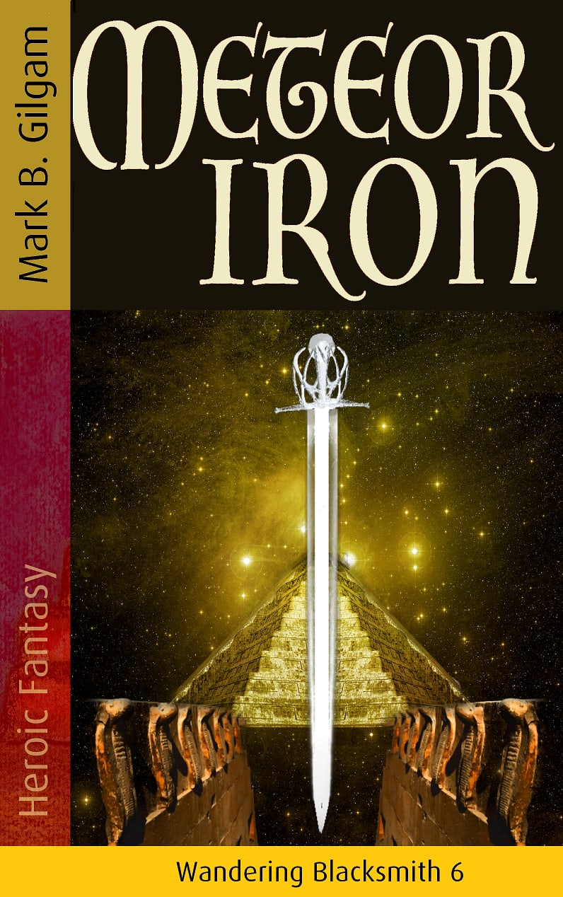
Option A won this Ranked poll with a final tally of 109 votes after 1 round of vote counting.
In a Ranked poll, respondents rank every option in order of preference. For example, when you test 6 options, each respondent orders their choices from first to sixth place.
PickFu requires a majority to win a Ranked poll. A majority winner differs from a plurality winner. A majority winner earns over 50% of the votes, whereas a plurality winner earns the most votes, regardless of winning percentage.
If an option does not earn a majority of votes, PickFu eliminates the option with the lowest number of votes. The votes from the eliminated option are reassigned based on each respondent’s next choice. This process continues in rounds until a majority winner emerges.
Scores reflect the percentage of total votes an option receives during the vote counting and indicate the relative preference of the respondents. If there is no majority winner, look to the scores to see how the options fared relative to one another.
| Option | Round 1 |
|---|---|
| A | 54.5% 109 votes |
| B | 27% 54 votes |
| C | 18.5% 37 votes |
Age range
Education level
Gender identity
Options
Personal income range
Racial or ethnic identity
Science fiction and fantasy book reader
109 Responses to Option A
A has the most professional look to it, it looks the most intriguing. None of these are particularly intriguing, but I think A looks the most dramatic and well designed.
I like how A and B show the sword, which you can imaging being created from iron coming from a meteor. A first because I think the pyramid just looks cooler than the knight. C last because the picture looks too abstract and not relateable.
I like the simplicity of this cover. It looks classic and nice.
The sword is the most attractive. The weapon puts me into the mode to understand the perspective that this book is coming from. Naturally, a closeup like this picture, would be the best
The sword in front of a temple and in middle of the path looks more interesting, like it is a real adventure.
The one with the sword and the stairs?/pyramid? is interesting and has something for the imagination. The suit of armor seems strange, more liek something out of a history book. The cartoony one would be interesting if the art was a little better.
A looks the most abstract, and doesn't feature any particular character or setting. It lets my imagination do the work. B is similar, but it has the knight character, which biases my mental imagery. C looks like a children's book cover, the art style is very crude and simple.
I liked choice A the best since the cover looks simple easy to focus on. Choice B and C look too distracting with the knight on the cover which isn't appealing.
I guess the sword is a little less corny
With this title Meteor Iron and the sword front and center in the picture, my interest was piqued. This sounds (just from the title) like and interesting book and I would choose it because of the facts above.
Option C's stylized artwork unfortunately makes me think of a children's book, turning me off immediately from it. Option B looks odd, like it was stock art thrown on a background. A is the most interesting, as it's still stylized, but looks unique and intriguing to the point where I'm curious what its relation to the book's story might be.
A looks cool and B is way too generic, the knight on it looks bad
I strongly prefer the two covers that are black. They look more professional and so do the illustrations on the cover. The third option is far inferior and I wouldn't use that one if I were you.
I think that A is the best because the cover is the most intriguing. It keeps me a base sense of the book, but still draws me in and makes me want to learn more.
A is a good looking cover. It's eye-catching and engaging. Cover B looks good too. C is the one that really isn't connecting with me. Of the bunch, I would likely purchase A.
A looks the most professional and intriguing and so I would definitely pick it over the other two. As for B and C, they both look like they were haphazardly put together and they give me the vibe of being copy pasted, especially B. Neither makes me feel like the content will be as rewarding as in A and while I think that C has more complexity, it looks a lot sloppier than B.
I like A because it immediately conveys its gokk in nig to be a fantasy story. B is also cool but the addition of the knight it think makes it a bit busy. C looks like they hired the lady that destroyed priceless works by “restoring” them
A - 1st choice - With the name, the sword on the cover and a secret path into an ancient pyramid - looks like a book into the discovery of a sword from ancient times - most likely Excalibur! Being a Fantasy fan, I would likely at least read the back page to discover if I were correct!B - 2nd choice - A medieval knight and a sword made from a meteor - again would lead me to think Excalibur and I would read a synopsis about the book.C - Last choice - a bad drawing of a peasant? I doubt I would give it more than a glance figuring the contents weren't any better than the cover...
Prefer A I like the look of the cover I like just sword by itself
I like Option A the most because it is subtly paying tribute to the Egyptian history of the sword forged of a meteorite that was found and I think that's a neat inclusion to have a pyramid and the sword and the snakes. I think I most likely buy a book based on this cover because it gives a sense of scale and setting and fantastical aspects with respect to the sword and the monument that I find really interesting. Option B is my second favorite choice because the armor and the sword give no illusions about what the book is referencing with respect to the iron being used to forge weapons and potentially armor. I think that it effectively conveys the theme and matches well with the title and so I would be more likely to buy a book with a cover like this and less likely for Option C. I like Option C the least because the art style is confusing with respect to what the title of the book is. It is ambiguous and it looks unusual compared to the other two options, and I would be less likely to buy a book with a cover like this. It doesn't effectively convey the weapon aspect of the meteor iron and it is confusing with respect to scene and setting. The character also looks somewhat unsettling in terms of being a protagonist or main character, with the sad eyes and what looks like clown makeup for the face it is just not quite the kind of aesthetic I look for in terms of having a physical copy of a book for a personal library. This is not the kind of cover I would want for a book on my bookshelf because it is a very odd art style to look at, I would be fine with option A or B on my bookshelf because the art style is straightforward and more realistic.
Choice A is my top pick because I like how the sword is at the center of the image. I like how it is liked up perfectly in between the bronze color rows on each side and how it is lined up perfectly with the gold mound in the background. The image has amazing symmetry to it which I love. The background is cool as well. Choice B is second because while it has the same cool background the sword in this image does not look as good. The blade looks too skinny and weak. Also, the cover does not have a main focus since you attention tries to draw to the man and the sword at the same time. Choice C is last because while I love the idea for the cover the actual look of it is bad. I think that a realistic looking style would be a lot better for Choice C.
It has an epic and classy feel that I feel the others lack.
Choice A is the cleanest story and leaves the most to the imagination--it's meteor iron and there' sword. Is the sword the from a meteor? Who wields it? What does it do? With Choice B, there's a figure in a suit of armor holding another sword and it sort of confuses the situation. Is the armor meteor iron? Who is this guy? Choice C is a sort of medieval throwback artwork style, except they didn't do faces looking straight out. I don't like the solid color background under the title and two third plate picture.
Option A would most likely catch my attention. I don't know that any of them would be more or less likely to make me buy it, but I'd look at A first.
I like A the most because it really catches my eye. I like B for the same reason but find the knight a little distracting. And C is kind of creepy looking to me.
The sword and starry background give the title more of an aspect of mystery.
Simple and timeliness, it has enough to get the message but not too much as to be cheesy. Option B and C have no symmetry and looks cheap.
A is a classic fantasy design and there is a reason for that, it works and looks great. C reminds me of 1970s fantasy novels, which is great for people like me but could see how some would not care for it. B just looks unprofessional and like something i would expect associated with fan fiction.
I think the sword alone is a very powerful image. I like this vocer a lot.
The first cover draws your attention to , what can be assumed is the central theme. I like that it's simple. The other covers make the book seem cheap and potentially a rip off of another story.
I prefer option A because there is no person. Usually in books i prefer to imagine what the person looks like myself rather then have someone elses interpretation leak into my mind.
Option A because it doesn't have a figure since neither of the two covers that do appeal to me.
I ranked the image for the book covers that I liked the most. I think the sword in the center of option A looks the best. I then liked the knight next to it in option B. Option C's image looks scary.
Option A is the best looking of the three book covers. Option B is a little strange because the man and the sword are just hovering in space. Option C is the most unique but the man scares me so I probably wouldn't buy a book with this cover.
I think A looks the coolest and most attractive. C is the worst one and looks like a textbook for school.
I like the background the best and it has a sort of mystical feel to it
I like the sword design in the cover and darker yellow strip on the bottom looks better than the lighter color.
Honestly, all three of these covers look terrible - they look like they were created in five minutes with MS Paint and some free clipart. But, of them, Option A is the least bad - at least its not super obvious that it was done very quickly. Option B looks very obvious that they just grabbed free clip art of a sword and of a suit of armor and slapped them on the image. And Option C is just amateurish and makes the book look like it was self-published by a small child.
A. Focusing on that mythical looking sword. I wanna know more about it.
Made my choices based on which book cover made me interested and stood out to me that would make me likely to buy the book
The one focused on the sword seems the best. On B, the blacksmith or knight looks out of place. The option C drawing doesn't look that good - go for a tapestry style illustration if you want that.
choice A is the best design and visual balance, Option B is somewhat basic and option C is a childs drawing looking cheap
None of these are really appealing to me.
I like how simple the cover is for A and think it fits the name of the book well.
A and B are close, A wins as the cover is a bit more open to interpretation, the knight on B tells me it's a middle ages type story. C looks bad, and could well be a children's book
The one with just the sword in the foreground looks the best. It looks way better and more intriguing than the others
My first choice is the least silly. I actually prefer the drawing to the stock photo of the armor
Option A leaves the most to the imagination. Option C is terrible.
option A looks to be the most classical sci-fi/fantasy cover. dont like the artwork at all on option c, looks like a classics free library book
I think Options A or B look the most professional. Though I selected Option A first because I really dislike the random sword since there is a knight already holding a sword. I wouldn't pick Option C because it looks like a children's or Young Adult book.
Option A is simple while still conveying the genre. Option B just looks terribly photoshopped.
A provides a certain sense of wonder, without having a character straight up in your face. B is cool because of the suit of armor, but less abstract and therefore eye catching than A. C....well C looks like it was done in a 7th grade art class.
I like the focus on the sword alone
The reason I selected A 8s because of the background. It gives me an idea that it has something to do with pyramids as well as an astral mystery. I prefer the sword in B because it is more intricate. The think the knight is interesting and would draw my attention but the double swords is unnecessary. I didn't like the drawn cover in C.
Option C looks like a childs drawing of a knight. Option B looks like a clumsy photoshop of two pictures. Optiona A looks somewhat professional, intriguing.
option A: I really like the sword being in the middle of a path, makes me curious as to what the book is about. adds mystery and curiosity. option B: the knight is awkwardly places randomly on the cover, does not look cohesive or follows a themeoption C: reminds me of my Childs drawings, not interested.
The knight looks hokey and fake. The drawing is good and modern but the single sword is inline with the title of the book.
The first option makes the most sense for me and I would be the most likely to pick up. The second option is a close tie with that. The last place option just does not appeal to me at all. The items on the cover just appear tossed together without much thought as to placement.
I would be most attracted to purchasing the book in option A based on the cover. I think this cover looks the coolest and feels slightly divine.
I like the sword on A and B
A : The Sword stands out the most, with a focus triangle that gives your eye an easy way to take in everything.. This would be the first one id notice and most likely to click on to learn more. B is still god because the images are of equal size and still creates intrigue to lean more. C I just really don't like the art for the book. I would probably pass over this one an not notice it was the same book as the other two.
A is the one that looks least like a kindergartener made it. The other just are either very unprofessional looking or just look like they threw some clip are on a page.
A has a more cosmic/ other worldly implication, B show a knight who might be involved, c might be somewhat accurate of the character but Is least attractive to the new comer.
There are elements I like more from the other choices, but overall this aesthetic is more appealing, especially the graphic used. From this picture, I'd assume that iron from a meteor is fashioned into a sword at some time during the novel. The choice of graphic is also better in my opinion on the second, but I do like the choice of colors in the title on the third choice still and would prefer a bit more contrast in the other choices.
Option A engages me more than B and C. Option C looks cheap and poorly made, I don't want to read that.
Choice A looked far cooler. B is alright. C looks very amateur.
C does not fit with the theme of the book. A looks more symmetric
Since the book seems like it's about a magic sword, I like the cover where the sword is the focal point. B looks like something from Dark Souls, which, fine, whatever, but C looks like a middle school art project and I would probably assume it's for much younger readers.
Choice A is the most unique of the options so I like choice A the best. Choice B uses generic symbols that doesn't really reflect the title in my opinion. Choice C is unappealing and would not make me want to choose this book for any option.
I don't like the drawing in C. I thought it looks amateurish and turned me off. A and B are fine, but the look like somewhat ugly arrangements of clipart. I preferred A, because it seemed simpler and symmetrical.
one and two were both my first choices despite the art style difference I like them both. However the third ranked one I liked the least, I dont like the bright yellow banner on the bottom and the suit of armor looks cut and pasted to me
I love the font. I like the way C is blocked, but the image is to juvenile, which would be fine if the book was for younger kids, but the other two covers don't seem to suggest that. Judging by the fact that the silver sword is on two covers, I felt as it was a major theme, so I liked it by itself on A. I like B, but having two swords on it the cover is distracting.
A has an air of mystery to it that captures my imagination. C is too cartoonlized and B lacks luster
Option A because thw sword in front of the stairs makes it really intriguing
I don´t really find any of the covers appealing but option A and B seemed more interesting to read than C, also I would want to read the back of the book. as the old saying goes about judging a book by its cover and all.
Option C looks bad. Option A looks the best; plus it is simple and symmetrical.
The sword is neat and cool. The knight and person are poorly drawn and make the product seem bad.
My first choice was one that left a little to the imagination, which would compel me to read a book to explore the story line. Option C just looks too childish.
I'm most likely to buy A. A looks very intriguing and mysterious and really gets my attention. B is attractive and gets my attention somewhat but doesn't quite seem as mysterious looking as A. C is my last choice. The simplistic art style of C makes it much less appealing than either of the other two choices and makes me think it's a book for teens or children instead of adults.
Ranked in order of design aesthetics and how well they get my attention.
Option A looked the most professional, and Option B also looked professional, and worthy of a good read. Option C looked less "professional/polished," but also looked garish enough to make one want to read it anyway.
i like the layout of option A the the image of the sword is really intriguing it really catches the eye
I like both the layout and the color scheme of Option A. The color scheme of Option C definitely does not appeal to me.
I choose option A as my top choice. I like an uncluttered book cover. I liked that the sword was large and centered on the book cover with the light and detail behind it. I liked the darker yellow at the bottom of the cover with the series number on it. It stood out without being a harsh contrast and the same for the Authors name. Option B was my second, it was still a great cover but a little more cluttered cover and the yellow at the bottom and at the author's name were a bit too bright in my opinion for the colors on the book cover. I did not like the third choice at all, option C. I didn't like the style of the artwork, and the colors in the color blocking just didn't seem to work with the cover.
Option A looks so interesting, I would definitely pick it up to know more, it looks like the book will take me on a far away magical adventure, my favorite kind, Option B also looks mysterious, it would get my attention and I like it, but option A would get first look. Option C would be a good cover if it is a children's or preteen book.
I like the big sword more
I voted for choice A because it seems to be the simpler of the covers. I also felt it was the least awkward and most professional looking of the covers.
I would choose option A because I think the sword must be a central part of the story and I like that there is some sort of pyramid which makes the setting somewhat different than a knight in England.
C is dead last because the art looks childish. A and B are close, but the composition of B - the sword and suit of armor make it look like two things cut and pasted onto a background, where A looks more put together.
I prefer the simple centered sword over either of the characters in the other Options. Option C in particular looks a bit amateurish--but I can believe that that's probably by design.
I like the simple design of A with just the sword. B was my second choice because I like it with just the sword on the cover. C was my last choice because I'm not a fan of the abstract painting on the cover.
I picked A first because the cover really didn’t give anything away. I like how the sword is the focal point. B came next because it was the next design that still allowed me to ponder about the book. I do not like the design of C at all. It’s very crude and looks like the artist did not try.
I didn't love any of the covers. The title has thr word meteor in it, however there is nothing that shows a meteor. A was the best choice for me with the stars. B was good and showed a little bit of everything except I didn't like that there were 2 swords. I didn't like C at all, as there was just a drawn picture of a man.
C looks like a juvenile drew it to me, but A looks mystical and clean.
Choice A has a lot of symbolism with the pyramid among the stars with an other worldly sword that speaks of secrets and mysteries beyond which is very intriguing. Choice B has the unique sword but the suit of armor really seems to date the book timeline-wise. Choice C might interest an art scholar but looks a little cartoonish.
I made these choices based on how much I enjoyed the cover of the books. I find the 3rd cover the least appealing due to the style of the picture.
Choice A seems mysterious enough that I would like to learn more, while choices B and C remind me of the kid books I used to read - choice C especially reminding me of the old Harry Potter book cover artstyle.
I voted in the order of how best the picture was drawn. The first one is too sketchy. The other two are more realistic.
The first one is the only one that looks a bit more modern, the other two look incredibly outdated
Just the sword on its own is good.
The image is clean and simple in A. It makes me curious to look further. B is also close. The knight gives me a visual that I might not make in my head while reading the book. C looks like a not very skilled artist drew the picture. I wouldn't even pick up the book.
The focus on the sword and the mysterious building in the background support the title of the book as well as give a hint as to what is to come. This automatically gets the reader's mind imagining what the book is about.
Option A looks like a typical book cover with visual interest so I picked it first. Option C has a unique twist with the illustration style and is more appealing than Option B which looks like a poorly-photoshopped composition.
They are all good but A is great because it looks ominous and like there is an epic story.
C is just not attractive looking. A is best since it is the most simple and the graphics arenot super well made so keeping it simple is better
It was a tossup between A and B, but I chose A because it looks like an adventure with the stairs behind the sword. It looked like it will lead you somewhere interesting. C looks like a child's rendering and while you might get an idea of adventure, I'm not so sure how well written it might be with such a cover.
Both A and B are very good and similar but I like A just a bit better due to the symmetry of the artwork. C looks like an amateurish painting and would not make me want to read the book at all.
C looks a bit too rough around the edges for me to think its a book meant for adults. A seems a bit mysterious, so I put it first. That left B in the middle.
Option A is the only cover that I like the other two are awkward and unattractive. The center focus on the sword draws in the imagination.
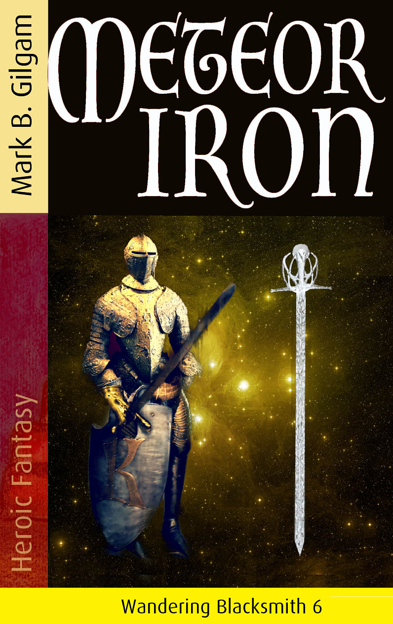
54 Responses to Option B
B has a very magical and special layout that is inviting
I think that they all kind of work on different levels but that's the order I prefer them in
I like the more traditional seeing a knight or sword on the cover. The hand drawn picture in choice C doesn't look great for the cover at all
I'm not very confident here. I think I like the realistic character in B.
I liked the darker colored themes of B and A more than I did the lighter theme of C. Then, of these two, I preferred B because I thought it had more intrigue and conveyed a sense of a character, while A was more object focused and plain.
I love reading about Knights and historical fantasy is one of my favorite types of books to read so having the Knight and the sword on the cover is the best by far. I like just having the sword better than the drawing on option C which I do not like very much
My first pick was Choice B which is intriguing with the armored figure against a backdrop of stars and the white font really catches the eye. Choice A is interesting with the pyramid in the background. Choice C with the painting of a person I did not like at all
Not a huge fan of the 3rd one the only reason being I am not sure that i get an accurate description of the book by looking at the picture. The 1st and 2nd one I like both but the 1 with the picture of the knight i think it's slightly better because it gives you a better idea of the book itself of its contents story
Showing the knight on the cover shows me who the protagonist of the story is going to be. It also helps to set the time period in which the story takes place. This image is simple, but gives me the most information about the book before I even pick it up.
I like my first choice best. the guy in armor really looks interesting.
I think I would pick b first, but only slightly over A, as I like the addition of the knight with the sword. I don't care for the style of art on the cover of C
I like the two that show a character which gives you a little more feeling for the book than just the sword. Between the two characters I find the knight to be more interesting, and I also don't particularly like the art style of the second place choice.
B: For a wandering Blacksmith series ,having an image of Blacksmith kind of depict the book.A: The meteor image backgrounds can be relatable with the book name.C:I don't see any image related with the name of the book though it could relate some with the Blacksmith.
i love the suit of iron/mail on the cover, it catches my eye right away to come look at it
To be honest, I do not prefer any of them and based on the book cover I would not read the book because I tend to really take a lot from the book cover if I am going to be reading a book. However, I chose option B because I felt like it had the best cover because it was simple. Option C was the worst because it looked like a child drew it.
Man that watercolor is ugly, I get what they are going for but it is the last option. A simple knight or sword would work
I like Option C the least. I really do not like the art style and think it makes the book look bad. The art style in Options B and A is much better.
The bookcover on B matches the book title, Both B, A look as if more Adult level reading while C looks more Elememtary level.
Options b and a look more like adventure novels
I voted based on how appealing the images were to me compared to the others and which ones I would click on in the real world.
I like one with the knight the best and the sword. It fits the title and theme the best.
I like option Bs most detailed cover design. Feel like it makes the book much more interesting to read and wanted to check it out
This one looks like it would take place in medieval times and I would enjoy reading about that. The drawing on the middle one looks kind of creepy to me.
I voted this way because I felt that B was able to really capture the feel of adventure and the character. The reason for this is that seeing the knight in and the sword makes me feel the mystery and curiosity of the book.
To get my interest based just on the cover B is the absolute best. A is good and does draw my eyes to it but B is better. I don't care for C at all.
C looks like a joke bu B is a good cover.
These book covers are the strongest for the most part in terms of apperance
I would choose option B first. I like the sword but also the inclusion of the knight. Second was option A which had a nice good view of the sword which fits with the title. And last was option C which felt too much like a kid drew it
i love how the cover of this one captured my point of interest by alot this design is genuine and authentic
B looks the best overall to me. I think it's the most attractive and more unique.
B makes me think middle ages which is really cool. I really don't like the art much on C, it's borderline ugly (I don't mean offense, just speaking truth here).
I think B is a good cover for the title.
Choice B. It it's more emotional evocative
the colors reflect the title better, male figure is most likely to be central character
B was the most interesting with the knight standing there. A was ok as well but left a lot of blank page. C was just weird and looked like a junior high school painted it.
The picture is more interesting and fits the title in #1, then #2. I hate the picture on the cover in #3, it looks amateur and childish and doesnt fit the book theme.
I like B with the knight and sword the best
Option B looks very mysterious. Who is that and what is he about to do with all that armor on?
Option C was just poor/childish art. Unless the story revolves around a child, it just doesn't draw attention properly. Options B and A could be interchangeable without more information about the story. Assuming that the Meteor Iron is related to a sword, I selected Option B which also showed someone who would wield the sword, as opposed to the ziggurat and snake statues that *might* have something to do with where the sword might be hidden. Bottom line - need more info on the storyline to best choose the cover.
My first choice has a person and a sword and is not drawn, it looks like a professional artist made it. The second one just has the sword only and that is not as amazing. The third one is too much of a drawing and not interesting to me as much as the other two.
Option B is my first choice because I like the suit of armor. A is my second because I think the large sword looks cool. C is my last choice because I don't care for the drawing.
Choice B's color, layout, and imagery are the best combination. Slightly dark but understandable. C as second has a less than appealing color scheme. The tan/beige is unattractive and the face of the individual appears feminine- on purpose perhaps? Choice A would rank second but the imagery isn't immediately clear. Perhaps it ties to the story, but as a stand alone it seems more confusing than the other two covers.
The knight with the staff gives it a sense of ominous quest like adventure. The one with just the staff is good too, makes me think could be an adventure or a religious book. Last option is just a bad drawing.
"C" Looks more professional than the others.
A looks like it is an inward journey of conflict and growth when a knight finds something powerful. B looks like it focuses just on the magic material. C looks like a kids book because of the illustration.
I like the imagery with the sword, I prefer it more with the knight added. Option C kind of creeps me out.
I really don't like the cover art on C. It looks like a teenager drew it (a talented teenager, to be sure, but not what I want to see on a book cover). Visually, I really like A, but unless there are pyramids in the tale, the pyramid is confusing for a heroic fantasy. It makes me think it should be about Egypt. B evokes what I'd picture for heroic fantasy, and the suit of armor makes sense for a story about a blacksmith. I don't like the title font on any of them, though. "Iron" is clear enough, but that font makes "Meteor" look a bit odd. I think the sort of medieval feel is the right direction for the font, but maybe there's another one with that feel, but clearer, or maybe something with both upper and lower case?
I liked these choices so much.
B looks like it might have something to do with a knight and fighting, which might intrigue me. C just shows some weird picture of a woman and doesn't really tell me anything.
Option B seems most like the genre of Heroism with the knight and sword. C follows only because its a bit more esoteric. Option A looks like a child's drawing and almost cartoonish.
The picture on the cover gives me a good idea about what type of book, genre and time era this book is
I like B the most and also A. The covers are well traditional art types of style which I like. I do not like C. The cover is kind of childiah and makes me think this a book for younger demographics
B, the colors are vivid and the title contrasts nicely on the background, the colors used contrast well with the other areas on the cover. The character holding the sword interests me and makes me wonder if that is the blacksmith, and why is he wandering.A, the objects depicted on the cover make me intrigued, I want to learn more about what the objects are.C, the design is fairly simple, and makes me kind of uninterested in the book by the color that appears to be hand drawn with something akin to crayons.
Books with the characters on it give you more to visualize while you are reading. That is why picked those two first. The visuals are nice to remember as you read and not as plain as the sword only.
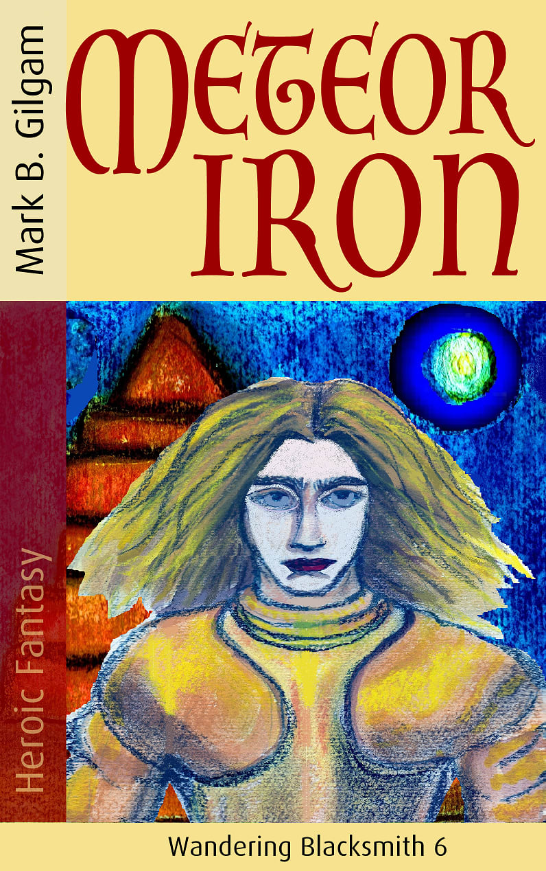
37 Responses to Option C
It's not conventionally attractive or anything, but I think it stands out a lot compared to the other two which are more generic. It's the kind of thing that would catch your attention and make you check out what the book is about.
C is #1 because I find that the face-forward view, while not looking directly at the viewer, but looking upward; gives the illustration a lot more depth the more you look at it. It makes you want to look at the book longer, hold onto it longer. There's a big drop off between C, and A & B. A is #2 because while it seems like just images pasted over a starlit black background, it at least provides some symmetry and intrigue with the way the items are organized. B is #3 because it does none of these things.
i think options c and b are the most creative and cool options that will get the most attention
Option "C": The knight, pyramid shaped structure, and floating orb are elements that make up a decent cover for the fantasy format that as a reader brings familiarity; the primitive nature of the composition I hope has some context for the storyline. I cannot get over the unusable sword in the other two options which I would have chosen in preference to this selection.
C looked rather interesting to me. I liked the design and the color of the book better. It had a lot more character.
C because it is not too obvious and leaves you wanting to find out more, it is not too revealing.
I like the uniqueness of the drawing of the woman in this image, which is striking and caught my eye. I also prefer the beige header to the black versions in the other choices, which is more inviting. Looks like an interesting book fior sure!
I like the art style on C because it seems classier than the others. I prefer the more abstract image of A over the generic image in B.
i like this picture because it is a throw back and an original design.the others are ok but look like they were done on photoshop or with a computer. the one i picked gives you an idea with what the author might see how the character looks.
C looks artsy. The rest look like bad photoshops.
I think that C is the best out of the three, but it does look really dated. The other two look weird, and I don't know what is going on in them.
I like the unique art on the cover. I feel like this is different and even if I don't read it I can have the book as art.
Option C is a little b bit more innovative and interesting, Option C and Option A are a little bit more generic for this kind of book.
Honestly I am laughing at all of these (sorry). On all of them, the left margin is covering part of the first letter of the title. On 2 and 3, each image looks like it was poorly copy and pasted in MSPaint with no editing. So I picked option C. The illustration is interesting and colorful and has human interest. It makes you wonder who the artist is. Option B is the worst because I don't understand what's going on with that knight, the image looks like the person used the lasso tool and cut parts out that should've been in and left stuff in that should've been out. I don't understand the K between his legs. It's so bad and weird.
I love the colors in option C. The pyramid in the background is real color. I like the color circle that could be the moon. I like the hair on the mans head. Option a I love the sword in middle pyramid. Its really cool. The tombs look great. The stars look like they in outer space. Option C is alright looking would make but the book. I don't like the suit of armor on the book.
I like the art style of C. It reminds me of Starry Night. B looks bad, which is why I selected it last. A is only a little better than B.
C is at least a bit original and it is more creative. B and A are just poor look Photoshops.
I like image C, because the colorful image of the character looks inviting and curiosity inducing for potential readers.
Option C is eye catching and unlike most other commonly seen book covers, while A and B seem pretty standard.
Option C is the only one that makes me feel like I want to learn more about the story.
The cover on C is simplistic and not the best, but I would be interested in what the book was about. B is a boring cover but I would take a look at it. A is has me a bit confused as to what would be going on.
The photography of B and A comes out to looking cheap since it's clear it's a graphic design. C's painted style is the best, traditional and higher end.
I would have chosen B first but its so photoshopped and unprofessional looking. Therefore I chose c first with the drawing and it looks more put together. Then A is last for the same reason stated for B.
C looks like an Oxford Classics cover and would look nice on my shelf. The others just look stereotypical.
Honestly, none of these are really appealing. All look sort of fake and cheap. I think I picked C first because it felt childlike, which might seem like a bad thing, but it reminded me of adventure stories from my youth. The others felt bland and not really eye-catching at all.
The artwork on all of them are really solid. I just prefer the ones that look a little bit more professional. The only thing I would say to change is the yellow bar at the bottom of the covers.
I'd be most likely to pick up C. The unique art caught my eye immediately. I love the characters hair and that the cover has so many colors. I looks for things that are colorful to fill up my bookshelf.
The book is a heroic fantasy about a wandering blacksmith. Option C shows me what the wandering blacksmith looks like. It provides me with a character to "see" as I read the book. I don't have to imagine what he looks like. Option C makes me wonder who he is simply by showing me his face. It makes me want to know more about his world and what he does in it. I don't like the maroon color used to write the book title. I would love to see it in white. It would make it really stand out. Option B shows me an armor suit and two swords with an outer space background. It sadly looks badly photoshopped. That alone makes me question the writing style of the author. However, I do like the white used to create the title. It really makes the title stand out. Option A doesn't potentially tell me anything about the book. It is is a generic cover with a sword, some things I cannot describe and a pyramid. That cover doesn't draw me in or make me want to flip it over to the back side of the book to read the description.
The only option I would consider would be C. I like the weird art style - it catches my eye and makes me feel like the story would be equally as weird, which I like. Option A and B look very photoshopped, and that makes them look cheap.
All three covers look a bit dated with some rudimentary layouts. For example, the M in Meteor seems to be colliding with the left box with the author's name.However, I like Option C the best. There is something eerie and wonderful about the drawing and its use of colors.Options B and A are not as unique. I prefer the coat of armor in Option B a bit more than the strange unclear snake-like fence projections in Option A.
Option C is brighter than the others and it’s also a lot more unique. The sword is not unique at all.
Option C was my first choice because I thought that cover art was the most distinct and eye-catching. Option A was my second pick because while that cover wasn't as memorable as the cover in Option C, it was still somewhat visually interesting. Option B was my last choice because I thought that cover design was lazy and boring.
I decided on option C for my first option because the hand drawn cover gave book a more artisanal look to it. For the second and third option, B was a little too sparse compared to A (I was interested in the symbology of the pyramid and the snakes in A, whereas B was a guy and a sword).
Loved my first choice because it gives the lead character a face, a personality as well as an age that I can visualize throughout the book
I chose option c as my first choice since it has a more artistic feel to it. I like the overall coloring and it makes me more intrigued about the content of the book and makes me want to see what kind of writing is inside! That is a good thing because a book cover really needs to draw you in like that! I chose option a next because it feels like there is some type of foreshadowing being shown in the cover. I think that it will really focus on the sword and how it relates to the blacksmith. Option b was my least favorite because it feels hastily slapped together and the quality is not very good, even with just a quick glance at it. It feels very amateur and keeps me from wanting to look inside the book, which is not a good thing at all!
All of these book covers are pretty unappealing but the one that I've ranked first is the best of a bad bunch. The other two seem like something 3D generated in a poor game and then copy-pasted onto a book cover. Option C at least looks like it was meant to be a book cover.
The "old" hand drawn look of the cover makes it seem like it's more fantasy. The second one is ok, but the design is awkward. The last one is just awful and looks like a child made it.
Explore who answered your poll
Analyze your results with demographic reports.
Demographics
Sorry, AI highlights are currently only available for polls created after February 28th.
We're working hard to bring AI to more polls, please check back soon.

