Poll results
Save to favorites
Add this poll to your saved list for easy reference.
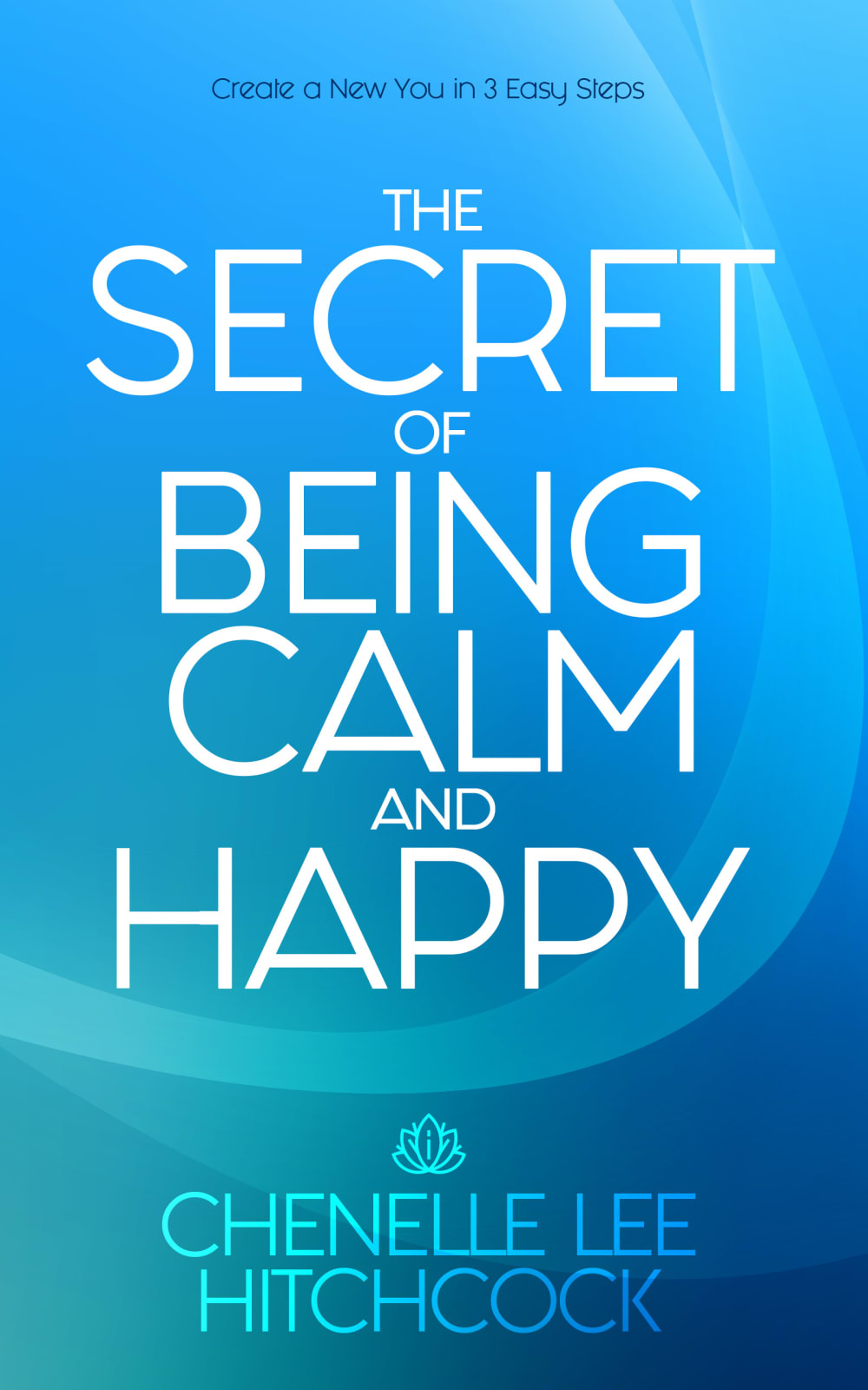
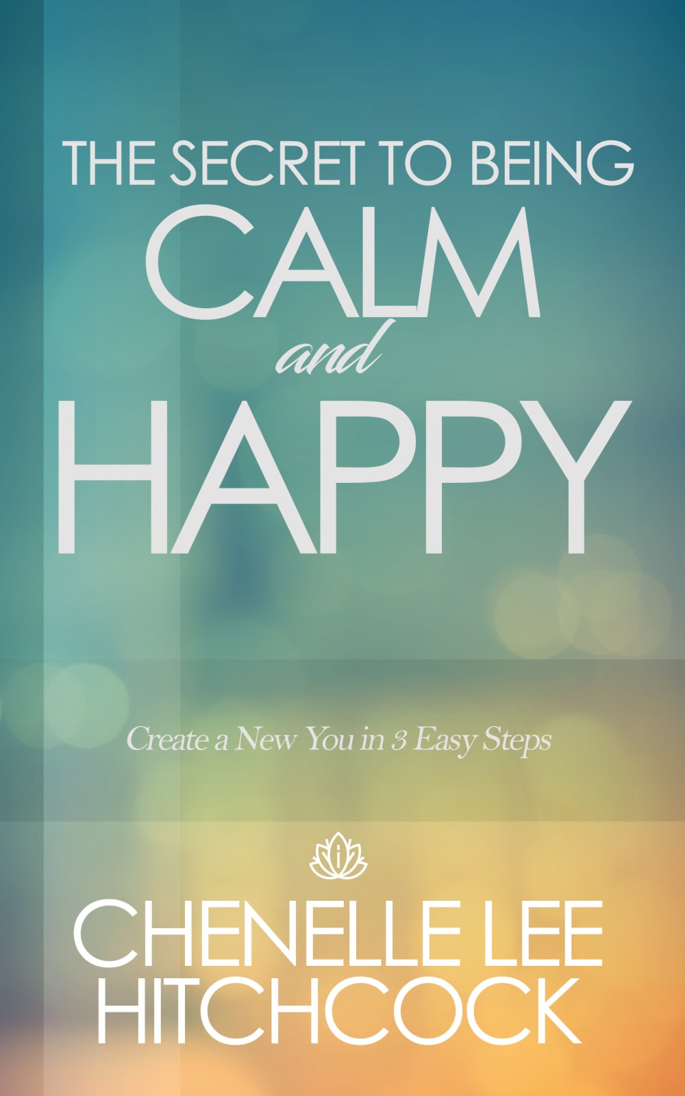
Based on the cover, which book would you rather buy?


Age range
Amazon Prime member
Education level
Gender identity
Options
Personal income range
Racial or ethnic identity
Self-help book reader
21 Responses to Option A
I like the blue better. It stands out more to me and it represents calm more in my opinion.
I get more a sense of calm with this cover and anxiety with the other.
I like the blue sky look to this cover that puts the item in a good light
I like A because the title pops more in its entirety. By having the copy in all caps, it grabs the readers's attention.
Ii think option A is more calming which matches the tittle and makes me more curious about the book
The blue has a more calming look to me, it also has a more bright and vivid look that's more attractive and appealing overall.
I would pick option A because I like the different shades of blue for the background color.
I liked both Options, but Option A seemed more like a structured and professional book. The blue stood out and made me more inclined to purchase it. Option B was pretty and had the color scheme that reminded me of 'calm' but didn't seem as appealing.
The blue background color is more calming to me. It reminds me of the ocean.
I chose A only because of the 3 easy steps. This sounds attainable. I actually like the colors and layout of B better but if I were purchasing, I would buy A based on the 3 things.
I like A the best because the blue color makes the words standout. I like the location and size of the words better on B. My overall first choice would be to have the blue background on B.
The rich blue hues are very calming and relaxing. The placement of the words on the top of the cover really peak my interest in the book itself.
the white text jumps off the blue background more than the other option
I prefer option A. This one just immediately makes me look and draws my attention in. This cover almost resembles a motivational poster and because of that it motivates me to want to read the book. I like the title takes of a majority of the cover really telling me what the book will be about.
This one is easier to read. Plus I like the color scheme better too.
I chose A because I felt that the colors best reflected “calm and happy.” I also thought these colors made the cover more eye-catching.
I chose A because the blue background is more appealing. However, I do like the font chose on B.
The colors on this cover are more calming.
Blue feels like a calmer color to me. I would hesitate based on the tagline, though - anything promising 3 easy steps to "create a new you" feels like a snake oil panacea
I like the blue tones, I think they are more calming than the color scheme in B. I like the sizing of the title text in A better as well
I chose A because I like how the title is laid on on the book, but also I find all the blue colors on the cover to be calming which is the point of the book.
29 Responses to Option B
The cover of option B looks a little more unconventional and unique, and it would garner a second look. I prefer option B by far.
I really like the variations of colors and the soft bokeh graphics, it's very eye-catching and beautiful.
Based on the cover, I would buy option "B". The color scheme on this cover looks appealing and attractive.
Option B is the best option because of the style and the soothing colors. Based on the design, I would assume that the author knows what they're talking about.
This one because it lets me know there are 3 steps which seems dueable and the book seems calm and serene.
I love this one because the colors seem relaxing to me when I look at it and I love the way everything just blends together between the green and the light orange.
I like B because I think the colors look more attractive and subdued and I think that fits better with what the book is about.
After carefully studying and comparing both book cover images displayed above I selected Option B over Option A as my first preference and the one that would most likely make me want to purchase this book. I felt that the design and coloring of this cover had amazing eye catching appeal. I also felt that the wording of the title of the book sounded smoother and more fitting for the subject.
The word format, colors and placement of the subtitle all look better in this version.
I loved the warmer and sunnier colors in this cover since this option had pops of yellow which felt more cheerful.
I like the colors better on B. I think it is more calming than A.
The colors of B are more dimensional and give more room for imagination and interpretation. It's less flat, more personality and inviting, friendly.
I liked the option B because the orange with green color give it a good contrast. It also matches each other perfectly. Also The title is not too big which makes it look more appealing. In addition the slogan "create a new you in 3 steps" is in the center which makes it easier to read. Lastly the two words that are very important for the title "Calm" and "Happy" stand out which makes it appealing for the cover of the book
The colors in option B are calming and soothing. I like the text and the way that it is places on the book color. The colors of the text are preferable over option A. The differences in text make the cover more interesting and even easier to read
The green color makes me feel calm and the yellow color emanates a happy feeling.
I like the calming colors on my first choice.
I prefer this option because the words "Calm and Happy" jump off the page and caught my attention immediately.
B, because A felt way too busy. I liked the brevity and color scheme of B.
i like the wording better, the secret "to" as opposed to the secret "of". the word "to" indicates something that can be, something you can bring into existence. something that includes all the variables of whoever maybe reading. the word "of" sounds like it's something that is set in stone and already in place. plus the color-scheme is more soothing and appealing to my eye.
A has no balance or flow. I like the way the text goes down the cover on B. It's more natural. Plus, the color scheme is much better and more reflective of "calm and happy."
Ithink the blue color is more calm on choice B
To me, option B - green is the color of calm and orange is the color for happy. The orange is very warm and inviting and the green seems refreshing. Unlike option A which is kinda sad
I like the colors of Option A better, but I like the use of "to" in "to be happy" better, and I like the "Create a new you in 3 easy steps" that the other option doesn't have.
The choice of colors for the book are more calming and add to the overall theme
B is serene and peaceful in color.
I think the colors for choice b are more interesting and they stand out more so I would be able to see it on the shelf at the bookstore.
i feel choice b looks most condensed and easy to read. the other option is too streched out
The title sounds better and it would stand out on a shelf to me
I think the colors on that book cover are a bit more unique and stand out over the blue.
Explore who answered your poll
Analyze your results with demographic reports.
Demographics
Sorry, AI highlights are currently only available for polls created after February 28th.
We're working hard to bring AI to more polls, please check back soon.

