Poll results
Save to favorites
Add this poll to your saved list for easy reference.
Do you like this book cover? Why or why not.
50 Responses
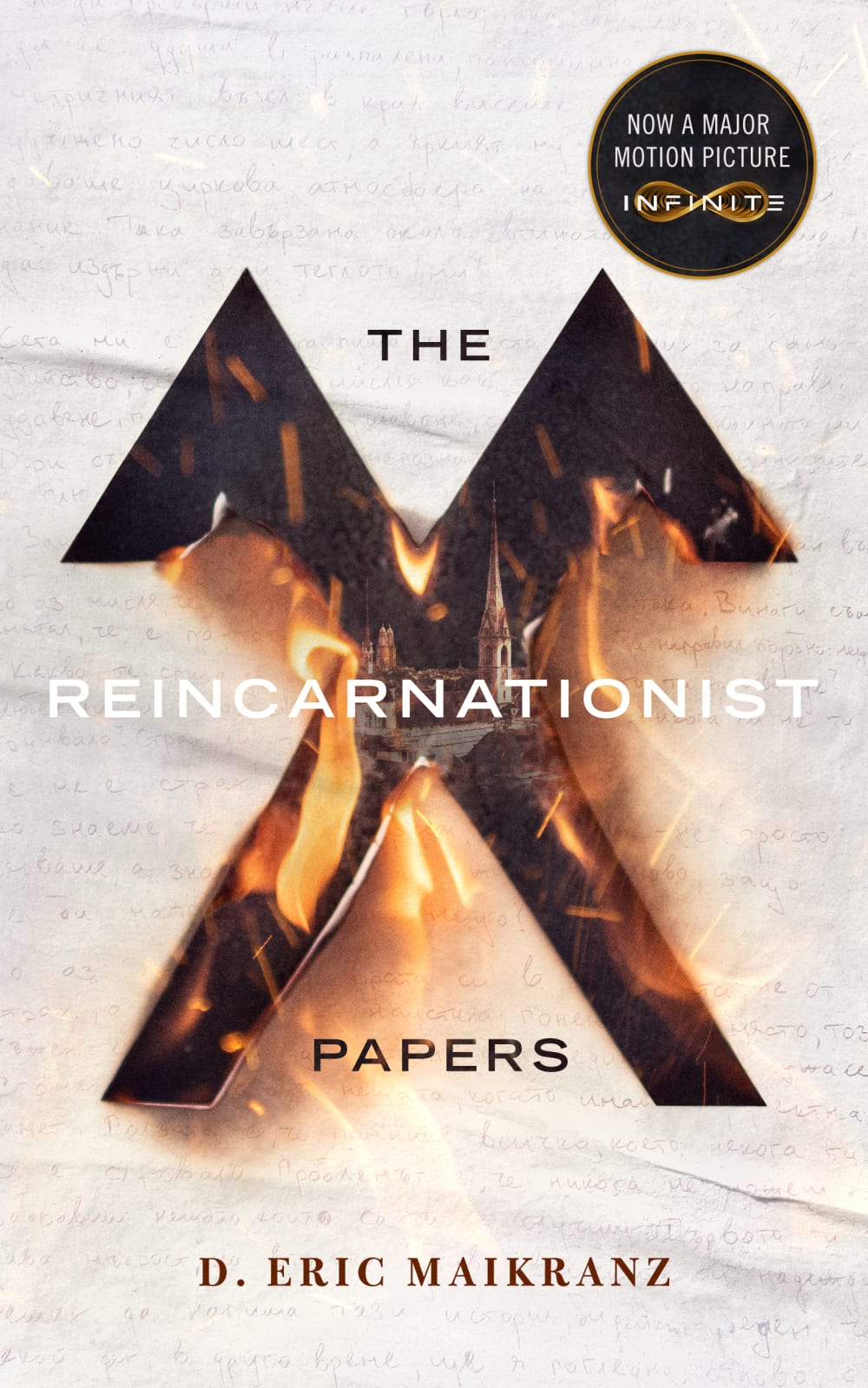
Yes, it looks mysterious and sort of scary
It is okay as it does not stand out that much. The background could be more colorful.
Yes I like it. It is very intriguing and has a lot going on that makes me curious. The emblem, the fire.
book cover is more attractive because it has more intense theme in it
Yes, because I like the flames and it looks artistic. It makes me want to know what it's about.
I do like the cover. I love how realistic the flames look on the cover, whoever created the art did a fabulous job! The background is also very eye catching, with all these different aspects going on one may think the cover is too over whelming. But again whoever created the cover did a fabulous job putting it all together!
I like the cover because the background looks like a realistic paper burning.
Not really to me this screams horror and scary. I don't like that genre and wouldn't read it.
Not particularly. It wouldn't catch my attention if I saw it on a display at a book store. Having not read the book, I'm not sure if the cover is representitive of the story or of the plot, but I am not able to imagine about what this book is like just by the cover.
It is very captivating imagery with a nice contrast between the white background with writing and the burning of the X. It definitely draws my attention.
It would be fine but the white lettering is hard to read .
Yes I like it, it has an intriguing appearance to it, it looks dramatic and interesting. I like the image within the image it is a unique and bold style.
The book cover is interesting. I like the look of something burning and the background as well with the wording
Yes, I do! It's very eye catching and intriguing. It makes me want to pick the book up and read more about it to see if I would want to read the book.
The book cover is very eye catching and dramatic. The tones of whites and blacks are great and make the cover stand out. The fire adds a dramatic effect and makes me wonder how great this book is.
Yeah, I'm a big fan of covers that have a lot of white with some highlights that really stand out, and the cut out symbol with the flames really pops off of the page here. Quite stylish.
I do like the book cover. It evokes a sense of wonder. The contrasting use of light and dark colors draws your eyes to it as well.
The cover is of high technical skill, but it doesn't help me understand what its story is about.
I love it. I get a really mysterious vibe from it. It is really suspenseful looking and it intrigues me.
I do, the image captures my attention and makes me curious of the contents.
It's a unique take for the cover of it with a clear underlining meaning that shows how great it is.
I can't relate the picture to the title. Can't really decide which way to read the title. Can't read the handwriting. Don't like it at all, sorry.
I'm not a fan of the book cover because I'm not a fan of how the title is spread out as much as it is. At first glance, it's difficult to determine the title of the book, which might cause me to pass it over. Also, I don't like using white font for the word "Reincarnationist". It doesn't contrast very well with the mostly white background.
I liked the cover of the book, but I wasn't too interested in the logo in the top right stating it is turned into a movie. I like the burned out "X" in the cover and how it makes it look more intriguing and dangerous.
I liked the book cover, it's simple but impactful. The symbol being on fire certainly catches my eye.
It's not bad, it certainly catches the eye. I don't really have anything to complain about with how it looks.
I do like the cover overall, I think the graphic is intriguing and eye-catching and the text is neatly done and easy to read. My only issue is I'm not really sure which order to read the title in, as it could be read "Reincarnationist: the papers," or "The Reincarnationist Papers." Other than that I'd say that this is a cool little cover.
I like the symbol that looks like an "x" in the middle of the cover. I do not like the light writing behind the symbol. I think the writing is distracting to the eye.
Yes I do since it looks very ominous and is subject to many ideas.
I do like this cover. It's provocative and interesting. The burning emblem on the cover giving way to the skyline and in particular what appears to be a church steeple makes me curious about the story, and the Cyrillic print in the background makes me wonder if there will be some eastern European mysticism involved. The implication of conflicting ideology between the church and folklore is fascinating to me.
I do not like the cover design. The information provided on the title is very limited. There is no selling point of this book. It could be useful to highlight some key information, e.g., best-selling on Amazon or something else.
Yeah this ain't working for me. I'd go back to the old cover
Yes, it combines multiple symbolic elements in a thoughtful manner. These include birds, fire, church spires, and other icons associated with spirituality, death, and the afterlife. These elements are nicely consistent with the title of the book and the elements reveal themselves gradually by the viewer as they examine the book cover.
I think this boom cover is very cool and has good connection to the title of the book as well.
Yes I like this cover. It catches my attention without revealing a lot about what it is about. I would pick it up to read more about what it is about.
I believe the book cover looks great. However, the only thing that I do not like is where it says, "NOW A MAJOR PICTURE INFINITE," on the upper right corner. Even though I love how it looks now, I feel like it would look better without that written on the corner. In regards to the book cover, I feel like the colors go well together, and I love the paper in the background.
Very much. I like the burning as a way to bring an attraction to the cover. It is very unique and I am a fan of it quite a bit.
Yes, it is very eye catching but also minimalist at the same time. I would pick up this book if I saw it on a shelf.
I think it is definitely unique. I like the strange symbol being burnt out in the center. I feel it fits the book title well. The major movie sticker I find more distracting then anything. Overall, yes.
My opinion on the cover is pretty middling for a few reasons. On the positive side, I really enjoy the main design of it, with a flaming symbol through old looking paper revealing a church behind it. That's a striking design that immediately gets my attention and makes me curious about the contents. I realize that this isn't something that would likely be changed, but the title 'The Reincarnationist Papers' is a bit of a turn off though - that combined with the image of the church inclines me to think on first impressions that this might be some sort of religious work, which I'm not interested in. Also, the blurb on the top right (Now a Major Motion Picture Infinite) is a double edged sword for me. It's good that it's been made into a movie, since that does imply a baseline of good quality, but I was confused by the 'Infinite' part. It's not part of the study, but I Googled it and found that they re-titled the movie 'Infinite' so it makes sense to me now, but before I did I thought that might be the name of the studio making it or something. Honestly, and I don't know if this is possible, but if this cover design is being used as a tie-in for the movie, I would re-title the book to match the movie title, both to make it more likely that fans of the movie will pick up the book, and because frankly I think 'Infinite' with that loop symbol below it is a more intriguing title.
I like the burning, very intriguing and draws you in as a reader.
The word "Reincarnationist" blends into the background too much, and it's a different color than the words "The" and "Papers". All three should be the same. It's an adult book, not one for kindergartners. HOWEVER: a black/reverse contrast font could be used over the graphic (e.g. the text fades/gets darker compared to the background). That would be more appropriate and eye-appealing.
Looks cool. Lot of details and a nice layout.
Yes. I like the handwritten note in the background with the flaming symbol burning through to show a church. Very dramatic setting and it gives you the sense that there will be lots of intense scenes where you won't put it down. I for sure would pick it up to look at the synopsis.
Not so much, it strikes me as maybe a religious book.
I don;t, I find it kind of ugly and unappealing
I don't recognize the icon that looks like an X with the extra hooks, it distracts me a bit
Yes, I like this cover a lot. The graphic details give clues to what this book is about. I like the flames because it makes me think of starting over, like reincarnation.
no.. I cannot tell what the book is about and I don't like that the title is so spread out, it makes it look choppy. the background and graphic is nice, however, it does not appear to tie in with the title either
This is reasonable eye-catching. I know nothing about the topic, and I'm not sure if it would draw me into reading the book, but it certainly wouldn't discourage me if I had reason to believe that it's compelling reading.
Explore who answered your poll
Analyze your results with demographic reports.
Demographics
Sorry, AI highlights are currently only available for polls created after February 28th.
We're working hard to bring AI to more polls, please check back soon.

