Poll results
Save to favorites
Add this poll to your saved list for easy reference.
For a murder mystery book involving a scheming sex swami swindler, which book title and cover do you prefer, and why?
Option A won this Ranked poll with a final tally of 28 votes after 3 rounds of votes counting.
In a Ranked poll, respondents rank every option in order of preference. For example, when you test 6 options, each respondent orders their choices from first to sixth place.
PickFu requires a majority to win a Ranked poll. A majority winner differs from a plurality winner. A majority winner earns over 50% of the votes, whereas a plurality winner earns the most votes, regardless of winning percentage.
If an option does not earn a majority of votes, PickFu eliminates the option with the lowest number of votes. The votes from the eliminated option are reassigned based on each respondent’s next choice. This process continues in rounds until a majority winner emerges.
Scores reflect the percentage of total votes an option receives during the vote counting and indicate the relative preference of the respondents. If there is no majority winner, look to the scores to see how the options fared relative to one another.
| Option | Round 1 | Round 2 | Round 3 |
|---|---|---|---|
| A | 40% 20 votes | 46% 23 votes +3 | 56% 28 votes +5 |
| D | 22% 11 votes | 32% 16 votes +5 | 44% 22 votes +6 |
| C | 20% 10 votes | 22% 11 votes +1 | Eliminated 11 votes reassigned |
| B | 18% 9 votes | Eliminated 9 votes reassigned |
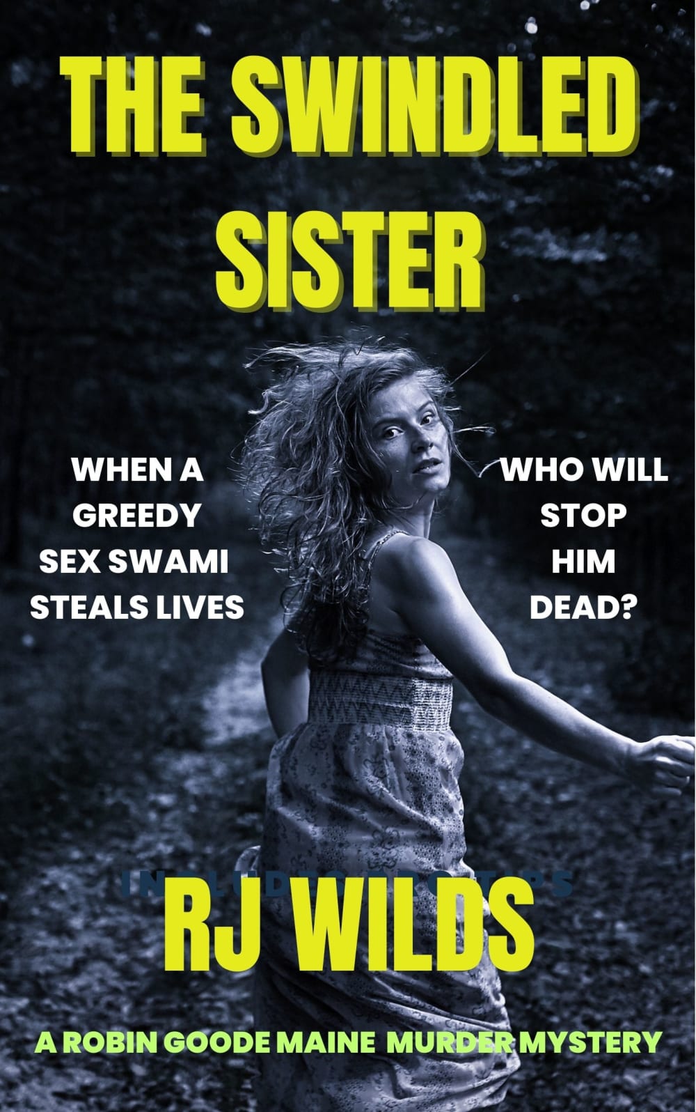
20 Responses to Option A
I think this represents someone who is in distress and has been swindled.
I like A the best; the woman on the cover looks most real and elicits the most sympathy on this cover. D and B are next. C is last.
I picked option A because the woman looks like she is running away terrified.
I prefer option A because the cover graphics make the book seem more interesting
A was my first choice because it looked the most scary. D was second because the colors went well together. B was third because the image was too blurry. C was last because it looked too peaceful.
I think the imagine of option A would be eye catching and I would want to read more.
I like this one, I like how it peaks your interest and draws you to start reading to get the thrills of the book
A seems like it's the most fitting image for a scary story.
Option A with the yellow letters and the girl running looking over her shoulder it would definitely grab my attention. I would click on that one first compared to the other ones. Although they are all very good this one just grabs my attention quicker it looks like it would be very interesting by the cover.
I like the book cover the best for option A. It makes you want to read the back of the cover.
The picture of the girl running. The description of the book makes me want to read the book that says who will stop him dead.
Option A makes me curious and would most likely grab my attention.
Out of these choices, I only thought A made sense for the subject. D’e image was more for a yoga or wellness book, C’s image made me think the person in the raincoat looked like a child, and B’s image just felt awkward to me.
Option A looks more like a murder mystery book. It’s a little spooky and mysterious.
Based on the description of the novel I would much rather have options A and D as a cover. I like these two covers the most because I feel like they are very well done they connect more with what the tone of the novel would be they also add a bit of mystery and thriller. They are more to my liking and getting me more interested in the tone and setting of the book. I dislike options C and B because I don't feel like they match with the tone of the book they also look less interesting and make me not want to read the book.
I like the cover with the young woman looking back. I wonder who is chasing her and why is she looking back.
I think A and C give off an idea that doesn't match the premise of the book. I think B is great, but A is the most interesting.
A #1 because it looks like a murder mystery type of book. The black and white photo is a good choice. It brings a coldness to it. B#2 is a little weird, but there is no real reason, it is a mystery. D is kind of plain and I don't like all the yellow. C is just questionable. Looks more like a yoga cover.
Choice A looks mysterious. Choice B looks like a blurred memory. Choice D looks better as a rule than C does.
Choice A matches the plot of the book better, the rest of them don't make any sense to me
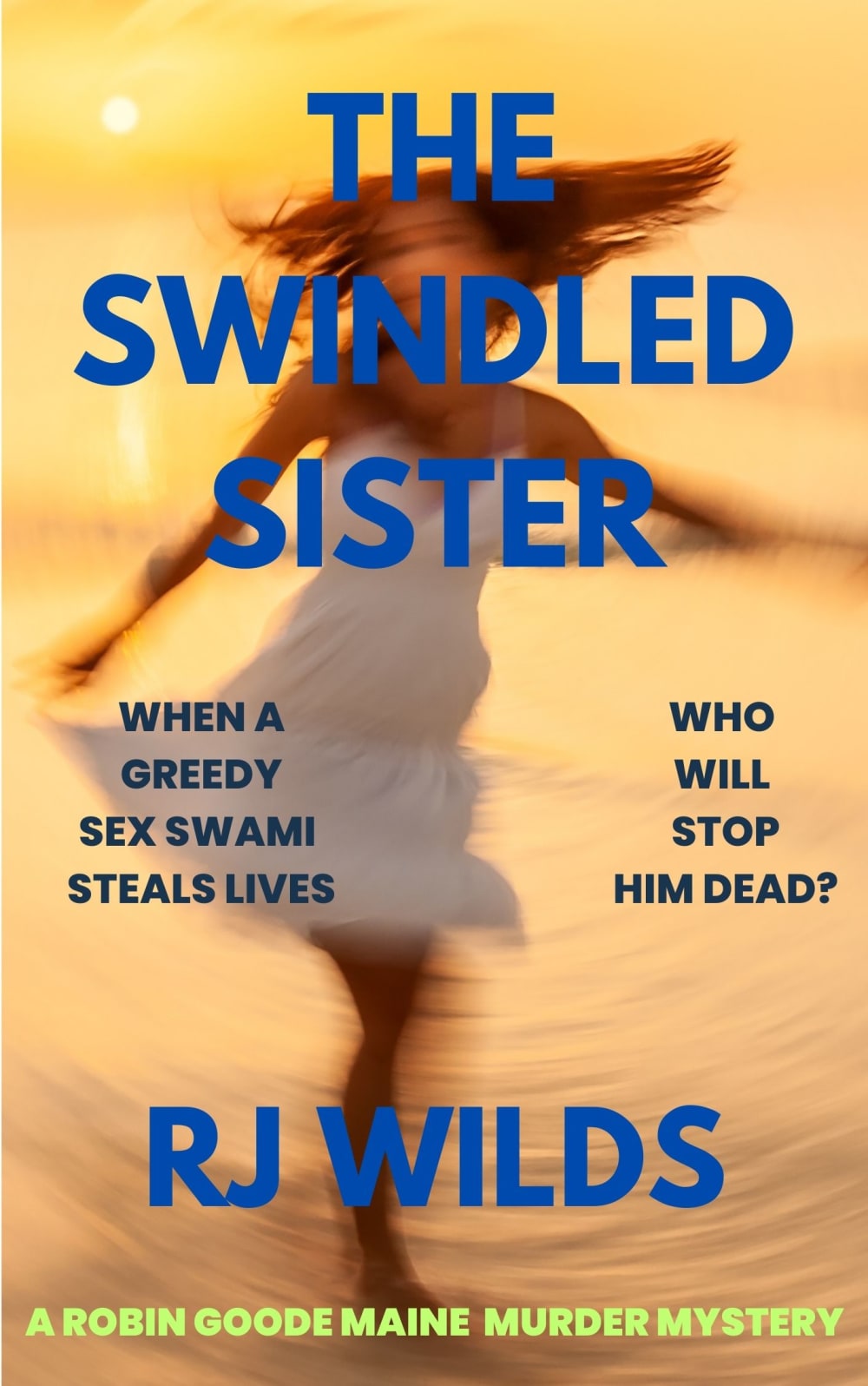
9 Responses to Option B
I like B because I think the shadowy image of the girl looks the most intriguing. It gets my attention first.
I thought B was slightly more relevant than D. C looks unprofessional and A is kind of creepy.
I ranked based on which image fit the book description the best
The picture on this cover reminds me of the Whirlwind of emotion such an event would cause for anybody
I feel like B and A seems more hippie commune style dress on the girl which fits in slightly more with sex swami. I think the pose on C feels most related to sex swami but I don't like anything about it. I like D a lot but don't feel it works with the description.
The image of the girl twirly but is blurry matches the mystery of the novel. I also like that it is a contemporary design but has a bit of classic elements to it.
I chose B as my first choice because I like the image, the text, the colors, and the overall look.
Option A looks a movie poster from a B movie in the 50's. I like Option B the most because I can relate to a very feminine-looking character and I love the red hair!
I find cover B the most intriguing. I do not want anything too "scary" like A, and walking in the woods is creepy. LOL.
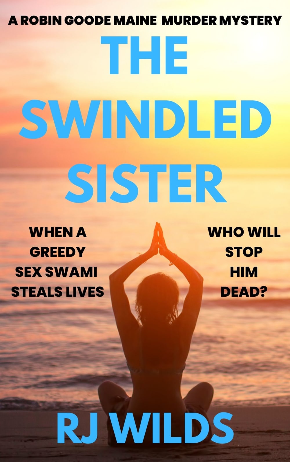
10 Responses to Option C
I like C and B because they make me think of an ashram or similar.
I went with the front covers and how engaging they are to look at and I would pick
C I like this cover. I like water and the girl on the cover. I like the blue writing. D I like the picture of all the trees and the woods. B I like the picture of the water and the girl. I like the letters in the blue color. A I don't like this cover. I like other cover images better. The cover is too dark. Maybe, lighten it up and add a house or cabin at the woods etc.
I chose in the order that they cover fit the title and appealed to me
I prefer option C. I like that this cover looks less frantic.
I chose (C) as the book cover I would reach for, because it shows a person siting on the beach looking towards the ocean, and meditating, gearing up to do battle with an unseen enemy.
I like Option C the most. The cover conveys secrets with a bit of the exotic thrown in that makes it seem intriguing. Option D is also eye catching with the hooded person running in the forest. Both set the stage well. The remaining options are perfectly fine but not as compelling and seem more frightening than mysterious.
My first choice is by far my preferred choice in this category although the book looks like fun
I like C with the pose. Makes me think of a swami.
I don't really like it as much as D (just from a visual interest standpoint), but C makes the most sense with the story. The others are just kind of generic.
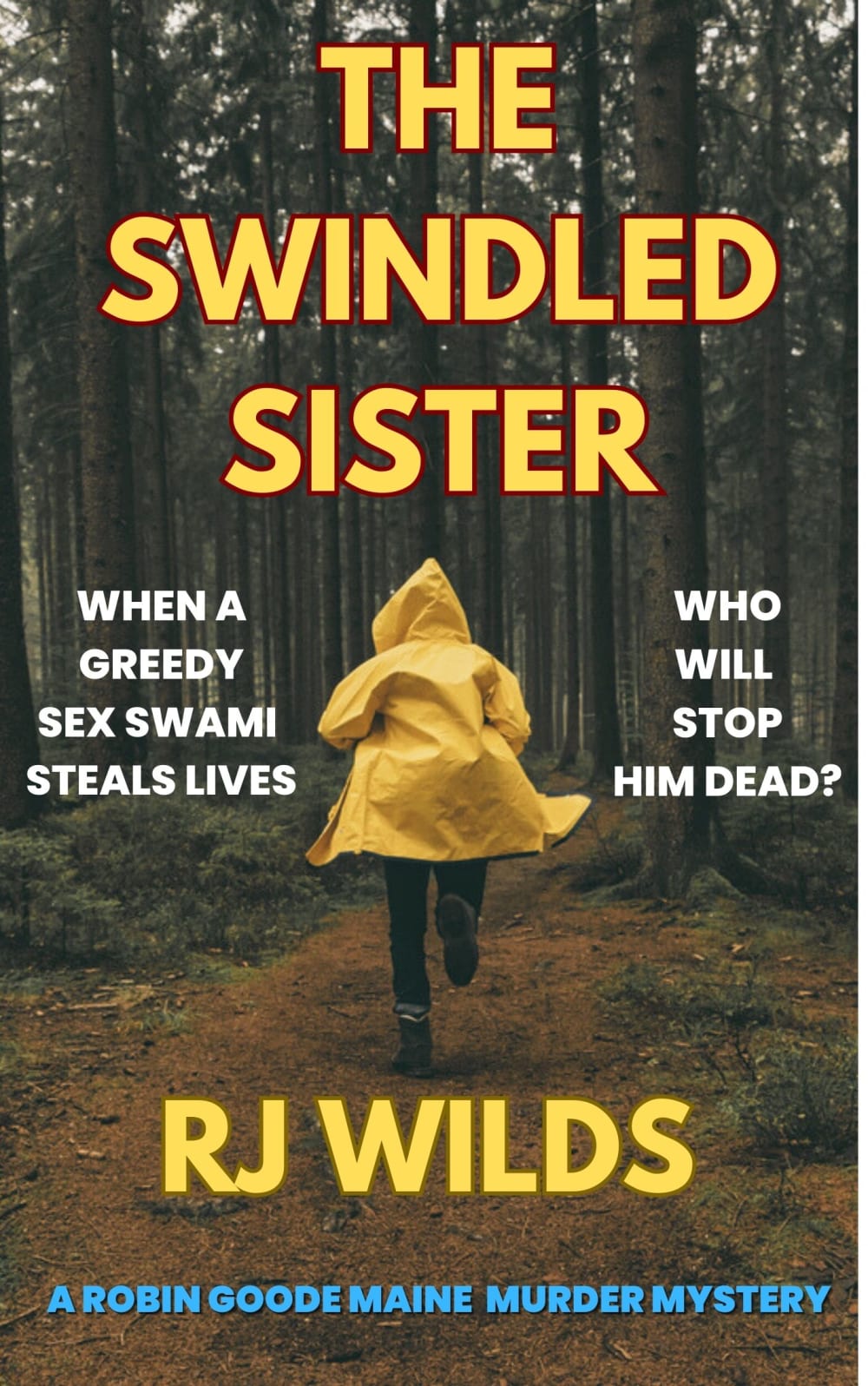
11 Responses to Option D
I like options D and A the best.
Option D. It is more mysterious because she is running away and you cannot see her face.
I don't like the yoga pose or seeing the actual face of someone. The yellow title matching the coat is great and I like the mystery of the running figure.
Option D caught my eye first, so I went with that one. With the content being about a swami, C seems like the best fit. B and A were things I've seen before, so I didn't like them.
I chose option D because I like the look of the cover as it makes me think of a thriller or mystery. It fits the title well and causes intrigue.
My first choice was the image conjured mystery and intrique.
My choice looks the most mysterious
Option D is actually the only option I would choose. It gives suspense. Option A would be next in line as suspenseful, intriguing. But options C and B are not even close to fitting what the book says it's about, look more like self help book covers to me.
I like the dramatic front of D, B or A book. I don't like the yoga pose on C, I think that book would be boring.
The typeface looks professional not like a novice put it together. The image also reminds me of other books I've seen in the mystery genre.
D is the best because I like the way the title stands out and really pops with the yellow raincoat. It feels like a murder mystery cover. A is next. Ecause of the nice contrast as well and feels very noir. C is next because of the way the text looks. I would have chosen B as number 1 of the title was a darker color that was more contrasting and didn't hurt ym eyes to look at.
Explore who answered your poll
Analyze your results with demographic reports.

