Poll results
Save to favorites
Add this poll to your saved list for easy reference.
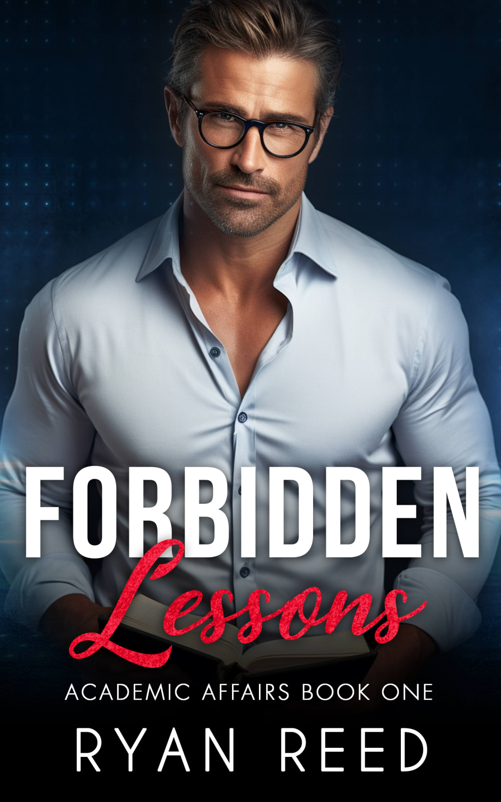
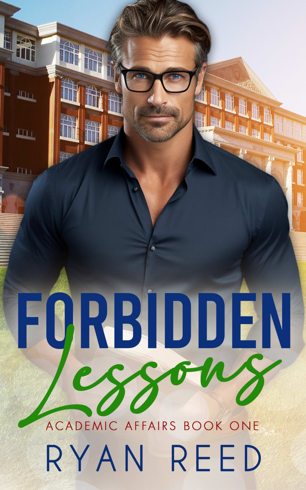
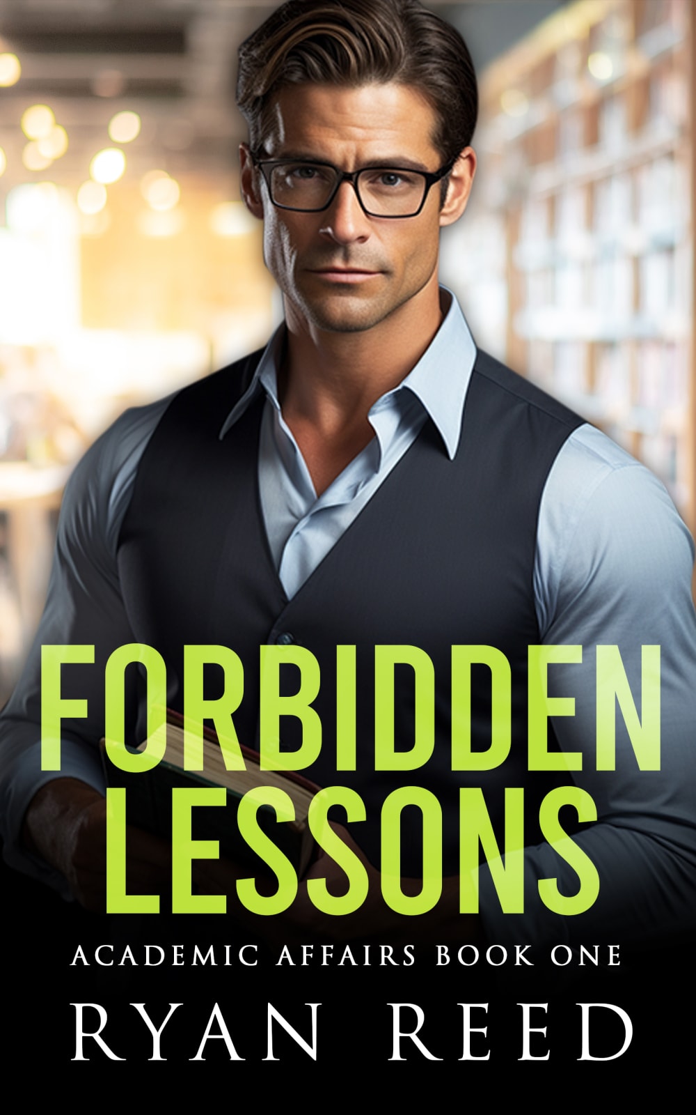
From the options below, which cover would compel you to purchase this M/M romance novel? The novel's themes include forbidden love, professor/student, age-gap, college setting, and spicy romance


There was no majority winner of this Ranked poll after 2 rounds of vote counting. However, Option A and Option C had the most votes (25).
In a Ranked poll, respondents rank every option in order of preference. For example, when you test 6 options, each respondent orders their choices from first to sixth place.
PickFu requires a majority to win a Ranked poll. A majority winner differs from a plurality winner. A majority winner earns over 50% of the votes, whereas a plurality winner earns the most votes, regardless of winning percentage.
If an option does not earn a majority of votes, PickFu eliminates the option with the lowest number of votes. The votes from the eliminated option are reassigned based on each respondent’s next choice. This process continues in rounds until a majority winner emerges.
Scores reflect the percentage of total votes an option receives during the vote counting and indicate the relative preference of the respondents. If there is no majority winner, look to the scores to see how the options fared relative to one another.
| Option | Round 1 | Round 2 |
|---|---|---|
| A | 42% 21 votes | 50% 25 votes +4 |
| C | 34% 17 votes | 50% 25 votes +8 |
| B | 24% 12 votes | Eliminated 12 votes reassigned |
Age range
Amazon Prime member
Favorite book genres
Gender identity
Options
Reading frequency
21 Responses to Option A
I chose the covers that were most intriguing to me.
I picked the first one because he is handsome and muscular
I like A the best is gives a feeling of mystery and makes you interested.
The cover is the one I like because it makes me interested more
A I like the background and the man in the light colored shirt. The Lessons in the red is alright, it would like better in another color. B I like the shirt and the color on the man The background is alright. The word colors there are too many. Only use two not three colors. C I don't like the title color. I would change it to another color. Maybe, Royal Blue or a Deep Blue. The man and his shirt and vest look good. The background is good. If the title was a different color I would of picked this one first.
Options A and C or more compelling and fit the description of what the story should be about. These two options are more exciting and fit with the theme of what I would be looking for in a book like this. Not only do they keep a intrigue mysterious vibe to them but they have a better look that is more focused on the character to get you more focused on the inside of the book. Option b does not fit this description when I look at it and read what it's about. To me option b looks more romantic comedy and doesn't fit the vibe of a more forbidden Love with a spicy element I would bypass this cover if I saw it thinking it was not what I would be intending to read as it looks too much like a Hallmark movie cover. The other two options look more intriguing mysterious with a bit of spice that fit the theme of the novel more.
A I feel is the most tempting one as I feel since there is nothing else but the man on the cover, it becomes clear that it is a romance novel. C is better than B because if you are going to use an image, one in the library is better.
Option A makes me want to crack the cover now, its smart, intriguing and well planned cover, option c and b are a bit old fashioned romance novel cover
The more subdued tones of A make this cover more alluring to this reader.
I like the plain, dark background of choice A. It wouldn't ever look dated or out of style. I like his little bit of 5 o'clock shadow.
I chose by the cover of the book that I like the most
I prefer the dark background with the red font as it pops more. The next option is more legible and easier to read.
He looks sexier and more mysterious.
The dark background looks the most mysterious
A looks the most seductive b shows the school and the overall theme C is jsut basic overall A is best because of romance type of book
The artwork for A and C are the best out of the three. The title font for A puts it in the lead ahead of C though by a fair margin. B is my least favorite, it looks like it would be boring an the font is not as eye catching as the other two.
I like the font change for Lessons and I like the color red. Also makes me think danger.
I find the picture on the cover of option B to be the most appealing. I like the dark background against the light shirt, the hair color seems lighter and the text coloring is more appealing for the type of book being sold. After that, I like option A simply because the picture in A is simply sexier than option C.
Option A is sexier and draws the eye more quickly. Options A and B's fonts are more interesting and give the covers a richer feel. Option C is not bad, it just appears plainer and does not draw the eye as quickly as the other options.
I prefer option A because I like the simple cover, it allows my mind to fill the blanks while I'm reading. I also like the font and colors of the title
A half naked man busting out of his shirt would be enough for me.
12 Responses to Option B
It shows a school in the background which is the setting.
B - The building in the background makes you think about the setting and story line instead of just the model.A - Attractive but lacks creativity.C - Background is too vague and the model appears more AI generated than natural.
Definitely A gives the right idea of the book
A's cover photo looked too plain; I liked that B showed a clear school setting.
I like the school building in the background of B. I like the combination of blue and green for the title.
B - I liked the school in the background. C - the library was almost as nice. A - the plain black background was ok.
I like Option B because having the building behind the man gives more depth and interest to the potential story.
B conveys a college the most and the professor looks a bit older with is grey hair. I think C looks more handsome than A.
I would choose "B". I like the looks of the education buildings in the background.
I picked the cover where the man looked the most like a professor and not a creepy guy
I would go for B because the cover, to me at least, looks like it is in a college setting, so I would be aware of some basis of the story by just seeing the photo on the cover.
I like the building depicted behind the handsome man. It looks like a school which intrigues me. C draws me in with the abstract background. A is too plain.
17 Responses to Option C
I like the font best on the front of this book and the man looks sexy but not too over the top. The cover of option B just looks like it is done on photoshop.
I like the way the green radiates from the title in C -- it helps the book cover immediately stand out.
I ranked my choices based on how much I feel attracted to the man on the cover of the book...how good looking he seems to be to me.
I love having a background image the most as it tells me more about the product and it feels a lot more informative to me. From there, I like C over B as C is bold and O like the background being a bit blurred
Option C ha the best cover for the books you described - rank 1.Option B is good as well and deserves rank 2.Option A isn't for me - rank 3.
The cover in (B) really bothers me from a graphic art standpoint. The title in (C) is the best, since it has good contrast and great font choice. The guy looks constipated in all three, however.
This cover matches the description of the book better to me. I like that the professor is the vocal point but you can see the academic background, that lets you know that it plays a part in the story but is not the main focus
this one seems like the most provocative to me because I think the guy looks more like a professor here and it sets the tone for the type of book that this will be
All of these options are bold, eye catching and intriguing. It was very hard to rank them!!!!
Option C is my favorite. I like that the college is in the background but blurred out, making it not the focal point. The professor is hot and alluring.
There is something off with B. The person and the background don't mesh well. I think something was off during Photoshop. I like C, since he is a professor. At a glance you can tell he is a scholar. He looks sexy in A, but I think the photo in C fits the book theme better. I think the green text stands out. It would catch my eye while scrolling.
I like having a bit of a background, so I'm not a fan of my last option. And for the background I prefer a library over an academic building.
I definitely prefer C. It's a really nice, interesting effect having the man in foreground with the slightly blurred (but still identifiable) school hallway in the background. It creates nice shadows too. It's sexy but he also looks like he could be a teacher. My second choice would have been B but I think the title on it looks like "Forbidden Leggong" which is very distracting and too much work (even though I like everything else about that cover). So that means that A was my 2nd choice - the colors in the title definitely work with the sexiness and, no background to speak of but let's face it, the man looks like he's about to strip down - and no one is complaining.
C still has the educational building but with a more dominant male
I like C because it looks the least cheesy. I like that the character looks smart by wearing the glasses and the suit makes him look professional so it really helps the theme of the book.
I think that the man in C looks the most sexy and more like a teacher than the other two. I like how the library is blurred behind him also. Next choice would be B because he looks sexy in this as well. A, obviously is the same good looking man but the shirt looks too flashy and overt.
These are all fine in my opinion and seem to fit the theme of the book. It is helpful to have an academic background image to make it more clear.
Explore who answered your poll
Analyze your results with demographic reports.

