Poll results
Save to favorites
Add this poll to your saved list for easy reference.
If you were scrolling through Amazon looking for books, which book cover would you be more interested in? Are there any changes you would suggest to make the cover more appealing?
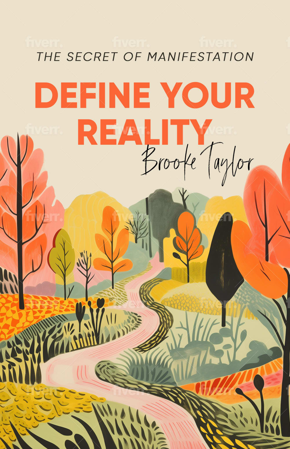
33 Responses to Option A
I liked that this option actually showed a pathway to reality so it felt more like a "defined" path. Lighten up the color scheme to make it more optimistic.
I like A because I like the image. It has a whimsical look to it that I like.
the aesthetic of the cover with the painting with bright colors is incredible for a design here.
Option A has a better cover. I like its colors. The fonts of the title would be changed to be more appropriate with the image.
These bright colors of yellow and orange add excitement to the cover.it is very attention grabbing
I think option A looks a little more high quality and fun
I chose Option A because it is very colorful, appealing, bright, and cheerful.
I like the amount of color of this option and it looks most modern and interesting.
A because B looks like a cheap art novel from walmart.
Option B is too boring while option A is more colorful and fun
I really do not like the cover in choice B. That one looks fake and boring. I think the image in choice A is more interesting visually. I like the colors and image a lot. It looks inviting.
I really like A (I personally think the cloud theme is overdone for stuff like this....so it hurts the book). A has got a beautiful color palette and I like the use of the road with the curves. It looks like the road is heading towards the title of the book (define your reality). It's really nice. I just think that perhaps the sub-title should be a little darker (just a little) so we don't miss it.
I like the overall concept of this one more but really don't like the colors. If it were more realistic colors with greens, and a blue sky I would like it a lot more. As it is, it looks more like a children's book.
I chose A because the design looks more professional and less generic.
I love this one more because it is vibrantly colorful and the depiction of nature makes it look so beautiful.
I like option A the best and wouldn't change a thing about the cover. I love the graphics and those graphics grab my attention right away.
Option A to me fits better with the title and offers a comforting and relaxing feel that goes along with what the title is conveying. I think the artwork is very beautiful and draws me in and makes you more interested in Reading the inside based on the title and art together. The only thing that I would change about this is maybe changed some of the shades to a lighter hue.
I think A has more primary colors, which makes it stand out more and more enticing.
I like this setting better as it is much more bright and clear, which is what you expect when you define your reality.
A has a warmer and more pleasant style that I find more appealing
After carefully studying and comparing both images of book covers displayed above and on Amazon, I selected Option A over Option B as my first preference and the one that I would more likely click on to purchase for my own reading enjoyment. I felt that this image just jumped right out at me as having more eye catching appeal based on the bright colors and contrast in shades. However, I felt that both book covers were quite acceptable.
Option A is my choice with the brilliant coloring which indicates a lead to a happy cheerful path in life.
i like the image on the cover. I like the colors a lot. I might make the title a different color or something to stand out more.
The brightness of the colors makes the book more attractive for me to select it.
the cute retro colors are a lot better and more attractive
i chose option a because it is more colorful and visually pleasing
A is more realistic showing a road one would actually go through in life, B would be more suitable for dreams than reality.
I can see this cover and imagine the same as a real environment. like a real road with trees, even the season. The name of the author is well positioned, easy to read without being the tradicional layout of author name on top or bottom of the cover with a traditional font. I like the colors, but in personal opinion, I suggest reducing the intensity of the beige/creamy background because the overall cover also reminds a recipe book. And in my laptop screen seems that the color tones include pink and makes the book more directed to a feminine public target.
A’s cover felt more unique and interesting. Please note—there are still multiple Fiverr watermarks on each book cover.
I would certainly be more interested in Choice A's version of the book. Being far more colorful and thoughtfully designed, it pops out far more effectively than B does, with its colors mostly being muted.
A looks more appealing to me. B looks fake and scammy with the picture of the smoke. To make it more appealing, I would make the cover to be an actual photograph instead of art. It looks more realistic that way.
I like this because it is different . The other cover is kind of a cliché here. A is creative, soothing and showing a path
Wow, I liked this picture. At first with the word reality I said but this is not a real picture but then I said this could the" idea" of what my reality could look like. I also didn't like the storm clouds in the other option.
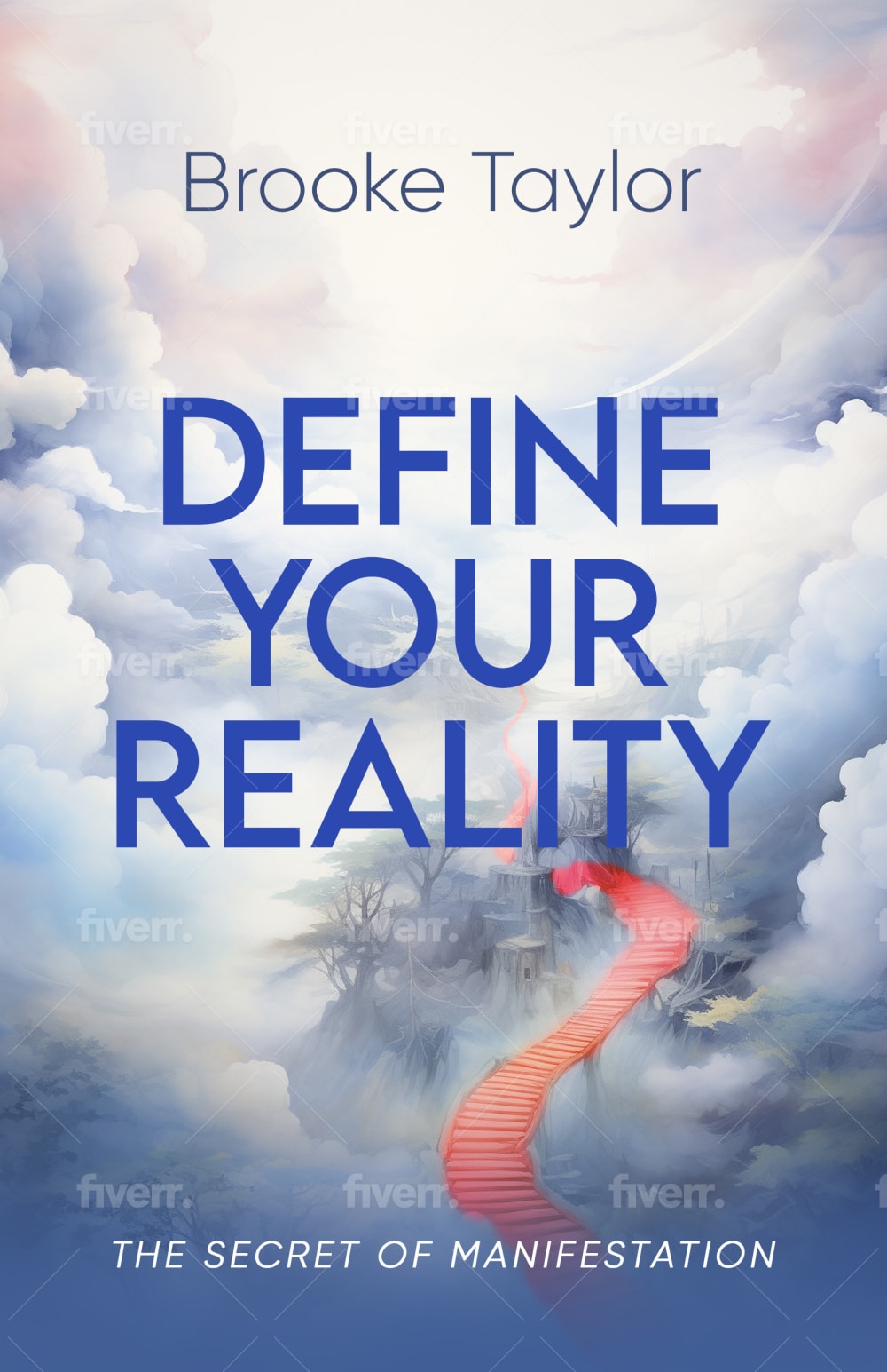
17 Responses to Option B
The image int he other version has too much going on. This one better suits the book and looks more professional. to me.
This blue cover is very appealing. Makes me want to read it as soon as possible.
I love this one more because the blue and the clouds are so pleasing for me to see. It feels so magical to me personally and works for this.
B got better colors, a more interesting positive feel to it. But the bottom white text in a bold font and little bigger if possible.
B. I like this book design better. It feels otherworldly like you are soaring through the clouds. I would add an eagle soaring somewhere just as an added bonus.
I am drawn to B because of its engaging style and design. I don't think I'd make any changes. I like the colors and the font!
the clouds are much better scenery, it's more intriguing
I prefer option B because this cover looks more serious and trustworthy but A is more attention grabbing, I feel like it should be something between B and A ideally.
The book's cover design is fantastic and goes nicely with the title, which is why I choose choice B'. Additionally, it suggests that reading this book will be highly engaging.
I like this one because it looks more modern, the other one is nice, but it looks like it might be a book from the 70's, it just has an "old " look to it, so I would think that the information might be outdated, or mistake it for an older book. The other one is dreamy, more spiritual looking and just has a nice look to it.
This looks more ethereal for the subject of the book. It would make people more interested in reading this.
B.. I Would pick this one because it looks really intriguing and I like the depth of the image and how that orange color really pulls it together.
Personally I think that this cover looks great, no changes needed. The colors and picture is nice.
The other one is a weird composition that doesn't work as well as the background and blues of this one
This seems more in line with what the topic of the book is about. Option A seems too whimsical and artsy.
In my opinion option B cover has a more modern design and looks more mysterious and intriguing. May be change the tag line to: The secret of manifestation revealed
I would more likely click on option b because the other choice looks like it's probably something from the mid 1900s when color is going to be made as vibrant
Explore who answered your poll
Analyze your results with demographic reports.

