Poll results
Save to favorites
Add this poll to your saved list for easy reference.
This is a book for German elementary school students about our earth (continents, weather, water cycle, etc.) Which book cover would you buy for your kids?
Option D won this Ranked poll with a final tally of 56 votes after 3 rounds of votes counting.
In a Ranked poll, respondents rank every option in order of preference. For example, when you test 6 options, each respondent orders their choices from first to sixth place.
PickFu requires a majority to win a Ranked poll. A majority winner differs from a plurality winner. A majority winner earns over 50% of the votes, whereas a plurality winner earns the most votes, regardless of winning percentage.
If an option does not earn a majority of votes, PickFu eliminates the option with the lowest number of votes. The votes from the eliminated option are reassigned based on each respondent’s next choice. This process continues in rounds until a majority winner emerges.
Scores reflect the percentage of total votes an option receives during the vote counting and indicate the relative preference of the respondents. If there is no majority winner, look to the scores to see how the options fared relative to one another.
| Option | Round 1 | Round 2 | Round 3 |
|---|---|---|---|
| D | 25% 25 votes | 32% 32 votes +7 | 56% 56 votes +24 |
| C | 32% 32 votes | 36% 36 votes +4 | 44% 44 votes +8 |
| A | 26% 26 votes | 32% 32 votes +6 | Eliminated 32 votes reassigned |
| B | 17% 17 votes | Eliminated 17 votes reassigned |
26 Responses to Option A
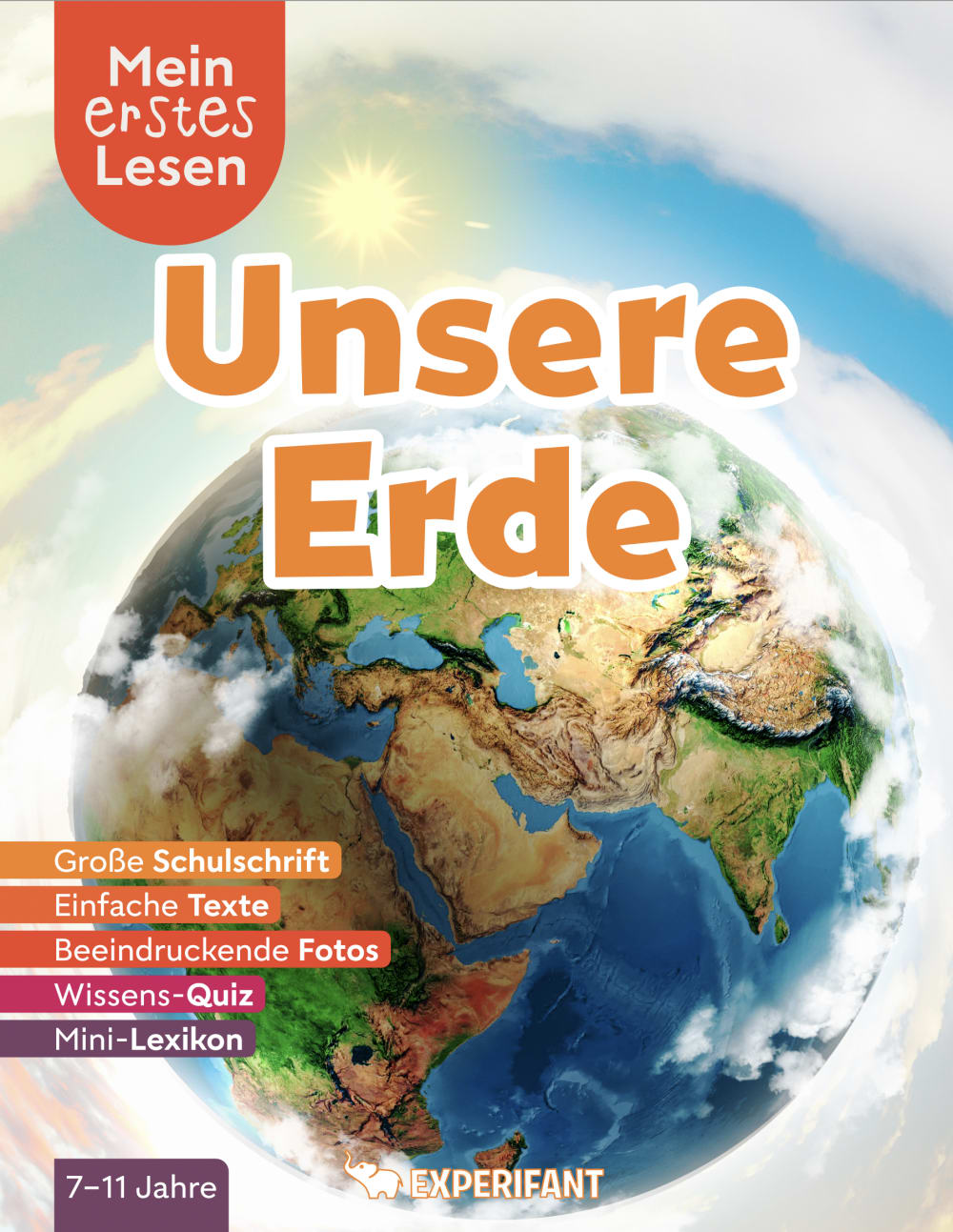
A first because I like how it shows the whole earth. D next because I like the brighter colors more. B over C because I don't like all the buildings on B.
I liked choice A since the image of the earth looks realistic and detailed. Choice C looks too fake and artistic with the view of the city popping out of the earth.
I would buy A for my kids as the colors are bright and varied, which is very enticing to the younger set.
I like that A looks realistic and shows atmosphere and clouds. I don't like that C shows the city building. They are not to scale and look unrealistic. A looks like a fiction book.
The bit of cloud around the Earth makes it seem like it is center stage and draws my eye to it.
I feel like option A shows the idea that this book is about ALL things earth. The image gives the impression best that this is not just continents, but weather, etc.
I like Options A & B the best. The layouts are colorful, bright and attractive with the globes. Option A has a lightness to it thats very appealing. Option D is nice but i dont like as much the dark background. In Option C the presentation looks too urban and concentrating on cities rather than nature and natural things.
I like the more traditional pictures of the Earth. I picked A,D, and B in the order that I liked them. I don't like C as it shows how we are destroying the Earth. That would be depressing to look at.
I like options A & D. They best represented what earth looks like. Option B looked a little cartoonish and Option C was neat but too confusing.
I like the ones that look most natural. I would not choose the one with the buildings. The clouds were very cool looking on A above a realistic looking Earth, that is why that one came first.
Option A looks to be the most intriguing with hyper realistic detail on the continents and water, I feel compelled to stare at it and open the book more so than the others. I would pick this one thinking students would have a better understanding of what the text is about underneath the cover.
I preferred the options that featured color schemes that were slightly brighter since these felt a bit more engaging and youthful to me than the options with heavier and darker hues.
Alright so my ratings are based off of the text and how well it fits with the overall image and scheme. Some are better than others and easier to comprehend.
I feel A looks the most realistic and less cartoonish
I like A because you see how big Earth is. I also like the clouds and how light it is around the Earth. C is just way too busy! It has too much going on in it and around it. I do like the outer space tho, but the buildings sticking out of Earth look quite odd. I don't think kids that age would like it. In fact- I asked my daughter- who is 9- and she said- I like A. D looks weird.
From a childs point of view - A is the most engaging and exciting looking cover.
I like option A the best because the image focuses on the planet and the immediate atmosphere of the planet such as the sky, clouds, etc.
I really like the colors in choice A and D the best. I think the colors really make the book stand out and draws your attention to it. I like choice C but I feel like it is a little too busy for the human eye. Choice B is kind of boring to me and doesn't stand out as much.
The covers that focus more on the earth itself (and less on space, other planets, stars, etc) seem more appropriate for the topics in the book
Option A tends to have the most of the target elements (weather, water, continents) pictured in the illustration over all the other choices.
A is the top choice as it draws the eye the most and is the most compelling. C is the last choice as I don't like the cities/human built things with the earth. I like the focus on the earth itself.
I like A because of the realism of the picture of earth. D because it is realistic as well as it shows more than just one continent. C is better than B because B seems like a cartoon.
I ranked them in the order that I think it would hold my kids attention and get them excited about it.
The pics of the real earth are best. A is zoomed out far and D is closer. Those are better than the fake pics of B and really better than the super fake C
They all look great, ny favorite is A, the the cover is more realistic and appealing
I like the one with the city, but I think this clean view of the earth is the best looking.
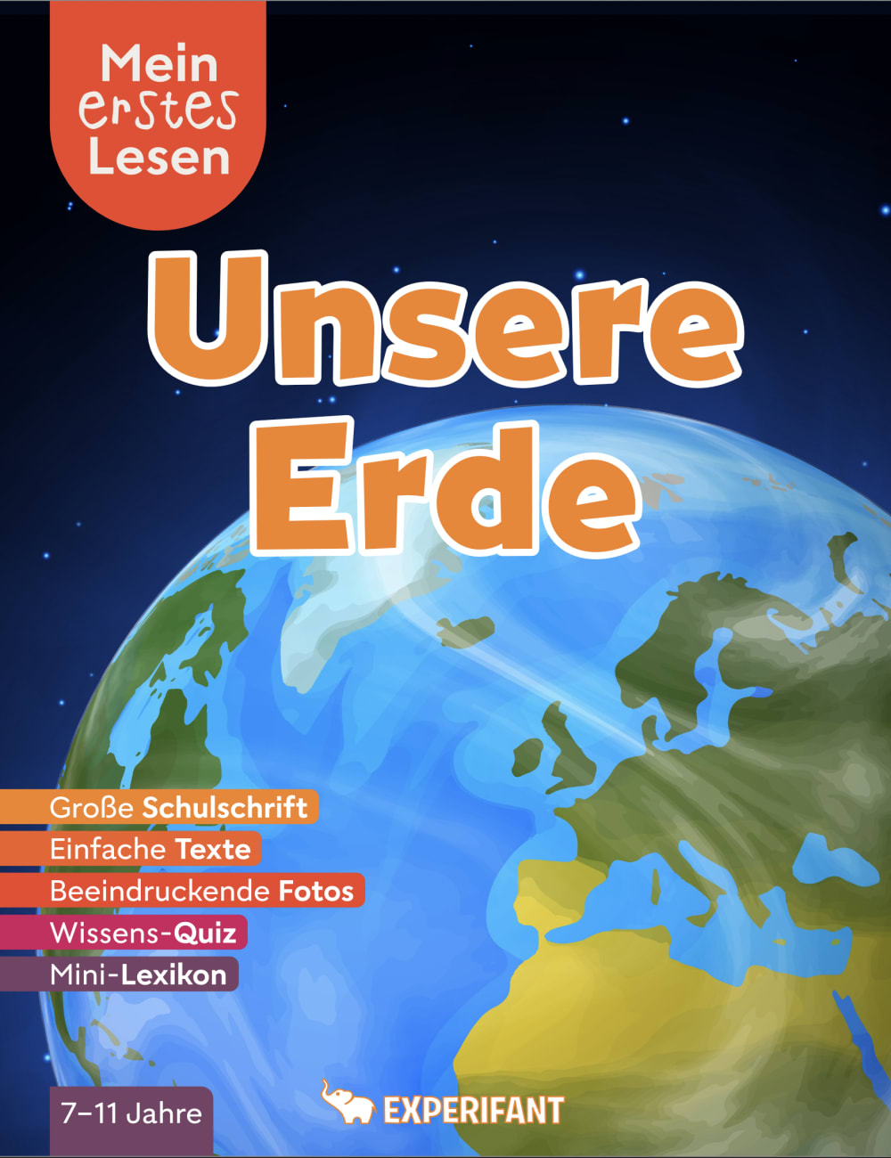
17 Responses to Option B
I like A because it has the most even colors. B is good as well because it highlights structures. C and D are both a bit more bland.
I picked the one based upon the subject matter that represents it the best the earth weather patterns The one with city represents it the least
I selected the book covers that I felt would be the most visually appealing and captivating for children, based on my personal preference.
B because the overall design looks much more put together and well created.
I think they all look very good. Great combo in colors and also text. I do not think you will go wrong with any of them. I just slightly prefer the first two due to the darker tone.
I don't like Option C because it gives unrealistic imagery for my kids. I don't have a lot of high expectations for its quality if it shows giant planet sized buildings. It seems too much like a video game and my kids are already learning too much in relation to video game styles. I like Option B because it shows the Earth in the clearest representation without a lot of distracting background to confuse the focal point. Option A is nice, but the fuzzy background is weird and not what space would look like. It distracts from the earth's image. And Option D has way too much going on in the picture. I get lost on what I am supposed to be focusing on.
I like option B the best because the color text and the image of earth stands out the most.
In above the four types of the book cover I choose at the first position is option B because this product is all of the kids are like to see and judge the outer look so I choose this option. Then I choose at the other options are seem to be a good look...
they are so interesing i would like to read
Voted based on vibrancy of color
There covers are all nice, actually - but I very much prefer the minimalist and simplistic design on the cover of B - I think that cover is simple enough that it's not distracting the children reading it, but at the same time it conveys the idea of what this book is about.
I made my selections based upon which cover I felt would draw a child's attention most quickly. I felt like Option B would draw a child's attention quicker than the rest, so Option B is my top choice.
Option B is my first choice because the image of the earth is more generic and not focused on one particular area like Options A & D. Option C has too much going on, it's too busy, lacks focus and seems to be more interested in cities rather than the earth itself. Option A appears to be focused on the Middle East, while Option D seems to be focused on North America only.
nature is better than buildings, C is the worst. B has the best colors, best! then D. A is a little weird, in between real and animation, better just stick to one theme, so it's 3rd.
I chose these answers in order of what is the most aesthetically pleasing while being the least cluttered. Picture B seems to be the brightest with more defined colors. Picture C does not have as many defined colors while seeming the most cluttered. I get distracted from the words when I look at C.
shows me the best details and color that would catch my attention and make me want to find out more
B shows the terrain of the ground and green grassy areas on the map from an areal point of view. It is not cartoonish.
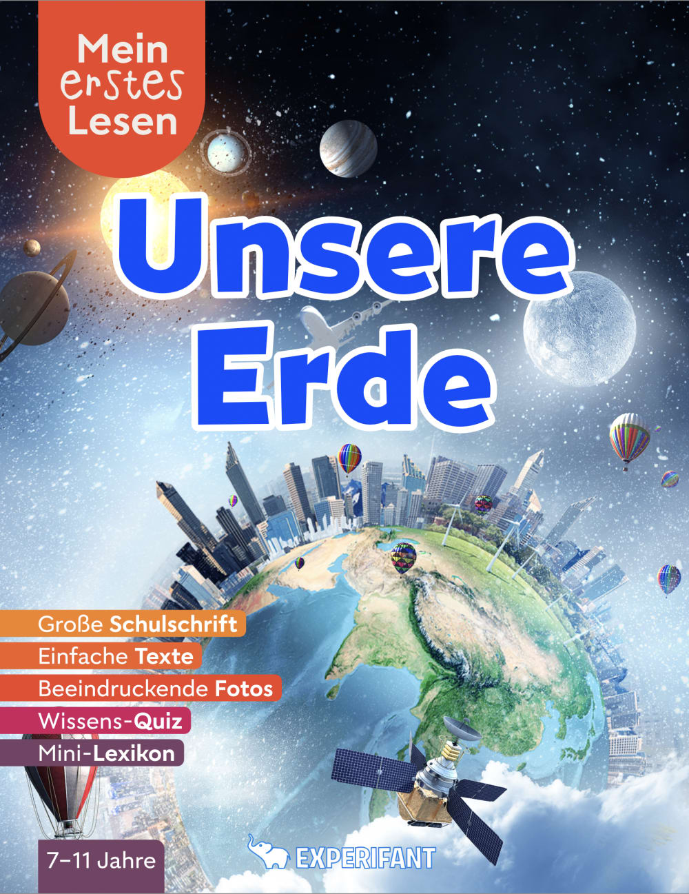
32 Responses to Option C
I think the buildings set up on earth are unique and would grab a child’s attention
When looking at these books C is by far leaps and bounds better than the others. When dealing with that age group you want something that will catch their attention, bring them in and keep them interested. All the different parts on C will spark different conversations vs just a flat earth.
I really like Option C best. It has so much going on in this. The satellites, solar system and the sim city like world really pulls you in. Option D is pretty epic as well. Options A & B are a little bland compared to the others
I like C the best because it shows the human effect on the earth and goes with the theme of the book. Option B is too plain, more of a classic flat view of earth from space, outdated.
I like how C shows many different parts of our environment, like other planets, satellites, stars, clouds, oceans, land, buildings, etc. It makes the topic seem more interesting and fun.
I like that choice C indicates that the earth is populated. I feel like that makes it a bit more interesting
Option B is kind of plain. Option A is okay but I like the angle of Option D better. I love the skyscraper effect of C.
For a book for German elementary school students about our earth (continents, weather, water cycle, etc.) the book cover I prefer the most is Choice C because it's bright and colorful, a fun and clever view of the earth which kids would like, and it's more appealing and visually pleasing than the other options.
C shows the earth as is. The city skyline, satellites and the more. The cover tells a story in option C
I not only like the blue font they use for the title of the book, but I also like the image. I feel like It has a lot of components to it that captures what earth is as we speak today.
C's imagery makes me think of all the different ways people interact with the planet, building cities, flying, space, and the like. It makes me excited to learn and think about things. A's view of the whole world and clouds makes me think of land and ocean and weather cycles. D makes me think of geography, though it's unusual that it's centered on the united states. D looks low-quality and generic, it doesn't make me think much about the science of the world.
I like this option as it shows a great picture of earth but also shows what is on earth such as buildings and whatnot.
Option C looks really neat, it stands out compared to the other choices. Option A is also nice but not as unique as C. The others are OK just not as nice a cropping
I thought the use of the colors just stood out more and seemed brighter on the cover than the others.
The option with the city on the world was the most appealing and the after that I chose the color schemes I liked the most.
I like the imagery in option C with all the things that make up the world. B isn't bad just showing a view of the globe.
C is more fun with the cities and satellite
The overall design of C is the best one due to the business of the cities in the drawing and the stars and planets in the sky. It caught my eye the quickest. A is my second favorite because of the color scheme. I like the sky color in space. D is third because I like the way the earth and the sky look. B was my least favorite because it's the least detailed and looks generic and plain.
I like the fact that choice C shows not just the Earth, but other things on it as well.
i enjoy how in choice c you can see the buildings and landmarks and actual places youd expect on earth
I feel like options C and A illustrate what the book is about, all the parts that make up earth
I like to chose option C. because this seems the image shows new technology with buildings and satellite. so my kids will love that.
I like C best because it shows other things on earth and looks interesting to read
My top choice shows more structures built on the earth, which would make me more curious to learn about how the earth got like that.
My first choice is option C because it has so many great details in the picture, and they are nicely and orderly in how they are displayed. Option D was my next choice because it shows both the sun and the star, and my child just happens to be very into space at this time. Option A was next on my list mostly because option B was my least favorite. Option B just looks a little too plain and generic.
I think option C does a good job showing both human and nature elements that would draw in students interest.
I think option C is the coolest cover with the buildings wrapped all the way around the world, just reminds me of harmony among the world somehow and is very visually appealing especially for kids.
C's cover stands out a lot more to, and I feel is a little more reflective of what the book is about.
I love the two where you see Earth from more of a distance, but showing the cities in Option C makes it definitely seem more interesting. B looks cartoonish and doesn't appeal to me at all aesthetically.
Option C is cool, I like the art style and font. Options D,A and B are good, but not the best.
best design and color / good design nice color scheme / average design / poor design
I think the cities and satellites will make kids more interested.
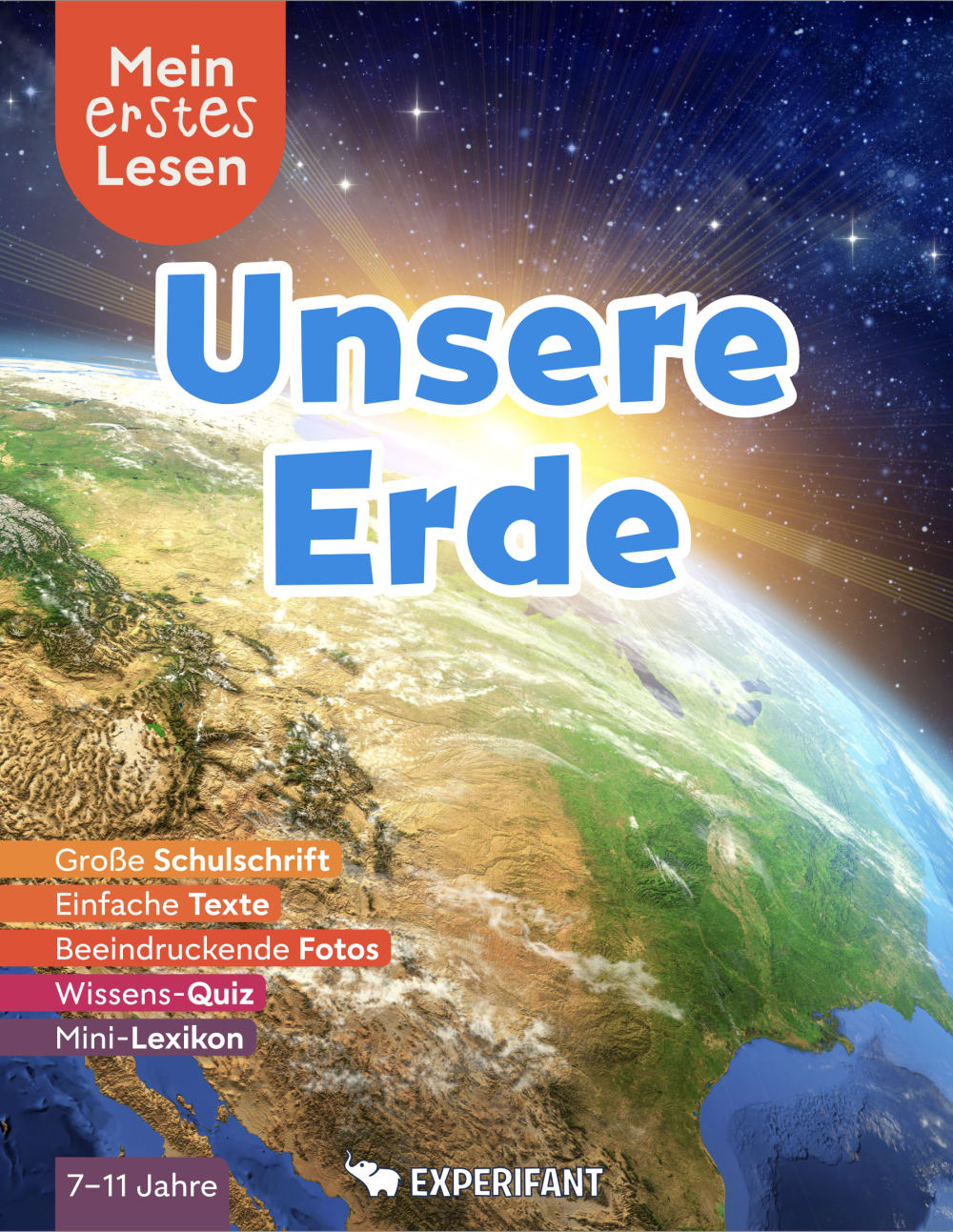
25 Responses to Option D
The top two seem to be the most kid friendly. They other ones don't seem as though they would appeal to a younger crowd.
I like that it’s a real picture. The colors and font are engaging.
I love the darker color scheme of the first three options. Option D is my favorite because of the stars. Kids would love that. Option A is last because it's too "plain" compared to the rest.
I like a more natural looking earth for a kids book, and between D and A, D is a better composed picture.
I liked Options D and A first [and second] because they were not only the most realistic of pictures, but the pictures "drew me in" more into, perhaps, into what the content of the book might have. While I cannot read German, those pictures might influence me a lot more than Options C and B, which seemed more "textbook-like" images and instantly turned me off.
D--the colors (orange, purple, lavender) all seem to follow together making an artwork that assists an explanation.B--colors of the earth drabby looking. The orange in title very good, Yellow and green depressing.C--Way to many shades of blue. This was my contender at first. Awesome illustration. Needs more coloring. Space shuttle, planets, and balloons perfect add ons.A--Too much orange. The earth tones are too lid back. To much light browns/tan. Sky is way to white.
The sunrise over the realistic earth is the most eye-catching to me. A is also okay but it looks more like a mobile app then a textbook. Maybe that's a good thing? The others I do not care for.
I like the realistic images of the earth surface and also i like the solar one
I like option D because I think the picture of the Earth looks the most appealing, therefore it is the most realistic to me.
I think that I like D the most. I enjoy the angle of the picture that earth is in. I think that it looks super realistic
I like choice D how the book is bright and looks textured and will appeal to children for their studies.
I ranked my choices based on my preference for the depiction of earth on the cover.
More engaging photos
I like choice D because it looks the most realistic. A is a close second because of the many different ways it portrays our world ( i.e the earth, satellites, and cities)
I picked my choices based upon the criteria the kids would be learning about. The criteria is just to learn the basis for land, water, continents, etc. More "advanced" ideas about towns and cities, like in Choice C, would be later in their learning progression. While I like C the most, it would not be appropriate to force kids to learn that advanced. Thus, I went with what picture and graphics on the covers of A, B, and D were the best. D has the most detail and looks the best, then A. B is awful, but still not "advanced" learning like C.
The image of the sun rising over the planet provides great imagery as well as teaches kids about how our planet fits into the larger scheme of the universe.
D is the most realistic planet, I have to be honest and I don’t like the rest of them, especially C, way too much going on.
i like choice D the best because it is the most realistic looking.
I like the more realistic view. Sparks imagination grounded in reality.
for a kids book a cuter design is better
I like the extra details and realism on the planet so chose D first. A next because a bit less detailed when zoomed out. Then C because it is out of proportion and B last because the image is too flat.
I like all of these covers, but Option D was the most appealing. I liked the black background and closeup of earth. Option A was also nice as well since it showed the entire earth, but I would have preferred a black background to make it look like a galaxy.
I prefer this one because the earth image actually looks like earth as well as there being a galaxy over there in which it makes it look realistic.
Choice D is my primary choice because the brightness of the earth contrasts well with the space background. Choice A is next because even though there is no contrast, some elements of weather can be seen on the globe/earth image. Choice B is third because it is an average picture and nothing too special. Choice C is last because he building on the design make it look to busy and congested
I like option D the best because i am drawn to its graphics mostly. The graphics in this one are done very well and i think children would love it .
Explore who answered your poll
Analyze your results with demographic reports.
Demographics
Sorry, AI highlights are currently only available for polls created after February 28th.
We're working hard to bring AI to more polls, please check back soon.

