Poll results
Save to favorites
Add this poll to your saved list for easy reference.
Which book cover do you like best?
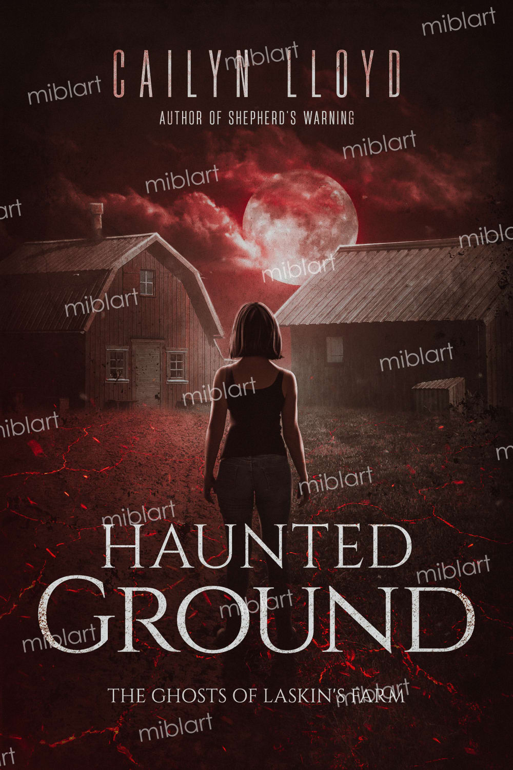
28 Responses to Option A
the color tones of the other image look too bright and kid friendly. does not fit the theme of the book overall.
I prefer A because it looks like a more mature, year-round book. The other cover looks like it is for a childrens' book, and the red text for the title is extremely jarring.
I like the option A which looks a bit more modern - the girl and the barns. I really like horror movies and this pulls me in.
I really prefer A, although I am not sure why. Maybe the overall darkness of the cover just meshes better with the subject matter and it doesn't look as rough and out of place for the lady to be there, as it does on the option shown for B.
I like the vibe of A a lot more. It feels more cohesive and the colors blend together well. I assume the miblart watermark will not be there. I don't like B because the person feels photoshopped in front of the house. The lighting is worse in B.
A because it looks more professional and creative while B looks like it would be found in a bargain bin.
A is much sinister and darker looking. I love the lack of contrast compared to B which looks a little too bright in some spots. Also, the fonts look amazing. I love the fonts themselves but also the textures on them. B is interesting but a little bit on the cheesy side.
The quality of option A is better and the character is more intriguing. I like the colors of the cover for option A too it fits more with a horror type book whereas option B looks like one of those cheesy crime thrillers all over airport bookstores.
I actually like them both but A looks better for a horror novel (which the title/subtitle implies) and B better for a thriller
Both covers look great but I like option A a bit more. I really like the use of red here. The red clouds, the red on the ground, the red cracks. I also really like the font used. Its also a bit clearer that it is a farm over the other option. If I was looking for a horror book and had to choose between the two, option A would definitely be my choice.
I chose Option A because I think the dark red sky with a full moon and the overall darkness of the cover suites the horror genre well.
I chose option a because the scene was more intrigueing and spooky to look at. I liked the reddish tones over the whole picture and the moon draws the eye. Im not sure what the miblart word all over it is for, maybe just a watermark? but it would still be my choice regardless. The other options scene reminds me of 90s tween book covers and its not appealing.
Assuming that the miblart watermark is gone, I like A better. It looks more unified, while B looks like a bad photoshop job. The shadows on the person and on the house do not match up in B, so I think it looks terrible.
I choose option A because it is the cover that makes me think of a book of suspense and terror. It is also more realistic. The only thing I would remove are the words "miblart" that are all over the cover
Option A gives the feeling of a a modern, "current day" story based on the woman's hairstyle and clothing, and the tone is more current. Option B the character and environment appear to be set in the past, and the cover itself just gives the feel of a bad novel you'd pick up in an airport or gas station.
Option A is much more attractive than option B. Option A looks like high quality artwork while option B looks like a edited photo.
A looks like a more modern book cover and has a slight movie look to it. B looks outdated, it would be a good cover 10 years ago.
I like this one better because it is more unique than the traditional image of a spooky looking house for a haunted house or haunted grounds story. I also like it because it makes me think more about the people involved in the story rather than what the houses look like on the property and what happened there. I think about if the woman on the front is the main character or maybe she is the main ghost haunting the grounds. That makes me want to read the book so I can find out the answer to who she is. The full moon in the center of the buildings and center of the cover gives it a nice spooky effect while also making me think about afterlife in general since lots of spooky things are said to happen on full moons, part of that being ghosts coming out to play which would make sense for a story with a haunted house/grounds. I like the images of the cracks or maybe lightening bolts on this cover too. If they are cracks it makes me think about that there might be an old cemetery on this property and the headstones are cracked and the ground is all cracked from the soil being dry and the property wasn't kept up well. If they are lightening bolts then maybe something happened to make this place haunted during a storm or maybe the ghosts come out during storms. There is a lot happening but it isn't overwhelming and it isn't the traditional imagery so it makes me more likely to buy the book to read it.
I think that A draws me in and makes me want to know more about it.
This one looks more ominous. It seems like the character is at the center stage of a terrible horror that tests their strength.
Option B's photo edit looks poorly done and slapped together. Option A has a more realistic look to it. The colors are not off and everything looks normal and not photoshopped
A looks cooler to me. It's feels more real and has a better quality. The only issue is the 'miblart' watermark
I think B is more cheesy and seems less professional than A.
I'm going to assume "miblart" is the watermark and won't be present on the actual cover. If that's the case, A is the clearly superior choice for a horror book. It oozes dread!
Remove the background watermake and this book would catch my attention, Has a unique look and is different. The other cover is very generic and would be looked over quickly
I prefer A because it reminds me of video game covers, like last of us, for some reason. I like the color pallete and the fact that it looks smooth and silky.
I really liked the book cover of A Its unique and memorable design can help the book stand out on the shelf and make it more memorable to potential readers. The cover can convey a sense of imminent danger or threat; it can make readers feel a sense of urgency and want to dive into the book to find out what happens. the mysterious or frightening image that captures the essence of the horror genre and makes readers curious about what's inside. Also, dark shades of black, brown, and red can create an ominous atmosphere and set the tone for the horror story. At the end, what draws my attention the most is that Book A has a more realistic character on its cover than Book B, which has an anime-like character.
I like this picture the most, it looks the most creepy and ominous of the two.
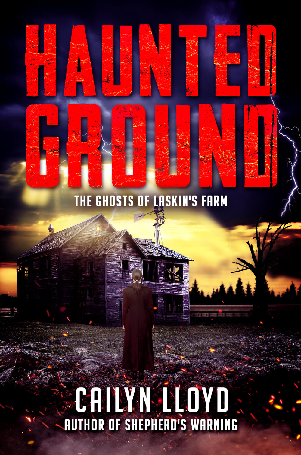
22 Responses to Option B
It looks really cool.
Option B because even without reading the title it looks exciting and thrilling. If I was to remove the title and look at it I could imagine exactly what it would be about and still come up with multiple scenarios and they could all be right, if that makes sense. It really uses my imagination. I think it's really cool image.
Very spooky lookingIt would be great to read the bookGreat for a Halloween read
The bright and vivid scenery really makes me feel as if I am actually right there by the haunted house in the book cover.
Option B is the clear better choice out of the two options because of the artwork. The art is so detailed in option B. The house looks great and the storm in the background looks ominous. The red text looks scary also. The other option looks bland.
I love the spooky ghost house type of look. Plus, the words all over the cover on A are just distracting and looks terrible.
I love the eerie and mysterious vibe I get from the cover and I really like the artwork.
I think B's graphics pop more than the other choice. The house looks appropriately haunted and rundown in choice B and I think the atmosphere just feels more creepy.
I like this one far more, the title is very noticeable and grabs your attention. The art itself is also great and I feel it makes me want to know more about it and grabs my interest, the other just does not grab me in the same way or seem as exciting or vivid
Seems more mysterious and less cluttered with a bunch of words I nothing about. B is easier to read what the actual title and author's name is. A also has a more appealing picture that is easier to look at as well.
Option B is much more attractive. The graphics are more vibrant, but in a haunting, forlorn and dark way. The cover is sinister and fits the genre better. Option A's colors are too muted.
Both the title and the author are prominently displayed, and I don't know why "miblart" is all over the cover of A. Also the farmhouse against the yellow sky shows more detail in B.
The colors are more saturated which makes this cover more interesting. The artwork also looks nicer and more professional overall
I prefer option B because I like the colors and details that the cover has. It puts a vivid picture in my mind to have while reading the book
This cover looks more professional overall, it does a better job capturing that lonesome and somber feel, with the tension that comes along with it. A is a bit too flat and the red seems to take away from the "gloom" and make it seem more like a zombie theme. B is more in line with, say, a Stephen King book, where you feel that tension but the theming is that kind of rustic coziness as well.
I vastly prefer the cover to book B because I think the colors are more vibrant and varied and that seems to convey something more to me about the book itself. Additionally, I think this makes the book cover a lot more eye-catching than A, where the more monotone colors makes everything meld together and I imagine my eyes would glance over it much more quickly if I saw it on a bookshelf or while scrolling on Amazon due to this. I particularly love the depiction of the sky in cover B and how it shines over the house in an ominous way. I prefer the positioning of the girl as well as how the color of the house is almost purplish as it adds to the eeriness. I think that this cover could be made even better if it was the same picture but used the lettering/font of cover A. I think B's font conveys a sense of lower quality compared to the refined and consistent lettering of A, so if that font was on B it would make the cover look the best.
I like the book cover in option B because I like the bright red bold title as well as the old house and scenery it just screams scary book to me.
It looks much scarier and more mysterious. I like the creepy house with no windows and the windmill. I like the long dark coat the girl is wearing too.
I Like option "B" better because the cover colors pop right off the page, it catches my eye more then "A"
I like option B. The cover is dark and mysterious. It gives just enough information with the title to gain the needed attention for one to pick up the book and find out more.
I prefer option b the most. I like option be better because it has a more older School feel to me that looks like an retro looking or novel cover. I like the look of the farmhouse and option b that's depicted in the cover it looks even spookier because it's more abandoned looking it looks like a place to add creepy spooky vibes that has a history of ghosts and wrongness I think that adds to the factor of the spookiness. I like the fact that you can see more of the sky and it has details around lightning and you can better see there's fire or embers burning but it doesn't make the ground look strange. I like that you can see trees surrounding the farm to me option b has a very good classic look at all it almost walks you right into a country farmhouse a state that has been long abandoned it gives you a thrill because it looks more genuine and I think it adds to the atmosphere so that when you're reading the story you get more immersed every time you open it to look at the cover to begin reading it. I'd like option A the least because the ground looks strange it looks like lava burning around the ground although it's a cool effect it doesn't blend well into the foreground where the buildings are and look strange. It has too much red on the cover that takes away from I think what the purpose of the story should be about to me it's more going about a vampire or werewolf instead of possible a thriller ghost story or murder story. It is too much saturated in red how much prefer option b that has more detail and looks more realistic.
I think the farmouse in B looks more creepy (though is it that dilapidated in the book?). I also think it looks more eye catching and interesting than the overly red cover of Option A. I do however think the person standing in front of the farmhouse in B looks cheesy and poorly photoshopped, and I am not certain the lightning is necessary. The person on the cover of A definitely looks better, but overall I like the feel of B better.
Explore who answered your poll
Analyze your results with demographic reports.
Demographics
Sorry, AI highlights are currently only available for polls created after February 28th.
We're working hard to bring AI to more polls, please check back soon.

