Poll results
Save to favorites
Add this poll to your saved list for easy reference.
Which book cover do you prefer, and why?
Option C won this Ranked poll with a final tally of 26 votes after 2 rounds of votes counting.
In a Ranked poll, respondents rank every option in order of preference. For example, when you test 6 options, each respondent orders their choices from first to sixth place.
PickFu requires a majority to win a Ranked poll. A majority winner differs from a plurality winner. A majority winner earns over 50% of the votes, whereas a plurality winner earns the most votes, regardless of winning percentage.
If an option does not earn a majority of votes, PickFu eliminates the option with the lowest number of votes. The votes from the eliminated option are reassigned based on each respondent’s next choice. This process continues in rounds until a majority winner emerges.
Scores reflect the percentage of total votes an option receives during the vote counting and indicate the relative preference of the respondents. If there is no majority winner, look to the scores to see how the options fared relative to one another.
| Option | Round 1 | Round 2 |
|---|---|---|
| C | 36% 18 votes | 52% 26 votes +8 |
| A | 36% 18 votes | 48% 24 votes +6 |
| B | 28% 14 votes | Eliminated 14 votes reassigned |
Age range
Audiobook listener
Average monthly book spend
Favorite book genres
Gender identity
Literary preference
Options
Pet owner
Preferred book format
Reading frequency
18 Responses to Option A
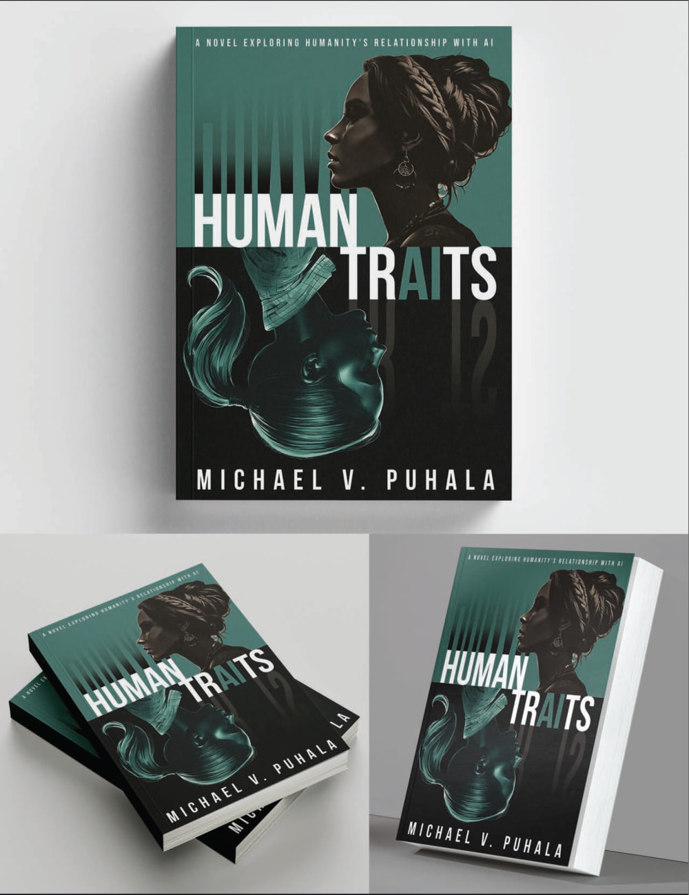
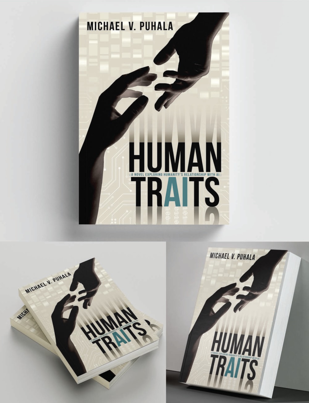
I really like Option A because of the way it features a human face; there is characterization there that makes me want to learn more about the people in the book. Option C also has that human connection that recalls that classic painting. Option B is simply too impersonal and generic, though it does look professionally done.
I really like this design. I like the color scheme a lot. I like the way they are mirroring each other. The face looks cool. It is the most eye catching option
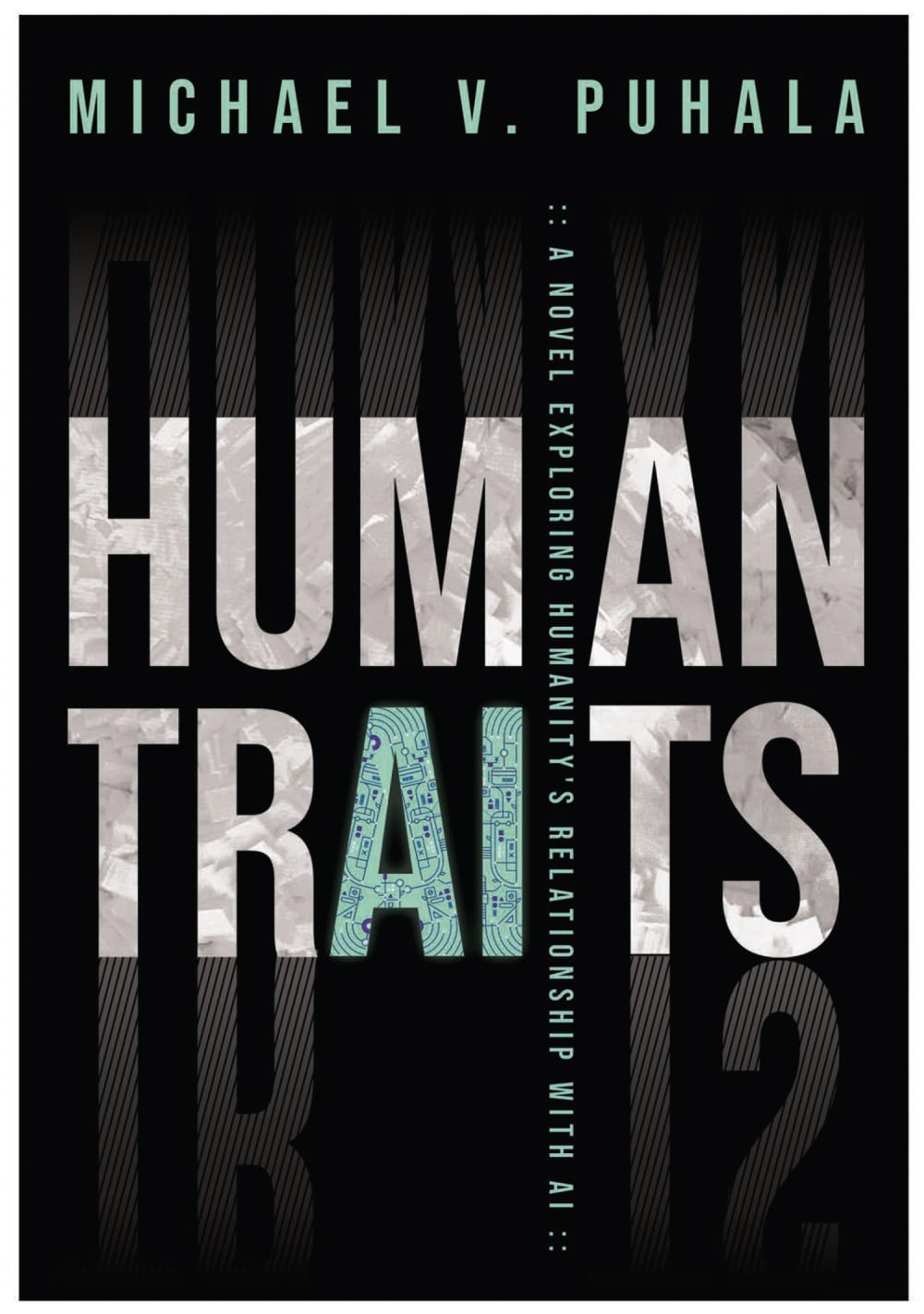
A book called "Human Traits" ought to actually have a human on the cover, right? The text-only cover has the least going for it, for that reason.
The dark art used on option A is preferable to the light colors used in option C, however, I really appreciate the representation and art work found in option C. The implications however, are best told in option A where you can see a clear artificial person next to the living one.
I I ranked option A #1 because it has a great design, the dark emerald green paired the visuals is eye catching. I ranked option C #2 because I like the color and the hands reaching out to each other but it's not as good as option A. I ranked option B #3 because I like the font but the cover is very boring.
I think the cover image and colors of A stands out and makes me want to know what the books about.
I like A and C more than B because of the multiple angled view but A edges out C because the color is more appealing to me
C is kind of sparse and cheap looking. A and B are bot hspectacular; A is unique
I prefer option A because I think that it is the most interesting and mysterious-looking book cover design out of the three options above. I also think that its two-tone background makes it the most eye-catching and visually appealing book cover design out of the three options.
I would say I prefer Choice A the most. As far as visual attractiveness goes, it easily wins, having the most use of color and striking imagery. It looks quite good. In addition, I think it represents what the book seems to be about the best with its artwork, at least as far as the title goes.
The image in A gives a feel of evolution so I chose A first. C resembles attraction which gives a sense of evolution so chose C second and plain A last.
I lean towards option A because to me it looks and feels the most intriguing and novel. Option C and B don't seem to engage me as much!
I prefer Options A and C because they actually include human parts (head and face on one, hands on the other) on the cover. The cover that's only text doesn't make as much of a visual impact.
I like the way AI is written and does not have a reflection. I would have liked a way that shows the hand or face being shown to be a robot as well. B is bland with only a black background.
Option A caught my eye the most. Visually it looked the most interesting. Option C, I liked the cover more than option B because it looked more interesting than option B with its more plain cover.
The shade of green used contrasts well with the large white text [A]
option A seems more human and i also fits the title the best
I would choose option A' since the cover design is visually appealing and makes the book appear more fascinating.
14 Responses to Option B
The big edgy and geometric font here really catches my attention on the black background
I prefer a cover that's more simple in design
The cover with mostly text stands out for me. I also think the title is the easiest to read in this version. And that's what counts.
I like the more simple and contrasting design of B
I think just the font alone looks cool and does the book enough justice.
I think B is the best because I think books that only have typography as the cover arts helps me avoid making any assumptions about the book prior to reading so I go into the book not knowing what to expect. A is my second pick because sometimes having people on the cover on a book can help me better visualize what the characters are supposed to look like. C is my least favorite choice because I personally do not find the color contrast between the background color and the shadowy look of the hands visually appealing.
I would choose option B because of the black cover.
I prefer this option because it looks very professional and formal. It makes me think that author knows what they are talking about and gives me faith in the book.
I ranked based on how eye-catching each cover design looked.
The darker backgrounds with the lighter fonts are more attention grabbing.
Option B really drives the fact that the novel has an element of AI into it. The other options appear to be too human based and don't scream a novel based around the interplay of AI and the human element, but rather just the human element.
I prefer B for its minimalistic, plain black background.
I think that B captures the tone of the novel best as well as overall what it is trying to portray. Without reading the byline I would assume that the other two were in regards to what humans share in common.
Choice B is more clear to me and visually attractive to read through for me because of the theme color which is darker so making it easy to read the words of the title.
18 Responses to Option C
The option with the lighter book cover looked the most elegant.
I prefer C because I think its cover matches the title of the book the best.
I think a book cover with such a title should include some visual depiction of humanity. Option C might be gesturing at The Creation of Adam which is a bit overplayed, but the composition as a whole is interesting. Option A is a bit odd with its mirror reflection layout - it's evocative but I'm not sure if I like it.
I would prefer option C as my first choice, why because it is most meaning full and also impressive compared to others.
I prefer option C's book cover because the image is left vague which seems more relevant to the title compared to the other options.
I like option C the best because it has 2 people reaching for each other, almost like our human traits are connected. Next, option A is best because there is a woman on the cover. Lastly, B is my least favorite because it doesn't give me much insight into what the book will be about.
C. More unique, More human and the color and contrast stand out more and seems more interesting.
I really like B best, as it reminds me of the Sistine Chapel, which is a really interesting insight if you're making a good point in the book in realtion to god vs humansim, etc. I like A second best as it looks more like a copy of a book that I would read, over B, which feels generic.
I like the 2 hands coming together. It gives me more of an idea of how nice it is and the unity between people.
C is the best combo of not being too busy in design, but not being overly plain.
Choice A is the cover I like the most but I think it would exclude some male audience since it only shows women on the cover. Cover C feels more gender neutral and could appeal to a wider audience. Option B is quite boring and has nothing that stands out to grab the attention of a reader.
I didn't even notice the AI word-play in the cover until I saw C, it does the best job of highlighting it.
I would say C, because the hands say to me, that there are connections between people and AI with certain traits. As if the AI is reaching out to humans.
I would like to choose option C book cover because its unique design.
C the cover is very eye catching and the hand give a good image that represents the title
I chose option C because I like the brighter color on the cover and the image of the two hands makes me interested in the relationship between the people
C since having the hands as the main focal point of the background imaginary helps sell the human part of the title and theme.
C and A look the best for the book covers
Explore who answered your poll
Analyze your results with demographic reports.

