Poll results
Save to favorites
Add this poll to your saved list for easy reference.
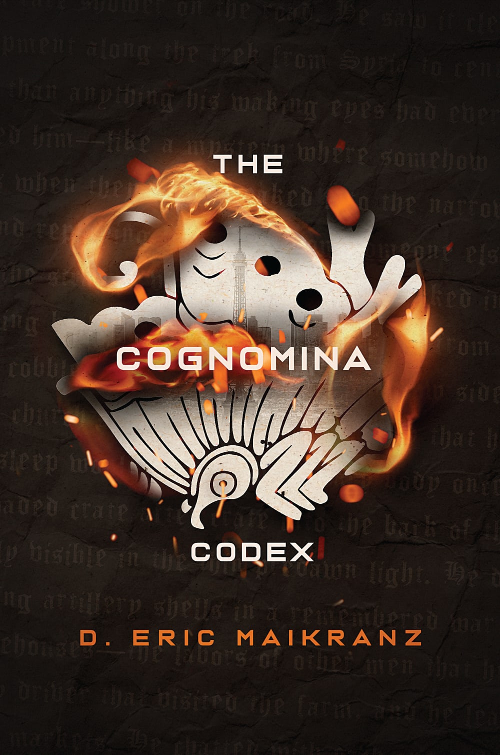
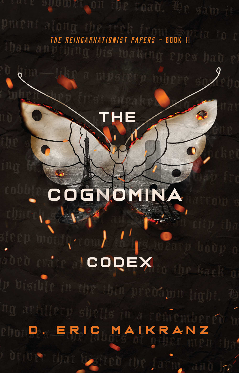
Which book cover do you prefer (and why)? Background: The Reincarnationist Papers book series is about discovered manuscripts that tell the story of a small group of people who have total recall of their past lives and drive history toward their goals.


9 Responses to Option A
A seems a lot more intriguing.
The fire on the book cover makes it electric and alive. It is immediately noticeable.
I like the flames that surround it in choice A. If I saw both book covers, I would grab the book with choice A's cover.
I choose A becoz of the description of the story.
I chose A because I like how there is fire drawing your attention to the center. But I do like the butterfly in B. Maybe if those two elements were combined, it would be perfect.
This book cover of the burning butterfly really captures your attention and imagination as to what this book is really about.
I prefer option A because I think that it has a more interesting, eye-catching, and visually appealing book cover design.
I feel the cover as featured in A is more balanced and takes up the best use of the space.
Choice A is the one that I prefer because I like how the burning image look more mysterious and vague which I feel like better matches with the name of the book and the description. That it is a mystery and amount past lives so it should be something more strange on the cover as opposed to a butterfly.
41 Responses to Option B
Easier to tell what the insect is that is burning in the graphic. The other image is a bit confusing
I LOVE THE BUTTERFLY. I THINK THIS REPRESENTS CHANGE AND RENEWAL SO I WOULD CHOOSE THIS OPTION
The fire in the other option is too much and it ruins the image. B is nice and simple and works best.
I like the butterfly and the more subtle flames in Option B.
This one looks more realistic. It bears a heavy burden.
I really like the butterfly in the background because it goes along with the theme better.
I prefer B because I like the reference to the butterfly effect. I also think that the fire in A looks really bad, fake, and distracts in a bad way.
The other cover is confusing and I am not sure what I am looking at, B is clear and interesting and grabs my interest and makes me ant to know more
I prefer option B book cover looks visually appealing. I find it stands out more.
It looks more symmetrical and straightforward, while still looking interesting.
B is more familiar. It is hard to tell what the image is in A. It was difficult making out the butterfly.
I voted for B because I think A has too much going on to begin to realize what the book is even called. Option B has everything spaced out and you can actually read the title properly. The design is also better than option A and I would rather pick up that book if I saw it on the shelf over option A.
I love the moth/butterfly cut out. It feels super cool and dramatic
I love the look of the butterfly it makes the cover really pop.
Cover B has a more cohesive look. I get the link between reincarnation and butterflies. I can't even tell what the illustration is supposed to be in Choice A.
The objects at the center of A's cover make less sense than the ones at the center of B. The imagery in the wings is clearer in B as well. B is an overall stronger presentation.
I chose option B because of the full butterfly pictured. I think butterflies can and do represent many things.
The fire in the image of option A distorts the main image.
I think the cover is a lot more legible and also very unique in it's composition.
the graphic used on option A is too confusing
I think the butterfly is more eye catching and not as confusing.
I think it's a bit easier to read the text in option B.
I like that B has less flame effect but I prefer the burning paper more than the butterfly
I think that B is more eye-catching and easier to parse at first glance.
I chose B because it gave the name of the series and the book number that it is on the series. That makes it easier for me to pick up a book and know that it belongs to a series and I need to read other books before this one.
The butterfly in B really attracts my attention, it is really fascinating!
I would choose choice B first because it has a nice image on the background and the writings are nice as compared to choice A.
I really like the look of option B. I love the butterfly with the Eiffel Tower on it. The other option is a little more difficult to make out.
In option A the flames just cover up the city design and it looks like a mangled insect burning. That is a turn off and doesn't seem to relate to the story. Option B is clean and overall more attractive to look at.
If I ever saw the book cover of choice A, I doubt I would pick it up. I don't want see something on fire because I feel it's going to be something bad. I think choice B gives that sense of a butterfly being reborn and how it evolves to which kind of goes off what I am reading of the description
I'm not sure of the significance of the butterfly, but the other shape is not anything I can figure out.
I like the cover of B more. I like the the butterfly logo with the city in the background more, and that the background text pops out more. Also it shows that it's the second book and gives the series name so that's a plus.
I prefer option B. I like the cover which shows a pretty butterfly.
The butterfly inspires imagery of the "butterfly effect" which is relevant to the story, sort of. I don't understand the imagery in A at all.
I would choose option B over A because B has a clear message about reaching the goals, option B has cover page as butterflies which directly give message about giving wings to your dream or goals.
I love the look of the butterfly and the fire
I feel like the blackened burning butterfly of option B is much more visually striking. My eye was drawn in by B right away, and it makes me curious to read the book. I find the image for option A confusing and not visually appealing.
I feel that this cover looks more interesting and mysterious with the moth and the sparks behind it. It seems to catch my attention more than the other cover art.
This one explains that it's a series a bit better.
They are both really cool but B's butterfly with the city in the back really catches my attention more, for this story.
I can make out the butterfly easily on B as well as the cityscape.
Explore who answered your poll
Analyze your results with demographic reports.
Demographics
Sorry, AI highlights are currently only available for polls created after February 28th.
We're working hard to bring AI to more polls, please check back soon.

