Poll results
Save to favorites
Add this poll to your saved list for easy reference.
Which book cover is better?
Option D won this Ranked poll with a final tally of 28 votes after 3 rounds of votes counting.
In a Ranked poll, respondents rank every option in order of preference. For example, when you test 6 options, each respondent orders their choices from first to sixth place.
PickFu requires a majority to win a Ranked poll. A majority winner differs from a plurality winner. A majority winner earns over 50% of the votes, whereas a plurality winner earns the most votes, regardless of winning percentage.
If an option does not earn a majority of votes, PickFu eliminates the option with the lowest number of votes. The votes from the eliminated option are reassigned based on each respondent’s next choice. This process continues in rounds until a majority winner emerges.
Scores reflect the percentage of total votes an option receives during the vote counting and indicate the relative preference of the respondents. If there is no majority winner, look to the scores to see how the options fared relative to one another.
| Option | Round 1 | Round 2 | Round 3 |
|---|---|---|---|
| D | 32% 16 votes | 40% 20 votes +4 | 56% 28 votes +8 |
| A | 24% 12 votes | 32% 16 votes +4 | 44% 22 votes +6 |
| B | 24% 12 votes | 28% 14 votes +2 | Eliminated 14 votes reassigned |
| C | 20% 10 votes | Eliminated 10 votes reassigned |
Age range
Education level
Gender identity
Options
Personal income range
Racial or ethnic identity
Self-help book reader
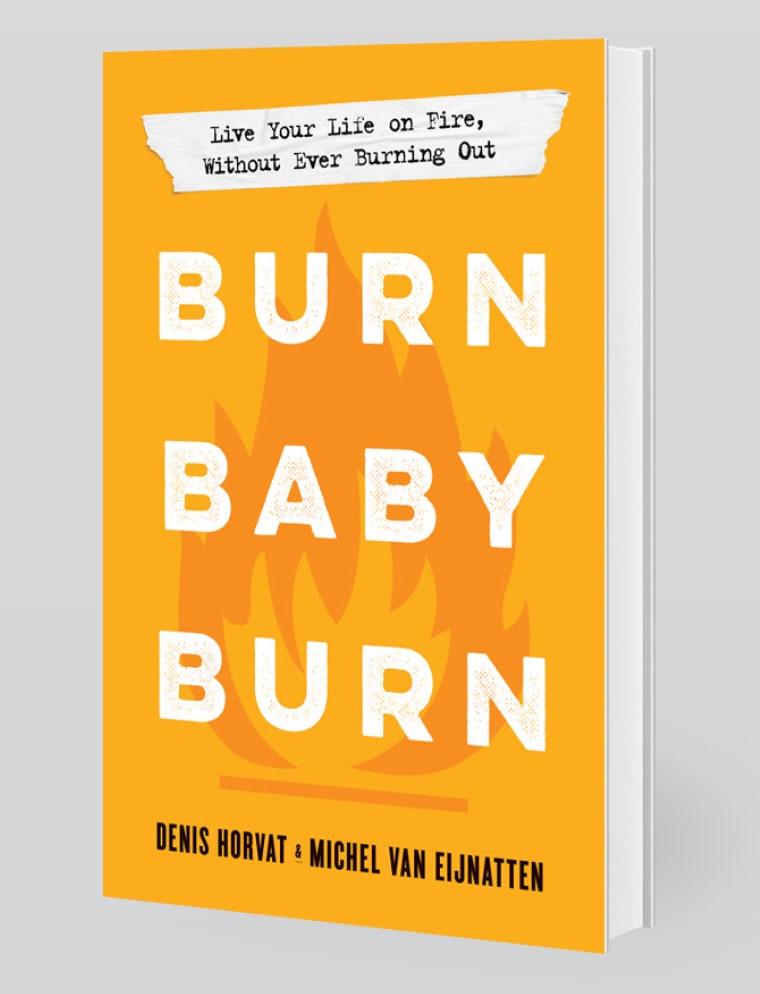
12 Responses to Option A
the higher ranked covers have more character with the graphic having correlation to the title of the book. the more interesting and eye catching the cover the better it is to draw in attention at a glance
I like option "A". The cover looks simple, yet appealing and attractive.
A: Like the fire logo in the middle of the book. C: Font style with ashes look cool and suits the title.D: burn graphic on right corner looks cool.B: don't like the fire extinguisher.
Considering the apparent message of the book, it seems better to have imagery suggesting active fire rather than a fire that has already happened or needs to be put out.
easier to read font and better theme
I like the background graphic of the fire. It is subtle, but it goes well with the title. I felt the others have this aspect as well, but they either miss the boat or a little too much.
I like #1 because it has eye catching graphics on the front and you can tell quickly what the book is about
I ranked option A #1 because I really think the flames on the background directly connects with the topic of the book; and also like how clear the letters are written. I chose option D as #2 because of the flames coming from the lower section of the book and also the words are so clear and well-written.I chose option C as my #3 because I was not really very convinced on the concept; I understand they are trying to chose the words burning but they get a little difficult to read.And option D is not one I would recommend, really don't like th concept of the extinguisher.
The font was creepily washed out in C and I disliked that A didn't really have any kind of attention grabbing marker on it. I liked that A clearly indicated burning with the flame and that B featured the fire extinguisher.
I chose option A because of the fire graphics in the background drew me into the words whilst grasping my attention in a unique enticing way. The only bad thing about it is that the text is white instead of black or else I think it would be perfect. Option c I ranked # 2 because of the creative text. I ranked Option D the worst because it was really corning corny seemingly to me.
I picked option B as my last choice because the title of the book, and the background image are opposites: you want fire, so let's not show an extinguisher. Option A is my first ranked choice because the image and the title are in sync, convey the same message. Option is ugly, it reminds me of carbon, it makes me think about people that are pro carbon mining.
I really like the font and the flame in the background of the first choice, I then chose on the font I liked better from the rest
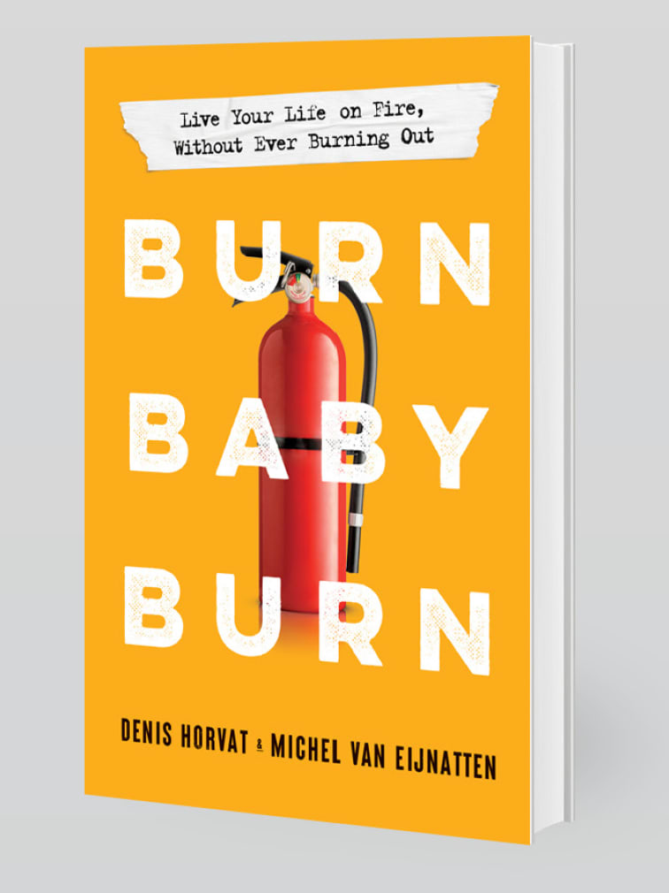
12 Responses to Option B
The one with the red fire extinguisher stands out the most to me. It looks the best.
I prefer this one the photo really makes sense with the burn baby burn!
I prefer option B out of these 4 options because I think the image of the fire extinguisher on the background is the best imagery in terms of fire and burning which makes me interested in the book as well as catches my eye.
My top choice is Option C because I like the image of the fire extinguisher putting out those crazy fires I’m living with. My second choice is Option D because I like the Font and it feels like a good feeling. Option C is third because the font is cool, but it has a bit of a criminal vibe to it. I don’t like A because it feels like it encourages fires, which is the opposite of what I would want. I would want to manage the fires, but not encourage more.
B is literal, eye catching, and unique. D is cool with the burned corner. A is simple. C is way too plain and lacks the eye catching colors and appeal of B and D.
Option B is superior by far because it shows how to put out the fire. D, C, and A are not as good - I ranked those in order of easiness of reading. I can barely read A.
b - i really like the fire extinguisher, it makes me think - given the little blurb bubble that this book may help me put of the fires that are causing my to "burn"a - i like the all orange background, with no logo - but this is second because the little burn in the lower right - at first, i thought it was a bug and it wasnt clear that it was to simulate the book burningd - not horrible, but obviousc - i just dont like the font - it feels juvenile
The cover with the fire extinguisher caught my eye immediately
I liked the idea of option C but it is difficult to read. Ultimately I decided option B was best, as it was eye-catching, and the image corresponded with the title well. The red extinguisher behind the text made the text pop out as well.
I voted based on my preference for fonts and overall creativity. I think the fire extinguisher and burning corner are both creative ideas and eye-catching.
I feel all these book covers are effective and get the message accross that the message is about checking themselves before they burn themselves . I picked choice B because I liked how it looked the best but they're all good.
The one with the fire extinguisher caught my attention and would entice me to pick it up.
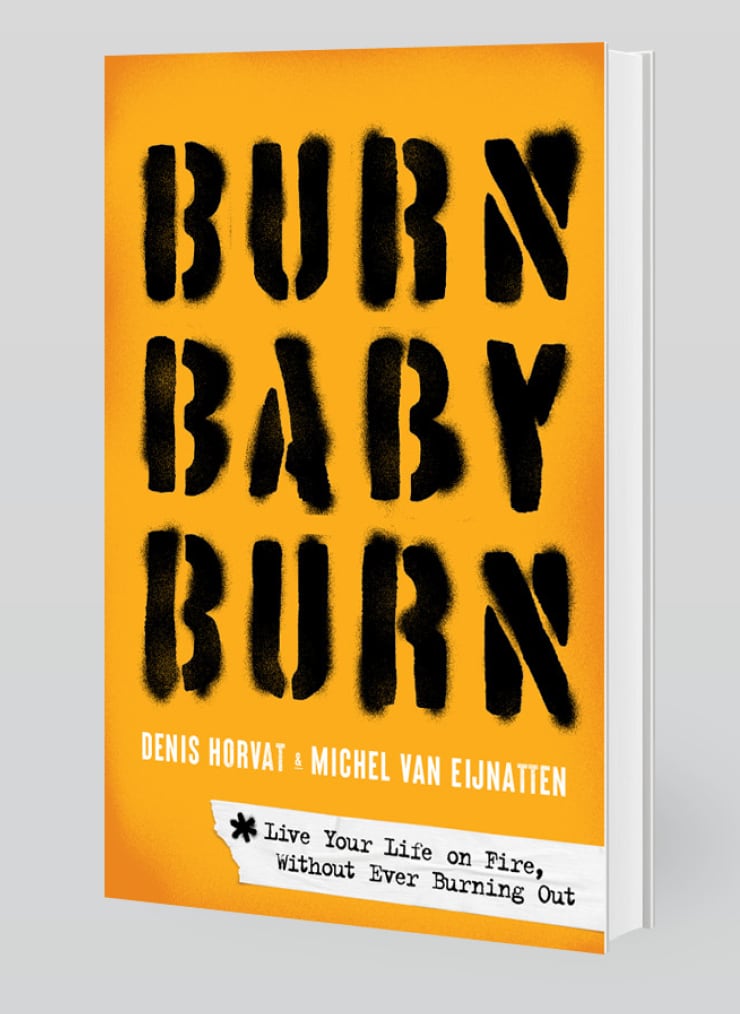
10 Responses to Option C
Option C looks the most unique and looks the coolest
Option C is the best choice because it has a powerful impact without any distracting elements like the fire extinguisher.
I like the font that looks unique here
I like the fount and color of the fount looks on c. B and A stand out thanks to the background behind the title. D doesn't stand out at all.
I chose option C because the burned in images of the letters look great on the cover. Option D is second because I like the burned corner look on the cover. Option A is third because of the image of a fire as the background on the cover. Option B is last because it has a picture of a fire extinguisher which is not a good fit for the title.
My top choice really sticks out to me. It fits the book's theme and catches my eye best too
Option C: The thick, black spray font was the first one to catch my attention. Option D: The bottom right-hand corner on fire is a good display of the theme of the book. Option B is not that suitable in my opinion as a fire extinguisher is more suitable for a book title like "Live your life with safety measures".
THE OTHER COVERS HAVE PLAIN FONT THAT MAKE THEM SO PLAIN. I PREFER THE BLURRED FONT OF BOOK C BUT THE SMALL DETAILS ON THE OTHER COVERS ARE NICE TOO LIKE THE CORNER OF THE COVER THAT LOOKS BURNED. THE ONE WITH THE FIRE EXTINGUISHER IT ON JUST LOOKS TOO GENERIC TOO WITH NO CREATIVITY AND THAT IS WHY I RANKED IT LAST.
C is my 1st option because the font is quite impressed, it express something has burntD is my 2nd choice because the right bottom corner is burning, matches with the title and content of the bookA is my 3rd choice because it has fire symbol which emphasize the main idea of the bookB is my 4th choice because the fire extinguisher is used to put the fire under control, it's not what the content of the book should be
I really like the burnt font effects of Choice C. Choice A also has strong fire imagery in the background, as well as Choice B with the image of the fire extinguisher. Choice D has a very subtle hint to a burning page at the bottom corner, which doesn't jump out to the eye, so I ranked that last. The top 2 have the strongest fire-related visual components.
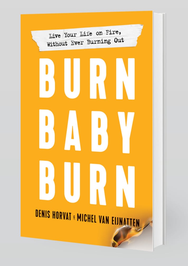
16 Responses to Option D
D is the most attractive to me. B is a cute cover. A is conservative. I do not like C
D looks the most unique to me, I like the burning corner, that really stands out to me and looks like a high quality and distinctive design.
I think D would possibly be the most attention grabbing. The "burning" illustration is fun, eye catching, and suits well with the title of the book. It would certainly make readers want to find out what the book is about and read on.
Okay, so A was my least favorite because the stylized flame feels a bit too soft and gentle to me and so it doesn't actually read as particularly fiery, especially the way it's only a couple of shades different from the rest of the background. I liked that B had a very vivid image that was identifiable at a glance as fire-related, and I would have ranked it first except that a fire extinguisher feels kind of contradictory to the tagline of *without* burning out. So that knocked it down to second place, with the other one that had an image that felt very fiery taking first place. That's D, and I just wish the bit of fire at the corner were bigger and taking up a larger percentage of the cover, because it felt a bit too minimal for me to be head-over-heels for it, even though it's still my favorite. And then C was neither one of my two favorites nor was it my least favorite, so that leaves it sitting neatly in 3rd place; I felt like it captured the emotional feel of the tagline but not the whole fire concept. (Unless that's supposed to be, like, ash? It looks to me like spray-painted graffiti which is what I'm assuming is intended.)
I love the little fire detail at the bottom of option D, very eye catching. I do like the nice clean look of option A but still has a fire in the background.
The top choice looks more motivational. There’s great symbolism of the burning corner, the corner to open and start reading and change your life.
D is the least cluttered and it's simple and easy to read. I like the flame on the corner. I like A a lot but simpler is always more attractive to me. I don't like anything behind the text. C is not good at all, it looks spray painted on.
I like option D the best because I like how the cover has the burning image in the lower right hand corner. That image draws my eyes right to the cover and in turn causes me to read the title and description of the book.
I really like option D. I like the bottom right hand corner of the book where it looks like a page is burning. I feel like it fits very well with the title of the book. For the other options, I ranked them based on how well they fit with the title and how professional the covers looked.
Option d is the best cover in my opinion because of the burning at the bottom of the page. Option B is OK, depending on the books contents. But it seems to be the opposite of the title. It's burn baby burn not put the fire out. The other options are basic and out dated font in my opinion
D is pretty clever, I had to do a double take with that one! So that would be my top pick. The others are all good save C, I don't really see how anything there ties in with the theme of FIRE and BURN.
The black font is a little hard to look at, so I put it last. I really like the design of Option D. I think it's nice and simple with the subtle burning at the bottom.
I like the smoldering corner on D. If your on fire without burning out the fire extinguisher seems misplaced
I picked D because it is the best looking phot for a book.
D has the coolest look with the burning flame on bottom corner. B second best with the extinguisher in the background. A Is a lot more readable with the white font in front of the flame background. C Least interesting in my opinion.
Option B is the more attractive to me, I like the fire effect from the lower corner. I would have chose a different font style.
Explore who answered your poll
Analyze your results with demographic reports.
Demographics
Sorry, AI highlights are currently only available for polls created after February 28th.
We're working hard to bring AI to more polls, please check back soon.

