Poll results
Save to favorites
Add this poll to your saved list for easy reference.
Which book cover is the most appealing?
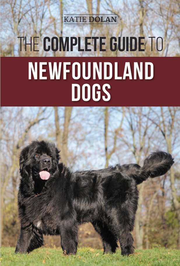
Option C won this Ranked poll with a final tally of 40 votes after 1 round of vote counting.
In a Ranked poll, respondents rank every option in order of preference. For example, when you test 6 options, each respondent orders their choices from first to sixth place.
PickFu requires a majority to win a Ranked poll. A majority winner differs from a plurality winner. A majority winner earns over 50% of the votes, whereas a plurality winner earns the most votes, regardless of winning percentage.
If an option does not earn a majority of votes, PickFu eliminates the option with the lowest number of votes. The votes from the eliminated option are reassigned based on each respondent’s next choice. This process continues in rounds until a majority winner emerges.
Scores reflect the percentage of total votes an option receives during the vote counting and indicate the relative preference of the respondents. If there is no majority winner, look to the scores to see how the options fared relative to one another.
| Option | Round 1 |
|---|---|
| C | 80% 40 votes |
| A | 14% 7 votes |
| B | 6% 3 votes |
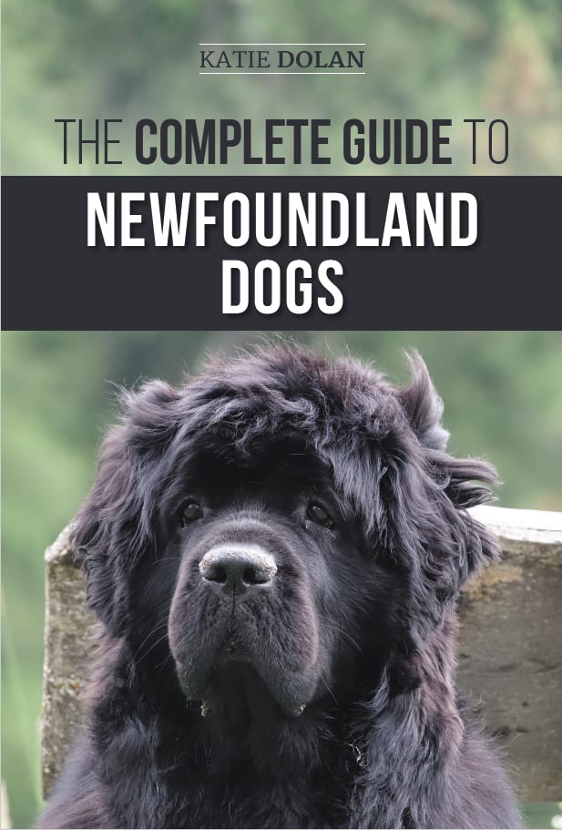
7 Responses to Option A
I really love the picture of the dog on A, the red cover and the full view of the dog on C and B I did not care for as much as it looked lower quality.
That is a good looking cover. Good looking dog picture. Yeah, between the three, I think option A is definitely the nicest looking cover.
I chose A because I like the full face of the dog in an environment that many can relate to.
I like option A because I feel it is the most engaging and novel. Option B and C are decent but don't captivate me as much!
Option A and C are very cute and capture the dog's personality well.
The facial expression in Option A is so sweet! I like the layout and headshot of the dog in Option B, but it needs to be cropped better. It looks as if his mouth is almost off of the cover. Maybe reduce the image or raise it up a bit and have the black rectangle cover a the top of his head.
The colors go really well together in A and I like the close up shot of the Newfoundland. Otherwise C would be great with the full dog, but maybe in the same color scheme as A.
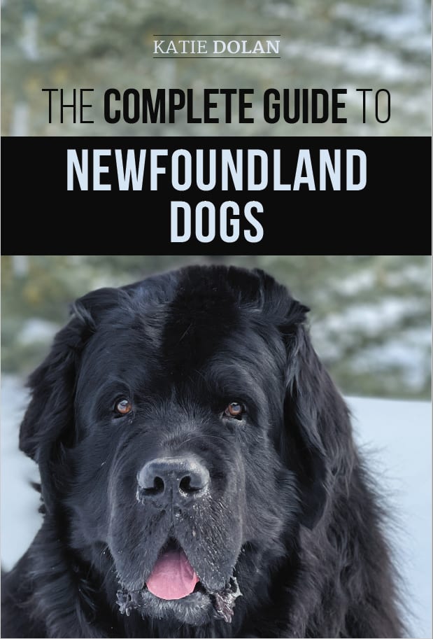
3 Responses to Option B
I am drawn to the up close view of the Dogs face and it makes him look friendly and approachable.
the book cover in option B looks the most appealing because the dog is beautiful
B and A are the best looking for these books as they have a close up on the dog
40 Responses to Option C
I think it looks best showing the entire dog on the cover.
Images that showed dogs as happier got my attention more than the others.
I'd rather see the full image of the dog to better understand the overall characteristics of the breed. Big legs, long tail, thick coat, all things I want to see.
The whole dog sells the book, not the face.
I like C the most because it shows the size of the dog. It would be better if there were also a person in the image.
For me the addition of color was what made the book stand out to me and catch my attention.
The shadow on option B makes the dog look creepy, and seeing a full body dog is the best.
The dog in B needs to be cleaned up a bit and there is a more blue, off putting tone used in A and B. C makes the breed of dog look a lot more majestic in the orange tone.
I prefer Option C because the cover is the most dynamic and eye-catching due to the outdoor background. In addition the dog looks both majestic and playful, giving a wonderful taste of the dog's personality.
I like to see the full body of the dog as that is informative. The eyes of the dog in my second choice get my attention.
Option C. I like how the newfoundland is shown full body in the image with the grass and trees in the background. It is very appealing and just off of the cover you get full description of what the dog looks like.
Option C was chosen for the really nice full image of the dog.
I ranked the designs of the book for the complete guide for the dog that I liked the most. I liked the color of the banner of option C the most followed by the lighter image of the newfoundland dog of option A more than option B.
I like option C the best because I like that I can see the whole body of the dog and I like the rusty colored brown color that is behind the "Newfoundland Dogs" white text. I also like that the image shows the dog being outdoors standing on the grass with the trees behind it.
I like how Option C shows the entire dog
I like the dog's expression best on choice C, better to have a farther off view.
I chose C because I like this one best. I like the look with trees in the background.
C's shows the dog as prominent and not as derpy looking like the other covers.
C is more appealing because it shows the whole body of the dog. The picture is more eye-catching than the others.
I like this one the best because of the full body picture of the dog. It looks the cutest that way. I like the long tail
I chose option C. I think having a full photo of the dog looks very good and the photo itself is very well lit and looks great.
I prefer seeing the entire body of the dog, not just the face.
My top choice is C because it is the best visual representation of this breed and their size. The picture itself is very beautiful. I wish the banner for title was not in red/burgundy because it clashes, but this is the best overall cover. I like that A and B have a black banner with white print but the dogs look like they were put in front of fake backdrops.
C is my favorite for a couple reasons. I appreciate seeing the whole dog cause it gives me better perspective. I like the un-blurred background of outdoors. B is an attractive photo and it's preferable to A, because that dog has no expression.
Seeing the whole dog is best, and having the tongue makes the dog appear happier.
I chose C first because I like how it's a sunny day and the maroon color instead of the black color. I think the brighter colors are much nicer looking than the other two.
Cover 1 shows a good example of the dog. it is a clear picture with a lot of distinction between the dog and the background. 2 shows the distinction but not the whole dog. 3 is harder to see because the dog, features and background blend together more.
The red is more eye catching. B and A have dull backgrounds
I liked the photo of the dog in C. Also the banner in C is more visually pleasing than in B & A. I thought the photo in A was the least enticing.
I prefer this version because it makes the dog look strong and majestic. The dog looks like a big slobbering mess in the other versions.
In the Option C the picture of the dog is most attractive along with the background. The title color bar could be changed to a different color like black maybe to match the dogs fur & color. I would go with C because we have the cute face close up in that picture also the title bar is black so makes more sense. But based on the picture taken in option C that still looks the best.
The most appealing cover in my eyes is option C, because of the outdoor setting where the dog stands. The vibrant colors of nature is what makes the image a far more appealing cover. Options B&A equally promotes an image of a bad and un-cared for animal due to the darker scenery surrounding the dogs.
I think the picture of the dog and the colors really pop out more. B and A feel a bit more bland and generic to me.
I prefer the option C dog guide book cover because I like the bright background scenery and how the full body of the dog is shown beneath the red background text highlight the most. I chose option A second because I like the more distinguished look of the face of the dog in this book cover. I chose option B last because I do not like the snow covered background nor the black text highlight on this book cover because it matches the fur coat of the dog.
I made my choices this way because the picture where I could see the whole dog looked the best. I also felt that the colors and design stood out the most and made you feel some type of connection with the book.
Option C looks like a dog in a natural setting. The dog looks happy and in a playful mood with its tail outstretched and hanging out. It is a great photo of the dog with the trees in the background. The photo really captures a dynamic scene.Option A looks like a dog having a bad hair day leaning up against a tombstone. And, the dog is drooling.... Not a great image to have on a cover of a bookOption B, the poor dog looks like it has a mohawk. The dogs muzzle is not clean. Option B really doesn't look like it has a background as it is completely blurred out. Option B is a mohawk dog with a dirty nose.Option C is by far the superior photo. It gives the dog a majestic look. Just the look you want for a book cover.
The full picture of the dog looks better and the brown banner is more appealing with an outdoor background.
I love the dog on choice C best. This shows the dog is in a profile form. B was second with the dogs mouth open and smiling. A was last because the look might be seen as more intimidating, with his mouth closed.
I like the cover page image of the option C.It was well designed with dog image.It was completely differ from the other cover pages and had some uniqueness.The background theme color and the effective text format were enhancing the look of the cove page.
The cover design in Option C looks very catchy and appealing, the background photo is what's more attractive.
Explore who answered your poll
Analyze your results with demographic reports.
Demographics
Sorry, AI highlights are currently only available for polls created after February 28th.
We're working hard to bring AI to more polls, please check back soon.

