Poll results
Save to favorites
Add this poll to your saved list for easy reference.
Which book cover would make you more interested to read it?
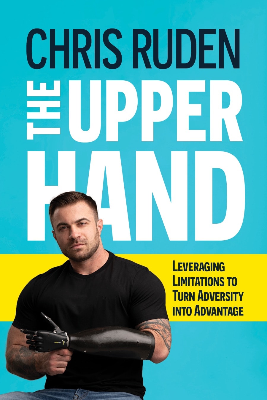
25 Responses to Option A
I like A because I think the name and title at the top looks more attractive. I also think the close up picture of the author looks better too.
A is my preferred choice because of the uniqueness of the book cover and the display content, the design looks good and attractive and will call more attentions to it, it a beautiful and mature idea of design and it is pleasant to the eyes
The book cover in option A looks bolder and more serious. I like how the writer is looking directly at me as it seems like he takes the subject more seriously and he can be trusted more. The look of the cover in option a is powerful, strong looking and seems to have a lot of knowledge
I like the larger picture of the robotic arm, more eye catching
A gives much more of an impact. You can clearly see that the author has a prosthetic arm and the title is much more promient and powerful.
I picked A as my top choice as I like how it shows a closeup of the guy with the fake arm.
I think A puts more emphasis on the "upper hand" with its image that is on the cover.
I chose option A because I feel this image really shows the author looking determined. I feel just look on his face makes me feel like this is a motivational book and that this was the perfect image to demonstrate that. .I feel that in the alternative he looks like he is just hanging out oppose to this option he really makes me feel inspired.
I like option A the best because I like how the author and title are in big print at the top of the book. I then like how there is a close up of, who I assume is the author, showing his prosthetic arm that times in with the tagline next to him on the cover.
The prosthetic arm is more noticeable and eye catching. Makes me interested quicker.
A looks more professionally made. B looks Author made. Both would probably see, but A would sell much better. The size of the text, location of graphics, are all better proportioned in A.
I would be more interested in reading Option A. I think the photo of the author makes better use of space in Option A, and I appreciate that Mr. Ruden is looking at the camera and making eye contact - it feels more inviting than the photo in Option B. Overall, I think Option A better uses the full space of the cover without looking cluttered - all of the information is easy to read from a distance and is attention-grabbing.
I prefer option A because the model looks more compelling and complements the book cover. Option B does not look as refined to me.
These are sad. Lol. So much self absorbtion. Get the face off the front
I prefer A because the text is a lot bigger and darker which makes it easy to read. It also makes me feel like this person has authority and he knows what he is talking about. I also like seeing the close up of what may make this book interesting (his arm). That instantly gets my attention while with B, I feel like I don't notice his arm as quick.
I think this image gets the point across better and goes better with the title.
I feel like A is more attractively laid out and fills the cover space better, making the book look more appealing.
it puts his arm in a bigger focus of the photo, i liked that a lot
After carefully studying both images of book covers displayed above I selected Option A over Option B because I was attracted to the male profile that appeared to be looking directly at me rather than off to the side. This grabbed my attention and seemed to be more appealing to me than the other image.
I actually didn't even notice the robotic arm in B. After noticing it in A, I went back to B, and could clearly see it. I think A is the better book cover because the robotic arm is way more noticeable, which is probably a good thing since the book is about that.
I think the hand is more visible in this choice and it's cool and something you want to display
I chose A because the cover is positive.
I like the more close-up picture of the author. It makes him look stronger and more worth reading.
Both are, honestly, kind of corny. I prefer A because it's a little bit more calm and better
Choice Option A would definitely make me more interested to read the book. With that cover I really notice his artificial arm quicker and understood the book title in relation to it.
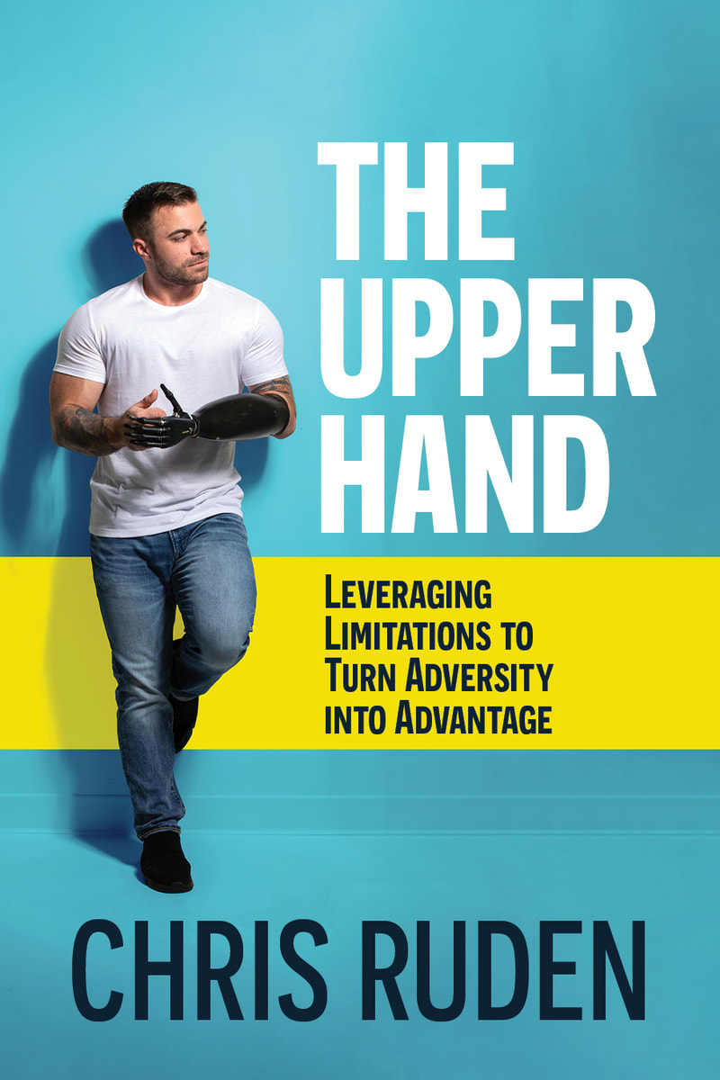
25 Responses to Option B
I think B looks a bit nicer and a bit more unique than A.
The pose here is a bit less intense
This one is better because the dudes fake arm stands out on his white shirt and it draws your eye, whereas the other one hides the arm and you don't really get the whole point of the joke title.
I really like the full body shot, gives me a glimpse into what his everyday would be like, makes me feel that though he may not have his hand, he has the rest of his body. whereas option A, makes me think he is in a wheelchair. the facial expression of option A is forced and superficial, like he is trying to make himself look sexy, loosing that connection between the title and his picture. option B, i like that his looking away, like if his looking into the future.
option B has a more intriguing title and picture
I thought Option B was more eye catching because I can really see him and the artificial arm in this image. I think the white shirt helps to highlight the arm. The white shirt also works well with the white font color of the title.
I like the full scope of the person and smaller font for the title.
The pose here is less cliche and stands out more, and the arm stands out more.
he looks less intimidating in this photo
I like choice B with the full body pose, more of a stand out statement, attention getter.
I would prefer this version as it seems to be written by a more competent writer based upon the overall appearance of the person on the cover.
Option B is interesting
I strongly prefer Option B. It's more attractive and subtle. I think Option A is too "in your face" and looks typical of this genre. I am really impressed with Option B and would have no hesitation reading more about it.
The photograph on option B makes the gentleman look more thoughtful and insightful - the expression on his face makes him seem like someone who has something interesting to say. In option A, he has kind of a motivational speaker/pro athlete look - confident and attractive - I'd watch that guy on American Ninja Warrior, but I don't know if I'd want to read a book he wrote.
The layout of Option B is much better. It makes it easier to read and focus on what the book is about and what it has to offer. The image is also a little better and makes you notice more right away what limitations this man has. It is also just more visually stimulating and catches your eye more right off the bat. It would make more people notice it and want to pick it up. Option B would appeal to a wider audience of people and would make them more likely to dig deeper into what it has to offer.
I chose panel B. The man standing at a wall contemplating turning adversity into prosperity. I like the symbolism.
I thought B was better as it had a full picture of the "one-armed-man" which really brings home what he has to contend with more for the resources he has.
I would be more interested in Option B. It's more unique. Option A seems to be the default for a lot of lessons/lifestyles/biography type of books - a head on image of the author. Option B with him standing off to the side in a relaxed pose is more unique and appealing. Also It's more clear what his "limitation" is since he's wearing a white shirt. I honestly didn't notice the arm/hand on the Option A cover because it blends in with the shirt too much.
I chose option B because I prefer the layout of the title, author, tag line, and picture in this option. It's easy to read at a glance and gauge my interest in the subject matter. I prefer the picture of the author on the cover in option B as well, I think it's more flattering and wearing a white shirt makes it easier to see the author's prosthetic hand, making it easier to understand what information will be in the book.
I like the full body shot here. Makes the person seem more real.
I like b's body shot more than a's sitting down
While both are very similar I like the placement of things like the title, picture of person and subtitle better in B.
I like how more laid back Option B is. I almost think Option A might be a little too aggressive in the wrong manner and might give the wrong vibe for this book. So generally I'd rather go with B to read.
makes me focus on the title -- option A is distracting as the guy's image on the foreground is too out of proportion
I like it better with his name at the bottom because it shows the actual book rather than his name.
Explore who answered your poll
Analyze your results with demographic reports.
Demographics
Sorry, AI highlights are currently only available for polls created after February 28th.
We're working hard to bring AI to more polls, please check back soon.

