Poll results
Save to favorites
Add this poll to your saved list for easy reference.
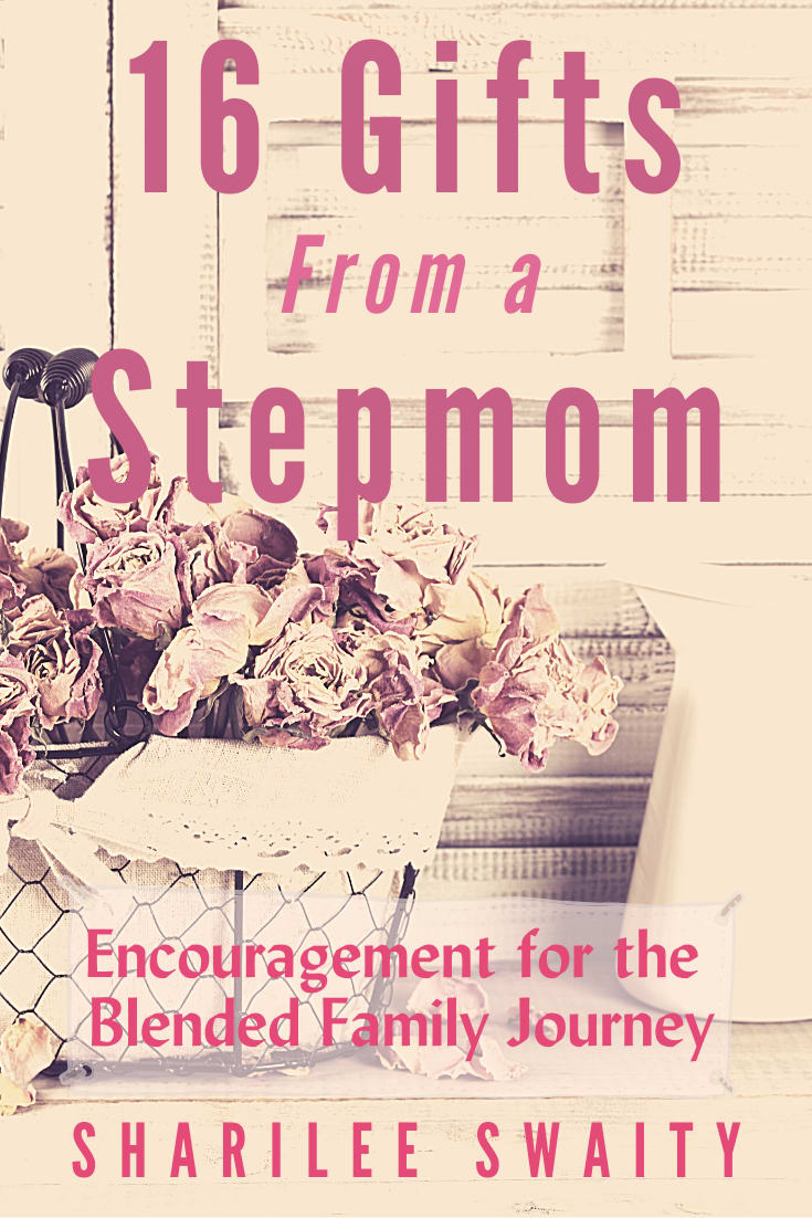
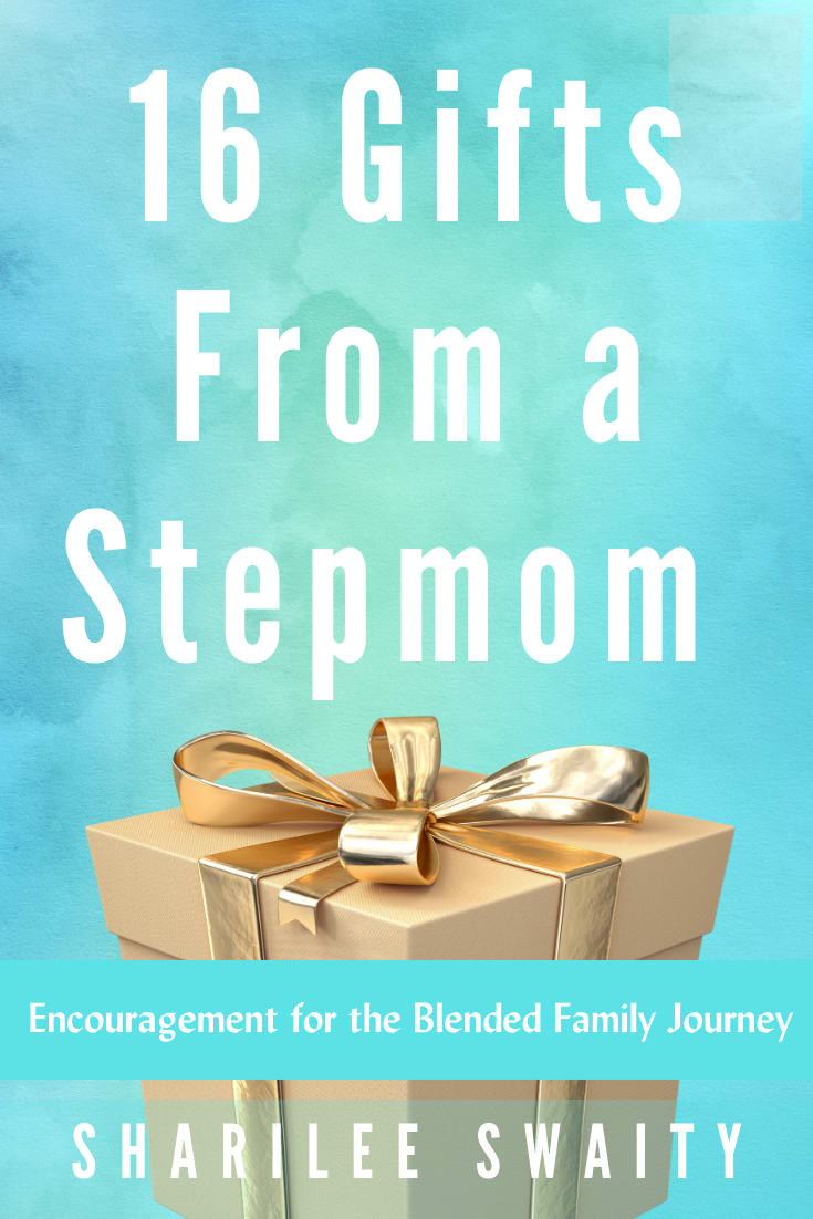
Which book cover would make you more likely to pick up the book? This is a book to encourage stepmothers.
Age range
Education level
Gender identity
Options
Personal income range
Racial or ethnic identity
22 Responses to Option A
I like the dried flowers in the basket for the book cover.
I like the colors on A more than B. A is more catchier to the eye.
A looks more professional and like it was designed by a graphic designer. B looks more like someone random designed a book cover.
I like the farmhouse cover. the more modern one seems unfriendly
I love the color and femininity of the front cover.
I'd be more likely to get this book because the cover imagine is more appealing and feminine.
I prefer option A because the image is more appealing, it looks "less trendy," and the font.
the cover of this book is more pretty and eye catching to me.
Colors are more appealing to me
I like the color of choice B much more, but I chose choice A because the cover artwork looked like an old photograph which I associated with the author being older and therefore wiser.
The background image looks really nice as opposed to just a plain background on Option B. The image of the flowers are appealing. The color scheme of the book is nice, unique and feminine.
I chose option A because it is more vibrant and feminine than option B. Option B is also a nice cover but definitely isn't as enticing as option A.
The color of the cover in Option B looks like it's from Tiffany. So, that makes me think that it's too hoity-toity for someone like me. I think the cover in Option A looks like it would be more relatable.
I would choose this one because the color makes me think of a stepmom more.
I prefer this cover because it is softer and the flowers evoke a sense of compassion. I am a step-mother and would buy this book, but I am attracted to the pink cover moreso than the other.
the flowers present a warmer picture
I like the softness and floral image and colors of option A. I would select that over the blue. Sometimes being a step mom is hard so the softer look is better.
I love the color scheme in choice A. I think it gives a more relaxed vibe than choice B where the colors are brighter and a little more harsh feeling. I also like the bouquet of flowers in choice A as it conveys a softness and makes me think the book will be positive.
This cover is much more attractive, and seems more professionally done. I think for the specific audience, this is good.
I think the cover of A looks more intricate and more thought and design was put into the picture of the flowers. I think B looks too simple. I also like that the image is faded in A, it gives it more of a vintage look.
I think it's a sweeter and more feminine cover and color scheme
I like the soft colors better.
28 Responses to Option B
The blue is very eye-catching and stands out.
B is warm welcoming, and engaging.
I chose option B because the cover is bright and clean. The other option had a less bright color and it was very muddled. There is too much on that cover and it's hard to read and understand what you are looking at.
I like the teal background better and the picture of the gift on the front.
Option A looks too pink and has a rather cluttered look and vague looking imagery. The image of the present with the blue background on choice B looks far more appealing.
B looks more modern and this is a very modern topic.
Option A is noisy and has too much going on. Option B is modern, sleek, and clean.
The colors and overall design of this one are more appealing to me
The bright colors of the baby blue and gold would make me want to pick up this book as opposed to the drab tan and floral of the other cover.
This feels insightful. It is interesting and a good layout. I would look closer.
The blue stand out and looks really nice
I liked the blue pattern in this background. I think it helps me read the cover easier too.
B has a newer style to it. This reminds me of The Lovely Bones cover. A looks older and to me screams 1980s. I wouldn't pick up something that looks like it was written in the 1980s because that to me doesn't seem like it would be relevant to what we deal with nowadays. I'd rather read option B, then later on look at the copyright date to see when it was written. Even the Font looks older on the subtitle at the bottom. It may be the same on both books which I think it is but the styling (size and color) dates it greatly.
I prefer the blockout for the tagline and I find the teal/gold background more attractive overall. Option A feels washed-out and old.
B looks more interesting and energetic. It also looks higher quality to me.
i thought the word play and the image kinda played well together and the title and bookcover and subject matter felt right in this option i picked.
The blue color is both eye catching, postiive, and has a connection to some of the sadness that a Stepmother may face. The other one looks more "old" and that the information may not be relevant anymore.
I feel B is a better looking and more classy looking cover out of the 2.
Would like to pick option B is absolutely best book cover that more likely to buy when see the book, attractive as well, beautiful looking and every bright like stars in the sky.
The blue background with the gold really stood out. The gold title really stood out and made me def want to pick it.
I love the background color of my choice, it stands out! The picture of a gift box is a little boring though. The fonts are too big in both of these choices, which makes it a bit messy cover. I'd prefer the picture from option A and the background color of option B.
The bright color is more eye catching
The color palate is much more enticing and it's easier to read all of the text on the cover.
Option B is much easier to read. Option A doesn't have enough contrast to catch my eye or quickly determine my interest.
I like the cleaner, less distracting background.
Option B is more visually appealing and has a more modern, unique look to it. It doesn't seem as old fashioned and makes you believe the lessons it would offer would be new and relevant. Option B also matches better with the theme and idea of the book and would grab people's attention more right off the bat. Option B would appeal to a wider audience of people and would make them more likely to check into what the book has to offer.
I think B is much clearer. It is easier to read and looks more like a book than the art for A. I like the higher contrast in the colors. I think it fits better as a book image.
B is more appealing
Explore who answered your poll
Analyze your results with demographic reports.
Demographics
Sorry, AI highlights are currently only available for polls created after February 28th.
We're working hard to bring AI to more polls, please check back soon.

