Poll results
Save to favorites
Add this poll to your saved list for easy reference.
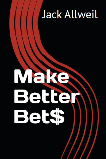
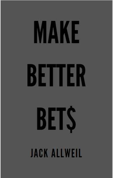
Which book would you buy?
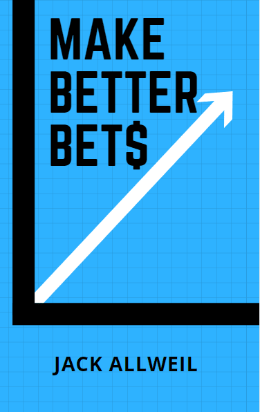
Option A won this Ranked poll with a final tally of 37 votes after 1 round of vote counting.
In a Ranked poll, respondents rank every option in order of preference. For example, when you test 6 options, each respondent orders their choices from first to sixth place.
PickFu requires a majority to win a Ranked poll. A majority winner differs from a plurality winner. A majority winner earns over 50% of the votes, whereas a plurality winner earns the most votes, regardless of winning percentage.
If an option does not earn a majority of votes, PickFu eliminates the option with the lowest number of votes. The votes from the eliminated option are reassigned based on each respondent’s next choice. This process continues in rounds until a majority winner emerges.
Scores reflect the percentage of total votes an option receives during the vote counting and indicate the relative preference of the respondents. If there is no majority winner, look to the scores to see how the options fared relative to one another.
| Option | Round 1 |
|---|---|
| A | 74% 37 votes |
| B | 26% 13 votes |
| C |
37 Responses to Option A
more appealing in order of selection
The cover is really appealing. It definitely catches me eye more than the other choices. The graph is a nice choice as well.
I like the graph on A
Went with my gut on these. Option C just looks a bit too plain, absolutely nothing. Option 2 doesn't make me think "betting". Option 1 really is the only viable one to me.
The number one selection I made is the coolest cover, and probably the only one if I saw on a shelf I would be interested in. The 2nd one is okay, and the third one is just so boring I wouldn't even think twice about walking past it.
I thought option A showed the idea of making more money with the arrow pointing upwards. Option B was striking in it's color choice and interesting design. I thought C was too plain and did not catch my eye at all.
I would buy the book in option A. I think that the color is dynamic and attention grabbing. I also think that the graphics are poignant.
A and B have interesting designs. A is more related than B. C is pretty boring.
I like the projection the cover gives. It is most positive and welcoming.
The upward trend seems to be about money and stocks here so I agree with this item shown here.
I found them all equally visually interesting and informative.
The arrow pointing up is always good for confidence from a visual standpoint in my opinion. C is kind of bland and doesn't show much to make me want to buy it but B is weird and don't understand the design marks on that.
The visual chart showing stable growth is a more visually appealing title page. It grabs the readers attention and tells them what they are looking at without having to make guesses or assumptions. I could see myself reading this book more easily than the alternative options.
I have to admit I'm not a big fan of the dollar sign on the S. That being said, Option A with the chart is my favorite because it illustrates the point nicely and it looks good.
I like the Blue. It is very eyecatching and attractive. I really like the arrow of it going up in the air and I love the font. I like the black one next with the red swirl in the back. It is very eyecatching as well.
The one with the "graph" is the mot interesting and professional looking. The one that's just a gray background is one that I would probably not buy.
I like the design that simulated rising income.
The vibrant blue was just eye catching. Very nice color.
Option A has a design that looks high quality and would be beneficial to read and that research was done. The other two options seem more generic in design.
I like the covers on the first two that I selected as I feel the colors are more aesthetically pleasing and appealing.
It's the one that looks the least cheap.
Option A is the best because I think the graph makes it stand out and conveys that your money will increase. B is second. I don't like the font as much with B and find the design to be too simple compared to A. C is last because it is too simple for my taste. It would not stand out to me.
I picked A for number one because the upward trajectory on the graphic implies that it's related to business or improvement. Option C was my second choice because as much as it's harder to read at first glance when compared to B, the black on gray is a non-standard choice so the fact it's different would make me curious. Option B was three because the red swirl over black doesn't really tell me anything or make it stand out.
The graph along with the title give me the impression that this is a great source of knowledge on betting.
I liked that choice A had a graph showing an uptrend, made me think this will help me win. The next choice I picked just because it had some color. The all grey/black choice C was not appealing at all, it was far too drab.
I like style A better, it looks catchier.
I want this books
I like choice a because the bright blue makes the letters stand out.
Book A is bright and eye catching. I also like that it shows an actual chart that lets me know the book is about the stock market. I prefer the color contrast on B to that of C. C is too dull and the gray is blah.
A matched my perception of what playing the stock market would look like. Of the other two, B was most colorful.
I think the blue color is the most striking, and is the most consistent with the topic of making more profits.
Blue is generally used to convey trust, so that is why I chose Option A as #1. I ranked Option B as #2 because it has nice color, but provides not as much of "trust" factor. Option C I ranked last because it is the least colorful and most boring cover.
I choose A first because of the grid on the front, it shows better winning ability. Second was B because of the art work, it shows a difference in contrast. Last was C because it is plain, flat.
I like option A the most because the graphic of an increasing profit catches the most. Then I like graphics better in option B than C.
The first 2 are more lively and would grab my attention.
I would buy the blue because it stands out the best, so A is my pick.
I feel that this cover has a "smarter" and more professional feel to it.
13 Responses to Option B
I like the graphic red and black cover the best.
I like the red background always more vibrant colors
the colors and the fonts were easier to look at
I think that bright and interesting book covers are very noticable.
The more colorful designs stand out to me more. The black and red looks the best
Of the options provided, and judging just based on the cover, I like Option B the most. It's got some appealing graphic design and use of colors to it, while maintaining a bit of mystery about what exactly the book is about exactly. Option A is decent too, though mostly if the book is about investing in the stock market since that's what the upwards leading graph immediately implies to me. Option C is by far the least appealing - it's just too plain, boring and dour to make me want to purchase it at all.
B was my first choice because it is the most interesting and original cover.A was second because the arrow pointing in a slanted upward direction suggests gain. C was third because there really wasn't anything about it that stood out.
The red black and white color combo creates energy and is dynamic
My first choice if I were buying one of the above books would be option B, because I like the darker colors of the cover, and the font for the lettering is larger and more noticeable. My second choice would be option A, because the cover is brightly colored which makes it stand out to me. My third choice is option C, because it's not attention grabbing at all and the colors on the cover are dull.
Option B is most eye catching with the black background and the lettering coloration that pops nicely off the page drawing my attention. Option A also is eye catching but the use of a graph type chart and arrow makes me think its more of a textbook for learning and not leisure reading. I would avoid the book. Option C is too drab and I would not even keep my eyes on it longer than a second as I scanned other books around it.
The gray one, C, is extremely boring and plain. I like the kind of 70s vibe of B.
black is a good color. the others are good as well
The cover I picked looks the coolest to me.
Explore who answered your poll
Analyze your results with demographic reports.
Demographics
Sorry, AI highlights are currently only available for polls created after February 28th.
We're working hard to bring AI to more polls, please check back soon.

