Poll results
Save to favorites
Add this poll to your saved list for easy reference.
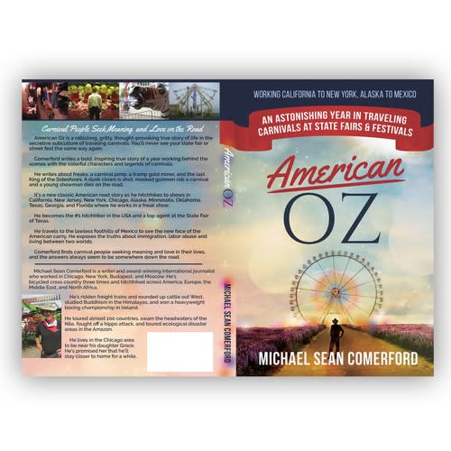
Which book would you buy?
26 Responses to Option A
This cover looks nicer in regards to art quality but it also seems more 'American' in my opinion.
I think A sounds the fanciest out of all of them
I prefer the more subtle colors - they are much more realistic.
I like the font of the title, which looks both classy and classic. Very cool!
I like the colors of Choice A more. The colors in the cover really spoke to me. It is an inspiring vibe.
COVER LOOKS BETTER WRITTEN
I like the less high contrast look.
I like option A. I think the background is endless which inspires hope and doesn't overshadow the author or title.
I like the color and less clustered cover. I will read
I like the way it oooks a bit more
I just think that the design of book A is a lot more appealing than the design of book B. Book A's colors are muted and relaxing, Book B has ugly garish and bright colors in my opinion.
The colors make it look more subtle and appealing to me
I like the more muted colors, it looks more serious
I like the more rural looking book cover here. It's not as busy. I feel that makes you pay attention to the text more. And that text is great to hear about how carnivals and state fairs are being run. This seems like a great read and the hitchhiking story seems like a ton of fun. Good looking book and the more earthy book cover looks better and more fitting.
I think this one really grabs my attention more, the colors are warm and peaceful without being overwhelming.
Choice A is more visually appealing to me. It is simpler and easier to comprehend what it is trying to portray. I like this image best.
The cover makes it look more of a classic
The other book cover looks too cartoonish
The colors are less obnoxious in Choice A.
A looks much more appealing; I like the design better and the cover seems to be more intriguing to me.
This book has nothing to do with the actual Wizard of Oz book so I chose A because there will be no confusion with the movie. B looks too much like the concept of the movie and I think people would get confused that it has no link to the movie.
The layout and color schemes of option a just look better to me and it also looks more realistic
Back and front are put together and design so much better than the other option, someone really put the time in on this.
the colors on A look so pretty and really pull me in. looks much more interesting than B
This has more realism to it and I prefer the art that is used in this instance here
it stands out a lot more. it caught my interest quick and kept me interested
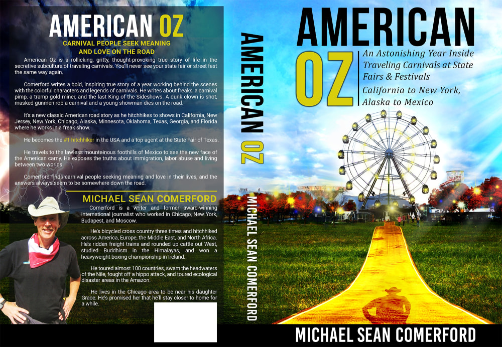
24 Responses to Option B
The cover photo is more colorful, exciting and inviting. The description is more detailed and interesting.
I am really drawn to the bold colors and long walkway into the scene.
I like the bright colors in Option B more, especially the bright yellow road. My eye was immediately drawn to that book.
I really like the picture of entering a fair. It gives you that feeling that you are going also. The picture would get me to look at the cover and read.
While Option A has a more patriotic feel to it, Option B was more eye catching. Perhaps if the colors were more vibrant in the patriotic one, it would change my mind.
immediately thought carnivals when i saw this cover, the other cover felt more like it was a country story, and this option felt like it matched up with the description best
I like the option B. It has a vivid colorful presentation.
The cover has a vibrancy if color that catches your eye
I love the fair and the ferris wheel reminds me of good times.
I feel like I prefer this book cover more because it catches my eye
This colorful book cover entices me to read the synopsis and find out more information. I find the scheme of colors bright and encouraging for the most part.
The yellow "gold" in B is a little better and more appealing for the yellow brick road that is in oz.
I chose Option B because the cover is colorful and I like the play off of Wizard of Oz yellow brick road. I think it would draw prospective readers attention in more than Option A.
I love the bright yellow road in the middle of the image, it caught my eye immediately
B is more vibrant- it makes me think the story is more interesting
the subtitle drew me in and i was drawn to it better b this cover
Choice B almost puts me in mind of the "Yellow Brick Road" and brings up a feeling of childhood which grabs my interest immediately. The bold happy colors from Choice B attract your eye immediately and give you a sense of warmth and a need to know more about the book itself. Choice A is nice but it would just blend in with everything else that's available on a bookshelf.
Would like to pick option B is an excellent design which is more attractive information on the page, fantastic tongo
It's brighter and flashier and grabs my attention. The yellow road is far more prominent.
I love the more vivid and colorful picture cover as it catches my eyes and draws my attention to it. I also prefer the authors picture placed as it is and not in a small box in the corner
The book seems to talk about different festivals and events, so choice B seems to be more suitable for the book.
They both look like great covers but the bright colors of option B would really stand out to me on a shelf so I would have to select that one.
B is a little more colorful and it makes it pop.
I would choose B and the reason is that the book captured my attention more than the other. The cover with the golden path is like inviting to the consumer I felt like I was being invited to come read the book and acquire knowledge about the subject matter which is carnivals. Also the back page I found fascinating because of the storm in the background overall the art attracts me to choice B and learning more about the subject matter.
Explore who answered your poll
Analyze your results with demographic reports.
Demographics
Sorry, AI highlights are currently only available for polls created after February 28th.
We're working hard to bring AI to more polls, please check back soon.

