Poll results
Save to favorites
Add this poll to your saved list for easy reference.
Which Book would you buy and why?
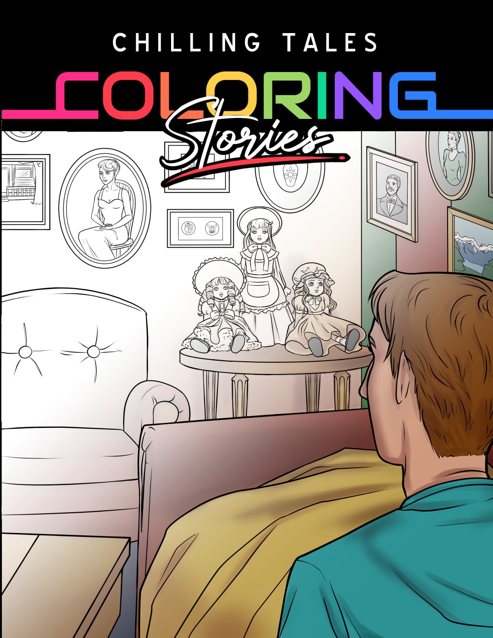
14 Responses to Option A
I prefer the title at the top so you can see the whole image in a, And I like the fade out on the color portion of the cover.
I chose a because the picture looks a little less detailed. I have an issues so anything with lots of details would be difficult for me to do.
it's obvious that it's a coloring book from the cover! I like that it fades to color. very creative
I like both designs, but I am drawn to Option A as the one scene on the cover draws me in and makes me want to learn more.
I picked choice A because I like the single image, instead of all the images melded into one. It is more streamline, but still gets the topic portrayed.
I like that the image in the background is not covered up by text title in the middle. It makes it easier to see.
I like the single scene coloring cover of A over the multi-scene of B.
This choice has a little color spread out over the whole picture, making it look more eye catching and attractive.
Option A I like it with the border at the top it brings it together. For the lack of a better word.
I wouldn't buy Option B because it promotes and glorifies violence against women and it's disrespectful to victims of murder and violence. If Option A also has those kinds of images inside I wouldn't buy it either.
The cover shows more open spaces to be colored, which is why I'd want to buy it. It looks clean and fairly simple.
I love this one more because the title of the book is on top making it more attractive to look at.
I like the larger image of option A.
the best choose A and good
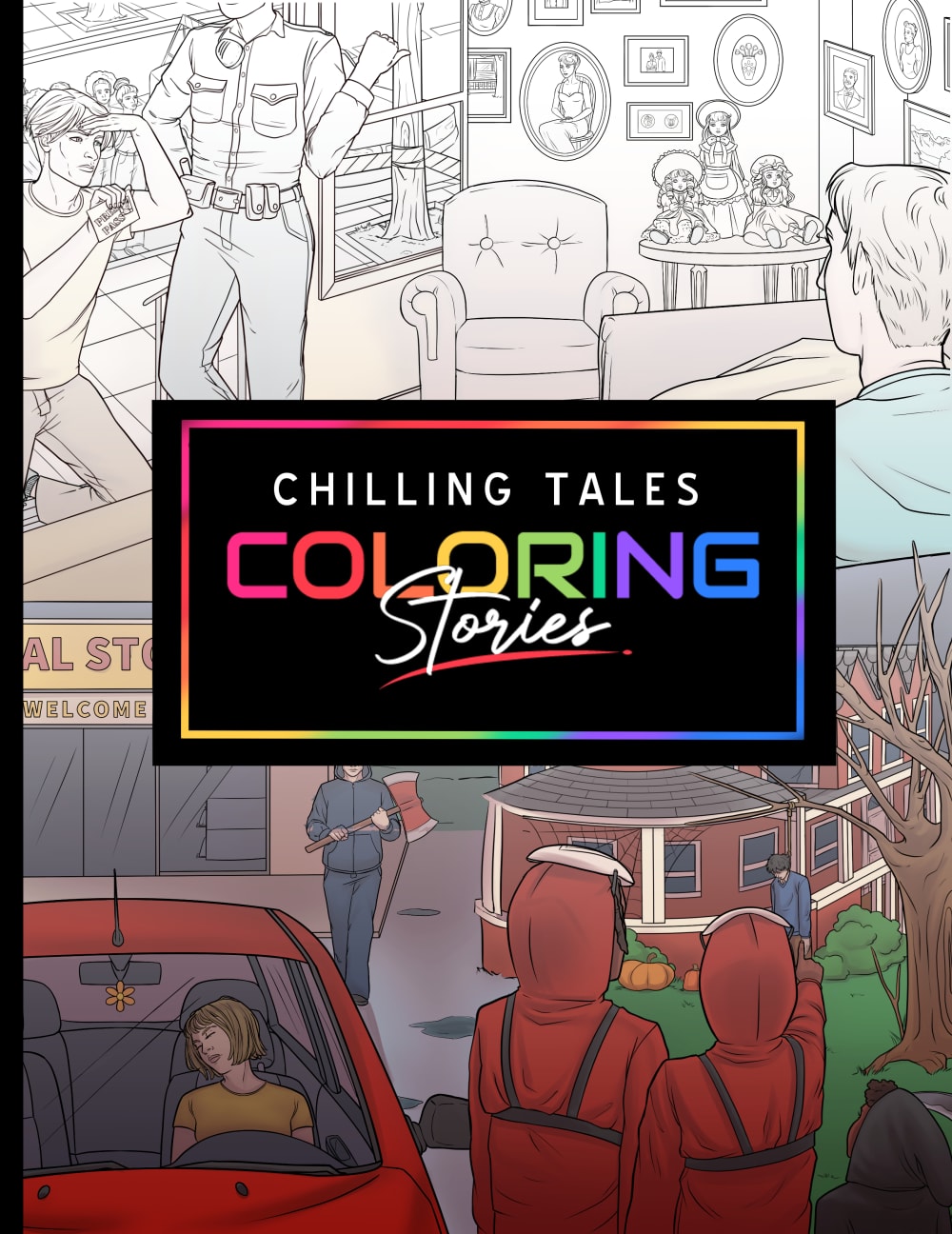
36 Responses to Option B
There is a larger range of color for an example as what can be done with these markers on B. The picture is full.
I would buy B because i like the colors and the pictures better then option A. A seems a bit boring and vague to me.
I like this one because it looks like there is more things to color on the pages.
This image represents the word chilling better since you can see chilling scenarios
This option featured richer colors and more complex drawings.
Option B is giving more of the chilling vibes of what the book is suppose to be illustrating.
This cover looks at least somewhat chilling. Not everyone is afraid of dolls, so Choice A just looks like a very ordinary picture to me.
I think B has more vibrant colors, and I like that the art has more variety.
I choose B because its graphic design is more creative, and visually appealing with customers, compared to A
I like the colors used in B more and I think it's more interesting than A.
i like choice B cause i like that it has more colors on it and i feel like it stands out more out of the two choices. i also think it shows the chilling stories better on the cover of choice B.
The cover of B looks way more interesting than the cover for A. I can get that A is a lot of stories rolled into one book, where A just seems like it isn't as involved.
The cover on B, shows me more "chilling" tales in a better way than A does. I didn't even realize A was something creepy or disturbing until I looked at B's cover.
B is bright, colorful and really grabs my attention and makes me get in the mood for coloring.
I feel like B shows off the fade from uncolored to colored better, and I like seeing the different stories on the cover.
B gives me a better sense of what the stories are about. It helps realize it is a little creepy vs just pictures of dolls.
Visually option A seems like it captures the essence of the product and it's purpose through its front cover
Both of these are great! B draws me in because there are so many possible stories depicted on the cover. There are a lot of frightening scenes and I can imagine various scenarios. A is good because I am right there with that man looking at these photographs that clearly have terrifying stories behind them. I think I would buy B over A. But both are very good.
I like B most because it shows part of a page colored in fully and one mostly blank. As a consumer you can imagine more yourself coloring it in.
Option B is more descriptive and "chilling". It shows more color and more choices. I like the title at the top of the page like A more than B though
This one looks more fun to color. I like that it's on the city streets.
I like that it has more color in the cover
I like this because it shows more examples and looks a little more interesting
Option B is very mysterious! I would purchase it because I would want to know what other mysteries are included in the book. It looks like it would be filled with fun and mysterious stories to color.
I like this layout a lot, gives it a much more dynamic feel and the top to bottom contrast seems more interesting.
I picked B as my top choice as I like the better view.
B looks very scary but I like the design of A because it is less cluttered . The price and the content would also help in my decision .
Option B is more visually intriguing and captivating. There is more diversity and creativity, as well as more to view.
I think I would find B more appealing because it shows more intricate areas for coloring, and also shows a variety of scenes. I do like the arrangement of the title and layout on A, and the scary doll scene is pretty intriguing, but the lower half of the picture with the guy seems like a lot of the image is pretty plain and doesn't draw me in very much.
The image in A doesn't match the title, there is nothing chilling about it. B is definitely chilling and seems interesting; I want to know what is happening in that picture.
I would buy B because it shows a number of different scenes - all of which look like they're out of horror movies or scary stories. Not having a context for A, it's a person looking at a chair? It's not a compelling image in my opinion.
I prefer option B. It looks like it has a more interesting and involved story.
I like how this one has a few different options to show you what it means, I feel like this would have been great as a Halloween product.
B because the scene is more interesting than the bedroom scene in A.
I prefer option B I think it is more appealing to have the logo in the middle of the page. I also prefer the images on the cover of B because I like that is shows half colored and half uncolored.
Both are super creepy, imo. But i do prefer this layout better
Explore who answered your poll
Analyze your results with demographic reports.
Demographics
Sorry, AI highlights are currently only available for polls created after February 28th.
We're working hard to bring AI to more polls, please check back soon.

