Poll results
Save to favorites
Add this poll to your saved list for easy reference.
Which book would you buy based on the cover alone?

Option A won this Ranked poll with a final tally of 28 votes after 7 rounds of votes counting.
In a Ranked poll, respondents rank every option in order of preference. For example, when you test 6 options, each respondent orders their choices from first to sixth place.
PickFu requires a majority to win a Ranked poll. A majority winner differs from a plurality winner. A majority winner earns over 50% of the votes, whereas a plurality winner earns the most votes, regardless of winning percentage.
If an option does not earn a majority of votes, PickFu eliminates the option with the lowest number of votes. The votes from the eliminated option are reassigned based on each respondent’s next choice. This process continues in rounds until a majority winner emerges.
Scores reflect the percentage of total votes an option receives during the vote counting and indicate the relative preference of the respondents. If there is no majority winner, look to the scores to see how the options fared relative to one another.
| Option | Round 1 | Round 2 | Round 3 | Round 4 | Round 5 | Round 6 | Round 7 |
|---|---|---|---|---|---|---|---|
| A | 22% 11 votes | 22% 11 votes | 24% 12 votes +1 | 26% 13 votes +1 | 28% 14 votes +1 | 42% 21 votes +7 | 56% 28 votes +7 |
| C | 14% 7 votes | 14% 7 votes | 14% 7 votes | 20% 10 votes +3 | 32% 16 votes +6 | 32% 16 votes | 44% 22 votes +6 |
| G | 18% 9 votes | 18% 9 votes | 24% 12 votes +3 | 26% 13 votes +1 | 26% 13 votes | 26% 13 votes | Eliminated 13 votes reassigned |
| H | 14% 7 votes | 14% 7 votes | 14% 7 votes | 14% 7 votes | 14% 7 votes | Eliminated 7 votes reassigned | |
| D | 8% 4 votes | 10% 5 votes +1 | 12% 6 votes +1 | 14% 7 votes +1 | Eliminated 7 votes reassigned | ||
| E | 12% 6 votes | 12% 6 votes | 12% 6 votes | Eliminated 6 votes reassigned | |||
| F | 8% 4 votes | 10% 5 votes +1 | Eliminated 5 votes reassigned | ||||
| B | 4% 2 votes | Eliminated 2 votes reassigned |
Age range
Education level
Gender identity
Options
Personal income range
Racial or ethnic identity
Reading frequency
Small business owner
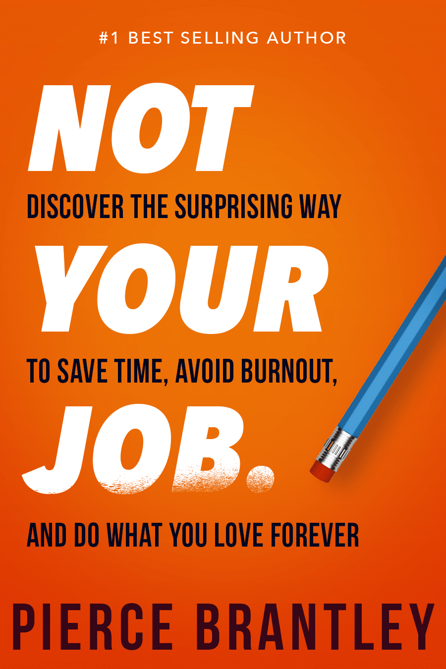
11 Responses to Option A
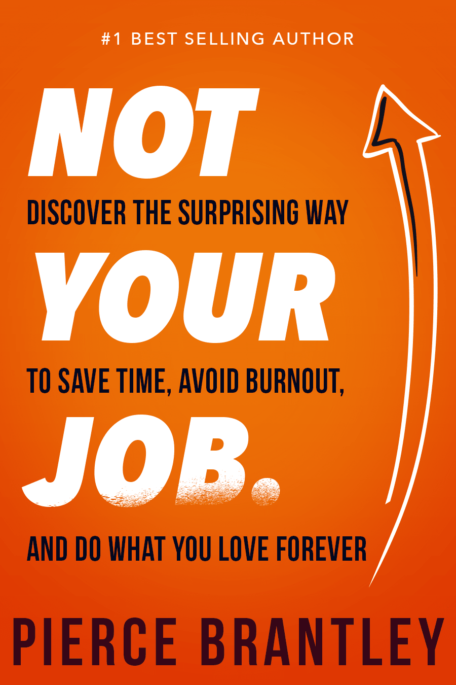
I like the words on the cover of option A, and I prefer the Pencil in option A over the arrow in option H.
I chose option A because I think "Not Your Job" is a more straightforward and catchier title. I also like the pencil on the book cover.
I would choose A because1> This book cover has bright orange color which is more appealing and giving positive vibes2> Font style and color is complementing the background color
Option A, with its provocative title and subtitles would have me reading in seconds. Many of the others have needlessly complex titles ("Entrepreneurial Management"), undefined terms ("Master Delegation"), and unattributed quotes ("Brantley is a Genius")--all of which seem needlessly tricky.
The NOT YOUR JOB covers got my attention right away. I also liked the ones with the thumbs up. The others had too much text and needed some graphics.
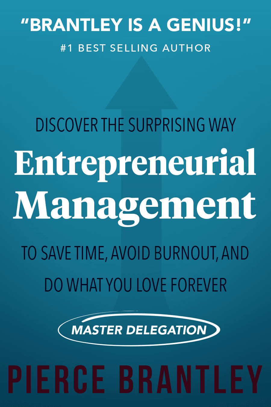
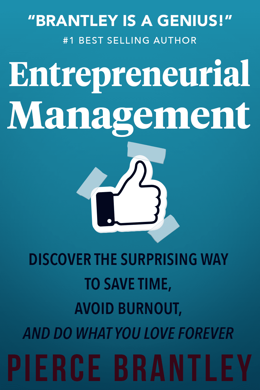
A / "Not Your Job" title is big, bold and grabs my attention.H / Title catches my attention. Arrow clip art feels out of place.D / Avoid burnout catches my eye, along with the title in white. C / Visually, this looks like option D to me. F / Hard to read text on the blue background.G / Hard to read text. The Facebook icon seems out of place here.B / Overwhelmed by text. Plus the arrow. the Genius quote. Feels like far too much on this cover.E / Too many things on the cover.
I would prefer the cover page on option A more because of its font and wording which does capture my attention.
Like the subject, but would get rid of the genius line.
This design is very bold and with minimal small text and I think this would make the larger impact
Option A is my favorite, I like NOT YOUR JOB as I am usually not good at delegating.
The cover design in Option A is just simple and nice.
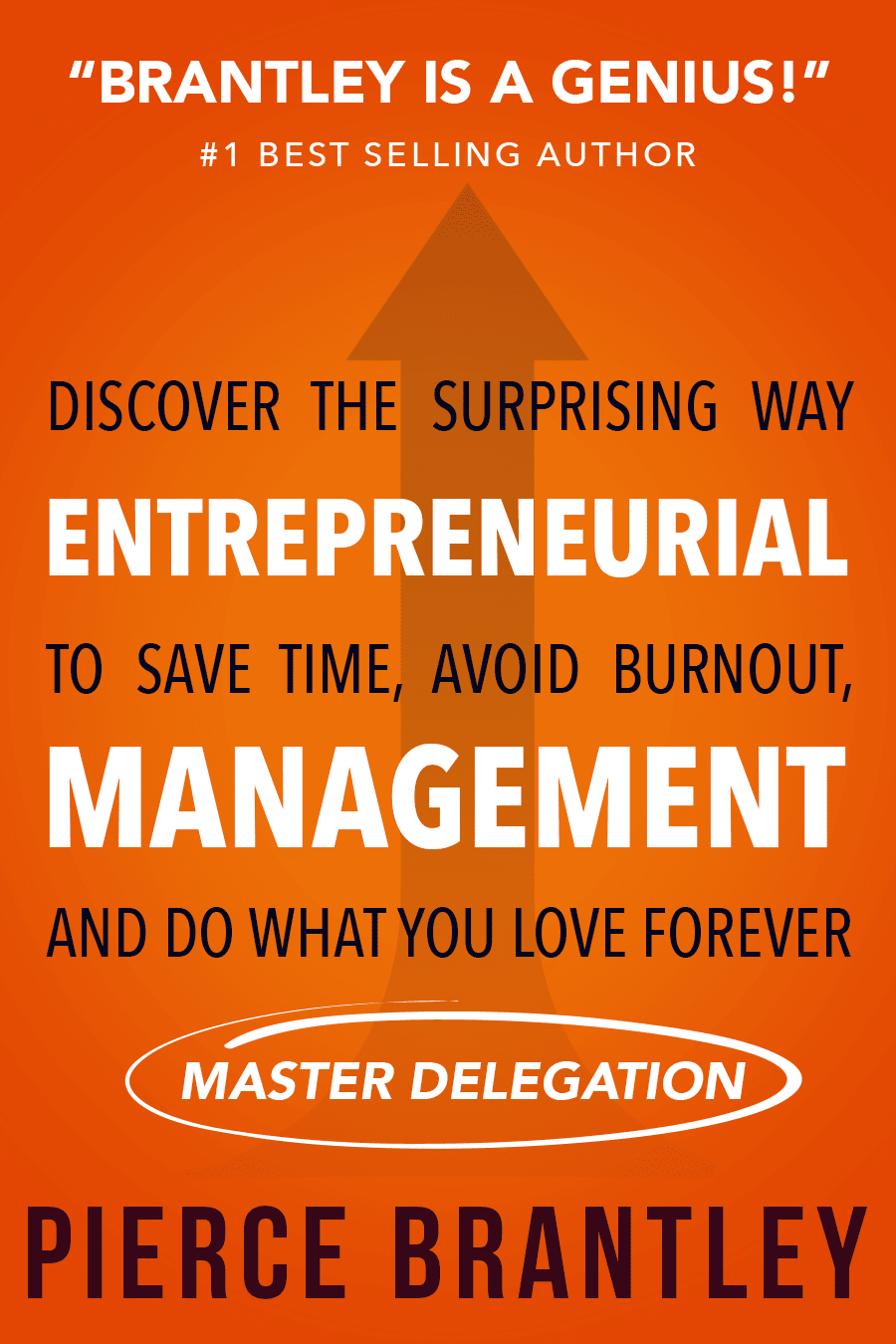
2 Responses to Option B
Choice B is the one that I like the best with others in order of preference.
I like that the market delegation is circled and it makes me more interested to read the other words on the title.
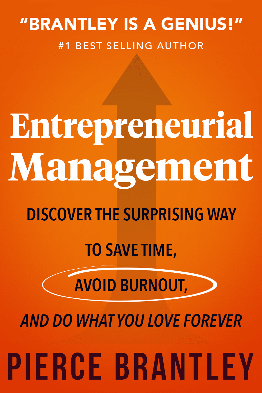
7 Responses to Option C
I am not at all partial to any of the choices where the words get all out of order. Simple is much better.
I like the orange cover with the arrow and the Avoid Burnout statement. I think it's more powerful than the blue covers and the Not Your Job title.
C is my favorite because I love the overall design. The arrow and the orange really strike me in the other ones as well. The blue is my least favorite and doesn’t really catch my attention at all.
I liked the orange covers the best as I found them more eye catching. C and were my top choices because I liked the keyword of burnout being circled because burnout is something that people want to avoid and is also an easy to understand catch word.
Option C is the most visually appealing and grabs your attention more right off the bat. The title is much better as you get right away what you are getting and there is no ambiguity to it. It also lays out the subtitle better and you grasp what is being offered more right away. I like the color better and think it makes the wording stand out more and just plain looks better. I also think it has a more unique and interesting look and would set itself apart more from similar books. Option C would appeal to a wider audience of people and would make them more likely to check deeper into what it has to offer.
I would provide an honest opinion first. None of the titles are good. I understand the message the book is trying to convey but the titles are not looking professional at all. This books is supposed to be for business leaders who are going to manager various people. It is trying to give a message to people to manage things in a way that they don't have to do extra work and keep the tasks to the point. I get that but the message should be given in a professional manner. There are many good designs you can reference from on the internet. Having said that, here is the feedback I have for the best designs out of the ones you have shared. Option C: It provides the title of the book quite clearly so I have a clear understanding about what I am getting. I like the term "avoid burnout" highlighted in the middle. I as many other face this situation at work or business too. it would be nice to find out some techniques that can help reduce that. There is too much orange in the cover. Maybe it should be a bit on the lighter side. The arrow doesn't really make sense as it does show that maybe the career path is going upward, but it points to "Brantley is a genius" . Its the like the author is trying to praise himself which shouldn't be the case if you need to put some recommendations maybe they should be on the back of the cover. Like they normally are. Options F & D are pretty much similar in design to C but some other terms are highlighted. I liked the way things were in C as those terms are placed in the most optimum manner. F has a weird blue like color same thing goes with G. I don't think this is the color that is the preference of a lot of people. Orange is a more acceptable color as compared to this bluish tone. Options H & A seem to be giving a message to people that they don't have to do their job or they might abruptly use that cover title to talk to people like that saying "its not my job" at work. So no one is going to like that.
I think all of the bright orange color is really get your attention faster and let you read the text with just a glance.
4 Responses to Option D
I would choose choices D, B and C which have a more attractive color of the poster and the writings on it are much easy to read through because the font is nice as compared to choices E, A and H which have a more less attractive font which is not attractive at all for me and the last options will be F and G which are the least attractive to me as from the color choice of the poster and the font of the writings which is less attractive to me.
i really dont like the titles with not your job or the thumbs up. i would prefer something more technical.
D and C super similar and best choices color is great and title is also wonderful then you also used some buzzwords like avoid burnout simply wonderful and eye catcher. then B and E are also good choice just not as great as the first two. Fand G i do not like the color as much on this title are great though but i wouldnt graviate towards this book just simplu due to color. last place is A and H and hate the title "not your job" no motivation there that should never be the title
I prefer this option. Overall, I like the orange covers better than the blue. I liked the focus on 'avoid burnout' . Having been self employed, burnout was a concern for me so I like that it is a focal point in the book.
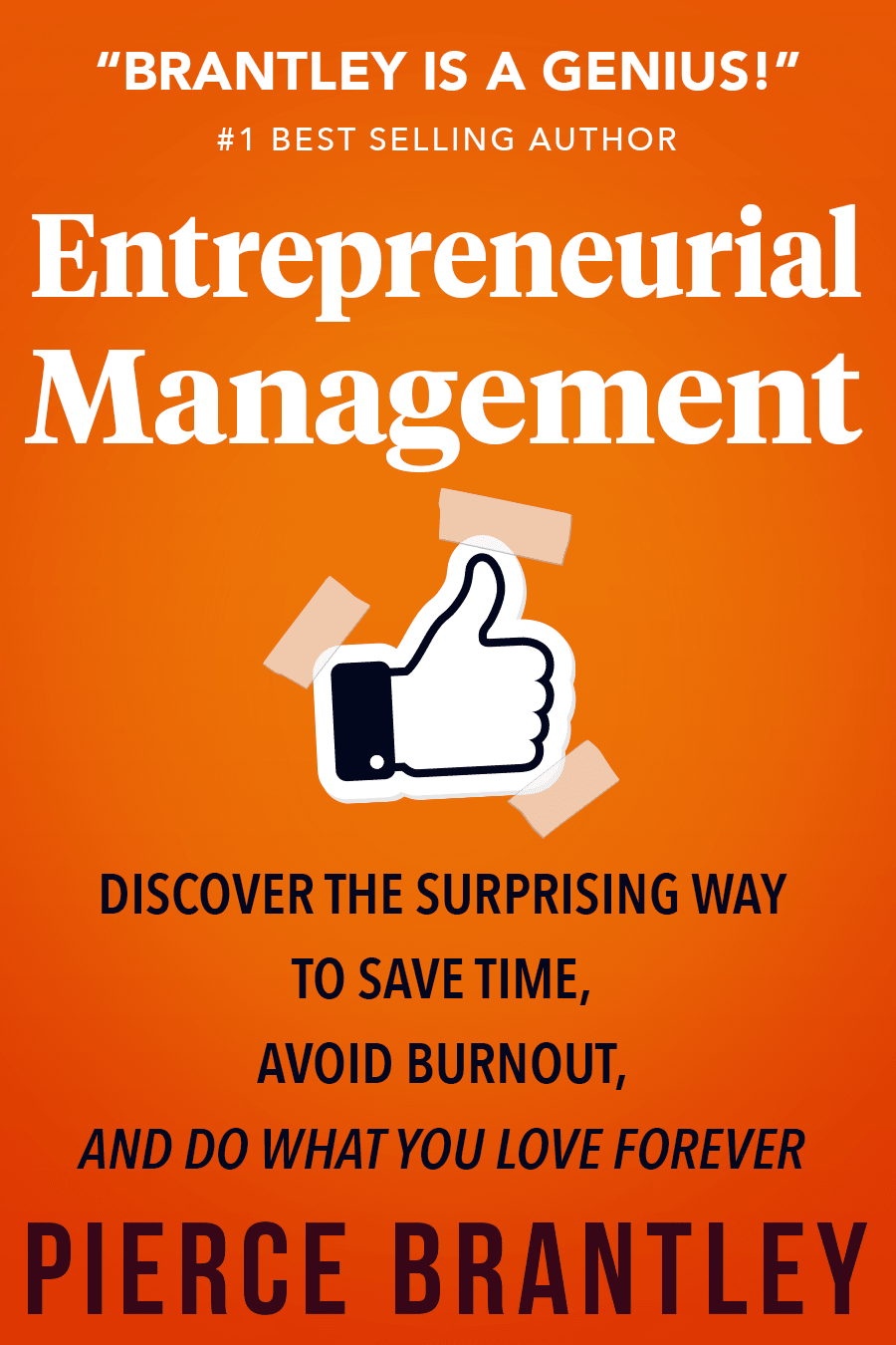
6 Responses to Option E
option E I like the entrepreneurial management it sounds more professional it sounds more positive and I love that color orange on a book cover it looks great ... To be honest I am not a fan of the words not your job anybody has been a manager before or entrepreneur never wants to hear the words "not your job" I don't read further through the description after I see that it is negative in my opinion.. although can clearly see it's not meant that way but it just gives me a negative impression
I generally liked the bright orange color more than the dull and depressing blue color; the orange caught my eye much more quickly. I liked the options that didn't intersperse the text of the heading with the tagline since this felt confusing and hard to read. I also thought "Not my Job" was super vague and I preferred the options that more succinctly identified entrepreneurial management as the book's content.
I rather prefer the option E book cover image because I like the thumbs up image and the orange background color and the entrepreneurial text the most. I chose options C, D and B second, third and fourth because I like how the subtitle text lines in options C and D are all right after each other more than the split lines between the title text lines in the option B book cover image. I chose options G, F and A fifth, sixth and seventh because I like the thumbs up image with the blue background color more than the split subtitle text on a blue background more than the not your job title text on the orange background color with the pencil. I chose option H last because I do not really like this shade of orange background color nor the arrow illustration nor the title text shown here much at all.
I don't like the "not your job" title. That has negative meaning in organizations. The orange covers are more attention grabbing.
Has the most interesting title and is the easiest to read. I also much prefer the orange color to blue
My two favorites used a thumbs up like icon and I thought that was unique and eye catching. My least favorites seemed unprofessional, the font and title of "not your job" in particular is just not the type of thing I'd think was all that serious if I was looking for a book of this type.
4 Responses to Option F
i would buy the book in option F based on the cover because it looks like a practical way to enjoy work
I chose F. And this is for two reasons. 1. I much prefer the blue to orange and 2. The Facebook thumbs up is not very appealing.
This cover looks more professional and color is better.
STANDS OUT AS THE MOST APPEALING AND CAPTURES MY ATTENTION WITH THE DEISGN AND HOW IT SHOWS WHAT THE BOOK OFFERS
9 Responses to Option G
I would be most likely to purchase and read option G because I think that it has the most interesting and visually appealing book cover design/color scheme out of the eight options.
I would choose G
I really do not like the orange color, it just sends me the wrong message. The blue is nice though and i ranked by colors by which style of title i thought was the best.
I chose this option because i find the cover design more attractive and eye catching compared to the other options. The cover design is straight forward and easy to understand .
Option G has the best cover for this book and makes me feel attached to this one because I think I will learn something new and improve my current entrepreneurial skills.
I feel the lighter color background makes it easier for the user to read and understand. Plus the message in option G is more uplifting and more motivating to make them want to read it.
The orange looks garish and irritating. It looks like an unprofessional color.
Option G would be my first choice and the one I would purchase based off of the cover alone. The color of the cover stood out to me the most and the text and font on the cover made it easy to read and caught my attention more than the other options.
I like my first two choices because I think they have the most welcoming designs that also look more professional and of higher quality than the others. I like the blue more because it feels more friendly and less "in-your-face" than the orange covers.
7 Responses to Option H
H and A really stand out to me. the words Not Your Job really grab my attention and make me want to find out more.
I love the large bold font on options A and H. It's really striking visually and the boldness looks to fit the vibe of the book.
I prefer the blue color, but only the ones that are titled Not Your Job would catch my attention.
I prefer option H because it is a simple cover. I also like the arrow showing that it is a number one best selling author.
Option H is my choice for the cover because I like the color and text choices, and the title and bylines speak to me.
Only the two "Not Your Job" covers are going to grab the most attention - the others come off as too "stuffy."
I thought that the covers about it not being 'Your job' was interesting because my job is usually boring.
Explore who answered your poll
Analyze your results with demographic reports.
Demographics
Sorry, AI highlights are currently only available for polls created after February 28th.
We're working hard to bring AI to more polls, please check back soon.

