Poll results
Save to favorites
Add this poll to your saved list for easy reference.
Which book would you pick up in a store?
23 Responses to Option A
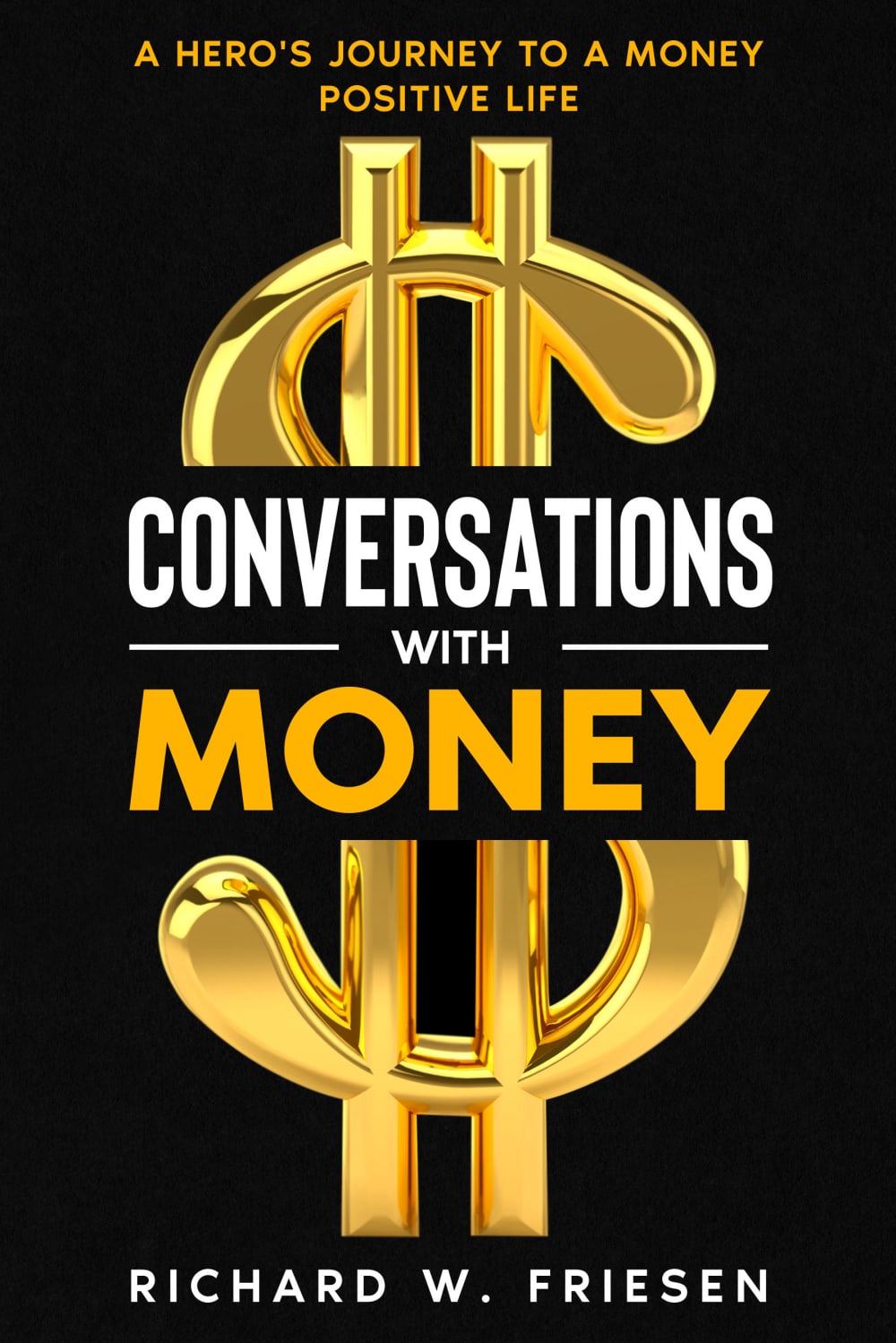
I chose option A because the black and gold color scheme just screams money to me and I like it more than the other option
This one is bolder and looks more professional. It would attract me more on the shelf.
After carefully studying and comparing both book covers displayed above I selected Option A over Option B as my first preference and the one that I would more likely click on to purchase for my own reading pleasure. I felt that this book cover jumped out at me right away due to it's bright coloring and contrast in color.
The black background and the gold lettering stands out. It catches the eye.
The gold dollar sign on the cover would convince me to pick up this book and read the description. I would be interested to see what the contents of this book is. This book looks like it hands out excellent information from a trusted source. I would expect high quality content from a book that looks like this
There is something about a large dollar sign that always appeals to me - it's simple and communicative, and the gold is a fitting color. I instantly know what it's about.
I would pick up book in option A - it has a very eye-catching design and gold symbol of dollar sign is definitely very noticeable and standing out. Great choice of using all black background with shiny liquid gold dollar sign.
I like option A the best because I like how the gold looking money sign stands out against the black background.
I like the clean look of Option A. Also, the black background with the gold money sign is a better eye-catcher about money!
Option a is more eye catching in my opinion
I like the gold dollar sign in A
I chose A because I like the colors and design of this book cover better. I like the black and gold colors. of A. Sorry , Benjamin Franklin.
I feel that choice A is a better choice as the black cover makes the book look more prestigious and upscale than choice B.
I would choose option A for the book to pick up in a store because of the intense gold color which would make me think about striking gold.
The dark color in choice A is a more attractive and appealing option to check out the book.
I find the choice a to be the best of the two. It looks more eye catching with the bright gold dollar sign. It looks more professional even to me. Like it's a more expensive book to be honest.
The cover of this book is more bold and attractive. It captured my attention immediately and makes me interested in reading what's inside.
The dollar sign is definitely eye attracting with those colors. Although the hero's journey makes me not want to touch it because there is no such thing as a hero.
I prefer this one it looks highquality and modern.
I like the large graphic of the gold dollar sign with the black background. It helps the book stand out nicely with those colors that easily grab people's attention.
This one stands out more. Plus it looks like it would be a more exciting read than the other one because of the book cover.
The black and gold really stand out to me. This would grab my attention right away so I would get this rather than looking around.
POPS...love the huge dollar sign...stands out right away
27 Responses to Option B
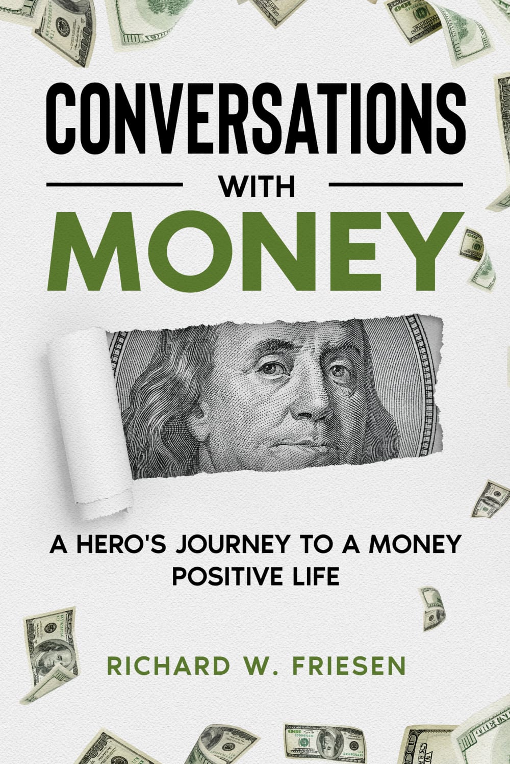
i like actual cash showing on the image
Choice B makes me feel like this book would be an entertaining read, not boring or taking itself too seriously. I get more out of material that makes me laugh a little.
Option B is my preferred choice because the cover is more engaging and compelling to me as a potential reader.
This has a little more pizzazz to it - I like seeking Ben Franklin - that's associated with money and the money falling - it makes it more interesting.
I would pick up option "B". The book looks interesting and appealing.
This book looks a little more interesting and I prefer the lighter style, it looks more inviting.
I like the way the paper looks peeled back with the face peeking out at me. It makes it seem more dynamic. I think the design pops out at me a little more. I noticed it first.
I chose option B as the choice that I would pick up in a store because the cover of the book is cleaner in appearance and looks more professionally put together.
I like B because it has the picture of Franklin which is on the $100 dollar bill and that relates money to me. Plus there's the falling bills.
I think the lighter color works better as it gives a bit more pleasant tone to the book.
I feel like this has a more dynamic sort of image to it. The other is eye catching but pretty simple.
Option B is the book I would pick up in a store. I think is professionally design, it's fitting and conveys what the title is describing.
I like choice B in that the design is interest and makes me want to pick up the book despite how common the topic is.
I thought A looked a bit too gaudy with the gold. I liked that B had real dollars on it.
The cover makes me think that the book is going to reveal something to me like how the money is being revealed by the paper being torn out.
The color scheme and overall look of this cover sticks out to me and fits better in my opinion.
The picture of Franklin really captures my eye. If I look at it, I'd get interested enough to buy it.
the black and gold cover makes it feel "slicker, more sales-y, BS-y" the other cover is more interesting
I like the cover that shows Benjamin Franklin for the image of money and the white and green is appealing
I think B has more of a "money" type feel and vibe. The green color scheme and Benjamin Franklin help telegraph this. The other design falls flat -- it looks more appropriate for cryptocurrency.
B is colorful, eye catching, intriguing, and powerful.
I prefer Option B, because it makes me think there is a chance the book could talk about some of the many ugly truths with our current monetary system.
the added description of a hero's journey to money positive life encourages me that i can have a positive relationship with money also. like the dollar bills on the design of the cover
I like the non-threatening nature of B. Something about A makes it too bold, and the gold and white contrast against the black actually hurts my eyes a bit. B's cover is interesting, and would make me look at it.
It looks more pleasing to the eye and not overly pretentious.
Seems more professional and the colors and layout of text/images are better in my opinion.
The image of Benjamin Franklin there makes it far more eye catching to me.
Explore who answered your poll
Analyze your results with demographic reports.
Demographics
Sorry, AI highlights are currently only available for polls created after February 28th.
We're working hard to bring AI to more polls, please check back soon.

