Poll results
Save to favorites
Add this poll to your saved list for easy reference.
Which book would you pick up in a store?
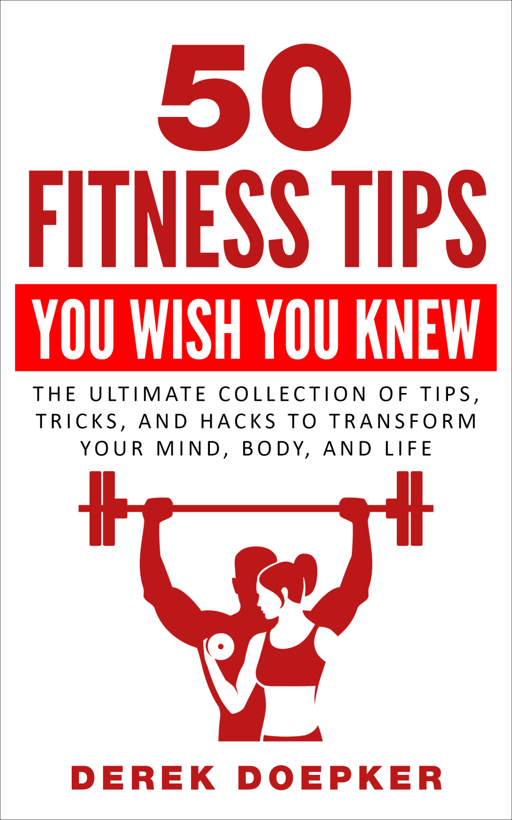
Option C won this Ranked poll with a final tally of 28 votes after 1 round of vote counting.
In a Ranked poll, respondents rank every option in order of preference. For example, when you test 6 options, each respondent orders their choices from first to sixth place.
PickFu requires a majority to win a Ranked poll. A majority winner differs from a plurality winner. A majority winner earns over 50% of the votes, whereas a plurality winner earns the most votes, regardless of winning percentage.
If an option does not earn a majority of votes, PickFu eliminates the option with the lowest number of votes. The votes from the eliminated option are reassigned based on each respondent’s next choice. This process continues in rounds until a majority winner emerges.
Scores reflect the percentage of total votes an option receives during the vote counting and indicate the relative preference of the respondents. If there is no majority winner, look to the scores to see how the options fared relative to one another.
| Option | Round 1 |
|---|---|
| C | 56% 28 votes |
| B | 38% 19 votes |
| A | 6% 3 votes |
Age range
Education level
Gender identity
Nutritional supplement use
Options
Personal income range
Racial or ethnic identity
Self-help book reader
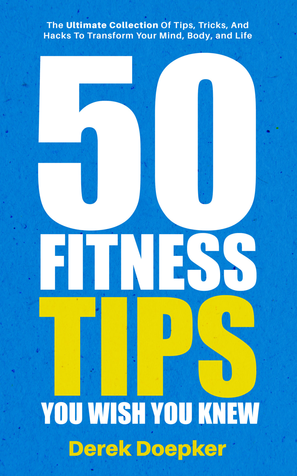
3 Responses to Option A
choices a & b have brighter color tones to the next on the book covers
Option B is much more eye-catching. I like Option B except for the rainbow color.
I like the color scheme which is easy on the eyes and I could actually see the title of the book.
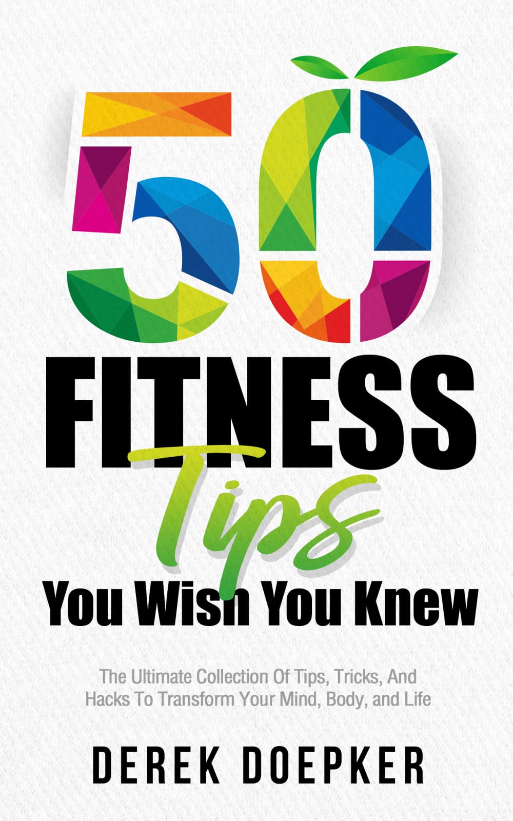
19 Responses to Option B
I would pick this one up because the multi colored 50 would draw me in first and make me want to know what more this book had to offer.
The book I would pick up in a store is option B because of the beautiful multicolor on the cover of the book.Option C would be second because it indicates both male and female on the cover.Last is option A because it has less interest than B or C option.
B is colorful and stands out. I like it. A is also a good one. It has nice big letters that make it stand out. C is OK, but not my first choice.
The colors of #B caught my attention right away. #2 looks authoritative. To me, #C looks kind of boring with just the two colors and the white background.
I love the colors in B. I like the way A stands out. C is my least favorite of the three.
The colorful option stands out to me and looks more professional. I liked the design on the last one but I hate the color red so it goes last.
B's cover just pops, love the coloring! It makes you want to pick it up and read. C is also nice but lacks the great color. C is very ordinary and I would not choose it.
I picked Option B because the colors would catch my eye first if I saw it in a store. Then Option C with the graphic of the people lifting weights would catch my eye. Option A looks a bit generic so I might pass that one by.
B is my favorite because I love the colors that are present in this one. It actually looks so inviting, lively and fun. I know it would get my attention right away. From there I like C over A just because C shows the people using the items and makes sense for a gym while A seems to be too basic for me.
I like choice B because it stands out the most to me with all the different colors that are used and it would catch my attention and draw it to the title more than the other choices. choice C is kind of boring but I like that it has a picture on the front so that would also draw people to look at the book and read the title. choice A in my opinion is two plain being all one color and no pictures used on the cover.
I chose B first because the "50" is very colorful and inviting.
I like the colours in B and how the 0 looked like an apple. It made me think of health.
Option B looks like a book that has all the info I need. It stands out more because of the colors and subliminal plant on the 0. Option C looks like it would be educational but option A looks like some click-bait on the internet and not a book written by a professional.
I love the rainbow colors with 50 and its eye catching. I like how it is organized and has a description above his name in black. I also like the use of colors. Next A is good because the yellow catches your eye on blue background with author name in yellow. Its broad and big to grap our attention . C is ok with showing lifting weight with both male and female to represent its for all people . I think it might be better with another background color other than white to help make it pop more excting .
The one with the most colors is the most appealing out of all of them
I like tge colorful cover if option B, so my first choice. I like the man lifting weights in option C, so that is my second choice, but not as much as option B. I don't like the blue cover in option A at all and would not choose it.
While book B doesn't have a Fitness related logo, it looks modern and updated, leaving me under the impression it will be more relevant to current knowledge surrounding exercise. Book C has a much more attractive design than A, but lacks the modern and colorful appeal of option B, leaving it in #2 spot. A looks bland. It doesn't catch the eye, and at first glance, i would think it's a self help book for mental problems rather than a fitness book.
choice b is hands down the one I would pick up and then buy. I think that colors in the 50 really pop out to the eye. The tips being in green stands out. I enjoy green a lot and relate green with healthy and grass and such. I think the words really pop out easily without clashing on choice b. Then the choice c is okay. But to be honest it's just too much red. It's not broke up much and the black font under the red should be bold so it's easier to read. The last choice of a looks bland and boring. Not hip or with the times. I would not pick it up.
I think Option B would definitely prompt me to pick it up first because of the bright and vibrant colors. Moreover, I also think Option B's design makes the book seem like it would be reliable , new, and of good quality.
28 Responses to Option C
C made it clearest that this is a book about fitness since there are graphics of people exercising. B looked like a tech book since it had the Apple logo (the leaf) on the title font. A looked like it had nothing to do with fitness as there were no graphics whatsoever.
i like option C and A both equally unfortunately option B instantly makes me think of gay people because of the rainbow coloring in the design
Red on white with the image would get my attention.
I would pick up option "C". The design swayed me . The cover looks interesting and appealing. I would love to pick up option "C" as a fitness book.
The graphic is pretty generic, but it's more interesting than the other two covers. I do like how the two people are nested using negative space, that's attractive. I'm not moved by the "...You Wish You Knew" line, I'm like "what do you think you know about what I wish I knew?" Second choice is simply the next most visually interesting cover. Some color, some cursive, I'd be slightly more interested in picking up that book each time to continue reading it than I would choice #3.
Choice C because of the book cover. My attention was drawn to the image of two people working out along with the expression, " You wish you knew".
Showing the people on the cover makes me think about the progress that can be achieved. I like how the people look so healthy and physically fit and that is appealing to me. I would want to look like those people and be in better shape so that is the cover that I would choose. It is inspiring
I like option C the most because it is hard to miss color wise. I also like that there is an image of a man and a woman working out - this is clearly fitting with the title of this book and helps recognize it from far away for those interested in this subject. B is nice and colorful, eye catching and inviting, good design. A is boring and not interesting.
Option C is the most compelling as it also has the description of the book, the option A is also good, I don't like that much the option B
Option C seems the most credible, and I like how its color scheme is consistent. Option B is too colorful.
None of these caught my attention and they all look outdated as they belong in the 70s or 80s. However, I think the graphic adds something to the cover and I think the second option is easiest to read, so I chose them in that order. However, I think going to the drawing board might be wise and updating it. I am not sure how or what to update, but this just screams 1st edition of a book that's had many more editions after.
C is bold, bright, and strong. It inspires and motivates me. B and A are boring.
c- gives you more detail about what you might find in the bookb-i like the color way choicesa-eye catching but no detail
C: The colors are nice and easy to read. The title font design has a nice flow and it draws your eyes down to read the entire thing without feeling confused or out of proportion. It has a very "even" look, It looks competent and well-reasoned.A I like the nice bright blue color, it's very eye catching. I think the "50" at the top is just too big though, it's like comically over-sized. It gives me the impression that the book is silly, non-serious, for children?, a gimmick? I wouldn't really want to be seen holding a book like this in public.B This cover is confusing. Without reading the words it looks like a cookbook for vegans or people over 50 maybe. It's pretty eye catching, but I don't think i could trust the books contents.
A is just too basic and boring. C is the most appealing and gender neutral, meaning appropriate for all genders. B is better than A but not my favorite. I feel like it's a dated logo/brand.
C has images of figures who are fit which i like very much. B is less boring than A
I like option C the best because I like that it shows people exercising as the main graphic of the cover and the information does a good job of getting my interest in picking up the book.
C looks like it’s outdated and written in the 90’s. C stands out with the white on red and the cherry red just catches the eye
I feel like the cover of Option C is much more of a traditional cover for a fitness book. It's exactly what one would expect to see if one were looking to purchase a book on fitness tips. I like that the subtitle, "The Ultimate Collection......." is prominently displayed and easily read. Option A is ok. It's plain and nothing necessarily sticks out for me. I don't care for Option B at all.
I chose C first because the book cover is 2 colors, easy to read and understand and I like how it focuses the "The ultimate Collection...etc" in the center of the cover. It makes everything flow so well on the cover. I chose B next because I like how the 50 is in rainbow. It really stands out and caught my attention. It'd be easy to catch other people's attention and stand out on a bookshelf next to other similar books. I chose A last because it's boring. There was nothing special about it.
I chose Option C as my first choice because it's the most modern looking and it features a man and a woman on the cover, so I would assume that it will have useful information for everyone, not just men, even though the author is a male. I chose A as my second choice because while I would have to check whether it will have information for everyone because the cover doesn't contain any images, it still looks sleek and modern. I chose B as my last choice because the graphics and font seem outdated and out of touch and I wouldn't think the information was as accurate or up to date as it should be.
c - the design is eye catching and easy to read. i like how the "you wish you knew" is front and center and not too fancya - feels straightforward, but cover looks more amateur. id then maybe assume the quality of the contents would be amateur, tooa - too colorful. the rainbow color doesnt quite make sense conceptually and id assume it was geared towards women. also, too many mixes of fonts.
C tells me a description asking with a picture that encourages. A person involved in fitness is interested in looking good and this picture makes you believe you will look like that
I like the image and design of C. The red and white really pop out and the image is relevant. B seems more like a general subject matter and A seems entirely unrelated to fitness,
C - the picture of the people working out put me in the mood to learn more. A - If C were not available I would choose A. I liked the solid blue color a lot better than B. With B the multi color in the 50 lettering bothered me.
I like the image of the people working out. Along with the info under the title. I feel this cover is more encouraging.
I like C because it shows people actually lifting weights. That makes me feel like the book is written by someone who knows what they are talking about. The other books are boring and look like your basic self help book. Choice B looks like it is a rip off of apple and microsoft with their logo.
I like the covers that more closely rate to the topic. Images make it easy and quick to figure out what’s the book is about.
Explore who answered your poll
Analyze your results with demographic reports.
Demographics
Sorry, AI highlights are currently only available for polls created after February 28th.
We're working hard to bring AI to more polls, please check back soon.

