Poll results
Save to favorites
Add this poll to your saved list for easy reference.
Which cover better expresses the title idea for a business book?
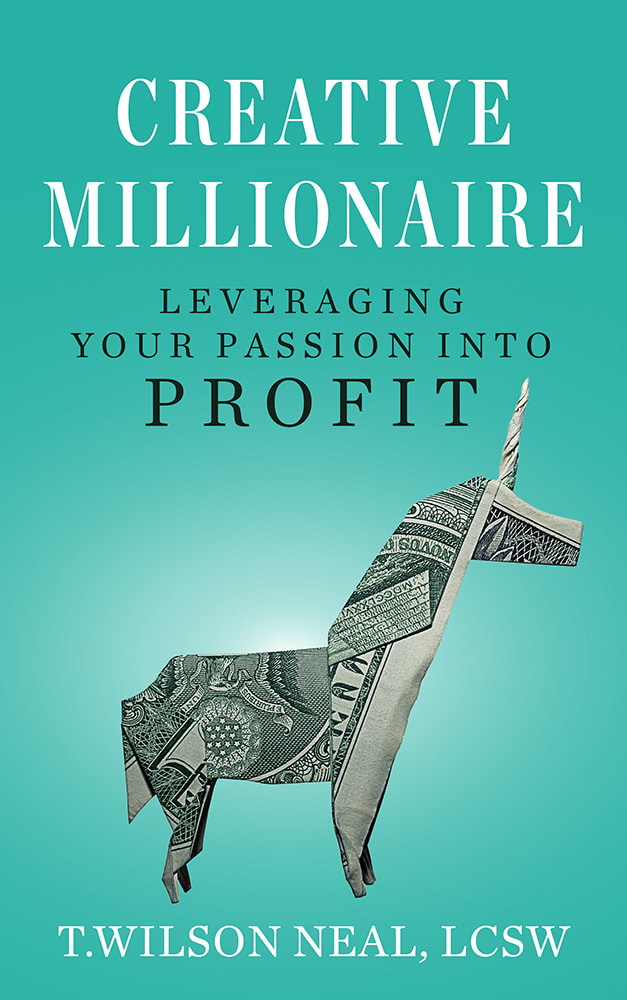
36 Responses to Option A
B is generic but A is great! The unicorn origami is so effective as a visual, esp made out of a bill
The money in the shape of a unicorn is more memorable to me.
I like that it's creative, and that it uses a dollar bill. It really helps communicate what the book is actually about.
the little origami unicorn makes the most sense, considering the title of the book contains the word millionaire, so it would make the most sense for the cover to depict money in some shape or form. the unicorn gives it an interesting character, which i like. the other is nice, but just is a splash of colors that in no way really correlates to the topic of the book.
I don't really know what the significance of the origami would be but I definitely prefer A because of the colors, the simplicity and that it shows money in some way for this title. B looks like a great cover for a different genre, not for business and finance. Also the text in B gets lost in all the color.
A has money on the cover which fits with the book title perfectly.
I chose A because to me it was a more creative cover for the title. I think that B is more playful and a little more 'fluffy' for a business book.
the dollar bill looks better for the material than the abstract cover.
While B is more eye catching, the dollar origami on A is what sold me. It is interesting and also fits the subject matter very well.
I think option A looks better and more professional. And I think the origami horse made from the dollar bill displays using money creatively rather well . Option B looks like a hastily put together self published book done with stock images.
I think business should be run cleanly and concisely. Choice A is streamlined and organized and that is what I would expect out of a business and especially a business book.
The money origami is very creative and appropriate for the title.
I picked A because I liked the ideal of seeing paper money folded into an item.
A is my favorite, I think the origami unicorn expresses the idea of making money using your creativity in business really well, and is very unique. B seems more generically artsy.
I really like the unicorn dollar origami and I think it would grab the attention of someone looking for a book about business.
I prefer the origami unicorn made of money in Choice A - I just think it's a better way of expressing the creativity in the title of the book than the explosion of colors seen in Choice B. I tend to prefer this type of highly meticulous and obviously skillful creativity, but I do acknowledge that Choice B represents creative chaos - the latter just isn't my style.
The title was clear to read and the colors not distracting
I feel that the clean and simple layout of A is more representative of what I would expect for the cover of a business book than B. B is a bit "noisy" and the imagery does not help to convey the point as creatively as the image on A. I would have liked to have seen the unicorn made out of a $100 bill as opposed to a $1 bill though.
I chose A as my option because I feel the title "Creative Millionaire" works well with origami made out of money. As this is a creative work of art and is made with the key thing you need to become a millionaire and that is money. Not only is it something that is creative it is something that is made just like he had to make the million dollars. I feel like this photo suits the title very well and is a unique perception that will grab readers attention.
Love origami and the other pic is kinda like wtf is going on
the logo was much more eye appealing than the one in option b
I like option A much better than option B. I like that they designed a unicorn out of a dollar bill - it's very unique. Option B looks like colored blood spatter and I don't like it at all.
I like the simplistic design. Also, there is money on the cover. The other cover is too bright and busy. The other cover looks like a self-help book cover.
I really love the origami unicorn on the front because it was really eye catching. Secondly, it is an exact representation of what the title of the book says. It displays that if you have a hobby or something that yout enjoy doing then the book shows you how you make money doing it.
A captures all the elements of the title much better than B
image of money is charming and engaging.
It looks a lot more focused and businesslike. The other cover looks like modern art, not business.
The cover with the multicolor scattered paint seems too disorganized for a business book, even one with "creative" in the title.
I like the money one
I like option A because it talks about money and shows an animal made from origami made of money. I think it is a clear design
I loved the colors with option B, but option A made me think more about money and all the possible ways it can be used and accumulated.
The unicorn made out of money really gets my attention. A whole lot more than the paint splatter. It actually makes me stop and read the title of the book.
Even though the rainbow coloring is supposed to look creative, I'm sure, I prefer the more professional cover look of A. The coloration with the origami folded dollar bill looks creative, yet professional.
It depict the title of the book creatively. Especially the unicorn made from folded dollar.
I think having the money made into a creative fashion on the cover is better at conveying the book title and purpose than the painting one. Also would be more likely to pick up this cover and see what it’s about than the other one.
This one appears more sophisticated and thus more likely to attract a business class or a business minded person. The other one looks to me to feel like a more creative book, someone that might be more interested in art than business.
14 Responses to Option B
I like the bursts of color on the cover more.
I chose B because I love the colors and the design, thinking it's every creative!
The bright colors caught my eye right away. It would probably be the first book I would pick up in the book store.
I love the more colorful cover
It’s a colorful and creative cover due to the colors. That exemplifies the point of the book.
The splash of color and how it stands out makes this cover more appealing.
I like option B. I think the artwork and the colors are fantastic and a real eye catcher.
The arrangement of colors is more appealing to the eyes and the cover is quite interesting overall. While the other one is of a nice blue color and has money depicted, I feel it's inferior to the other selection and doesn't get my nod of approval.
I honestly like both book covers but I think Option B pops out a lot more than Option A does. The colors and the background really does give a creative vibe.
Option B looks much more eyecatching and creative than A
Like them both but B more than A for the way the color takes my eye to it.
The graphics, although most probably appealing more to females, draw the eye to the book.
I think this one is more attractive. I like all the colors in it the best.
This cover is amazing and expresses the ideal subject of the book. It catches attention. And the design is really beautiful. I would buy this book.
Explore who answered your poll
Analyze your results with demographic reports.
Demographics
Sorry, AI highlights are currently only available for polls created after February 28th.
We're working hard to bring AI to more polls, please check back soon.

