Poll results
Save to favorites
Add this poll to your saved list for easy reference.
Which cover do you like the best and why?
Option D won this Ranked poll with a final tally of 54 votes after 3 rounds of votes counting.
In a Ranked poll, respondents rank every option in order of preference. For example, when you test 6 options, each respondent orders their choices from first to sixth place.
PickFu requires a majority to win a Ranked poll. A majority winner differs from a plurality winner. A majority winner earns over 50% of the votes, whereas a plurality winner earns the most votes, regardless of winning percentage.
If an option does not earn a majority of votes, PickFu eliminates the option with the lowest number of votes. The votes from the eliminated option are reassigned based on each respondent’s next choice. This process continues in rounds until a majority winner emerges.
Scores reflect the percentage of total votes an option receives during the vote counting and indicate the relative preference of the respondents. If there is no majority winner, look to the scores to see how the options fared relative to one another.
| Option | Round 1 | Round 2 | Round 3 |
|---|---|---|---|
| D | 33% 33 votes | 37% 37 votes +4 | 54% 54 votes +17 |
| A | 32% 32 votes | 34% 34 votes +2 | 46% 46 votes +12 |
| C | 26% 26 votes | 29% 29 votes +3 | Eliminated 29 votes reassigned |
| B | 9% 9 votes | Eliminated 9 votes reassigned |
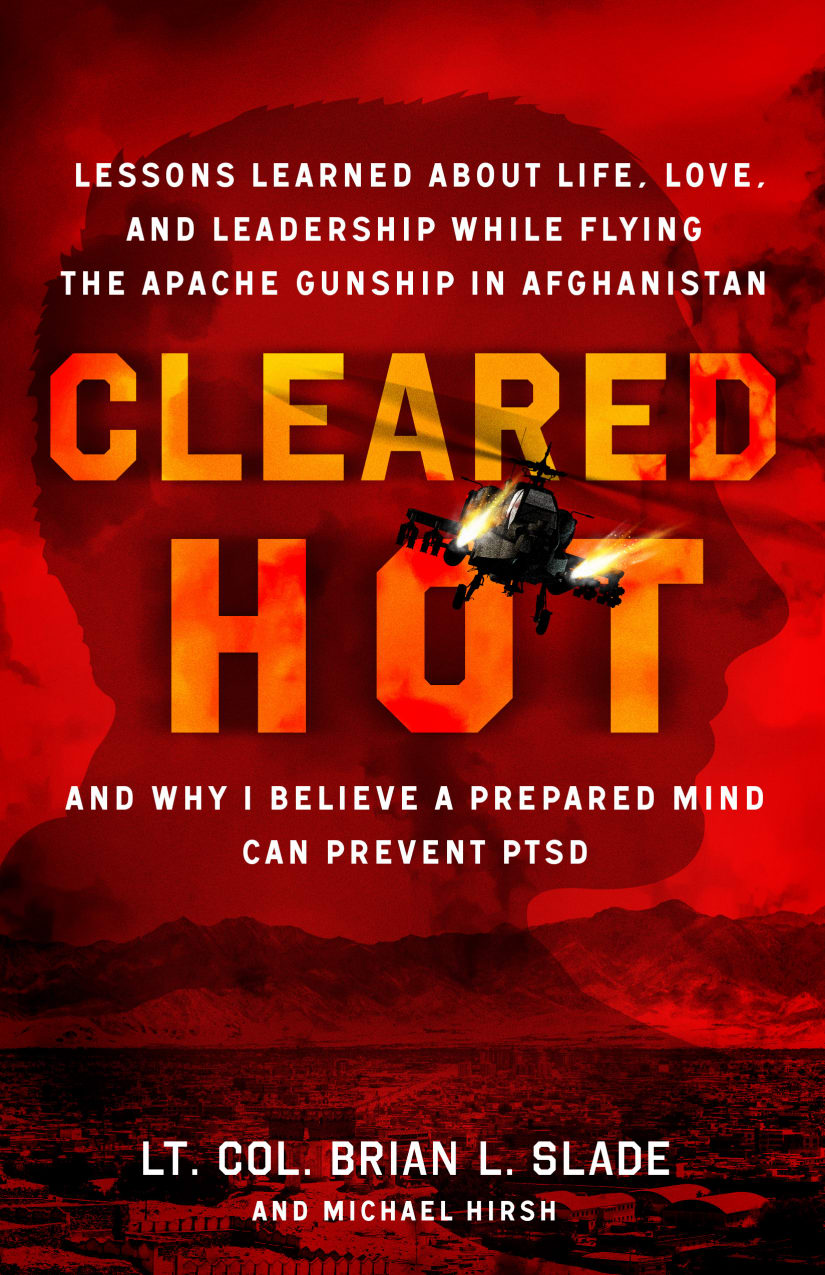
32 Responses to Option A
Simply hot makes me think of the color red, and black also works for this analogy as well. Good covers though
The color red is something that you think of when thinking of hot things so this one makes sense to me to pick.
I choose option A because I like the red background on the font
I like the red option (A) most because it is eye catching and invokes the intensity of the background scene. C is nice as well, since black helps emphasize the red text and creates a welcome contrast. I'm not a fan of the other two options, but would go with soothing blue (D) over the kind of inappropriate green (B).
I think the red color in option A better matches the name of the book. Red and hot a usually used together. I think the dark color of option C makes aligns with the books seemingly dark subject matter.
The red in Option A really stood out to me. It looks the best but it also evokes feelings of violence which might not be intended. Option D is my second choice and the blue looks great and is more soothing which might make it a better option. The green and grey are my third and fourth choices respectively, but I really don’t think they look bad at all.
I think the red background is the most distinctive and draws my eye the most. The images do pop out on the grey background, so that is also a fine choice. The blue and green backgrounds are both distracting, and I don't care for either.
This cover has the best color scheme that catches my eye and makes me want to learn more.
The red color makes the title look intesnse and menacing.
I like choice A the best. I love the background color of it.
The color red makes me think hot. The other colors I voted in order of what looks more eye-catching with the red title.
Red is a great color to describe "Hot".
I like option A the best because I like how the red colored cover blends in well with the title "Cleared Hot".
Option a looks like it is on fire! Very eyecatching.
I like A with the red background, i have PTSD and the red background sort of shows how severe it can be.
I prefer Option A because I prefer red and because it is most fitting because "hot " is in the title.
I thought the background of A best fits the theme and title of the book. I also thought C and B were decent fits, but D was too calm looking.
If you are going to say "hot", you need red. cool colors clash withthentitle. It makes no sense
Which cover do you like the best and why?- I like the red cover the most because it compliments the orange text and is the most eye-catching. The green and blue covers also look nice with the orange text, just not as good as the blue. The black cover was my least favorite because it was very plain looking.
I chose option A because the red tinted background is the most dramatic.
Red and Hot seem to go together - that's eye-catching.
I think option A looks the most eye catching and fits the best with the tittle
red represents hot...the black background is easier to see/read
Green seems thematically wrong. Blue has the best contrast. But ultimately red and gray suit the story best.
I think the red is most appropriate. Black is my second favorite than blue and green
red is the natural color when i think of heat, so that is my favorite. i like the color blue so that comes in 2nd. the other two don't impress me.
Option A - the red background is the most stunning and most eye catching
I think the red shows a sense of urgency and alarm that the others do not
Option A is in red which makes it stand out and really catches your eye. Option D is in blue which is a color that males like so they would be attracted to it. Option B is in green which is pretty attractive but not as much as blue. Option C is in a dull black and white which makes it look boring.
Red hot and red cover to indicate intensity works best. B and C are a toy. the gray or black ang white cover has a seriousness to it.
A is a winner here. I love the red and orange imagery here for "hot". Perfect. Barring that, what I like about B is the intense contrast, cool green and hot letters, same with D, the gray I don't love. Overall the cover art here is top notch though. Any of these options are worth it for you (except the gray - DO avoid that.
A option a because first of all that color red is absolutely gorgeous it grabs my attention and makes the words of the cover stand out immediately I would pick that one out of all of them
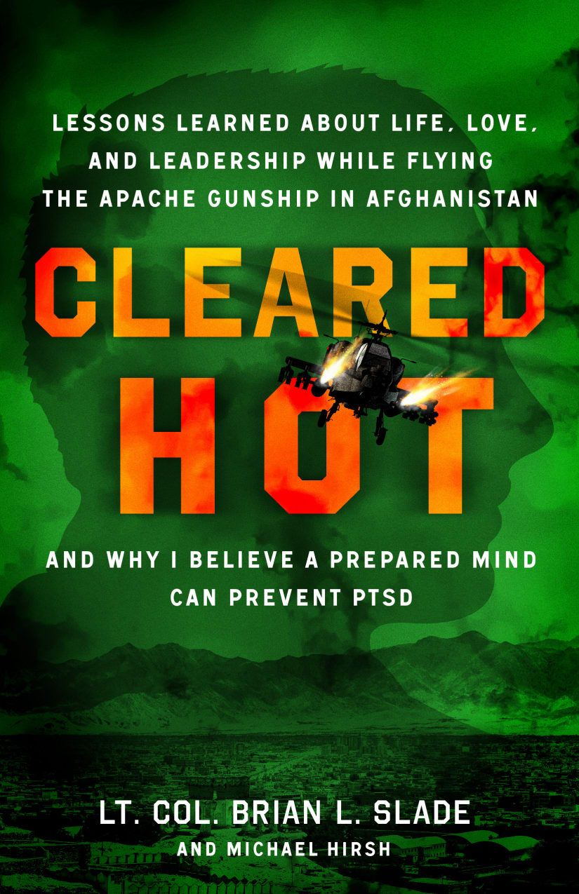
9 Responses to Option B
I like my top pick because it adds the military feel to it, like night vision.
The green and the blue are the best colors for any book cover. They all have way too many titles and subtitles. Do not scare people away by using violent military titles in an author's name
Green seems more military looking, with the great contrast with the flame lettering
I like B as green is my favorite color, so my attention always goes to that color. I I also like C for how simple it is color wise.
I think the green stands out the best.
i ranked like the style of cover really good font i like this image
B was my first choice, it was magnetic the way it drew me in. The colors are also symbolic, with the red/orange title seemingly about the intensity of combat, the green is like a green light, like a signal for full-speed ahead given once you have a "prepared mind."C was a very close second choice, as some may find the stark, dark grey background to be more appropriate for the subject.All-in-all, you can't go wrong with any of these covers. Great work!
B is more color appealing. It is brighter and it cathodes my attention quicker. Great bright color.
I like the green the best as you can see the details of the cover. The black one is the worst because you can't see it very well.
26 Responses to Option C
The black is the most bleak, and the red is the most intense. The other two are a little too mellow.
I ranked the colors by how much sense they made, especially compared to the main text's color.
The orange on grey really pops nicely. Blue isn't too offensive, either. The red and green are hard to look at.
I prefer the option C book cover because I like the gray color background color on this book cover because it makes it look mysterious and interesting. I chose options D and A second and third because I like the dark blue background color for the option D book cover more than the dark red background color for the option A book cover. I chose option B last because I do not really like the green background color for the option B book cover.
I think the subtitle actually belies what the color should be, more of a somber and gentle tone rather than the more active colors in A and B.
I like C because I think the contrast between the font color and the background color works well.
Black color is cool
I think the black background helped to emphasize the fiery lettering and that made it really stand out.
The gray in option C denotes the fog of war, and just matches the theme of being in combat. D is another option because blue can be associated with depression or a serious topic. Red works as well, but it does not go as well with the gray or blue, and it can be referred to the dangers of war. Green just does not work for this cover. There's no theme that can be used for this color for this book.
Picking solely based off my color preference and which one I think looks the best to me
I ranked my choices based on which color seemed most appropriate for the subject matter of the book.
In C the black really ties everything together and makes the helicopter slightly stand out. In D the blue blends well. In options B the green is alright but slightly takes away from the helicopter. Option A the red overtakes everything and makes it really annoying.
The black or red for the background of the book is fitting for a war documentary style novel so C or A works
The contrast in color in my first choice allows me to most easily read the book without feeling too distracting. The green is unique and the red is too bright and active.
I like the grey or the blue. I think they contrast best with the fire letters. It makes them pop more
1. C. The black and gray background provides a good contrast to the fiery orange text, and emphasizes the darkness of war and combat.2. A. The bold red background corresponds to the theme of fire and intensity, even if the colors look close to the text colors.3. B, The green doesnt play too well with the fiery orange and red text, but it looks better than the blue.4.D Having a cool blue background washes out the intense fiery tones of the text.
The dark background of C really brings out the red font massively. Hugely impactful.
I picked choice C as my first choice, as the grey cover with the orange font looks really good and makes the font stand out, it could also be used to imply memories of the past. I picked choice C as my second choice, as the red cover could imply caution or danger which could coincide well with the contents of this book.
I prefer the grey and the grreen options the best as the font seems to pop off the page more to me and make it more noticeable at a glance
I think C is the best , It is vibrant and bright .
"C" has the ideal colors for this book. Mich better that the other 3.
The red/blue/green are way too vibrant for the cover. Black fits better with the messaging.
I put C as my favorite with a close 2nd to B. I really like that black color background with that fire in the words. It really makes this book pop to me but it also has another meaning to me. I feel there could be a darkness with ptsd and that black background can be that and that fire is the preparation part. I think the green and fire is also good in B but the bigger meaning in C is my favorite.
I like the more neutral colors, they make the book seem more professional and serious
I can't really explain why, but I feel that option C works best for the subject matter. Maybe the grey conjures up past images.
i like the colors and contrast
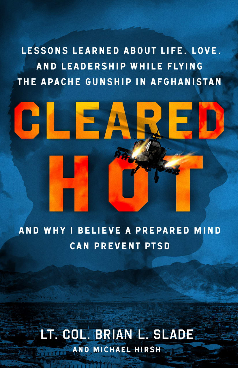
33 Responses to Option D
I feel like that the blue looks a lot better and makes the cover stand out without doing too much.
These choices are the most bold in terms of the color
stands out as the most appealing and offering me the best look at the book and it catches my attention and goes with the theme of the book
I picked a more chill cover, blue gives a chill feeling and went up the spectrum.
I chose D because I like the blue background. It looks really good to me.
The blue one has the best color combo, and is overall the most attractive and attention grabbing
I think a book about preventing PTSD should be a mix of the red orange text and a calming blue or black.
The blue is more attractive than the other colors. It is more inviting, thus I prefer Option D.
The blue cover stood out the most with the orange title.
I chose these options in this order according to which cover was the most attractive and had the best overall background color that really made the words pop I also chose them based on which color seem to fit the theme of the book the best
I picked Option A, as my least favorite, because I think it is difficult to read the words, "Cleared Hot," because the letters are the same color as the background, and therefore, they don't stand out. For Option C, I thought the grey, background color was boring. I thought Option B, was okay, but thought the green background, didn't jive with the word, "Hot," in the title. I liked Option D, the best, because I thought the two colors, orange and blue, made the best balance, between the words of the title, and the background images.
Blue is my favorite color so I definitely think that D would catch my attention first. It also fits with an action military book.
I like this color combination for the cover. It is appealing and eye catching to me.
I like Option D. The blue seems more relaxing and less likely to trigger the PTSD.
The contrast of the orange text against the blue background stands out more.
Blue is my favorite color so this choice really appeals to me right out of the gate. I like the way it looks and I would be drawn to it.
Blue and then Red in option D and A trigger strong emotions and thoughts that would make me want to read this colonel’s book. The green option in B is the worst because green does not entice me to read. It is off putting for this purpose. Green has a calming effect which is what I don’t want for this type of genre.
I think option D looks the most aesthetically pleasing. I really like the dark blue background and I think it sets the mood well for this book.
I think D has the best color scheme. The blue and orange has an intense contrast that I feel fits with the theme of the book.
I ranked them in the order of the colors I like. Blue is definitely my favorite. It is a nice shade. I picked red second because it represents hot better than the others
D is the most pleasant to look at. The colors of A and C fit the theme of the book well. Green does not make sense as a color for this kind of topic.
I tried to rank order by ranking the highest as the color that seemed the most soothing since this subject deals with PTSD. Notice option D is picked first since it seems to have the most soothing color, which is blue. Option A is picked last since it has the vibrant color of red.
I like the blue red and green background it stands out the most and makes you see the helicopter coming in the sky.
I like D first because I feel like the color of blue it seems calm and cool, then C because I feel like the black and gray are not as aggressive and seem cooler which is good for a mental health kind of book, then B because I like the green color it seems more positive than red which seems too aggressive and angry.
I prefer this one, I like the color blue and I can see the blue water below the chopper
choices d & c lets the main text stand out more among the background
The blue actually stands out to me the most, and blue and orange contrast the best. B also draws my eye. A is too red and C is too boring.
the colors used in the cover background was checked on by its beauty, clarity and how more its makes them enticing.
I chose option "D" as it reminds me of the dark blue colors in formal versions of the military uniforms.
The red is just to intense to me. the grey black is kind of boring. But choice D and B are great and think either one would work.
blue is my favorite color and I feel like red sells a book
I ranked the options based on how they made the title stand out. The blue was the best. The brighter (read/green) colors were a bit distracting.
Option D as it is a calmer less aggressive color compared to option A(red). So if it is a self help style book about preventing PTSD, blue would be a better color. Option B(green) is a close second but blue is definitely preferred. Option C is the grey and it made me feel colorblind to look at due to just the gray scale and black but not a bad one either. Option A is a bit aggressive and comes off as more of a horror/thriller color scheme I have seen before somewhere.
Explore who answered your poll
Analyze your results with demographic reports.
Demographics
Sorry, AI highlights are currently only available for polls created after February 28th.
We're working hard to bring AI to more polls, please check back soon.

