Poll results
Save to favorites
Add this poll to your saved list for easy reference.
Which cover do you prefer and what kind of book would you expect?
14 Responses to Option A
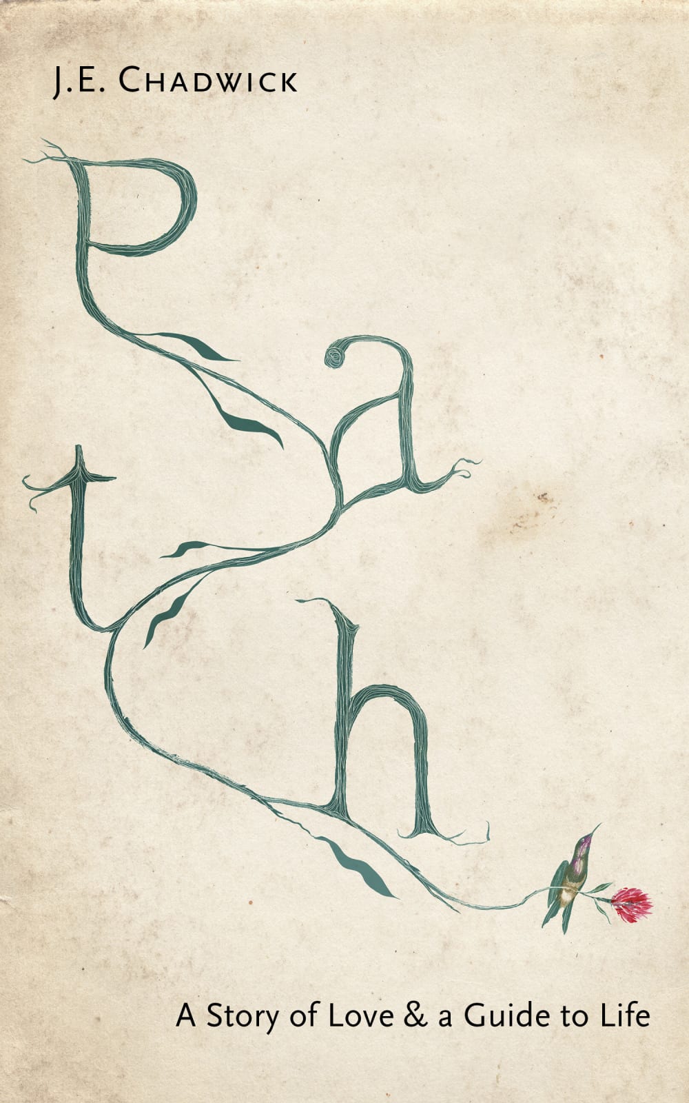
The title on this book cover in A looks like a path which augments the title. A self help book on love and life primarily for female readers. Definitely not my kind of book.
I feel that choice a is more eye catching. I also feel that the title Path looks like it's following a path and is more fitting for the book. I would assume that this is a fiction book about someones life. But i find it confusing because it says is a guide to life
I like the vertical image of the title “Path” more. I expect this to be a self-help book.
I like the vertical arrangement of the letters, I prefer the shade of green, and I prefer the slightly offset subtitle. I expect this book to be a memoir with a lot of self-help advice in it.
I just really hate option B it looks like something someone who does not know graphic design did. Option A looks very interesting and i love how full the title is on the book.
A more closely resembles a path and is more unique and intersting
I like how in A the title looks like a actual Path. I would think it's a self-help book.
I picked A because the title actually looks more like a path. The cover is more intriguing to me. Also, I believe inside the book is a guide on how to steer the reader on the right path to find the love that they want. I would expect it to be informative while also creative if that makes sense.
The letters in the shape of the word is clever.
I really liked A because the wording of path follows a curved path.
The design in A is more appealing because it spreads out across the cover nicely.I expect to read a book filled with either one or many stories that teach how important loving others is in life and the impact it can have on us.
I like the way the shape of the lettering matches its meaning, very artistic and based
Love the cover and it suggests a path with lots of twists and turns which makes it sound very interesting
A because there is no straight and narrow path in this subject. I would expect the book to be filled with contradictions about life and love. And all of them miserable.
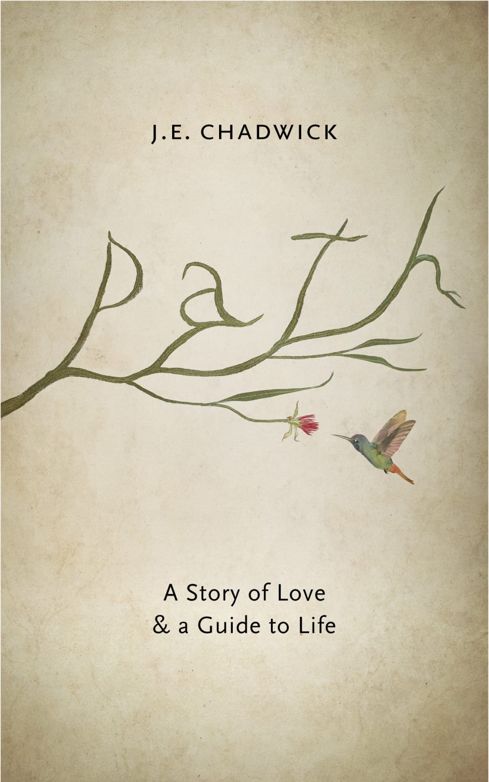
36 Responses to Option B
The other one looks awful and doesn't make me want to read it at all.
I picked B because the structure of PATH in A is confusing. The use of tree branches in B is much prettier. I would expect a memoir about the author's relationship and writing about their successes in their life and how you can apply it to your own life.
I prefer cover B because I can read everything on the cover, and I would expect it to be a book that explains how to love others in a more healthy and productive manner, and maybe understand the love language of others around us.
Option A is just too disjointed. Too chaotic for a cover in my opinion, in particular one about this topic.
B is better because you can make out the word path more easily.
The hummingbird looks very cute in the flying position and the flower also looks nice.
I like both covers but I chose B because "path" is less difficult to decipher and because the image of the hummingbird about to pollinate the flower is so much more captivating than the hummingbird's appearance in Option A. Re: book's subject matter, I would expect memoir, also something self-help, something inspirational.
I think this is easier to read compared to the other option and it is more pleasant on the eyes
I liked choice b better because the picture is more centered and looks better.
I like this cover because the word 'path' flows smoothly, is easy to read and really looks like the branches of a tree. Also, the hummingbird is feeding. which makes me think of nourishment. The other cover (A) looks broken, staggered and distressed. The word 'path' isn't clear at first glance, and though I see a winding path it looks confusing. I would expect this book to be some kind of personal story or memoir, possibly about love, loss, grief and healing and finding strength and a path through life.
I chose B because the other choice looks to messy and makes the word path hard to read at first sight. I would guess it to be a kind of self help book
I like the simpler colored design in B. A has a nice color scheme but The lettering meanders slightly.
I imagine something like "The Zen of Motorcycle Maintenance" but not as good. It sounds like the book will be about some relationship the author had and a bunch of musings and thoughts about life and other people. It sounds sort of pretentious. I dont have much of a reason to think this will be a good story or that the author has wise things to say about life. It could be religious, or maybe this person has lived some sort of interesting life. It's very hard to tell exactly what this book could be out. It could be very Conservative but it could also be very Liberal.
I like B because the title is easier to read. The hummingbird looking like it is about to sip from the flower is visually appealing to me. Also the color used for the branches/title is more natural.
It is much easier to tell that the word Path is being spelled out with the vines in option b. Option A does not make it that easy to tell what the wording is that is being spelled out. It just looks like a swirling but it is definitely a challenge to see what it is supposed to be and I had to look at option B to figure out and make sense of what option A was supposed to say
I prefer option B because the word path is much easier to read. I would expect to read a biography of the authors journey.
B is more pleasing to the eye and I think it will be about finding your path in life.
I would expect the book to be about self-improvement and how to live the best life. I like B better than A because the title is easier to read. The title for A takes up the whole page that the subtitle sort of gets lost.
Easier to readI would expect it to be some mythical type romance
I find B easier to read at first glance. I am guessing a love story of some kind.
The title is easier to read. The other option seems a bit messy.
B feels easier to read and when I am looking for books, the title is generally something I want to quickly asses. I get the winding of A, but I probably wouldn’t take the time to figure out what it says. I assume it is going to be a self-help book, some kind of thoughts or vignettes to show how life winds but has meaning. It doesn’t sound like a personal love story and I could believe it was about a love of god as the aged-paper background has me thinking antique scrolls.
Choice B is much easier to read at a glance, but still maintains the plant imagery. I'd expect it to be a fiction book about romance, but that also provides some universal truths about life.
I chose B because it seemed more pleasing to me. Choice A was very disjointed and hurt my brain to look at. Choice B looks very appealing and intrigues me as to what the book is about.
This option is a little bit easier on the eyes. The font is ok, but not the greatest looking.
I think this cover is much easier to read in the font it is in.
I think the way that is displayed the word: Path is strong here that's why I prefer this option and I think this book could help me with important advises to get more love and some life guidance tips.
I like this simple design and the book should be a romance novel about rekindle
This cover reads better for me. I don't care for comic book formatting, and option A reads like a comic book for me. I would rather have the word lined up and easier for me to read.
I like option B because the word Path really looks more like a tree compared to the image in option A. I believe this book would be a journey to becoming happy in life.
I like the visual of the tree as opposed to what I believe to be a stream. The bird makes more sense to my mind with a tree present. I would expect a non-fiction self help book. I think both are beautiful covers, but they do each have an ominous feel contrary to a positive outlook.
I like option B because I did not have to work for the title. Option A !are me question what I was looking at and if I wanted to waste my time trying to read this book if they just couldn't give me the book title. They loo k like journey to love and maybe a bit of happiness because a flower and bird are on the ends of the branches like a Japanese tulip tree or something. Option B also lo okay like the path will expand off the cover as branches grow.
B is easier to read what the title is. I would expect some sort of romantic book for teens.
easier to read PATH
I prefer B much more than A. B is beautiful, where as if I had to follow the path in A I think I would be in trouble. I think it is going to be a book about self discovery and how to live your life.
It just looks better, like an actual tree. I'd think it's some kinda mushy self-help book.
Explore who answered your poll
Analyze your results with demographic reports.
Demographics
Sorry, AI highlights are currently only available for polls created after February 28th.
We're working hard to bring AI to more polls, please check back soon.

