Poll results
Save to favorites
Add this poll to your saved list for easy reference.
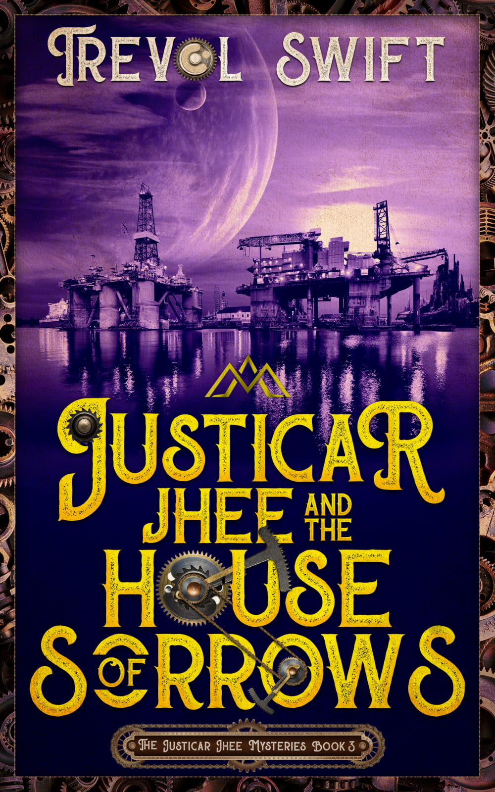
Which cover do you prefer for a book about a science fantasy murder mystery?
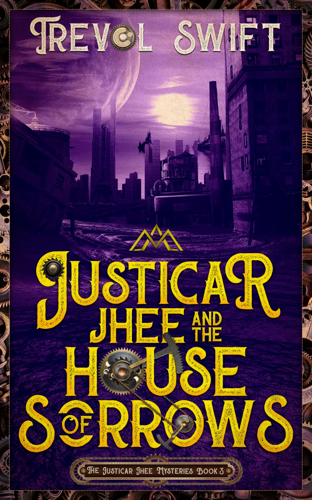
27 Responses to Option A
This one seems more interesting and expansive (with the way the background looks).
A looks grimier and more interesting
I like A because I think the eerie look to the buildings along with the rushing look to the water make it seem more science fiction like. B just looks kind of more industrial.
Image A seems more mysterious and appealing
The image makes this look more mysterious and fits the title better.
I chose option A but really either one would work just fine.
I think the main picture better in A. To me however there's minimal differences between the two
The higher waves of the water and the darker shadows on the buildings gives more of an air of mystery and suspense.
The city in the background seems more like a book I would read. The other option was more industrial looking and I wouldn't be drawn to it. Option B is more appealing for me as far as a story I would be interested in reading
I think the imagery serves the purpose better than the other one
i prefer this one because of the color
I definitely prefer the city-like background. It makes the book seem much more mysterious to me.
This one looks a bit more mysterious in my opinion
The background picture is more city-like for choice A which I prefer. Choice B looks more like construction and oil rigs out on the water. It would really depend on which setting is more accurate for the series!
The skyline in "A" is much more ominous than in "B", and thus much more appealing!
The cover for A looks more mysterious and dark, leaving more to the imagination for the reader.
I like this option because the buildings and structures in the background appear more mysterious. This does a better job of attracting a potential reader due to the fact that their imagination is able to interpret for themselves what the imagery represents. The other option appears to industrial and mechanistic which may seem dull to some people.
The mechanism and idea of 'house' of sorrows works better with a building. B might be more sci fi--as that moon (?) looks really large, but A has a more 'mystery' based element that would appeal to me.
I like this one better! the more dismal industrial looking environment adds to the intrigue and mystery for me and makes me want to read the book. The other one is nice, but it's almost "too pretty." The water ir pretty and looks inviting and shining-- the background looks more futuristic, not a bad thing, but just gives it a totally different vibe-- with "A" i think the dark edginess of the cover is what pulls me in.
The proportions made it seem taller. It also had a mix of fantasy in some buildings with futurism in the background.
This background offers more of a mysterious vibe and puts you closer to the action as if it were you looking from the street as opposed to B that is further away and separates the viewer from the story
These are both super cool and eye catching. However, the "drawn" graphic on A looks more professional than the photograph graphic on B
I am more drawn to this look. It's simple and draws my attention all around to page.
The cover looks more mystery with a look of an abandoned city. The zooming on it fit perfectly.
Option B makes me think it's about an oil rig. Option A looks more interesting for a setting.
a the close-up imagery is more attractive and looks a little less industrial than the other option.
The Option A book cover design has a nice background with images relating to fantasy and mystery The building in the background looks ancient and darker. It looks better for the subject of the book and would attract more attention than the option B
23 Responses to Option B
I like B because I like all the detail on the cover.
The construction landscape looks more appealing
I like B with the bigger moon because it looks like more of a fantasy novel to me.
The backdrop looks more mysterious here, which I like. I can also relate to it more because there's a place near my hometown that looks like that backdrop.
The water reflection is really nice. I can see what I'm looking at and it looks intriguing. A is a little harder to figure out what I"m looking at and doesn't really paint a solid picture of the city.
B looks better. The buildings look a little lighter so it makes it easier to see what is actually on the cover.
I like the solid color behind the text. Easier to read, looks better overall. There is a lot in the picture of A that is boring / unnecessary. B is more economic, visually.
The drawing on the cover of the book I selected is detailed and washed in mystery; I can easily imagine going into that strange city and having an adventure. The drawing on the book I did not select it is somewhat blurry, lacks detail, and doesn't even look mysterious: it could come from a city today--so I didn't choose it,
I picked Choice B because I liked how the light from the moon reflected on the water. For a mystery series, I though that was a good way to invoke the mystery.
I'll be honest I don't really like either of the covers. There's just SO MUCH going on and the font makes it rather hard to read. I chose option B because the planet(?) near the top is more easily viewable and not covered as much by the author's name. The coloring towards the bottom of the cover is also more solid and make it a *little* easier to read the title.
I prefer this cover for a science fantasy murder mystery. I find it more appealing and intriguing. This cover would entice me more to pick this book up, read it, and purchase it.
I like the detail of the cover, A is too dark and you can't really see what's going on
They are so similar it was hard to choose
I like the size of the planet and the moon. I also like how the buildings are reflected in the water. I almost didn’t see the water in A. Cover A seems too dark. I’m not a big fan of the gears that show up on both covers, but maybe they are appealing to steampunk fans.
I prefer book cover option B, for a science fantasy murder mystery because the background is much more detailed and whimsical and it makes me feel like the story will be too.
THE PICTURES IN B LOOK A LITTLE MORE COMPELLING.
I feel like this option looks more vibrant.
The second moon is intriguing and I can see the skyline of the buildings well.
It's a house of sorrows, you say? I get the feeling a lot more sorrowful events could happen in House B... Much more to work with, architecturally speaking.
Choice B is less foreboding and easier to look it. It is easier to see the details and I prefer it over the dark abstract type of choice A. The picture in B matches the font, etc of the rest of the cover.
I like option B. I think the view of the city is very intriguing.
I like the lighting of the picture much better in this cover.
I love the concept of the bigger moon on B. It stands out way more than the other one
Explore who answered your poll
Analyze your results with demographic reports.
Demographics
Sorry, AI highlights are currently only available for polls created after February 28th.
We're working hard to bring AI to more polls, please check back soon.

