Poll results
Save to favorites
Add this poll to your saved list for easy reference.
Which cover do you prefer for a book about learning French
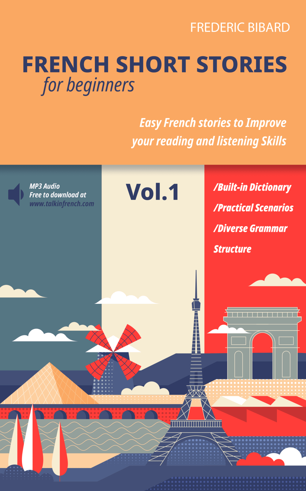
21 Responses to Option A
I love the colors in this one.
I like A better because it tells you more about what's inside.
I like how much more colorful this one is.
The design is more aesthetically pleasing, plus the French bars in the background are a nice design choice.
Option A looks more modern and legitimately scholarly. The colors are also more up to date and eye catching with the colors mimicking the French flag.
Book A provides a lot more information about what I'm getting when I purchase it so I can know what I'm getting for my money.
I like that it explains more about what's in it
The colors and design caught my eye. It's more descriptive about what's included with the purchase.
A makes me think of France more, based on the flag colors.
the color scheme of A feels fuller and more interesting. the details are the audio make it easy too
I prefer A, because I like the colors and art style, and think it looks a little more professional overall.
I LIKE BOTH. THEY ARE BOTH VERY DIFFERENT YET APPEALING
The colors are more appealing and I like that there is a play on the French Flag in the background, it is a more eye catching cover.
I like a because I like that it's more colorful
The cover is much more descriptive and you can tell what you'll be getting out of the book.
I think this book design stands out more than the other one and the other option doesn't look good with the big audio text in it.
The coloring in the background of A is very eye-catching
this option is more eye catching
I think the cover is more descriptive and explains it better
This flat art style is really attractive and eye catching.
This discription is much more informative on the front cover.
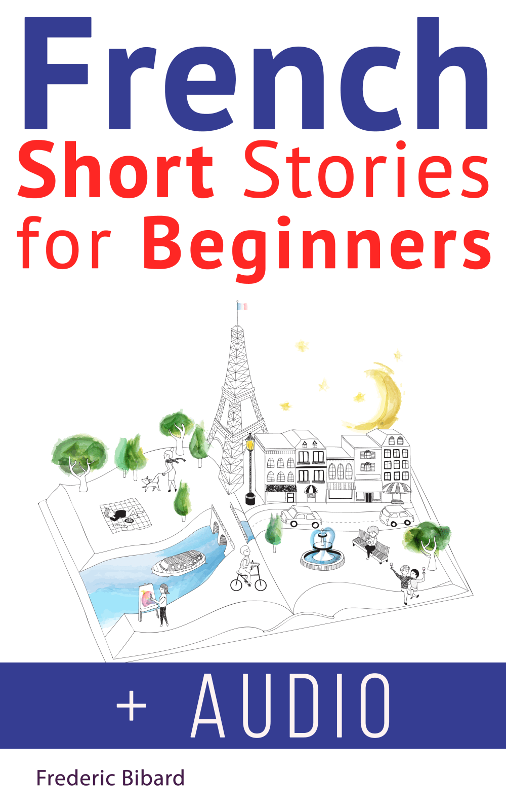
29 Responses to Option B
I like the plus Audio in big print on the bottom
looks a lot more artistic
B seems really fun and educational without it looking like a textbook!
B because it looks more simple and basic.
The design is more creative and interesting
The cover looks very well detailed and looks like it is composed of the actual occurrences that happen in France
Because I like the simple design of the cover better
I like that the included audio fact is displayed prominently. It helps to make me feel the program will be more successful for me to use.
Option B was simpler in design so I'm thinking it would be simpler in it's implementation.
I like the whimsical cover and the dreaminess it presents. I also think it's easier to read/take in than the other one - it's less overwhelming on the eyes.
The title stands out to catch my attention.
I like the picture and it is easier to see what the book is about.
It is more specific about being for beginners. It is also more attractive and attention-getting.
This book looks entertaining and immersive. It really makes me think there will be interesting and captivating stories, which would be great for helping someone just learning a language. Really like the design of this book cover. Feels like a book I choose to read, whereas the other feels more like a text book I was assigned to read.
I think this one looks friendlier. The other cover looks like a textbook, but this one looks like it would help you learn but also be fun to read.
I strongly prefer B. I think it grabs yours attention so much more and makes you interested.
The cover art is more artistic with the hand drawn pictures. It is also less cluttered
I like that B says "plus Audio" and I like the overall cover better it is more appealing to me
The cover lay out is more pleasing in B. A is too congested color wise.
I like that there is audio I also it looks more appropriate for this type of book. It has a nice simple appearance.
I like B because I think the little scene in the book gets your attention right away since it's stories. I also like the font and the fact that it says + Audio in large letters.
The people and realistic colors are more appealing to me.
Really hard choice because I have books with both types of covers. B edges A in my opinion because it is more modern.
B is more engaging and colorful.
Choice B looks more like a fun way to learn a language. Choice A seems like a college textbook and scares me a little. I feel it might be too technical for me to follow along, but choice B makes me think it will be more fun.
Option B looks more friendly and accessible. I like that audio is included too. Option A looks too much like a text book.
This one has 'personality' while the other looks boring and generic.
Choice B is more visually appealing and plus doesn't feel generic like choice A. The design communicates the premise of the book better, too.
Choice B is very clear with the large font. It tells you exactly what you're purchasing in a minimal amount of words. It also says in huge letters that the audio version comes with it.
Explore who answered your poll
Analyze your results with demographic reports.
Demographics
Sorry, AI highlights are currently only available for polls created after February 28th.
We're working hard to bring AI to more polls, please check back soon.

