Poll results
Save to favorites
Add this poll to your saved list for easy reference.
Which cover do you prefer for a book about PR and Advertising?
Option B won this Ranked poll with a final tally of 29 votes after 2 rounds of votes counting.
In a Ranked poll, respondents rank every option in order of preference. For example, when you test 6 options, each respondent orders their choices from first to sixth place.
PickFu requires a majority to win a Ranked poll. A majority winner differs from a plurality winner. A majority winner earns over 50% of the votes, whereas a plurality winner earns the most votes, regardless of winning percentage.
If an option does not earn a majority of votes, PickFu eliminates the option with the lowest number of votes. The votes from the eliminated option are reassigned based on each respondent’s next choice. This process continues in rounds until a majority winner emerges.
Scores reflect the percentage of total votes an option receives during the vote counting and indicate the relative preference of the respondents. If there is no majority winner, look to the scores to see how the options fared relative to one another.
| Option | Round 1 | Round 2 |
|---|---|---|
| B | 32% 16 votes | 58% 29 votes +13 |
| A | 38% 19 votes | 42% 21 votes +2 |
| C | 30% 15 votes | Eliminated 15 votes reassigned |
19 Responses to Option A
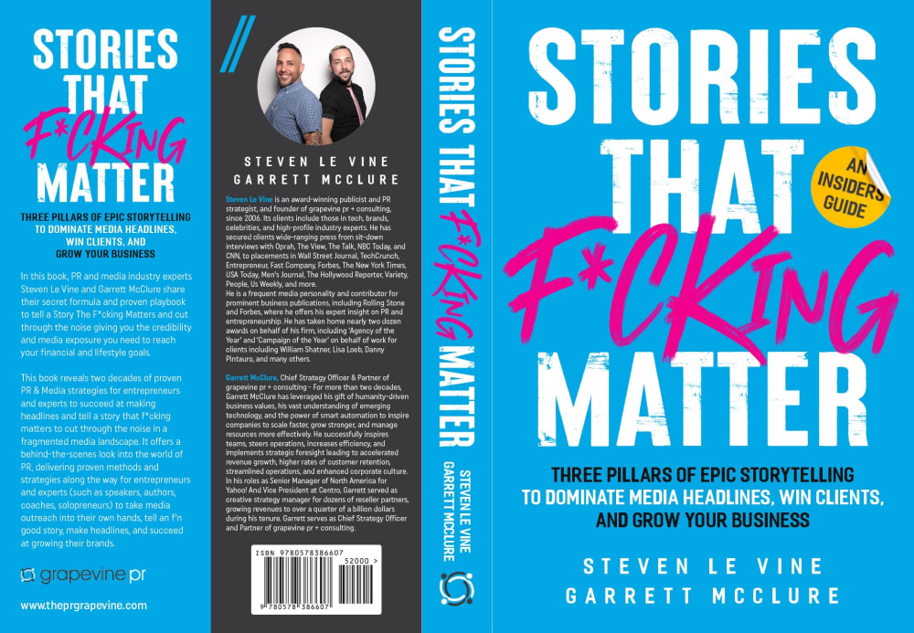
A - The pink just pops for meB - Blue was next eye-popping colorC - passed right over the gold/yellow, doesn't pop
I like the pink one the best. The blue is ok but the tan is not the best looking.
I like option A the most because the expletive is highlighted in a very visible color, meaning its eye catching. Option two has that too but yellow is less eyecatching. Option C has the same color throughout the cover so its not eyecatching.
I think the red and blue color contrast is really eye catching and fits this title perfectly.
I ranked the options in the order that I did based on the brightness of the F word.
I prefer to pick out the product which is in the product option A.There are three color combination element where appeared in the product option A.It was looking quite good and interesting too.The pink color was highlighting and enhancing the title of the cover page of that book.
The colors make this choice stand out. It is bold and bright. It feels kind of fresh and like the authors have a unique perspective on things.
I would definitely prefer the one that is majority light blue background. It is a really great color and I like how much there is of it. It matches really well with the little bit of black on the rest of it
I like the blue cover with the pink font the most because it sticks out more but I also really like option A.
The blue cover is better for option A. Love that look and it's bolder. I'd use that for the choice. Option C in black and blue font is nice too. Good designs for the book. Good description for the three pillars of storytelling and think that people will gravitate to it for learning what these are.
These covers seem the most appealing in terms of color and appearance
out of all the choices presented option A looks the most exciting because the word in the middle is written in pink
I like Athe most. I think that the pink really pops off the blue background! It makes it stand out a ton
I prefer option A because I think that it is the most interesting, eye-catching, and visually appealing book cover design/color scheme out of the three options for a book about PR and Advertising.
I picked A because the red font really stood out. After that the blue was more noticable.
I choose "A" because the pink writing stand out on the blue book cover.
I chose based on how much the graphics - claims popped, the pink is by far the best
I liked the colors in choice A better than the other ones.
B's gold color looked tacky. A's bright blue color felt the most vibrant.
16 Responses to Option B
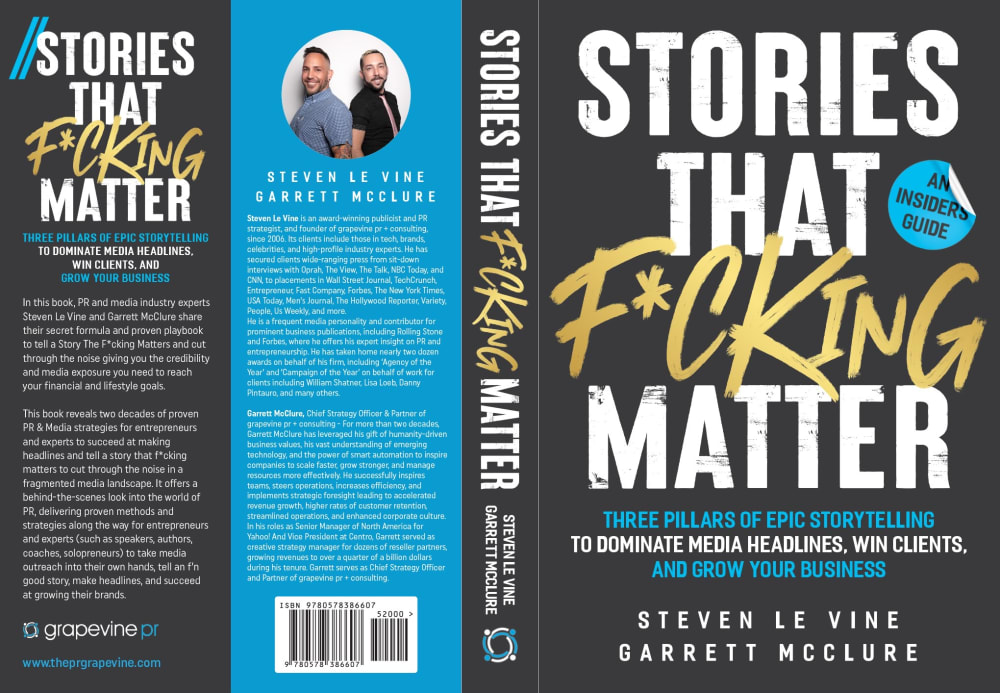
The color scheme looks more serious and interesting.
I think black and gold is the best combination out of the three options.
i PREFER THE BLACK AND BLUE WITH BLUE STICKER. YELLOW DOESN'T MATCH WELL
I prefer the black background, makes it easier to read. B was slightly ranked before C. A was last, hardest to read, most abrasive.
The gold text with the white black and blue background for this box set is good with this option B here
I prefer Choice B's cover overall. Anything business related is typically associated with darker colors, that's the standard for anything "professional", so B and C have that edge over A. As for why I like B more, that's primarily due to its choice of text colors. Not having as much text in the same shade as part of the background makes it look far better.
I would say option B due to the colors of the lettering. I think the gold color catches the eye more and engages the potential reader into looking at the book to purchase.
The colors on "B" are much better than the other two picks. "B" is my choice.
B i like the gold against black. A i like this but it's a little chaotic and bright.
I like the black background in B and C, it makes the words easier to read. And I prefer the gold lettering to the blue, it stands out more. The white on the blue background of A is harder to read.
I think the gold in B ties the design together. Blue and gold is a winner.
I prefer the black background and I think the yellow text goes best with it, so I like B
I like a black cover and gold colored text. That is why B is my first pick. I do not like A because it has a blue cover.
I like option B because our colors do not represent any gender, using pink or blue colors could be considered as segregated in today's society.
Lets put some more attention on "f*cking" then people are surely going to notice this. That's the idea with this title and also the book. So I would say the design should go with that. Color schedule is good and goes with theme o f the book. So I would go with this one.
B. The yellow text fits in perfectly not to bright or dark. C. The blue text blends in perfectly and matches with the other text below. A. The red text is too bright.
15 Responses to Option C
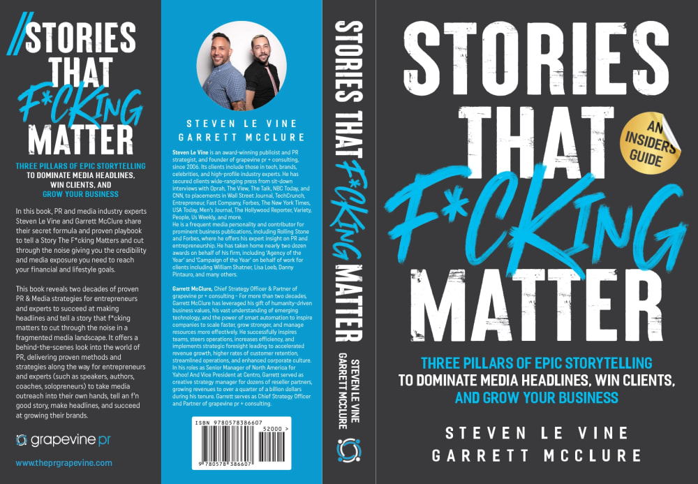
I feel that C has the best design to it that is the most pleasing and flows the best.
C looks best to me. The blue text stands out well and goes well with the rest of the book style and the gold label looks more natural
I like this coloring option the best as it all goes well together and also allows me to read it clearly
I prefer this book cover because I like the blue color that is being used
The blue text makes for the most cohesive cover. It seems to just all fit together. I like the black and gold for its classic look, but it doesn't quite feel right for this title.
I like option C because it is the most convincing and gets the message across. Option B and A don't really entice me as much!
The color contrast between the pink and blue in Option A hurts my eyes. I prefer the gold type on black in Option C because it stands out and while being pleasant to look at.
I think C has the simplest color scheme and it looks good. I prefer the two black backgrounds over the blue one.
I prefer this option. I think this cover really pops with the combination of blue text on the black background. I would like to compare the pink/black combination with this cover.
I like Option C because the black background really helps the text stand out. I then liked the blue font color as it flows better.
The darker colors used for the book cover seem to grab my attention more easily. Overall, I'm finding these selections to have a reasonable design and layout that makes sense for the most part.
I like option C because of the colors used for covered. Option B is similar and I hate optio 3. The word F... is strong enough and doesn't need this Fuchsia color
I prefer the option C because the book design is more neutral and would be perfect for any gender.
The blue book cover was very appealing and eye-catching, followed by the yellow cover. I did not like the cover with the purple/pink color - it was distracting.
The cover I prefer the most is C because they chose three colors and stuck to that theme and that is visually appealing to me. My second choice is B because I like the dark-colored background. The color of the expletive on the color is a bit visually distracting to my eyes. My least favorite is A. The blue-colored background is a color that is more irritating to my eyes than visually appealing. The bright pink also is visually irritating.
Explore who answered your poll
Analyze your results with demographic reports.
Demographics
Sorry, AI highlights are currently only available for polls created after February 28th.
We're working hard to bring AI to more polls, please check back soon.

