Poll results
Save to favorites
Add this poll to your saved list for easy reference.
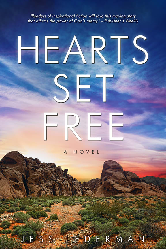
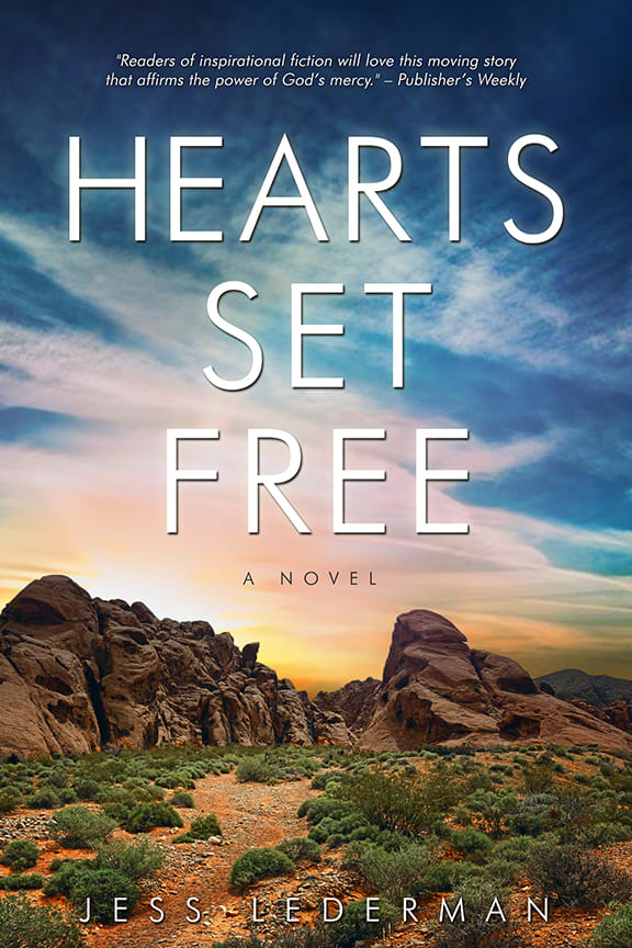
Which cover do you prefer for a book of literary fiction?
Age range
Education level
Gender identity
Literary preference
Options
Personal income range
Racial or ethnic identity
Religious affiliation
32 Responses to Option A
Like the colors in this one the best
I love the background. I think it looks much more pretty and appealing than choice B.
This background makes me feel better and the color of the sky is more appealing to my eyes than the other more garish version.
The amount of blue in the sky draws the eyes to the cover of the novel creating interest.
I think A will catch more attention since it uses more colors. I like the look of A even if that is edited.
I voted for choice A because the colors are more rich and vibrant. I also like the addition of the pinkish layering in the clouds. It adds a mystical effect that really pops to me and stands out compared to the other book cover.
I like the colors on choice A more. The sunset seems more dreamy, more fantastic and ethereal.
The picture on the front of the book is much more clear in option A and the colors much brighter.
The two covers are very similar but I do like the touch of red in option A. It stands out a lot more than the other option.
The colors are much more vibrant. They allow the words to stand out more and are easier to read.
I like the contrast of the sky in this version of the book cover. It looks more eye catching and I rather see this type of sunset.
I like the cover with the little bit of red in the corner. It makes me feel like there is some sort of drama in the book.
I like option A. I think the red sunset really brings this cover to life.
Both are very close and look very interesting. But the additional color on choice A caught my eye. I like the background pictures on both, but A makes it stand our from the other one.
The colors are just a little brighter and a little less apocalyptic looking. B just looks a little gloomier and a little more depressing.
I thought they were both similar
A draws me in because of the touch of colors that are added to the cover art. I can appreciate the purple and pink hues. They draw the eye in and make you think of a heavenly picturesque scene. The touch of color really does something to the art and makes you want to read more about the book and what is on the cover.
the sun set looks prettier than the sunrise
This cover book design has the best colors, titles and background tones for a book. It makes me feel attracted to it.
I like the colors in the backgound better because they are brighter and more vivid. It makes the cover stand out.
I prefer for a colorful cover to be a colorful as possible, show as many colors of the rainbow as possible.
The way the sun is setting on the right side of the cover and the specific pink/orange color are very appealing to me. The orange/pink indicates hope to me. Although its a very small change, Cover B looks a little sad and gloomy.
i like the red in the background. The red adds mystery and suspense to the cover.
The sky looks more real.
I like A the more because it is such a stark contrast. It really grabs your attention.
I like the red tones in the sunset on the cover.
I like the colors of the purple, orange and reds of option A the best. It makes the cover stand out better. Gives it a better sunset appearance.
I like the colors in the sky in A over B.
The cover is more vibrant and inspiring would definitely look into
I think the purple color gradient of option A makes the text stand out more and easier to read than option B.
The colors on this one seem more vibrant and nicer
I like the red in the clouds
18 Responses to Option B
The light sky gives me a uplifting feel which often is a feeling of hope.
the red on A looks kinda odd like a fire in the background
I prefer B because the colors are more realistic.
Choice B due to the natural look of the picture that allows for the words to pop and the rocks to look more real.
the colors are more calming
I picked B as I like the tone of the colors in the background than Choice A.
B is the one I like the way this one looks more like a sunrise and is bright and the colors make you feel alert. I would choose this one first
B - 1st choice - I see "B" as the start of a new day - which goes well with the title - basically, starting a new. When a breakup occur - you have to start over - your Heart is set free. When an old relationship ends, a new one starts. And you heart has to be expunged of the bitterness that caused the previous one to fail. So setting your heart free is a new start - like the dawn of a new day!A - The colors are darker - to me signifying the end of a day. The purples in the sky - I normally only see during a sunset. I don't like dealing with the end of things (end of the day, sunset). And it doesn't really go well with the title - which I view as being ready for the next adventure...
I like the book cover image. It not only catches your eye with the scenic cover but draws you into the title.
B looks a little more natural. In A, the red sky on the right looks a little more foreboding, and the purplish hues look too unnatural, and doesn't really fit with the inspirational message that it's supposed to convey.
B has an amazing cinemographic element to it and is highly ambitious.
The colors of the sky look more realistic to me.
The colors look more realistic to me.
I like the warmer colors in Option B. The red in Option A is a little harsh.
I don't really see a difference between the two, so either would work
The sky looks more realistic in B.
I chose B because it looks more like a sunrise than a sunset, as in A. The sunrise in A seems more inspirational and hopeful -- getting ready for something new. The sunset in B is a little less hopeful, like the end of something. So I think the sunrise in A fits more with the title and the theme of the book.
I think they're both good, but I think B is a little better because the colors in the sky are a bit more subtle and lighter and I like that it doesn't have the red in the corner like A.
Explore who answered your poll
Analyze your results with demographic reports.
Demographics
Sorry, AI highlights are currently only available for polls created after February 28th.
We're working hard to bring AI to more polls, please check back soon.

