Poll results
Save to favorites
Add this poll to your saved list for easy reference.
Which cover do you prefer for a Korean Grammar book?
Option A won this Ranked poll with a final tally of 27 votes after 1 round of vote counting.
In a Ranked poll, respondents rank every option in order of preference. For example, when you test 6 options, each respondent orders their choices from first to sixth place.
PickFu requires a majority to win a Ranked poll. A majority winner differs from a plurality winner. A majority winner earns over 50% of the votes, whereas a plurality winner earns the most votes, regardless of winning percentage.
If an option does not earn a majority of votes, PickFu eliminates the option with the lowest number of votes. The votes from the eliminated option are reassigned based on each respondent’s next choice. This process continues in rounds until a majority winner emerges.
Scores reflect the percentage of total votes an option receives during the vote counting and indicate the relative preference of the respondents. If there is no majority winner, look to the scores to see how the options fared relative to one another.
| Option | Round 1 |
|---|---|
| A | 54% 27 votes |
| C | 38% 19 votes |
| B | 8% 4 votes |
27 Responses to Option A
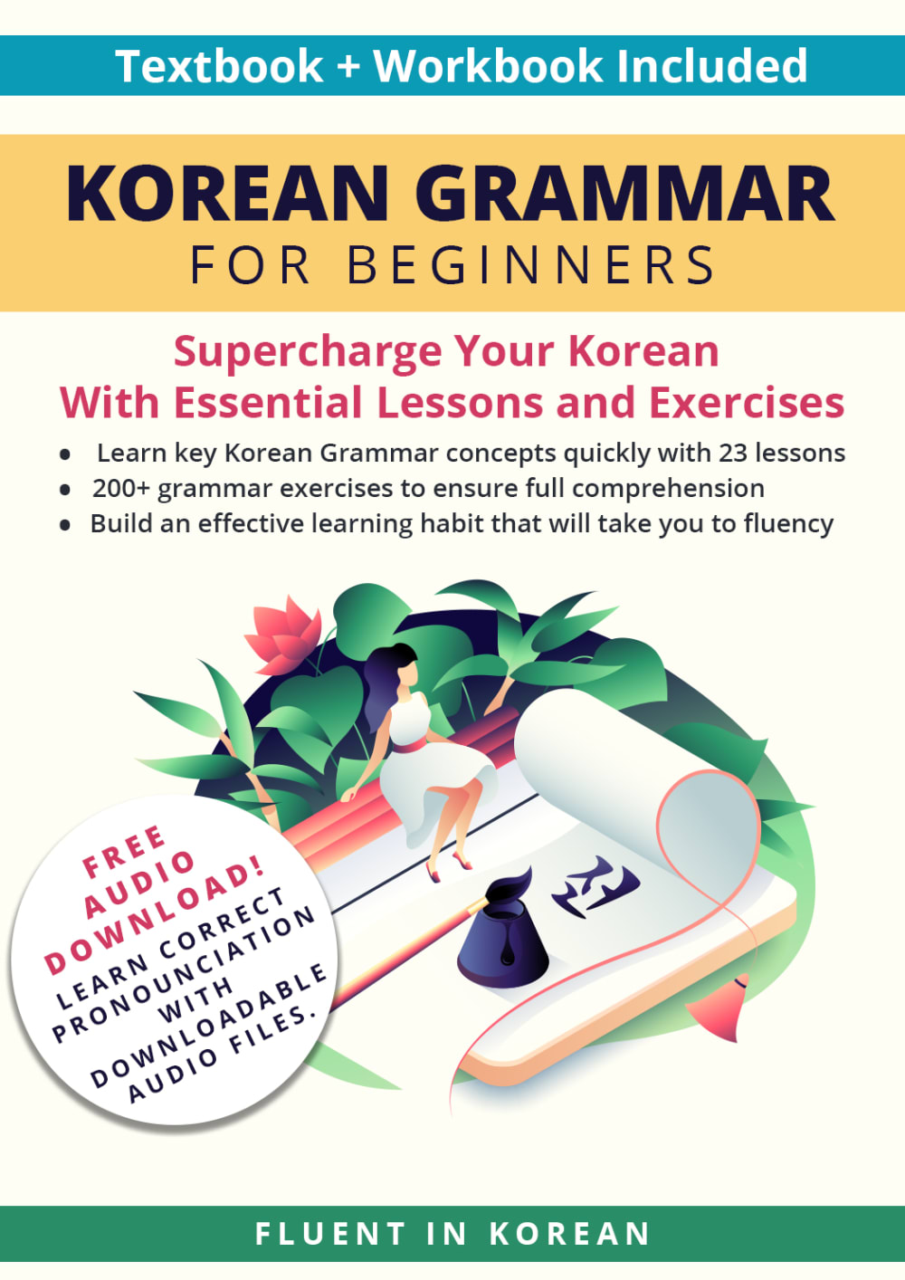
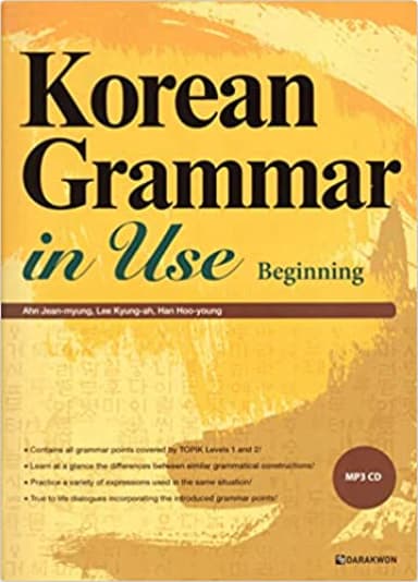
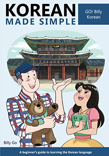
option A I like how it explains simply what it is and what it can be used for it's telling me Korean grammar for beginners. Now the other one that says Korean grammar in use that doesn't really tell me exactly what it's worth and the Korean made simple I'm thinking it's more of a kids book by the cover picture because that's the main focus of the front of the book
I prefer A because it's the most descriptive and detailed. C makes it look fun and accessible, but B is kind of bland and the smaller font is harder to read.
I like option A, I think the layout is what I look for in a language book. It looks good!
I liked books covers that provide a lot of valuable information about the book and ranked the options accordingly.
I preferred options A and B because they seemed more eloquent and studious. Option C seemed to be questionable and potentially racist.
The cover design in Option A is very nice and the best for me because it's very descriptive and uses a very aesthetic image. Option C looks good too but its rather dull and the texts are tiny.
I chose by options that make it most clear the book is for beginners.
The books that include some audio are a clear winner to me. It'll be easier to learn how to correctly pronounce the language with some audio.
I chose A first, because I like that it looks like a serious book aimed at learning the language, and that it includes a workbook. I chose C next over the more plain cover in B, because C makes it look accessible and fun.
I like option C best because it seems a bit modern and gives me a lot of information on why the book would be useful. As far as the other two go, I picked option B over option C because I like option C less than B. The cartoon graphic in option C doesn't appeal to me much, so I went with option B for my second choice. While it's pretty blurry, it looks like option B also highlights the book's uses which is good information to have at a glance. Option C has the graphic and doesn't tell me much other than it's for beginners, so it comes in last.
A really stands out with all the information on the cover, and does me justice.
I like option A the best because "for beginners" is emphasized in the title and thats what would draw my attention 1st. The artwork is nice as well and I appreciate that theres a graphic stating there is an audio download to help learn pronounciation. It does well to draw my attention and the functionality that is offered is what kleeps me most interested compared to the other options.
A looks fun while still being educational. It looks like it is suitable for children and adults.
First one looking like an intriguing choice. Options B and C look good but not as good descriptively. Need better color pelleting and fronting.
A's book looks like it would help me the most and is the highest quality.
It has more information on the cover and the design is more appealing to me.
I voted A C B because I like how option A also includes a workbook to practice what you're learning.I like how option C's cover makes learning seem fun and option B seems too serious.
Option A is my most preferred because it has nice graphics and tells you the contents in the book. Option C is also good but it looks a little old. I do not like option B at all as it reminds me of college textbooks.
My choice looks official yet also engaging with some creative art
There is more descriptions to the cover. And the cover design is more attractive
Definitely Option A because it really puts it out there that it has downloadable audio to make it easier to learn. Thank you.
A is the most descriptive regarding HOW it will teach me the language; it’s the only one of these I’d trust.
I like this one because it seems like it would work the best.
A is definitely the best to me, I did not like B or C. A has a beautiful drawing on the front that caught my eye, it is also smart about its wording "free audio download" and "supercharge your Korean" made it appealing to me. B is just very boring because there is no visual. C is the worst because the visual is just weird, why is the man holding a teddy bear? It seems like a child drew it or it is meant for a small child
Option A' is my first choice because, it has a brief description at the back that helps to know everything concerning the book.I prefer option C' because, it has an amazing design and looks very attractive.B' also has a simple design with nice colors which is very interesting.
I like a. Most professional and gives most info.
C seems too simple and B isn't so approachable. A looks the most accessible but also still effective.
4 Responses to Option B
Simple and to the point. No extra unnecessary pics or other things highlighted
"B" is the top choice because it's clear and not too busy. It conveys the pertinent information and nothing more. "A" is next, I actually prefer the font in "A" to "B", but the illustration makes it hard to take seriously and there's too much going on, too much text. "C" is awful and childish.
The simplicity of B is perfect for such a book.
The first looks professional. The second looks like its for a new learner, and the 3rd looks like it was meant for children. I prefer the professional copy.
19 Responses to Option C
I choose C, Because I like the style of the cover more fun and interesting and it is attractive in my eyes.
The front cover with the 2 kids and the Korean building is the best book cover of the 3
I like the fun nature of option C. Feels more accessible. Option A feels like it's for beginners. Option B feels stuffy.
Option C seems easiest to learn and the graphics are inviting and fun
I chose by the pictures. I feel like it was a fun picture so hopefully it will be a fun learning experience
First I picked C because the cartoon helps explain the book. Second pick is A because description is good but looks generic. Third pick is B because the yellow cover looks like a school text book.
Titles are catchy in C and A and I like the artwork, B is just too schoolbook like.
I like option C the best because the building pictured behind the two people immediately makes me think of Korea, which is perfect for a Korean grammar book!
"Korean Made Simple" is an appealing title for people who aren't great at learning languages, and the friendly cartoon figures make the book look welcoming.
I prefer the option C Korean language book cover because I like the cute illustrations of the people and the beginner guide focus of this book cover the most. I chose option A second because I like the more realistic illustration and how the key benefits of this book are described n this book cover. I chose option B last because I do not really like the orange and yellow background colors and paint style of the background cover image on this book cover nor how the text is much smaller and more difficult to see clearly.
C - this seems to be the most user friendly to me. A - I like the beginners in large letters. B - looks just ok.
A looks busy and cluttered. I do like the artwork, but it's harder to understand. The yellow one is ok. A little hard to see in the picture, which is a bit small. I like C the best. It's an intriguing cartoon that goes well with the topic. The title works too - and is the most appealing of them.
Option C looks like it would be the most fun by looking at the cover. Option A looks as though it would be the second most fun, but I'm not sure if what I'm seeing is a "safety cone" on the bottom of the cover? Either way, that still looks more more than Option B.
The 1st one looks the most user friendly although I like all of them number 2 also has a more simplistic look. In number 2 I like the inviting colors and design too
Option C makes it look easier to take a shot and learn the language.
I liked choice C as it gave the impression on a great learning experience
The way c is presented is awesome, I love the photo and illustrations used and I'd pick it by a mile over the others.
I like this because of the drawing on the front. I like the people conversing and touring the structures and trying to learn. I also like the drawing of the building that you would be traveling to see
I am fine with any of these options, but C is the least boring. B is a little more to the point.
Explore who answered your poll
Analyze your results with demographic reports.
Demographics
Sorry, AI highlights are currently only available for polls created after February 28th.
We're working hard to bring AI to more polls, please check back soon.

