Poll results
Save to favorites
Add this poll to your saved list for easy reference.
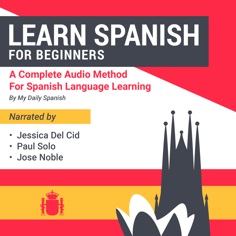
Which cover do you prefer for a Spanish language learning audiobook?
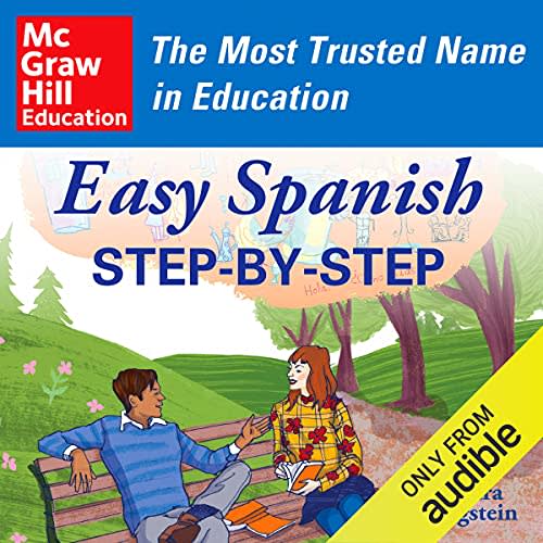
Option C won this Ranked poll with a final tally of 26 votes after 1 round of vote counting.
In a Ranked poll, respondents rank every option in order of preference. For example, when you test 6 options, each respondent orders their choices from first to sixth place.
PickFu requires a majority to win a Ranked poll. A majority winner differs from a plurality winner. A majority winner earns over 50% of the votes, whereas a plurality winner earns the most votes, regardless of winning percentage.
If an option does not earn a majority of votes, PickFu eliminates the option with the lowest number of votes. The votes from the eliminated option are reassigned based on each respondent’s next choice. This process continues in rounds until a majority winner emerges.
Scores reflect the percentage of total votes an option receives during the vote counting and indicate the relative preference of the respondents. If there is no majority winner, look to the scores to see how the options fared relative to one another.
| Option | Round 1 |
|---|---|
| C | 52% 26 votes |
| A | 32% 16 votes |
| B | 16% 8 votes |
16 Responses to Option A
I think option A meets my expectations if I were looking for a language book, I think the cover looks good.
"A" is the most professional and serious-looking of the three options. "B" is alright, but the font choice is poor - it doesn't need to be "cool" and this feels like it's trying to hard. "C" is the worst because it looks like something targeting elementary kids. Illustrations like this aren't relevant to the product at all.
There is more descriptive text to it as well as the cover design is more eye catching.
My choice looks official and serious yet with some art to make it appealing
I chose A first, because it looks like a serious studying method and is the most immediately clear that it is an audiobook just from looking at the cover. I chose B over C, because I slightly prefer the more serious style of the plain cover in B.
I like option A as it includes culture of Spanish on the cover. The image for option C could be used for just about any book and option B looks so plain and generic.
I like a best. Most professional looking.
A is really creative and I love the colors used on the cover in a. Very unique it is.
I like that A highlights multiple speakers, and that B is a "complete" course.
I like the Spanish flag included in choice A. I think that looks the best of the bunch
I prefer Option A. Its pleasant geometric design using warm colors, combined with excellent text readability -- including the high-contrast title -- is refreshing and most welcome.
I liked the more unique cover art of A and B, and the colors of Spain in A seemed most fitting.
This is one of my favorite language learning book, the cover pops off of the shelf this is the exact order I picked them up at a local book store and examined before purchasing. Love the name "For beginners" letting you know right off the bat this is going to be a product that guides you along the way with that in mind.
To me, A is the most attractive option and would be the one I would click on firsat when shopping for this item
the coloring and the graphics are pleasant without being overbearing and juvenile.
A looks the most modern and unique but also the most sophisticated. B would be next because it looks kind of original but dull as far as colors go. C looks like every other generic language book.
8 Responses to Option B
the simplicity of option B is more pleasant to my eyes.
B looks like it would be the highest quality and help the most.
The cover of B is easy to know what it is about without distraction.
Option B is my choice as the cover is very straight forward and not too condensed
I liked option B. I didn't really care for the other options.
I chose option B because I like that it looks plain, and I like that it has the sagrada familia in the background of the cover.
I like the font used in option B, it is unique, different and stands out. Both A and C are fine, but pretty generic and standard, nothing special.
B has a cool spanish looking vibe to it
26 Responses to Option C
I rather prefer the option C Spanish language book cover because I like the cute illustrations of the people in the park and the easy Spanish text on this book cover the most. I chose option A second because I like the more Spanish flag and castle illustrations on this beginner Spanish language book. I chose option B last because I do not really like the orange and yellow colors used on this book cover nor how the text highlights Paul Noble in such a large font on this book cover.
Option C looks the most fun and as an adult, I'm a firm believer that learning needs to be fun! As a side note, McGraw Hill is well known. I think it's great that you put that on there. Option A is the 2nd best looking (as far as fun is concerned).
This cover seems the most inviting and isn't too intimidating and I think this makes this cover the most effective.
The 1st one looks much more personable and I think more warm warm. Number 2 in number 3 are decent but they look more like a learning book and less like a storybook tutor
I choose C, Because the design of the cover is more lively and the color and creativity is above my expectation.
Definitely Option C because it says it's easy and the design is more appealing than the other options. Thank you.
Option C it's visually appealing and if I was searching for it online or for an audiobook it would catch my attention especially with the wording easy Spanish step-by-step
The cover design in Option C appears catchy and very persuasive and describes the book well enough for anybody to know what it's all about even at first glance. Option A is simple and nice too but C is my favorite.
I like option C the best because I like the image showing the two people being friendly on the bench. I also like that the graphics are full of colors that makes the entire cover stand out.
None of these are labeled with enough information about how they teach; I would pick c only because I know the name McGraw Hill.
I prefer this one simply because it seems like it would work the best
I really liked both C and A. C is cool because I like the drawing and I'm familiar with McGraw hill, it's smart to have the "most trusted name in education" next to the name that makes it trustworthy. A seems simple but good I like how it has the narrators on it. B is the worst because the drawing just looks very lazy to me
I choose C as that cover depicted best the relevance to me about learning a new language
I will choose option C' because, it has a very interesting image design at the back.Option A' is my next choice, the cover says a lot about the book with nice colors too.B' is my last choice, the cover is good but isn't that interesting.
I picked C because it looks the most professional and best looking. Second pick is A because I liked the red and white with the writing in the middle. Third pick is B because it makes the book look cheap and not worth it.
I like this one the best because it gives off the simple and easy vibe. The two people on the bench seem very relaxed and they are carrying on a conversation. This makes it seem like I wouldn't struggle to learn the language
Option C is my choice for this book because the step-by-step approach is very appealing and useful when learning a new language.
I chose in order of how easy the front cover of each book makes the product seem easy to use.
The McGraw Hill name is historically good, and the imagery on front is good too. C also makes use of yellow banner and blue sash. A makes use of red, which is almost as good. B is too plain though.
I would pick option to C as the colorful design catches my attention. I feel they spends a lot of time on this design, which means they also spend a lot of time on the contents.
I picked option C because it shows two people speaking on the cover and is the most attractive and engaging.
C) I know the brand 'McGraw Hill' so I feel comfortable that this would be a quality product. Also, seeing the people talking on the cover reassures me that I will reach that goal of speaking spanish.A) The design of the cover is attractive. It looks cool and I feel excited to try.B) This looks like an old world theme. I'm not drawn to this because it doesn't feel modern.
I like that option C states on the cover that the book is a step by step guide. That wording helps to ease my mind about the possible difficulty in learning a new language.
the plublisher McGraw hill is pretty well know
I chose by colors that make me feel that the book is for beginners and is approachable.
Being that it is the most trusted name when it comes to learning, I have to go with it.
Explore who answered your poll
Analyze your results with demographic reports.
Demographics
Sorry, AI highlights are currently only available for polls created after February 28th.
We're working hard to bring AI to more polls, please check back soon.

