Poll results
Save to favorites
Add this poll to your saved list for easy reference.
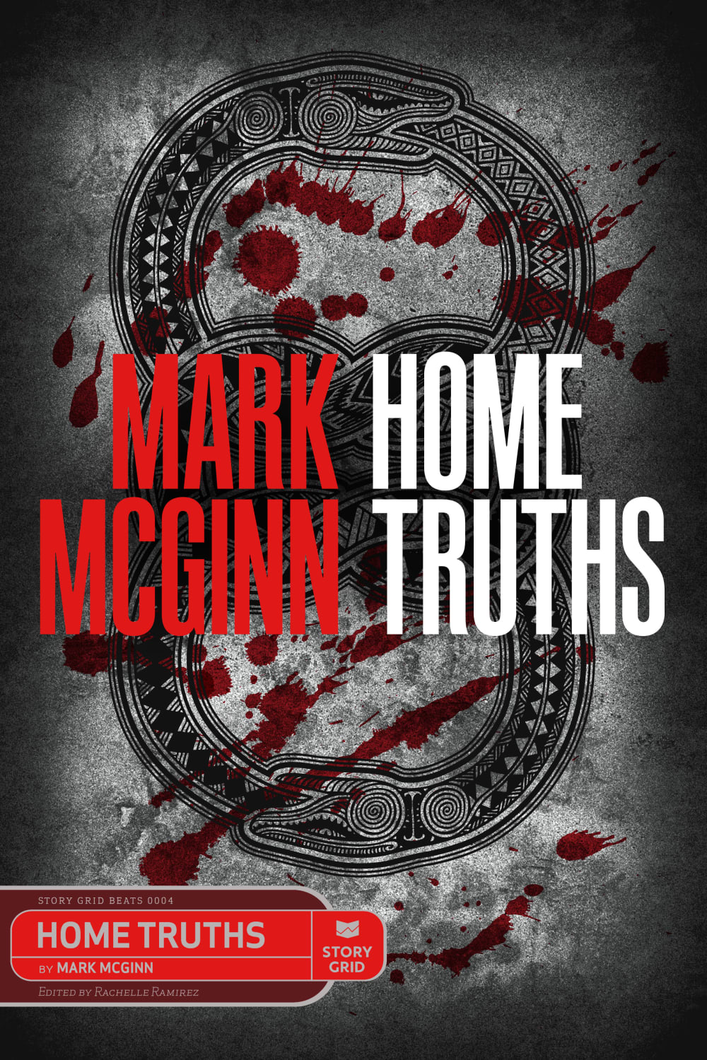
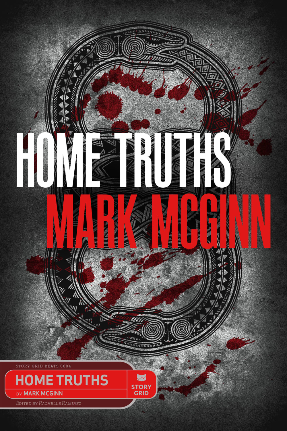
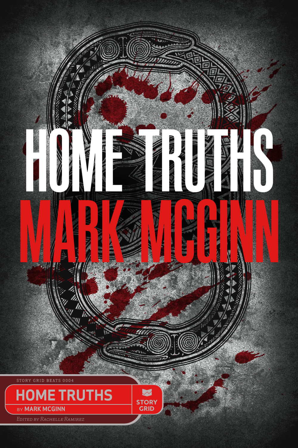
Which cover is easier to read?


Option C won this Ranked poll with a final tally of 27 votes after 1 round of vote counting.
In a Ranked poll, respondents rank every option in order of preference. For example, when you test 6 options, each respondent orders their choices from first to sixth place.
PickFu requires a majority to win a Ranked poll. A majority winner differs from a plurality winner. A majority winner earns over 50% of the votes, whereas a plurality winner earns the most votes, regardless of winning percentage.
If an option does not earn a majority of votes, PickFu eliminates the option with the lowest number of votes. The votes from the eliminated option are reassigned based on each respondent’s next choice. This process continues in rounds until a majority winner emerges.
Scores reflect the percentage of total votes an option receives during the vote counting and indicate the relative preference of the respondents. If there is no majority winner, look to the scores to see how the options fared relative to one another.
| Option | Round 1 |
|---|---|
| C | 54% 27 votes |
| B | 38% 19 votes |
| A | 8% 4 votes |
4 Responses to Option A
A grabbed my attention right away
Option A seems a bit clearer but all three are easy to read.
Option A is the easiest to read, all the words are in the right placement, so its easy to process and move the eyes from one word to the next without any problems.
I like on option A the name is stack on top of each other. I find this to be easier to read. I think it looks nicer on the cover as well.
19 Responses to Option B
I feel B is easier to read since the words are staggered. It makes it easier to digest.
Option B is easier to read then the others. The different colors being used in the words is nice
Choice B is easiest to read because of the font and the way the letters are arranged. Choice C is the second easiest to read, I can still tell what it says without a lot of effort. Choice A takes a bit longer for it to register.
First one has indentations that make it even more clear than just different color fonts and one on top of the other.
I definitely think the title and author should both be on their own lines. That is why I ranked Option A last. It creates confusion. Of the other two I think Option B is a little easier to read because of how the are offset. But I do think the centered one looks good and matches the symmetrical background.
I think B is the easiest because the word Home is a bit to the left. I think A is fairly easy too but not A. It looks odd the way the name and title are displayed.
I ranked the design of the book cover that I liked the most. I found the design of option B the most appealing followed by option C's book cover. I then liked option A the least out of the three.
I like the font of option B I like the color lay out the color scheme it’s easy to understand and read and comprehend
B is the easiest by far because it lets me read each line as it's own part
I think B works best with the lay out and the slight angle. You read the title first and then the author, the others did not seem to flow as well.
Choice B was the easiest to read since the lines were meant to be read from left to right, and were offset from one another so it's clear which words went together. In choice A, which was the hardest to read, the lines weren't offset and weren't meant to be read traditionally left to right.
Option B is easier to read because it reads left to right instead of up and down like option A. I like how option A put their title, it's a little different than option C and it's a little easier on the eyes.
Putting title on same line makes it easier to read and setting off from the author line below is slightly better.
A is a terrible design because you automatically read left to right, not top down. B is good because the words are offset a bit.
I prefer option B because i like the indentations of each line.
Having the two lines spaced differently is very helpful.
I like how the title and the author's name is offset on the book. It makes the book look more pleasing to me.
The title being on top of the authors name instead of side by side is better.
The lowest ranked is hard to read, it reads author's first name then the fist word of the title. Very bad, don't pick that one. I like the off set of my first choice best.
27 Responses to Option C
C has a stronger and more formidable background. It comes across as more dramatic which I like too.
i think options c and b are the best options
I prefer option C because it is easier to read when the whole line of text is the same color.
A is confusing. It looks like the book "McGinn Truths" is by Mark Home. C and B are equal in their readability and appeal.
THE LAYOUT IN C IS THE BEST IN MY OPINION, I LIKE IT CENTERED WITH THE TITLE ON THE TOP
C looks the easiest to read because the text is larger and bolder looking, it stands out a lot.
A is really confusing with the layout. C is the easiest to see due to alignment.
I like the over/under organization of the title and author.
The text being left justified or centered seems more appealing overall than the versions with a different arrangement of text on display for the title.
Straight across is always better than up and down because that's what people are used to
Straight out is plain and simple. I think it looks more professional.
The font color and positioning of options C and B is fantastic and makes the title readable and attractive. Option A positioning isn't that great.
I like C because the words are aligned neatly. A is the worst because of the confusing arrangement for the author name and the title.
C is the best as it is balanced and readable with its layout and contrasts of color. A is also good but leaves me a "little unbalanced" in reading it. A is a definate last as it is very difficult for me to read with the layout of color and text.
The cover in option C is easiest to read. I like how the text is aligned at the center and how the text is separated into white and red text.
I really likethe imagery of the image on the right
C centers everything and it stands out more, B still puts the title on top which I think is important, A, although bold leaves me kind of confused
Having the title on top and larger letters then the Author's name makes it easier to read.
I like my text centered, so this was a very easy decision for me to make.
It is definitely easier having the two lines being the same colors. I think it is easier just having the top line right on top of the bottom
I think Option C is the best as it is the easiest by far to read what the title of the book is. I think it helps being centered and all of the words in a row laterally.
I don't have a huge preference between C and B - I find them both equally easy to read, I just prefer when the lines are lined up rather than offset. I put A last because even with the distinct colors, my eyes initially went to "Mark Home Mcginn Truths" because I automatically try to read left to right rather than up and down.
C is the easiest to read but B is a little more eye catching since the spacing is different.
I like option C because it sounds looks the most bold and feels the most memorable. Option B and A are just average and mediocre to me.
None of them are hard to read to me. I do prefer reading right to left, so chose C and B first, and C before B because the font is bigger. A isn't bad and could be appealing to some, but A flows better to me. The grey font at the bottom could be a bit brighter, but it works well as it is.
Big bold letters will catch someones attention faster and no.2 is the same also and no.3 just might be a little confusing.
In my opinion, most people read texts from left to right. It is weird to put two words of the same phrase into two lines using horizontal align. Thus, A is the worst among the three options. Regarding C and B, I like the way how C positions the texts. Two lines of texts are aligned using center position. It is very common and accepted by many people.
Explore who answered your poll
Analyze your results with demographic reports.
Demographics
Sorry, AI highlights are currently only available for polls created after February 28th.
We're working hard to bring AI to more polls, please check back soon.

