Poll results
Save to favorites
Add this poll to your saved list for easy reference.
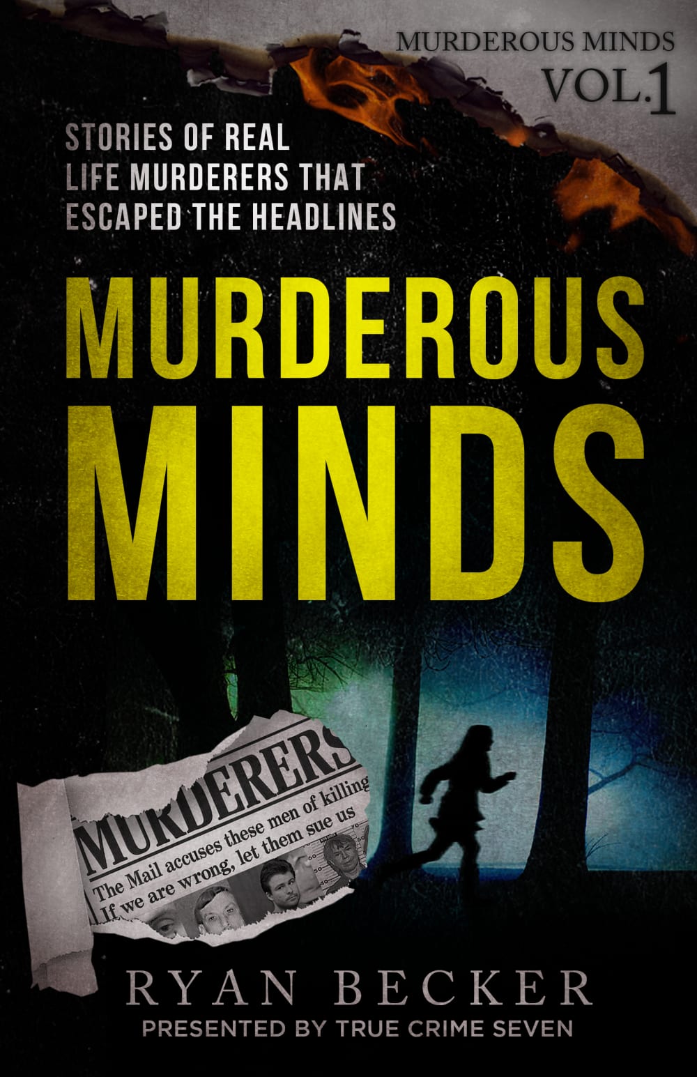
Which cover will make you want to read this true crime book?
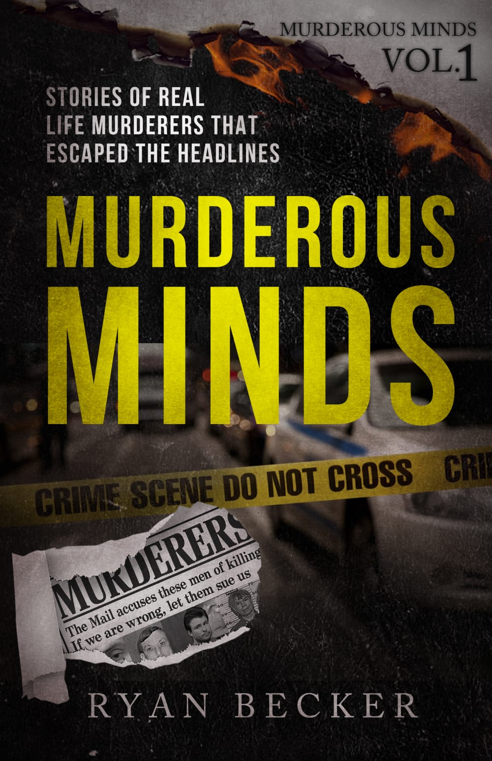
22 Responses to Option A
I'm a sucker for true crime shows and books. The police tape and cars makes the cover more exciting.
The image with the crime scene tape was more compelling and attention grabbing.
The image of police cordon makes it more appealing.
Option A stands out more because of the caution tape and the cop car in the background of the cover. I feel that communicates "murder" or "crime" better than the other cover which, I feel, implies the person went missing in the woods.
I chose A because the cover image gives the impression of real crimes while the image in B looks like the crime stories are fictional.
I like option A best. I think that option B gives away too much of the setting of the book by having the girl in the forest image.
I feel that A's overall cover design is more fitting and looks better.
I like the crime scene tape better than the girl running in the dark. Also, not having "presented by" looks better. It was too much.
I chose A because of the police car in the background. Makes me curious to find out if any LEOs would be listed in the book.樂
A is my favorite choice here because the design of the cover is flawless and draws your eyes right into the book.
I have no idea what True Crime Seven is, and the image of a running female is disturbing to me.
The crime scene tape is iconic and draws my interest
I think A is the better cover for this type of true crime book. I like the yellow crime scene tape, as it adds an extra bit of "pop" an color that matches the font along with creating a nice visual contrast.
This is the cover that makes me want to read this true crime book. This one grabs my attention. This one makes me interested and want to read it
a would probably fir the book more
I prefer option A' because the background image looks real, it gives a clear picture of a crime scene.
I like option A the best because the crime scene tape stands out the most and grabs my attention.
Option A with the crime scene tape. It is more realistic with an actual image behind the tape. It gives credence and realism to the book. Option B is too cartoon-like. It looks like a cover for a juvenile series. It does not take on the same feeling as option A.Option A gives you an image of a true crime with the crime scene tape and the image of the police cars in the background. This images raises the interest level for the book tremendously.
Option A. It stands out due to the crime scene tape making it more mysterious and possibly thrilling.
The police crime scene thing makes me more interested in the book than B, which is more boring
I picked option A because I prefer the crime scene tape to the dark figure.
It makes it look more real then just a painting of someone... (the photo makes it look more realistic)
28 Responses to Option B
B just held my attention more, with the rather haunting cover photo.
I think having the person running away on the cover adds more suspense to it.
The shadow of the young girl in the woods is intriguing for the cover of B
I like that this one shows that image of someone escaping against the pop of color. It is nice.
I like the blue colors/background against the darkness on the front of this one.
I think that the silhouette of the girl running through the woods is a lot more ominous than the picture of a police car sitting in traffic.
I think the figure is cooler and feels more artistic
This image looks slightly more catchy and encouraging for me.
I think that choice b is the better design for the cover.
We might as well go in and use the silouhette of a damsel in distress.
The sillouette of a person adds a bit more mystery to the cover and makes it more eye catching
I like B because it better illustrates the title, i.e. with someone escaping.
I like the cover graphics on Option B better, I like the shadow person running through the forest, I think it goes with the theme of the book and I find it more aesthetically pleasing to look at
The background of the person running adds a lot of character and perceived excitement
The scene in the woods is a nice sign of a horror film or something similar. That seems to be the best look. I'd go with that for the choice for the book cover. Nice to see the presentation by True Crime Seven as well. I'd go with the cover in option B first.
option B has a more attractive cover
the person in the background makes the cover more interesting and adds abit of intrigue
I think it looks better with the person running through the woods. It makes it look more suspenseful and like there will be more action
I prefer this color added to the book cover.
I like Option B. The scene of the woods looks more interesting and intriguing.
I chose B because seeing the person run away really made me feel more of a personal connection as a human. I feel that this made me more likely to feel like I am part of the crime as in all in with the victim and want to know what happened to them.
I like Option B's book cover because the lady running picture illustrates a crime scene and increases my eagerness to read the book.
looks like thriller by seeing the girl picture shows the story
These colors make the words pop out, which would make me more likely to purchase this cover!
The image of the woman running away in the night makes me feel the high stakes. I can feel the sense of trying to escape someone dangerous. It's a more unique image than the crime scene tape. Also even though I don't know who the True Crime Seven is... it feels very official as if some authority cosigned this book.
Easier to read and see better.
the title cover of this book looks the most interesting with the girl running in the woods
I chose B because of the person running. It makes it seem suspenseful.
Explore who answered your poll
Analyze your results with demographic reports.
Demographics
Sorry, AI highlights are currently only available for polls created after February 28th.
We're working hard to bring AI to more polls, please check back soon.

