Poll results
Save to favorites
Add this poll to your saved list for easy reference.
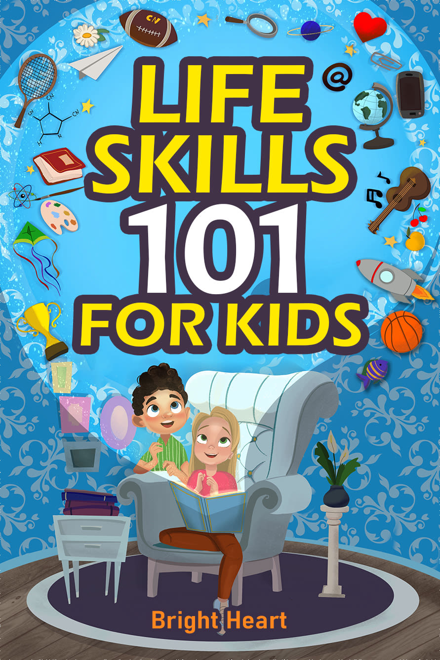
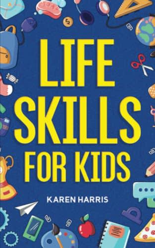
Which cover would you prefer for a book that teaches life skills for kids 8-12 years old?
41 Responses to Option A
This is a tough one as they change a lot during that period. I went with A because I think kids would identify more with it, but this would be strongest for say 8-10. Above that you start getting into the 'don't treat me like a kid' and older kids would identify more with B.
A has pics of kids as well as several images that suggest a comprehensive book. B Ok but not so visually attrative
I think option A is way more fun and exciting looking. The illustration of the kids enjoying the book with all of the floating lessons is cool.
For kids book covers, I prefer Option A because the design and gradient sound good for kids.
I chose A, because I think it is more creative and I like the imagery of the things to learn coming out of the book in a beam of light.
I think Option A has a much more fun cover and just from the cover would be much more relatable to children. I also think they would be more interested in reading a book with a cover like this. Therefore all things considered I would say option A.
I rather prefer the option A life skills book cover design because I like the more interesting illustrations of the children and how the objects are shown more clearly without being cut of by the edges of the book cover as in the option B book cover design.
Option be is a simpler title with better cover graphics.
I think kids will like the happy people on the front. This one is easy to understand visually for young kids.
I prefer this because it has an appealing cover design that I believe will encourage kids to read the book.
The characters are more inviting on this cover and there are fun pics all around the cover. It is more eyecatching.
I like the fact that you get a 101 skills vs an unknown number of skills.
More appealing image with kids on site
much more welcoming cover, better for the intended age group unless this is intended for the parents.
Showing the two kids looking up at the graphics above them make this book more inspirational.
It looks funner and would be easier to get my kid interested in it
Definitely Option A because it looks like it covers more information. Thank you.
A itis more directed towards kids the cover shows two sitting together and thinking that would show kids an idea on how to go about this book
I like the images in option A and think it is more unique, attention grabbing, and makes me and the kiddo more likely to read. I do wish there was some diversity on the cover instead of just white kids just so there is a little bit more representation showing it is for all kids.
A looks more geared towards kids. Make it fun.
I like the kid characters in choice A. They make the book look more fun
A looks much more fun and exciting.
The image of kids is more in line with the book
A is my pick because it shows some children and has a more playful cover overall.
I like A because it shows how knowledge can open up and illuminate our lives. The kids are cute but they need to be shown with their mouths closed.
I like this cover a lot better. I like the lighter blue background. I like seeing the kids on the front and how happy and fun they look like they are having. I also think the title makes me want to read it more as well
I like the simplicity of Option B but I really feel like A is more dynamic and draws me in better. I also feel like A looks more fun.
I like that option A has a cartoon look to it which should help to attract children.
The cover for Option A actually looks like a cereal box and is more enticing to kids.
I choose A, this idea and creativeness is very appealing and suitable and encouraging.
I think the kids will like the design that has other kids in it.
I thought A was the more kid friendly looking cover, so it seemed more fitting and appropriate.
I prefer the cover in A. It's more engaging than B.
I think that option A looks more exciting and leans more into the imagination of a child.
I like option a. The light that comes out of the book conveys the ideas the children will learn from this book. I just feel this cover had a lot of conceptualization around the subject. You're very well designed.
I like option A the best because I love how the kids are sitting in the chair and looking up at all the items associated with activities/skiills with amazed expressions on their faces.
I prefer this cover because it looks kid friendly and fun.
I think if the aim of the book is children the image in choice A does the best job of conveying that with the children on the cover.
I picked option A because I Like how it shows actual children on the cover.
This one is more cartoonish and seems more geared toward children and fun so I would chose this one.
clearer graphics, happy kids, the spotlight there really highlights the book and the kids' faces
9 Responses to Option B
The artwork is less childish and more relevant for a pre-teen.
I prefer B because it's a lot more simple and straightforward.
Best not to clutter it up with cartoon renderings
The other one seems a little bit too bright and colorful for this age group
The cover looks like it is more serious and not cartoonish.
The black font outline in A seems immature.
I like a title for a self help book that clearly states the book's intention.
I would pick option B because there shouldn't be a limit of 101 life skills. I think this book is so important for kids.
The whole 101 thing is overdone. I think the cover of B is also slightly more serious and mature without alienating the audience by seeming boring. Cover of A is seemingly less serious for the subject
Explore who answered your poll
Analyze your results with demographic reports.

