Poll results
Save to favorites
Add this poll to your saved list for easy reference.
Which cover would you prefer for this book topic about BPD?
Option B won this Ranked poll with a final tally of 51 votes after 3 rounds of votes counting.
In a Ranked poll, respondents rank every option in order of preference. For example, when you test 6 options, each respondent orders their choices from first to sixth place.
PickFu requires a majority to win a Ranked poll. A majority winner differs from a plurality winner. A majority winner earns over 50% of the votes, whereas a plurality winner earns the most votes, regardless of winning percentage.
If an option does not earn a majority of votes, PickFu eliminates the option with the lowest number of votes. The votes from the eliminated option are reassigned based on each respondent’s next choice. This process continues in rounds until a majority winner emerges.
Scores reflect the percentage of total votes an option receives during the vote counting and indicate the relative preference of the respondents. If there is no majority winner, look to the scores to see how the options fared relative to one another.
| Option | Round 1 | Round 2 | Round 3 |
|---|---|---|---|
| B | 27% 27 votes | 30% 30 votes +3 | 51% 51 votes +21 |
| D | 33% 33 votes | 44% 44 votes +11 | 49% 49 votes +5 |
| A | 24% 24 votes | 26% 26 votes +2 | Eliminated 26 votes reassigned |
| C | 16% 16 votes | Eliminated 16 votes reassigned |
Age range
Education level
Gender identity
Options
Personal income range
Racial or ethnic identity
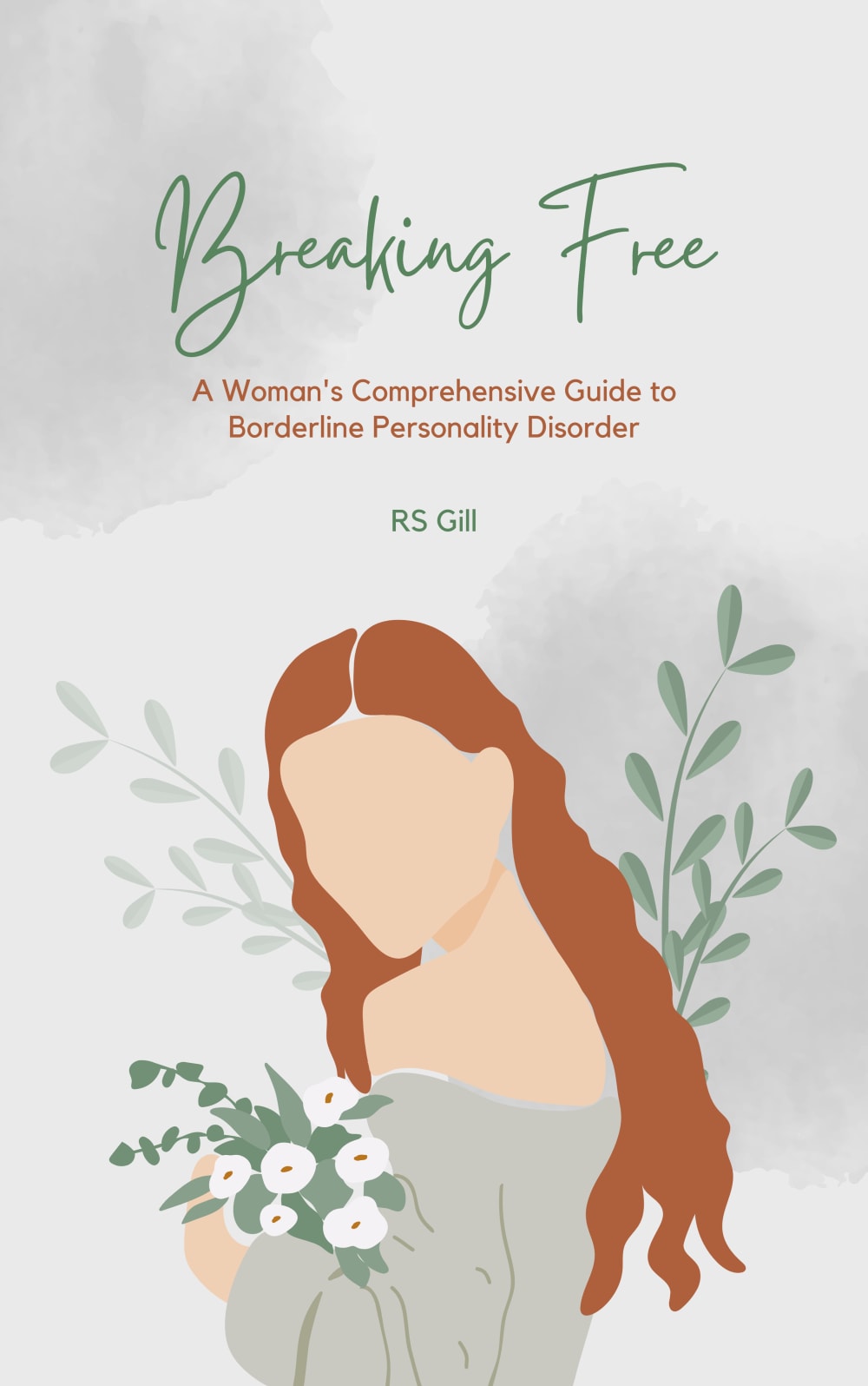
24 Responses to Option A
The color and image is quite compelling in option a
A and B feel as if there were more thought put into those designs. Options C and D feel vague and poorly put together, those could be covers for any kind of books.
I ranked like this color and font really good topic i love this design
I selected the book covers that I found to be the most eye catching, beautiful and attractive.
More colorful and expressive covers as ranked; better emotional connection than silhouettes
I prefer choice A for the brighter colors.
I liked the colors and the design used for option A the most. Option B did a good job at conveying the message of the cover, 'breaking free.' Option C looked okay. Option D, just didn't look as eye-catching to me. It could use more colorful colors.
Option A looks the most peaceful to me and the colors are nice and soft, B follows it closely behind. Options D and C look really generic and like they were designe din a rush
1st-A: the painting is graceful2nd-B: it matches BPD, for women3rd-D: it looks like a girl think and look at her future4th-C: the image is not good, it's more like a confident, happy girl who doesn't need BDP
i like a and b beacuse of the cover colors and style and words
i really like the colors and the art style
I picked the choices that had more pastel colors and less darker colors. I prioritized the options with some sort of nature-like image on it
A and B are both beautiful as art, but it's pretty creepy than the women don't have faces. It seems dehumanizing. C and D are worse, though, because the childlike silhouettes infantilize women with mental illness.
The first two look more for women, the other ones look like they are aimed toward younger women or girls
Option A draws my eye again and again. The faceless woman in this image speaks to me in a compelling way. I looked back at this image again and again. I think option A will also draw other people to look into this book.
A and B look like they're meant for women, while D and C look more suited for teens or girls.
I like the green cover with the woman holding flowers best because to me, nature really helps with mental health
C was ranked last because between the name and the art, it is incredibly cliched. D was next to last because using a little girl goes against the "woman's" guide name. A and B don't seem particularly related to the topic, but I prefer the art of A so rated it highest
most relatable and eye catching. better colors and illustration
D's cover looks tacky like clipart. So does C but not as bad, I dislike the texture on D. A is very pretty and pleasing to look at. B is as well. I like the colors and design of both.
I like C least because I don't understand the imagery - is she turning into an eagle? being attacked by a hawk? what does that have to do with BPD? D's imagery seems less professional than A and B and like the elements were copy and pasted from very different origins/themes. B and A are simple and not confusing, but I like A's colors and font better than B.
I feel like A and B best depict on how a woman with BPD would feel trying to connect with themselves; without a face and maybe after reading this book it'll help them be more in tune with themselves.
I chose Option A first because I think it's the most aesthetically appealing and attractive visually. However, none of these really strike me as being related to BPD. When i think of BPD, i see more of a stormy, struggle, tumultuouous aesthetic, and these all remind me kind of like a yogurt or allergy medication commercial. Option C specifically makes it feel like BPD is something casual or easy to overcome.
I like A the best because even though you can't see the woman's face, it still conveys emotion on the cover. I like that it's more of a simple design and my eye was drawn to that one first despite the lack of color the other covers have. A close second is D. I feel like this one also conveys emotion and hope. I do like the color scheme but I think it looks more like it was done in a hurry or more unprofessionally or with less thought than A; it just looks a little more generic. Then B is next. I like the simplicity again kind of like A but it doesn't have the same amount of emotion to it that A does in my opinion. It almost looks more like a Beauty and the Beast kind of cover. Like the woman is Belle. And my least favorite is C. It looks so generic. If it didn't have a reference to BPD, I'd think it was a poorly-written, cheaply-published self help book.
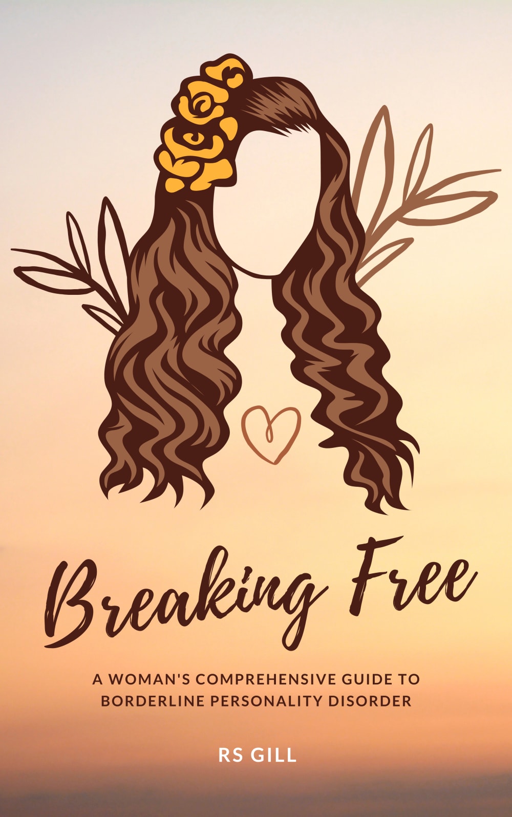
27 Responses to Option B
I liked the natural colors on B, the drawing on A, the stars on D and the birds on C.
I like the options that show a woman being calm. Most depictions of BPD are overly excited and manic. Having a nice, chill cover would be good.
I like this cover the most because it has an illustration of a women and not a child. I also think the illustration is simple, unique and also calming.
I think that cover B shows the beauty of women without over doing it.
I think that the color and design used on option B is pretty and nice. I also like how the product looks relaxed and happy. C and A are okay but they don't really give me the same warm feeling that B does. D feels a bit strange for what the book is about. I think that D doesn't make sense in for the idea of the book.
Based on design i like option B the best. I feel like it encourages the reader to embrace their beauty and accept who they are.
makes more sense gramatically
I like the image of the women. It’s relatable and calming.
D looks like it is related to a wedding and A looks like a children's book cover. I think athletics immediaetly when I see C so B is the best. It is pretty neutral colors and is clearly directed towards women.
I feel like this option is the most creative.
I think both covers B and A look good and would be eye-catching for a book cover. Not a huge fan of D and C looks really amateur.
prefer the soft earth tones and natural font
My first two choices, A and D are both equally preferred. The cover illustrations of those two are both beautiful and inspirational. C and A were both ok, but didn't seem to capture what the book is about, in quite the same way.
I like the colors and layout of option B. Option A looks like its for a wedding or something.
I prefer the book cover shown in Option B about BPD because I think this image is prettier and better than the other images shown in the other options.
I really love B, the colors and shadow of the face are really nice, I love the flower in the hair, it's feminine and cute.
Either Option B or A, they look to be the most suited for the book, the silhouette ones look like little girls, not women. Thank you!
The colors and imagery of B is simple and beautiful looking.The photo used of C looks generic and does not stand out from so many self help/motivational books.
I picked these options in this order according to which one had the best overall graphics and colors I picked the ones that I felt most symbolized a person specifically a woman breaking free
I really like the cartoon image on Option B. After that, I think the font in the title in Option A is appealing. I also like the lighter background color. Option D is a little childish to me.
I like the Option B better. It's the clearest, it has the best font use as well, and the color on the background matches really well with the color of the face, even if it is unintentional. Option D and A are my second choices, it can go either way, as they are not particularly good, but can both pass for a book cover, probably with the font used in Option B, Option D and A can also be good. Option C is my last as the background and the birds look like they are something from a gospel or a religion-based book.
I prefer the 2 covers with the artwork of a woman because it shows identity which i believe is on subject. I prefer B slightly because it looks nicer in my opinion. D is pretty but I dont thinks follows the theme appropriately enough. C is just ok
I think option B is a really beautiful cover. I enjoy the childlike cover for D (almost as if reclaiming childhood after a BPD diagnosis). A also is nice but feels like it puts a face on BPD and id want it to be easier to put me in the shoes. I just don’t like the silhouette of C.
Choice B immediately grabbed my attention before the over cover art options, it is unique the flowers in the character's hair is a nice detail a well as the heart both options B and A convey an aesthetic of a free and powerful woman which fits along perfectly with the top of the book. Options D and C are what you would expect of atypical self help book, they are bland and rather borrowing it would easily get lost among the sea of self help books unlike options B & A,.
I chose B and D first because the images provoke feelings of freedom.
My first two choices have the most personality of all of the covers.
B and A have beautiful and simple imagery, the color of A is more eye catching than B. D and C are too cliche.
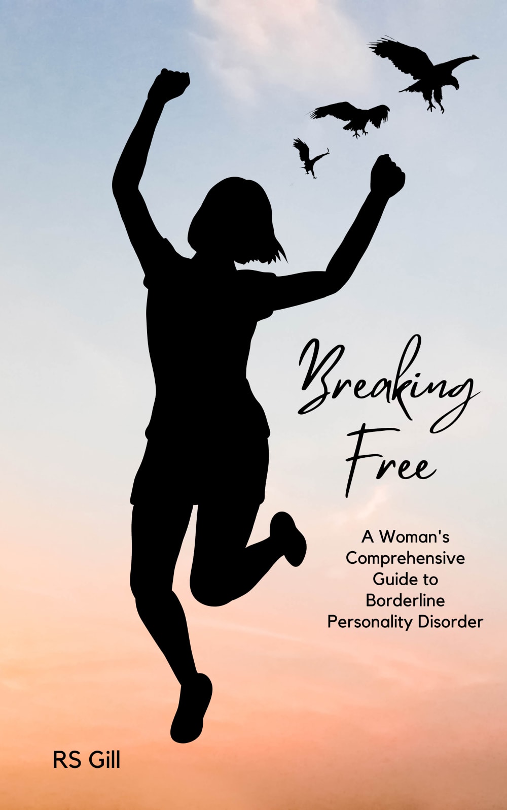
16 Responses to Option C
C and D emphasize the message of finding freedom. B and A just appear to be about looking pretty and feminine.
I would choose option C. I lie how in the image the girl is jumping like she is celebrating as well as the birds.
Option C's image seems the most victorious for someone who is breaking free. Option D also shows the birds which is a symbol of freedom. Option B seems more empathetic and kind with the heart image on it and option A is pretty but doesn't really have much relevance to the book.
Imagery seems to most represent the breaking free aspect of the title.
Based on the 4 images. I went with C , D, A and B. I really liked C and D for BPD.
I honestly do not like any of them. Try the color choice of C with a picture that's more like a picture of A. Except instead of a younger looking girl, pick an adult woman. Font of B I think is the prettiest.
I like the options that are closer up to the pictures and products and allow me to envision a relaxing environment while reading the book.
I liked choice C the most because it looks like that person is joyfully free.
Option A is the least appealing so chosen last. Option C is first because it shows a woman that actually looks free and happy option B is just an amazing illustration and D sort of symbolizes freedom as well.
I like when the woman is made more prominent, as it is about her struggle/way to overcome BPD. The colour choices in C and A are much more calming.
I like the silhouette designs of C & D. They seem cleaner and more attractive than the other options.
C&D give me the best escape vibes.
C It looks like she is celebrating feeling good and being happy. A has a woman holding some nice flowers and being subtle. B has a nice picture but the colors are dark and she isn't doing anything. D looks like it has a young girl which I don't like because the book is for women.
I like more active photos
These are all pretty. I like C because the lady looks like she is “breaking free” and the birds represent freedom, and I also like the birds in D. A and b make less sense, but they are pretty designs.
I chose C first because the woman looks the most free, and the silhouette looks child like. I chose D second because the image seems to be a little girl, and I imagine breaking free would feel like healing your inner child. B was next because I like the color palette of the flowers. Nothing stands out to me about A.
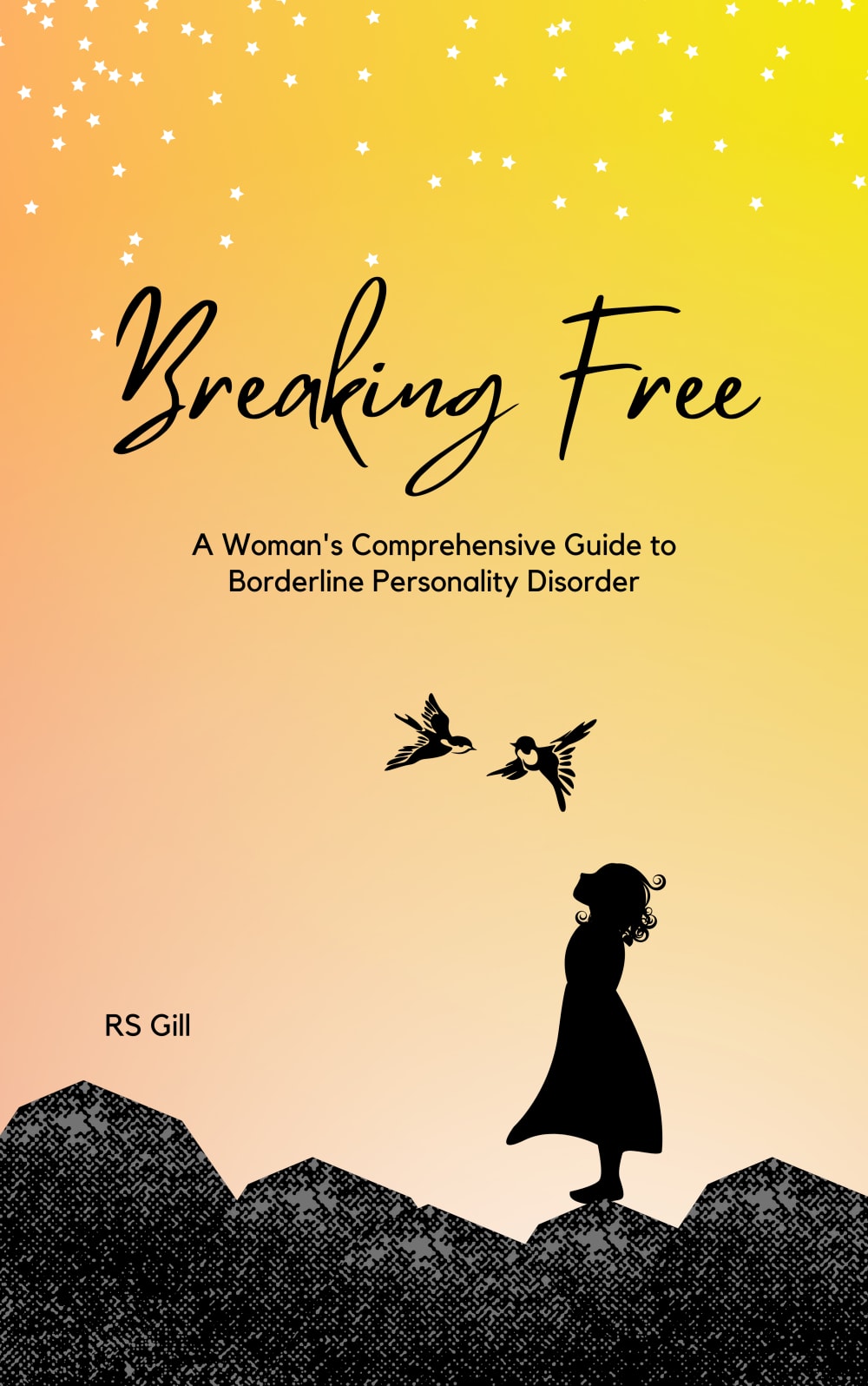
33 Responses to Option D
I have BPD, so I understand how important it is to break free from this mental condition. I really love this one as it gives me a sense of calm and collectedness
Made my choices based on which book cover I prefer and like best. The one I prefer and like best is the one in D.
The woman jumping looks too fun for the topic of the book. I like the more peaceful graphics like the girl with the birds.
My choice is option D as rank 1 because of the book title and the book cover is very suitable for the content . in the above chosen image is display a women see a bird fly independly so the title is suitable with the content of image so i choose this.
I really liked the bird/silhouette combo and d felt more calm and introspective
The options with brighter colors felt a lot more engaging and festive to me than the options with heavier and darker colors.
I like the covers
Option D as it isn't overly positive/happy. Individuals that I know with BPD loathe their illness and consistently put themselves down. So a book cover that still has a sadder undertone with a happier coloring scheme is more fitting. Option A is soft and comforting but does not explain it is about BPD. Option B Is warmer colors but not as impressive as option A. Option C seems like, from the image, it is promising that their will be a "break free" from the BPD when it may not work for that individual.
I like how choice C shows the woman with her arms open and the butterflies coming out. Really portrays the title of breaking free.
I prefer the coloring here on this cover as well as it looks like the girl or women is being set free, out in the open.
I like Option D the best. It is the most simple, but still effective.
The girl on the hill with the sky is the nicest and most motivating.
Option D has the most impactful image because although it is a book for a woman, she would have been experiencing the BPD since she was a young child, so the imagery acknowledges that there are years of mental trauma that need to be addressed. The release of the butterflies implies growth and hopeful and beautiful change. Option A is a nice image, but doesn't really relate to the sentiment of breaking free and might only relate to those with fair colored skin. Option B looks like a Hawaiian flower advertisement. Option C is too on the nose with someone jumping as if everything is totally fine.
I picked them in order of what seemed more relaxing to me.
A and B look really weird for a self help book, I don't need like a human without a face. D is fine, and C isn't bad. B looks like an ad for a hair product to be honest.
I ranked my choices by how unique and artful they felt. Some really caught my attention and would have me reading it to learn more.
I think Option D best fits for a book about BPD. It stands out the most out of the options given and would make me interested in reading the book.
A and B are too much like fundie influencer clip art and that alone puts me off the book.
I thought that choice D had a poetic quality to it that made it seem more profound and contemplative, making it my favorite choice. I thought that choice C was the most uplifting of the images, though it didn't quite have the same artistry as choice D in my opinion. My third favorite was choice B because of the bold, vivid lines that were used on the cover art, making it stand out more than choice A, however it did not evoke the same emotional response as options D and C. I thought that choice A was the least favorable of the four since the colors were very muted and the design itself wasn't as impactful.
The girl reminiscing shows the title the best
Option D really shows the "breaking free" with the birds flying away. Option C does as well but not as well.
i like the covers that depict the women being physically freed
The cover is dynamic and thought provoking. The product addresses an innate trait and is intriguing.
I liked option D as my first choice because the graphic reminds me of a female who is looking up as if she's wanting to break free of bpd, and the birds above her look free and seem to represent hope. My second choice was option A because the graphic of the female was appealing along with the cover design. It has an appealing overall flow to it. Option b was my third choice because I liked the overall design composition, but the image of the female wasn't as eye catching to me, and the colors didn't stand out in my opinion. Option c was my last choice because I felt that the silhouette graphic of the girl was too large compared to the text and a little bit overpowering. It reminded me of a cheap vector graphic slapped on the cover. If it were smaller or designed slightly differently I might have ranked this one a little bit higher because she looks confident.
I chose D first because it feels like the female is looking up and has realized something that has allowed her to break free. This made me think the book would be very helpful and reflective. I then chose C because it looks like the female broke free and was now running, giddy with excitement. I felt it fit the hopeful end result of the book. I then chose B as I did not feel a connection with it other than it being a female. Same with A, I chose it last because I felt it had the least connection with the purpose of the book.
I like D the most because it looks like the woman is out in nature, which is where I feel the most free. I also like the colors of C a lot, but the jumping woman makes it look too over-the-top "free", if that makes sense.
My favorite cover for BPD is option D. I like the black silhouette and how the girl is looking up at the birds. It looks beautiful, and the colors remind me of the sunset.
Option D was the most interesting appealing cover because of the colors and illustration. Option B is similar to option D. However option C looks very cheesy to me. Option A looks like some biblical guide seems unrelated to the topic.
the top one with the shadow really suits the title
I picked d first because I like the freeing of the birds and the sky, like if you read the book - you'll be more free. A was next because I like that it's a woman on the cover of a book about a woman. I think the faceless woman is great as well. I picked it over B because the pose seems more meaningful. It's not straight on and could signify BPD symptoms. B was next because I also like that it's a woman, but it seems plain. Also I really can't stand C. Something about the pose really bothers me. The pose is annoying.
I prefer option D because I like the image of the girl looking up at the sky. It exemplifies hope.
I would pick option D because I like the image of the woman looking up at the birds above her and the stars in the sky.
I chose option d first because all women were little girls and felt free at that point in their life. I like the lighting as well
Explore who answered your poll
Analyze your results with demographic reports.
Demographics
Sorry, AI highlights are currently only available for polls created after February 28th.
We're working hard to bring AI to more polls, please check back soon.

