Poll results
Save to favorites
Add this poll to your saved list for easy reference.
Which design do you prefer and title is best?
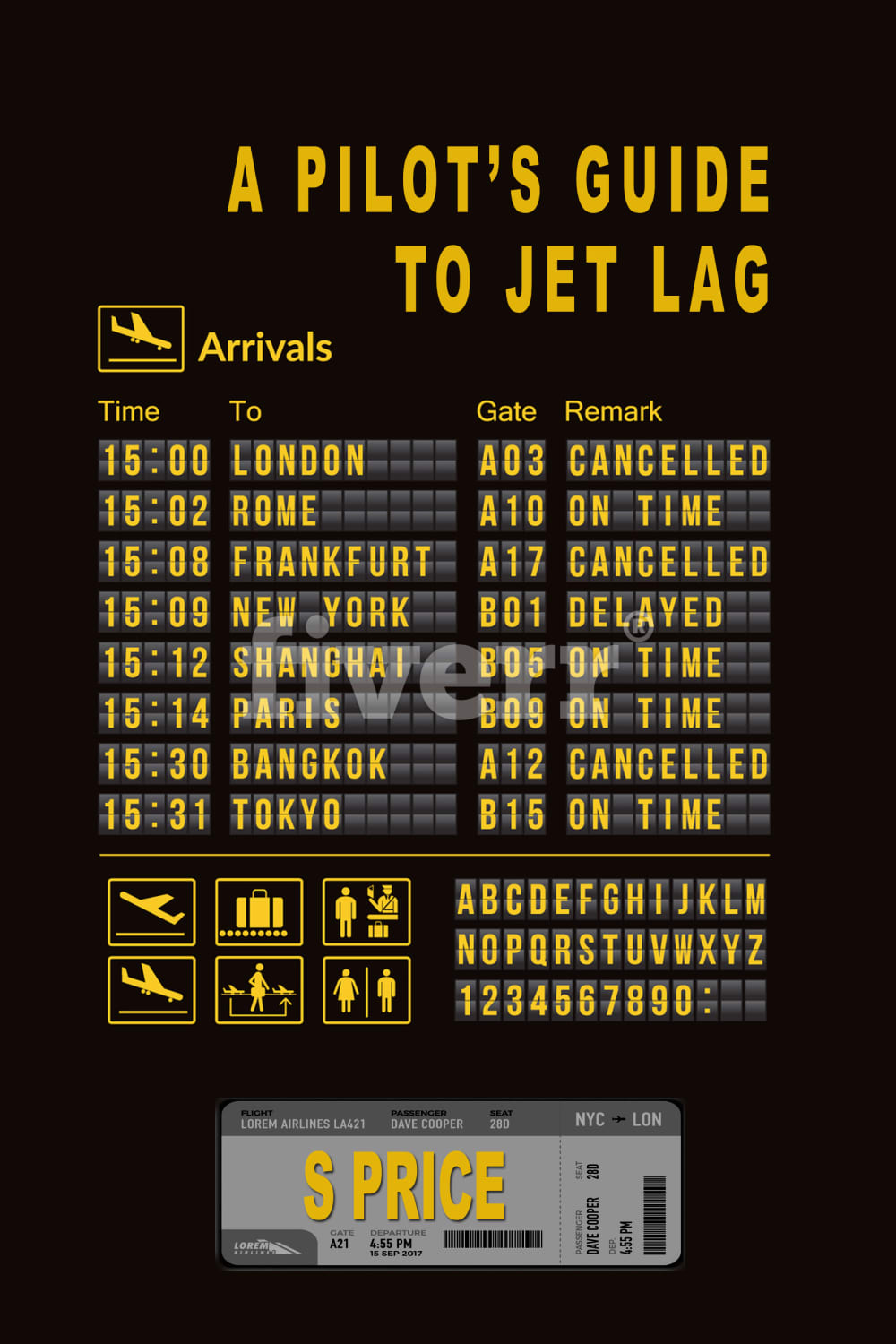
8 Responses to Option A
Less is more, so the word "beating" is unnecessary. Also, teh color scheme and cover are far more interesting, eye-catching, in A, than B.
I notice the title more on A, B is not as noticeable.
The yellow and black stands out and it is easier to read the text.
Choice A is more creative and eye catching. I like the colors and how the ticket has the author's name.
i like images and the whole tying into the photos and airport, it feels high quality and creative
I just like the schedule on this one.
I choose A because i prefer the design on the front of the book. It makes it seem more like it's going to have a graphic true story from a pilot versus the other cover seems to make light of the book to me.
I like both. I do like how this makes me look closer. I want to know what each line means.
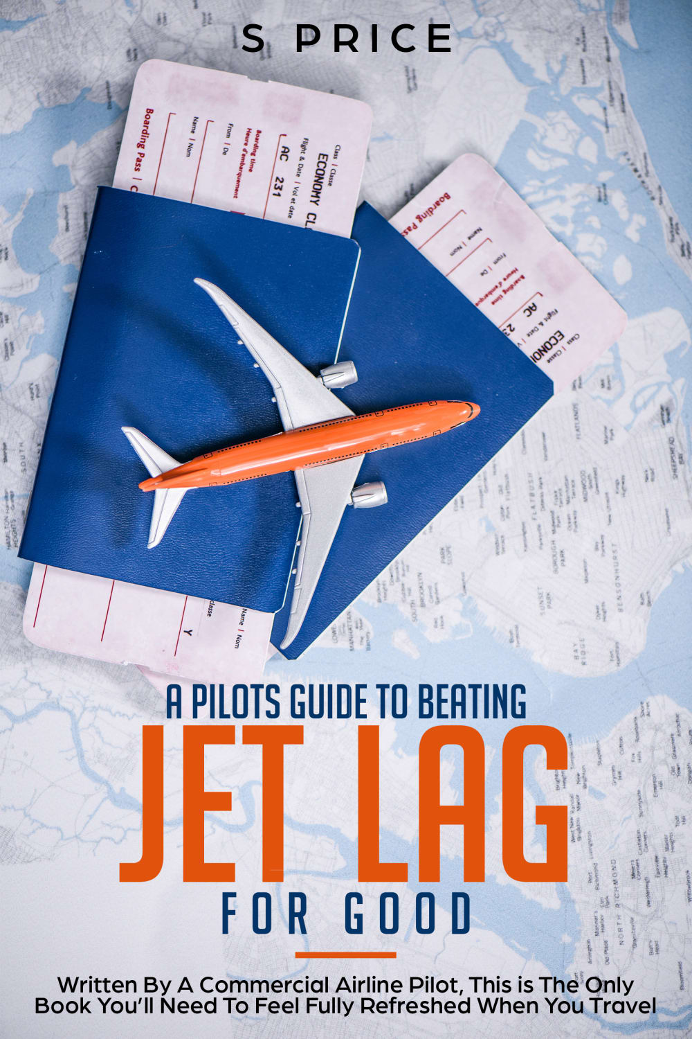
42 Responses to Option B
I prefer this one, it is more friendly
easier for readers to understnad
The blue and the white are just more bright. I also like the picture of the plane
Easier to quickly understand the point of the image. Not everyone has been to an airport
its design, presentation, colors and letter fonts attract me
I choose B because it is more appealing than A
Because A is too hard on the eyes.
I chose option B as being the choice that I prefer because it is more open in appearance and there isn't a black background like there is in option A.
I prefer the more modern look, it is more like my everyday experience with air travel.
much easier to read
Choice A is really creative and interesting, but it's just too busy to be an effective cover. It takes too long to cut through all the text to get to the actual title. But I applaud the idea.
This image is much more visually appealing and is one I would choose much before the alternate option.
B A is a little hard to make out...a little too much going on there
the color in B is better and the title is more appealing to me
Choice B, by far, presents the title and subject clearly and succinctly. The cover catches the eye without overwhelming it. Choice A, while clever, is far too busy and overwhelms the eye. The colors of Choice B are also highly attractive and work well together. Choice A is too dark and could blend into obscurity. I also really like the plane on Choice B. I also feel that the title 'A Pilot's Guide to Beating Jet Lag For Good' is much more interesting and enticing than the more generic 'A Pilot's Guide to Jet Lag'. It's a terrific concept, one many would love to learn about, but you need a title with a punch, which Option B gives without question.
I like the look of this one the most and emphasis
I chose B because the cover looks appealing and interesting. It also tells me something about the book. A's cover is really boring.
I like both designs, but beating jet lag for good is just an amazing title.
I like B more because it's a more colorful image. I love the background and I think the red white and blue go very well together!
more inviting less to look at on the cover
Showing the arrivals graphic in option A just looks crowded and confusing. There is way too much text showing in option A and it becomes all blended in with the title. Option B shows the title more clearly and it is easier to get right to what is important which is reading the title and determining that I would want to make the purchase
It's easier on the eyes and less abrasive
I like B because I think the image is more appealing and "guide to beating jet lag" sounds better to me for a title. Sounds like you will learn how to not have jet lag, which appeals to me more.
i felt it was a more personal way to express the pilot's point of view. like the book and myself could get well acquainted. the other option A, felt like it was directed at any and everybody..but not specifically me
I chose B since it is a clearer image: the color contrasts are more pleasing to the eye (as opposed to the yellow on black of option A), the background has light colors (and since it is not a horror book, I find it more adequate) and you can clearly distinguish between the title of the book, the author and other general useful information. The A variant, beyond the stressful colors, has the additional problem of confusing the consumer with unnecessary information. Indeed, it seems to convey the problem of jet lagging, but the book is supposed to fix it, not stress it and remind everyone that jet lags are awful.As a bonus, I find the whole idea of a toy airplane on the passports and tickets.
the subtitles and overall design tell me more about the book and what it is about.
B looks better because it is more polished and refined looking. A looks a little too messy and bland.
This one is an awesome cover. It would totally catch my eye. The A choice is all over the place and doesn't look very good.
Much better at delivering the point.
I THINK THIS PHOTO GIVE A MORE REALISTIC APPROACH AND IS INTERESTING TO LOOK AT
I like option A bit chose option B because it is less confusing and doesn't look so technical with the toy airplane. The photo in A made me think I was suppose to be looking for a hidden riddle or clue and B just looks interesting and the orange lettering is fun.
I like this one as I quickly associate it with a plane. And to see that it was written by an airline pilot would lead me to read it.
Its a lot easier to read the title, the other one has so many words in the same type and color that makes it a bit confusing. The title also defines what the book is for/about much more clearly.
I like B more because of the colors and readability.
This is a cool design that says a lot at a single glance.
B is a lot easier to ingest. You can clearly read the title and know what the book is about. I can see that A might be a little more fun for a pilot, but if someone who is not a pilot wants to read it, B seems friendlier to them.
I voted for Choice B because B looked more friendly. It has a nice images and colors. Choice A is more boring, it doesn't give a friendly vibe.
Better looking graphic and information
B is more interesting to look at, It show the plane, tickets and a map, which is everything you need to represent being a pilot. the departure and arrival board in A is boring, only 2 colors, and doesn't necessarily shout pilot right away. I like the title of B better as well because it lets you know they're going to give you advice on how to beat jet lag.
The color of this book cover is more captivating. The sky blue works hand-in-hand with the title of the book. I like the writing on the bottom of the book cover showing there was expertise with the writing of this book. This would make me want to read the book more because I would not question its validity.
I prefer this option because the alternative seems cluttered and hard to read.
Choice B is less confusing. I like the idea behind Option A but including that much extra text really confuses me. The image on B is good and eye catching, while the title font is modern.
Explore who answered your poll
Analyze your results with demographic reports.
Demographics
Sorry, AI highlights are currently only available for polls created after February 28th.
We're working hard to bring AI to more polls, please check back soon.

