Poll results
Save to favorites
Add this poll to your saved list for easy reference.
Which design is more clear and would make you want to purchase the product?
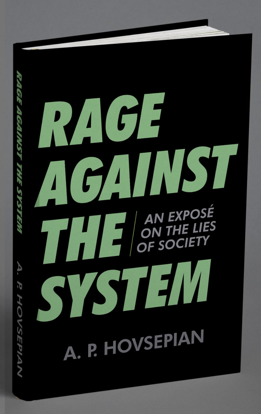
43 Responses to Option A
I like option A the best because the cover looks more organized and easier to read.
I like option A better than B because A the second text is kept separate and it is not blended in with the larger text. It is easier to read and also easier on the eyes as opposed to B where the text is blended in on itself.
Most logistical and easier to read
I prefer Option A because the text is organized in a way that makes it more compelling while the other option seems disjointed.
I prefer option A because it's more readable and less confusing.
The option A book cover is much easier to read and much more clear. I like how the subtitle in option A is embedded in the empty space next the word "the" rather than being split across multiple lines like in option B. The gray and green on black color scheme looks very cool in the option A image. The option B image uses gray, green and white on black as the color scheme, which is much less appealing.
i would pick the design in option A, the side text makes it seem more intriguing to me
It's easier to read the subtitle in A. In B, it's too visually distracting to see the subtitle placed under the main title.
Definitely, definitely prefer A. It’s a lot easier to read the secondary title and I think the overall look is much more professional which makes me trust the book more. Having the text centered like in B actually makes it harder to read
I think it looks better the way the words are laid out and without all of the extra writing
The font is more stylistic. It is free flowing. This feels like it works with the book's subject matter.
The design in Option A is more clear and would make me want to purchase the product. The brief summary is easier to read in this version than in Option B where it is stretched over several lines.
The other is a little bit difficult to read because it kind of jumps around a lot this one is straightforward for both the text and subtitle
I don’t like the broken subtitle in B. It’s a little confusing how to read it. Choice A is better
B is too confusing. A is much better
Option A is definitely my top choice because Option B gave me a bit of a headache while trying to discern the subtitle. It's just way too confusing.
Having the grey text on the side is more clear (option A). In B, it is confusing if I should read the grey text with green or separately.
I chose A because its easier to read and it conveys the message easier to faster.
Trying to read between the lines in B is something I find unappealing. A is way better and more streamlined.
A is much easier to read with the words "an expose on the lites of society" written in a block by itself, makes it much more readable, than on B where it is all spready out and a bit distracting to read.
Option A of the subtitle/description is easier to read when it is grouped in one area. Unless this was for a comic book, then it might be more fitting.
I like option A the best because the way the title and sub-title is laid out makes it very easy to read and looks better aesthetically.
I picked Option A because I prefer the part saying An Expose' On The Lies Of Society to be separate and placed to the side so you can read it easily right away and make sense of it. Where Option B has a nicer look and feel to it but its harder to read and comprehend right off the top of your head so may make someone look away and lose interest rather than look harder to see what it is saying.
Having the little words between the big words is confusing
I think that option A is more clear, I like that the subtitle is in one place instead of in the middle of the title, I'd buy that one.
I prefer Option A for this book cover. I like having the title all together with the explanation of the title in another area. This title is more readable than Option B. This design is much more clear and really looks good and makes a statement.
Easier to read style for the title and subtitle.
I think in option A the title stands out more with the subtitle on the side. The other cover is too jumbled.
Option A by far. Option B is confusing to read the way it is laid out
I found A to be more clear because it was hard reading the title with the smaller word interspersed in B.
Option "A": I liked this cover, graphic and font arrangement more than the other just for the basic clarity of title/subtitle when you first glance at the book; sometimes simplicity of arrangement like this is best.
Option B is confusing because it depends on graphic design only to make sure it is coherent. This adds extra processing time for the brain and my eyes would just slide over it.
I prefer the more direct approach and that is what is showing in the option A book cover. The title is directly shown in big, bold, bright text and then the description of the book is off to the side. The way that the book cover is designed makes it easy to read and it makes the most sense. Option B looks too scattered
A is the clearer cover. I find the title layout used here easier to read at a glance, and it is more eye-catching as well.
Option A’s design is much more clear and easier to understand. I believe Option A would grab one’s attention and make them want to read this book.
The subtitle formatting is clearer
I liked A better than the other choice. I think the other option looked too busy and its was hard to read it. I think it looked better without the words in between. The B option was too hard on my eyes to read.
I like having common font be in similar areas. Makes it easier to read.
Definitely prefer the option with the title all together and subtitle all together - it's much easier to read than the option where all the lines are interspersed. (which reads like: 'rage an expose against on the lies the of society system')
I like having the two passages separated from each other not together like choice B
I like the bold writing. I like the green on the letters. It is easy to see
The title and accompanying illustration is an appealing combination of strong, bold text and a nice shade of green along with the black.
A is much clearer without the words between the title.
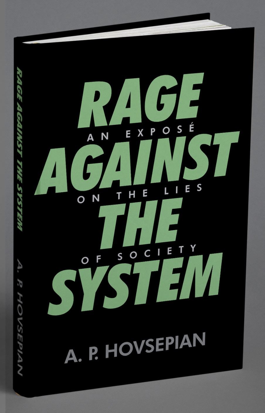
7 Responses to Option B
The reading between the lines format is clever and not cluttered.
Option b is more eye catching in my opinion because of the design
I think the font positioning looks better.
B has a bolder font and color stands out more. It's a lot easier to read and the color profile stands out.
I liked the central focus of the text, it drew my attention to it. I also liked the subtext, it felt like a secret message which was fun to read hidden between the lines.
I like choice B. I liked how you have to read through the title twice to read both titles
I prefer choice B just due to the format of the words on the book. this format is more enticing to me personally.
Explore who answered your poll
Analyze your results with demographic reports.
Demographics
Sorry, AI highlights are currently only available for polls created after February 28th.
We're working hard to bring AI to more polls, please check back soon.

