Poll results
Save to favorites
Add this poll to your saved list for easy reference.
Which design makes you want to buy the book?
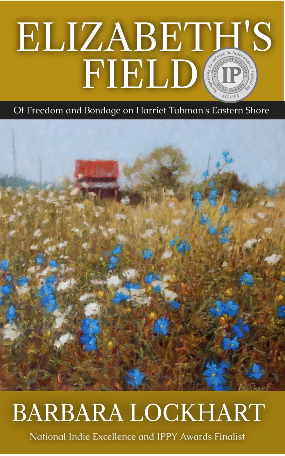
32 Responses to Option A
The gold in the bottom of B is UGLY AS HELL
The flowers look better in A.
I chose A because of the shadows behind the title letters making the titles pop out more.
It looks more balanced and the fonts are more title like
I like option A. The blue flowers are very vibrant and the text and layout are better.
The color is sharper and makes the flowers look more pretty
I like how clear the text is compared to the image in B. B is blurry looking. I love the I P stamp at the top instead of taking up a large amount of space like a. I like the black border with the words describing book in A. The flowers are Blue and better looking .
A is much better looking. B does not look like it was finished
I prefer the font and deeper darker colors on the cover of A compared to B.
The vibrant blue flowers catch my eye more
This design seems more similar to what a book should look and the fonts are easier to read because they are bigger and they use a darker background
looks more easier to see
It's more colorful and eye-catching. B looks bleak and dreary.
i liked the brighter blue colors
I vote for A since the mix of the modern more professional typeface on the top and bottom with the simpler drawing/painting in the middle catches my eye a lot better than B
I like the cover in option A more. The look of the cover feels more professional. This seems to be the right cover and style that is easy to read and flows well from top to bottom as we naturally read.
I like Choice A better because it's more vivid. I also think the title stands out more and I like how the award is close to the book title.
The darker gold color is a good contrast for the author's name in white - plus it "pops" more to the eye.
I like A because I think having the name above the photo with a gold stripe is more attractive and definitely gets my attention first.
title stands out more, specifically the awards won
I like the bright blue flowers in A. Also, I like that it isn't as blurry as the other choice but more lifelike.
The design in option A makes me want to buy the book more because it is more pleasing to look at. The layout with the title at the top and author at the bottom looks best to me. Also, the more vibrant colors in A are nice to look at and are more attractive. Thus, I think the cover design in option A is the better design.
I prefer A because it seems like a more modern book compared to the old-fashioned style of B's cover.
Choice a is easier to read
I think the colors are sharper and the blue's on the flowers look prettier, grabs my attention.
A looks more legit.
the darker color makes it stand out
This option doesn't put so much emphasis on the author's name.
I think A seems a bit cleaner. There is clear separation between the title, main picture, and the author section which is good.
I would like to buy option A design very much and images are very attractive and specially that blue color on the grass and excellent images in top, perfect image as well, make me good feel to ciew
Several things influenced my choice. On the one I picked, the title is more prominent, because on the other one the letters are harder to read set against the field/prairie/whatever. The same applies to the Independent Publisher medal; it just stands out much more on the one I picked and might influence me to pick up the book. Finally, the blue flowers are a darker shade on the one I picked, which also is more striking and makes the book stand out more.
choice a allow the author's name to stand out along with the background
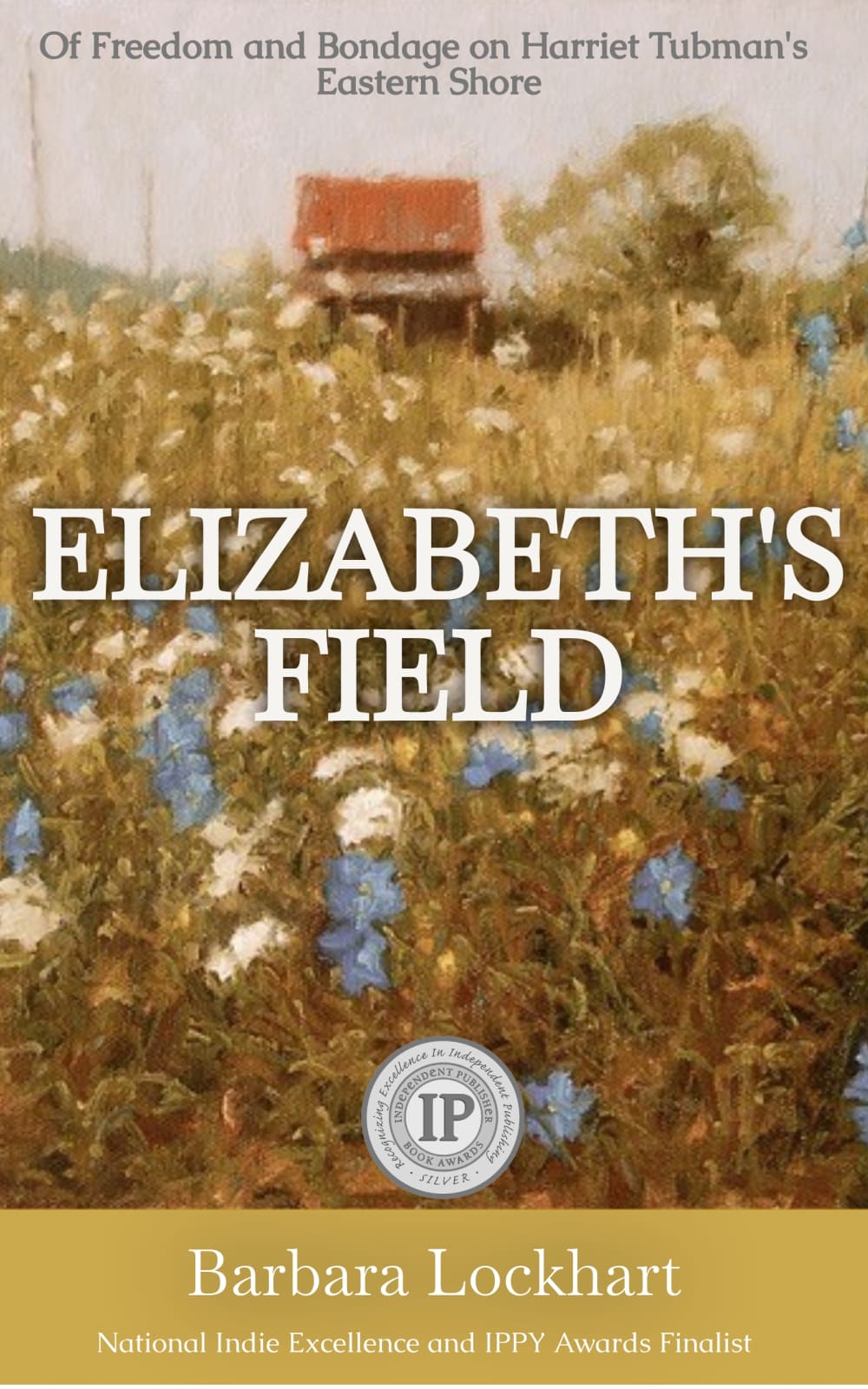
18 Responses to Option B
B has a more unique look without so much border. Plus it really lets the artwork shine more.
I prefer Option B as the picture encompasses the entire cover and you can get lost in it. The title is pronounced and centered with a emphatic feel. It looks attractive and appealing in a natural way.
The larger picture without borders is more appealing to me
Option B makes me feel more immersed in the field of flowers.
I don't like the top border on A
I feel like I'm getting a bigger view of the field, as, in Option A, the top tile is distracting.
I like the subtle and suspenseful appearance. I like to read so purchased.
B is engaging and immersive.
B is clean and uncluttered.
The book title looks better in the center of the image, as my eye is drawn there first. Looks like an interesting book!
Both look ok, if a little boring. But B looks slightly better to me.
I like the picture taking up the whole canvas of the cover.
The overall feel of it just looks much better and less cluttered than Choice A. You can get a better view of the details and the color is much softer on the Eyes while still keeping the same vibrant colors as Choice A. Not to mention The fact that it looks infinitely better without the banners and whatnot.
the framing of an upper and bottom border makes the cover look to old and boring,
The abstract image in the background is more appealing.
I think this book cover is more engrossing and attractive because the picture is larger and doesn't have the huge dark gold black bars that take up too much space.. I also think the font is too harsh on option A.
I chose option B because the beautiful imagery caught my attention. The text is more subtle allowing me to see and enjoy the whole cover of the book which made it look more interesting and worthy of a read.
The flowers have a more pleasant calming and realistic look here so I would prefer that.
Explore who answered your poll
Analyze your results with demographic reports.
Demographics
Sorry, AI highlights are currently only available for polls created after February 28th.
We're working hard to bring AI to more polls, please check back soon.

