Poll results
Save to favorites
Add this poll to your saved list for easy reference.
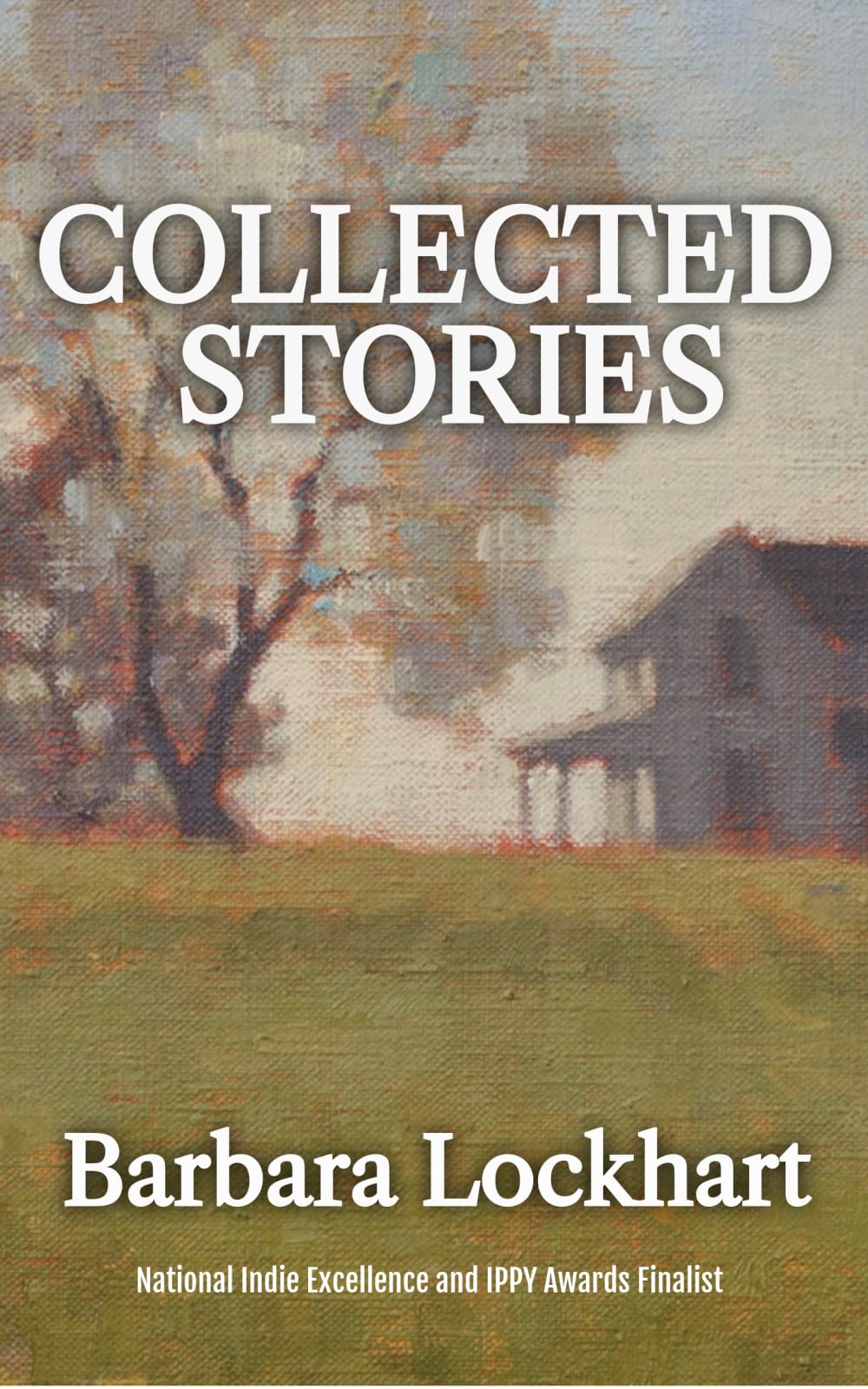
Which design makes you want to buy the book?
Option C won this Ranked poll with a final tally of 32 votes after 1 round of vote counting.
In a Ranked poll, respondents rank every option in order of preference. For example, when you test 6 options, each respondent orders their choices from first to sixth place.
PickFu requires a majority to win a Ranked poll. A majority winner differs from a plurality winner. A majority winner earns over 50% of the votes, whereas a plurality winner earns the most votes, regardless of winning percentage.
If an option does not earn a majority of votes, PickFu eliminates the option with the lowest number of votes. The votes from the eliminated option are reassigned based on each respondent’s next choice. This process continues in rounds until a majority winner emerges.
Scores reflect the percentage of total votes an option receives during the vote counting and indicate the relative preference of the respondents. If there is no majority winner, look to the scores to see how the options fared relative to one another.
| Option | Round 1 |
|---|---|
| C | 64% 32 votes |
| A | 22% 11 votes |
| B | 14% 7 votes |
11 Responses to Option A
I like the visuals in A and B.
Would prefer option A is excellent, design is awesome, fonts and images are attractive compare to other option, the image should be bit clear, good to go
I found the white font most aesthetically pleasing and for choice A felt the combination between text and picture looked best. For choice B I found the black font with the photograph to jarring
Chosen based almost solely on aesthetics - color choice. The dark on dark of B is really, really bad.
A was my first choice because I think the white font goes will with the background. I think the background is great, it's a little bit blurry and impressionistic. It really makes me curious about what the stories are going to be about. It looks kind of lonely or kind of scary, and that's the kind of mood I go for in books so it's definitely my thing. My second choice was B, because it looks pretty much like A except the font is black. It's pretty good too but I think the white font goes better. FInally, C was my third choice. I don't dislike the cover but I have a completely different impression of what the book might be about when I see a photo of a rustic door to a shed. It makes me think of supermarket novels and it makes me take the book less seriously.
I picked C last because I found it hard to read in front of the closeup of the door. Between A and B, I found A easier to read with the white text.
I picked A as my first choice due to how the white text stands out and makes it easy to understand. C is my next choice as I like how the background is a wooden door. B is my least favorite as the text is hard to see.
I like option a Better as the text looks better than the other two
A&B are close, but the white text stands out more. Option C looks like an outhouse door.
I like "A" and "B" mostly because of the images. The artwork of what looks to be a farmhouse/trees, but somewhat blurry is visually appealing. It makes the book feel more welcome-y and home-y. I prefer "A" because the white lettering is much easier to read on top of the background than the black lettering in "B". "C" is okay, except I'm not a fan of just the door as the image. Plus the title crossing the door outline is a bit bothersome and feels like it isn't centered.
I chose Option A because the cover is a little murky and blurred and implies mystery and suspense. The shadowy view of the house and trees together with the title in bright white jyst seems fitting. Option C seems clear and focused and there is something compelling about it. Option B us a little too blurry and pastel.
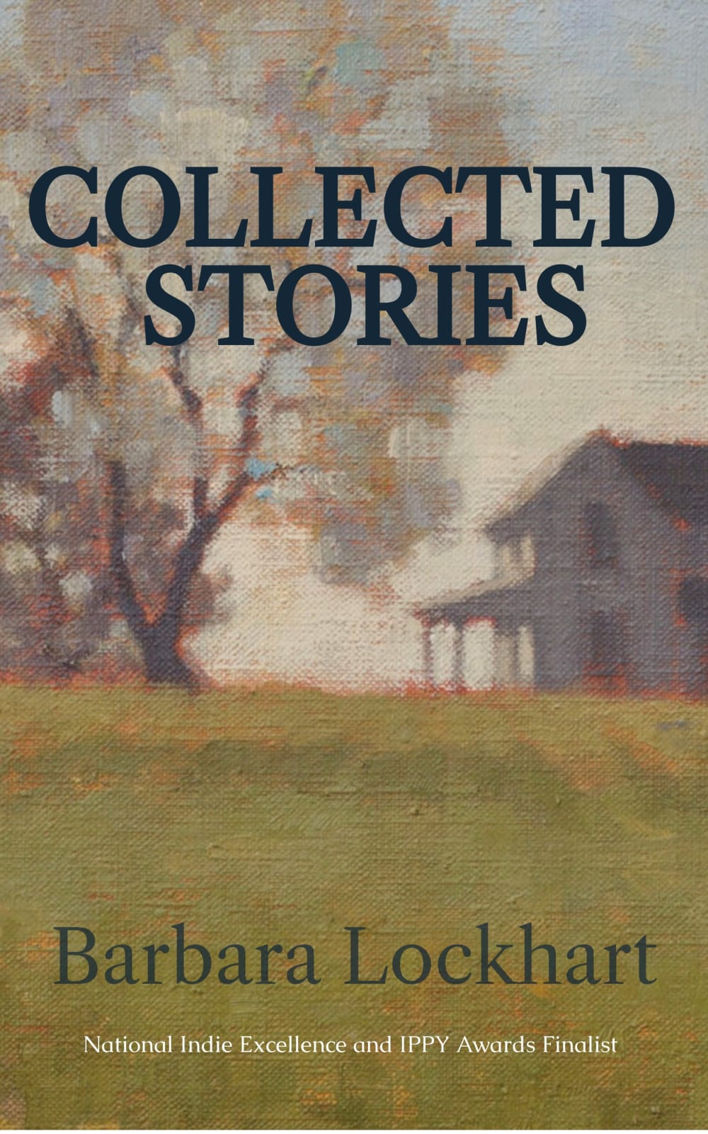
7 Responses to Option B
I love the option with the farm in the background. The black title gives it a slightly more mysterious feeling. I like the second as well, but just like the black font better.
I prefer the image of the old house and big tree. The type colors and styles don't matter too much in this case, but I was drawn more to the black type.
I prefer the covers with the image of the house
Option B is the best. I like black title and author name. Nice size and color. Second my choice is option A. I like white title color less. But it's much better than option C design and style. Option C is third.
A house gives comfort, a barn gives fright. The first house isn't eerie.
I prefer that the book title and author name not be in white font and I prefer the imagery of A and B to C.
Option "B": First choice is "B" as the cover presentation with the "watercolor" painting filter on the image, soft but engaging, while avoiding the font drop shadow usage (overused) on the other covers. This presentation, with no specific details, of Collected Stories would make one think of a rural setting where stories are handed down by mouth...it would make me look further into the book contents.
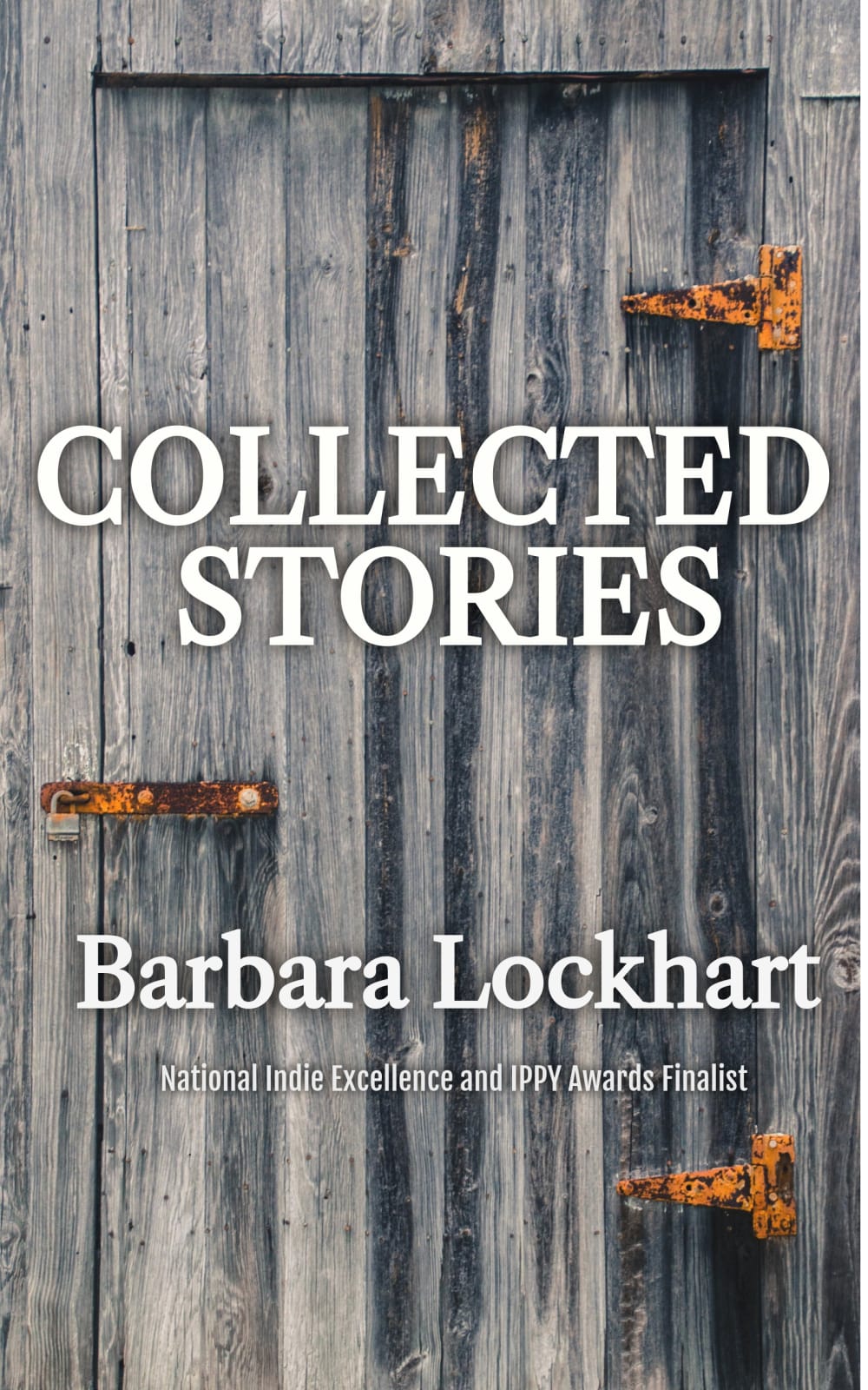
32 Responses to Option C
The door evokes a sense of mystery and is very intriguing. And I prefer the white text to the black text!
C's cover stands out much more
Choice C has a more mysterious atmosphere. Like it invites the reader into to read the book. The other two not so much.
I don't quite like the blurry oil painting, making me dizzy, so C is my first choice. Between A and B, the white fond stands out more, so A is better than B.
I like the first one because it looks more modern, and I like the clean, simplistic design.
I liked choice C since the closed door shows more mystery and interest. I also like how choice C is more associate with the title of the book. Choice A and B felt like it had no ties to the title of the book.
I like option C. I think the door represents a door that hasn't been opened in a long time hence the rusty latch. This goes great with "Collected Stories."
i went with what caught the eye first
Assuming this is a book of fiction stories, I think the only appropriate choice is C. Nice symbolism with a door that the reader is opening. A door into the authors' minds and the reader's own minds as they imagine. The other two choices to me are just bad and more appropriate for like a painting/art book
C is simple and clean. The fence has a rustic look is attractive.
I was looking for the brightest book cover. Option C had a dark background, but the bright white font on the title made it stand out. Option B is the exact opposite. There is a lighter background, but the dark font makes it look kind of dull and uninteresting. A was Ok, but C was the best.
Book cover looks a lot better with the distressed wood background by far.
I like the dark weathered wood and door a lot more than the blurry looking countryside painting. After that, I chose the font color that I thought was more appropriate for the book cover. This is a matter of personal aesthetic preference, but I think many will agree with my choices.
I am honestly not a fan of either of the old farm buildings. It makes the book look too old school and not very exciting. So, the decision for my top choice was very easy.
Option C. The cover reminds me of stories that reflect Americana. The cover looks like it will contain stories that reflect American life and be very entertaining
I get a clear sense of old tradition and past instances with this version of the cover. The color of the font should be white as the black is too difficult to read.
I like the barn door so much in C because the blurry pictures in A and B are really distracting.
I picked option C because the cover goes well with the title. The locked door symbolizes the collected stories that are inside the book. I picked option A second because the white font makes the book cover pop out.
I love the old wood look on this book. It really brings it out and makes it stand out among the others. However, I do love the portrait of the house and trees, too, and would probably pick this book up, too, but with the black writing, it seems to tie in better.
I am a big fan of the white text. It makes the information pop. As for the difference between C and A, I prefer to old wooden door background both because it's a high quality picture and it makes it look like the collected stories might be closely guarded secrets.
I ranked the book cover that I liked the best. I like the look of Option C, I then like the font color of option A.
really liked the grey one as it stood out
The grey background with wooden font pops out better grabbing my attention. The other two are very assuming and give off a boring vibe.
I like the close-up of the old wooden door - provides good background and the hinges give some contrast. The others - blurred out - are not very appealing.
The white text on the dark background in Option C looks the best. Option A comes next with the white text which stands out. The black text in Option B is bad against the darkish background
The first piece of artwork looks more like a picture which looks more professional than a painting.
The door just looks way cooler than the rather generic barn and field image. Of those two, I picked the white text as it stands out more.
I think all 3 book covers are pretty solid however option C has the most unique and interesting book cover. Between B and A which are the same other than the color of the lettering I prefer a darker color because I think it matches the book cover and the background/picture more than the white.
Option C has the most eye-catching design. The white text against the wooden background pops and I'm more likely to pick this book up over the others. The image on the other two is very dull and not vivid enough. I chose A over B because the white text is more noticeable, but I probably wouldn't pick up either of those books with that cover art.
I think B looks quite bland and outdated and nothing stands out so B is 3. C is the best because it is modern, different and appealing so C is 1 and A is 2
I liked the wooden background the most and it really made the title of the book stand out. The next two choices were very similar, but I thought the bold white font of book title stood out next best to me.
The picture with the old barn door (C) is very appealing and eye-catching. Barn doors are verhh in right now and it would pop on the shelves. I picked (A) next because the white on that picture is way easier to read than the black type.
Explore who answered your poll
Analyze your results with demographic reports.
Demographics
Sorry, AI highlights are currently only available for polls created after February 28th.
We're working hard to bring AI to more polls, please check back soon.

