Poll results
Save to favorites
Add this poll to your saved list for easy reference.
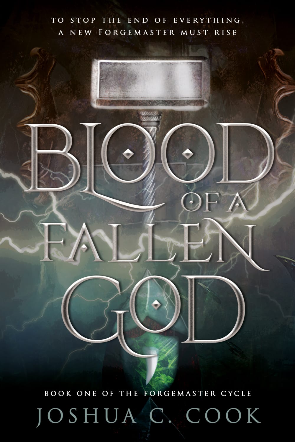
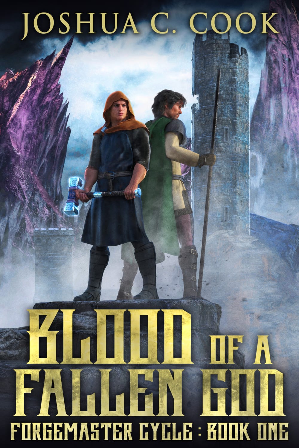
Which fantasy book cover would make you more likely to purchase?


37 Responses to Option A
This cover looks more professional. The other cover resembles a video game and isn't something i would pick up.
I would purchase the book with cover A because it looks more mysterious and looks more interesting than option B.
I feel like B seems too "game-like" and it would make it harder for me to get into the book with the characters on the cover.
looks like a more established author
I would choose A. I like the colors that were used
I like A, it is intriguing and does not give too much away about the story. B is a little too cartoony and young aged.
I love the color and the font choice. It definitely draws you in and make you want to see what this book is all about!
like the artwork better
A looks more professional and higher quality. B looks more "independent author". While there is nothing wrong with that, I've had some bad luck with indie authors.
cover A stands out a lot more to me and it makes me more likely to buy it
I like the hammer and the font on "A". Really dislike the font in "B". "A" is a pretty simple cover and that appeals to me.
Option A looks more like a book about myth and war while Option B kind of looks like a historical romance novel.
I felt this book cover is more geared towards fantasy kind of genre and makes a reader more likely to pick it up since it looks more mysteroious.
Cover A is much more eye catching and professional looking. Option B looks like it is geared to a very young audience.
I chose A because the saying at the top "to stop the end of everything..." really caught my eye. I also liked the lettering of the title in this choice compared to choice B. In choice B, the font makes it harder to read the title of the book. I also did not find the characters on the cover that appealing in choice B.
I chose A because B looked like a fantasy video game that I would not be as interested in. A looked more like a book cover to me.
I like the design of this cover. It's more ambiguous and reminds you of thor.
It makes it look a bit more mysterious and interesting. The other characters look a bit childish and mundane.
I would definitely vote for choice A because it is the one that popped out to me. The colors of the background are way more vibrant & they stand out more.
I want to use my imagination as to what the characters look like. The other option showed me what they look like and took away my ability to imagine that.
For me option A is by far the better book cover. It has a sense of seriousness and professionalism. It looks absolutely great as well and mystifies the book and would hook me in. Option B looks a bit cartoon like and does not look nearly as good as option A.
Beautiful book cover with an insight to the story that really make want you want to read more about the book. The top sentence would definitely make me buy the book
It looks more epic and also more of a high quality fantasy novel. The characters in Option B look a bit cheap.
i looks really good
I don't like seeing the characters on the cover. I'd rather come up with them in my own imagination.
more dramatic and i like to picture my own characters.
The font is easier to read.
the people look poorly drawn in choice b. so it makes it look like a childrens book
the other cover has weird characters
I like the font much more and the image makes it feel more fantastical and mysterious
In this case, I went with a process of elimination approach in selecting Option A. I just don't like the way the characters are drawn in Option B, they seems stiff and lifeless to me, so while I often don't like abstract covers, I prefer Option A here )I also like the choice of fonts more in this version of the cover, since I consider it easier to read).
I think that this book cover looks darker and more epic.
I think fantasy novel covers with humans on them are cheesy. Therefore, I would pass over choice B. Choice A looks interesting.
That's the kind of Lord of the Rings vibe to it I like it
i like more this colors look amazing
Looks more geared for an adult rather than a teenager.
I chose A because it seems not so childish.
13 Responses to Option B
I like the font more and that it shows the two main characters so i have something to base my mental image off of
i like the idea of the characters on the book. makes me wanna read it more
I'm a visual person, so I chose B because I like seeing the images of the characters in the book.
Choice B is more colorful and shows more action on the cover. This action is bold and powerful and stands out more to me as the consumer.
very impress the look
I like seeing the characters, the other cover just feels like a generic fantasy cover
Book cover looks better with the characters
The characters give me a clue of the setting and era.
I love when the characters are on a book cover because it gives me a better idea on visualizing them while I'm reading. I don't have to create with what they look like myself.
It says book One, so it may be a series, which means it is good and many others purchase. The book is bright and stands out with the bright colors.The other choice Blood of Fallen God, just does not sounds good. The words 'Blood" and God..Sounds very gross and unappealing to read. Looks dark..reading..with black cover..not for me and my views and age. Many for younger video gamers
Choice B really stands out to me and has a lot of character. Option A would really blend in with a lot of other fantasy books that all seems to play off of the "Song of Ice and Fire" design.
this cover looks more artsy and creative
B looks exciting and intriguing.
Explore who answered your poll
Analyze your results with demographic reports.
Demographics
Sorry, AI highlights are currently only available for polls created after February 28th.
We're working hard to bring AI to more polls, please check back soon.

