Poll results
Save to favorites
Add this poll to your saved list for easy reference.
Which sticker book cover design is more attractive to you?
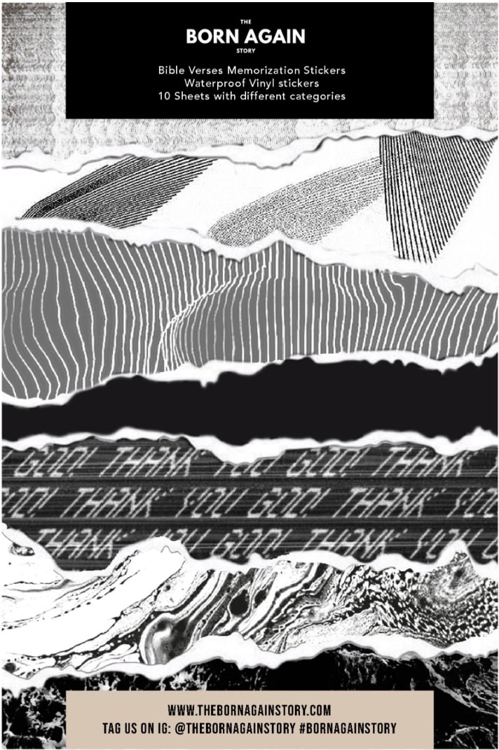
29 Responses to Option A
I think B is a little too busy. A is busy enough but still looks good. It gets the message across cleaner in my opinion.
I chose panel A. Something about the designs and patterns I like a little better.
It is easier to read than the other one.
A looks more attractive than B .many information on b making it look unorganized.
I prefer this one because it is actually easier to read what it is and what is about on the label.
The other one is too cluttered.
You can see what it is. The second one is very crowded and chaotic. It is very hard to notice what it is.
Option B looks very messy and it is not clear what is happening on the cover. Option A is much cleaner and easier to read.
I pick A as my top choice as I like how the words are scrolled across.
The words can be read left to right, there is no need to turn it sideways in order to read it. In B, the discription is sideways and the background is more chaotic and in a different language.
It's much easier to read the text when it's oriented from top to bottom as opposed to having to read it sideways.
I like how the patterns are stacked in layers in option A so it’s easier to see all of the aesthetic designs that went into the cover
B is too busy looking. I was having to tilt my head to read everything.
I liked choice A because the cover is much more appealing and flows better. Choice B looks too busy and I am not certain what I am supposed to focus on compared to choice A since it looks more appealing.
The sticker book cover of option A is more appealing, the sticker book cover of option A is well designed. The design of the book cover makes the book cover to be more attractive.
I like the born again wording on option A. This one is very nice and I like that it is water proof
I like A because it's a bit easier to understand.
I think A is simpler and easier to read. B has too many words all over it which make it confusing.
It just looked a whole lot better
I like the smaller words and fonts on this one. The Choice B is too distracting for me.
I like the more simple less cluttered version
I like the sticker look of A. I like the designs
I find this sticker book illustration to be the most aesthetically appealing and captivating.
These are both terrible and to busy for my lucking. I wouldn't purchase any of these. I think you could use a more simple design.
I chose option A, only because Option B was unreadable. Although A isn't to much better, i can actually read what is on the picture. I can't understand anything on Option b.
A is my choice out of these two options. I really don't like either cover for a sticker book about bible verses. I don't understand what either cover has to do with any bible verses or bible stories. Sorry, just my humble opinion.
I like choice A as my first choice. I like the simpler look of the front cover. I find the cover of choice B too busy with all the words on the front. It is about memorizing bible verses, and it is easier to see on choice A.
I prefer Option A because it is easy to read and simple to understand what it is. With Option B you have to read it sideways or rotate it and it looks a lot busier and harder to read.
I choose A because it is clearer than option B because option B is overwhelming and confused. Option A makes a much better book cover design, in my opinion.
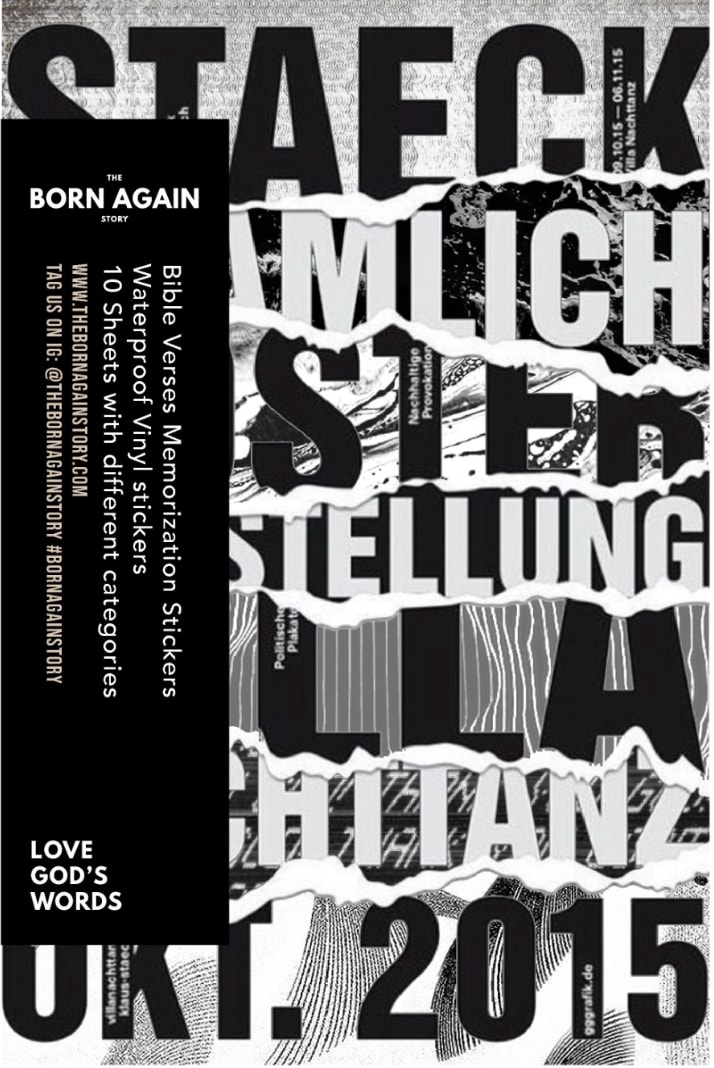
21 Responses to Option B
due to the large font size at least this one gets me curious
Born again is much more catchy than what the other one represents.
"B" is a bit more attention getting, but frankly neither do a good job of explaining the content at first glance.
I like how the words are in the design. Thai reminds me of poster you see on building that promotes alternate music or theater.
The one I chose is easier to view and understand, while the other one has odd textures and patterns that appear to have no relation to the content of the book itself.
B is more attractive and catchy
B is more cosmopolitan looking and creative.
I like the messy catastrophe that is Choice B. This image is very provocative and I really enjoy looking at it. I think this is the best option.
it looks more hectic which looks cool
It looks like a real book and has a clear listing
I like B more. I think the design is stronger and better looking. I also think that B is just a more professional design.
They're both too busy but I would choose the one on the right.
So, not exactly what I'd expect for a Bible sticker book, but Option B has a strong, bold design, and I'm assuming the stickers are also strong and bold. The text stands out, in part because it is so big. I like Option A's layers, but the blocks of text are not striking.
'B' is more attractive because it shows a clear description and design about a book and it's preferable.
This cover is more appealing to me. I really like the vibrant design and how the information on the page jumps out at you.
I feel the option B is better. It's appeals best to me.
I like B the most because it gives me a more modern vibe and updated version. For sure more eye catching and that is what I want. I would buy this one if I saw it for these reasons.
The words or legible and makes me wonder what they mean. I like being able to read without effort.
I like how it looks like the pieces are put together.
I really love the look of B. It has that youthful appeal to it. Option A is just kind of plain and boring which might be good for older folks but for me I want something awesome.
The jumble of text, including letters and numbers, seems more appealing to me and visually stimulating. The other design is a bit too abstract for my tastes and has less eye appeal in my opinion.
Explore who answered your poll
Analyze your results with demographic reports.
Demographics
Sorry, AI highlights are currently only available for polls created after February 28th.
We're working hard to bring AI to more polls, please check back soon.

