Poll results
Save to favorites
Add this poll to your saved list for easy reference.
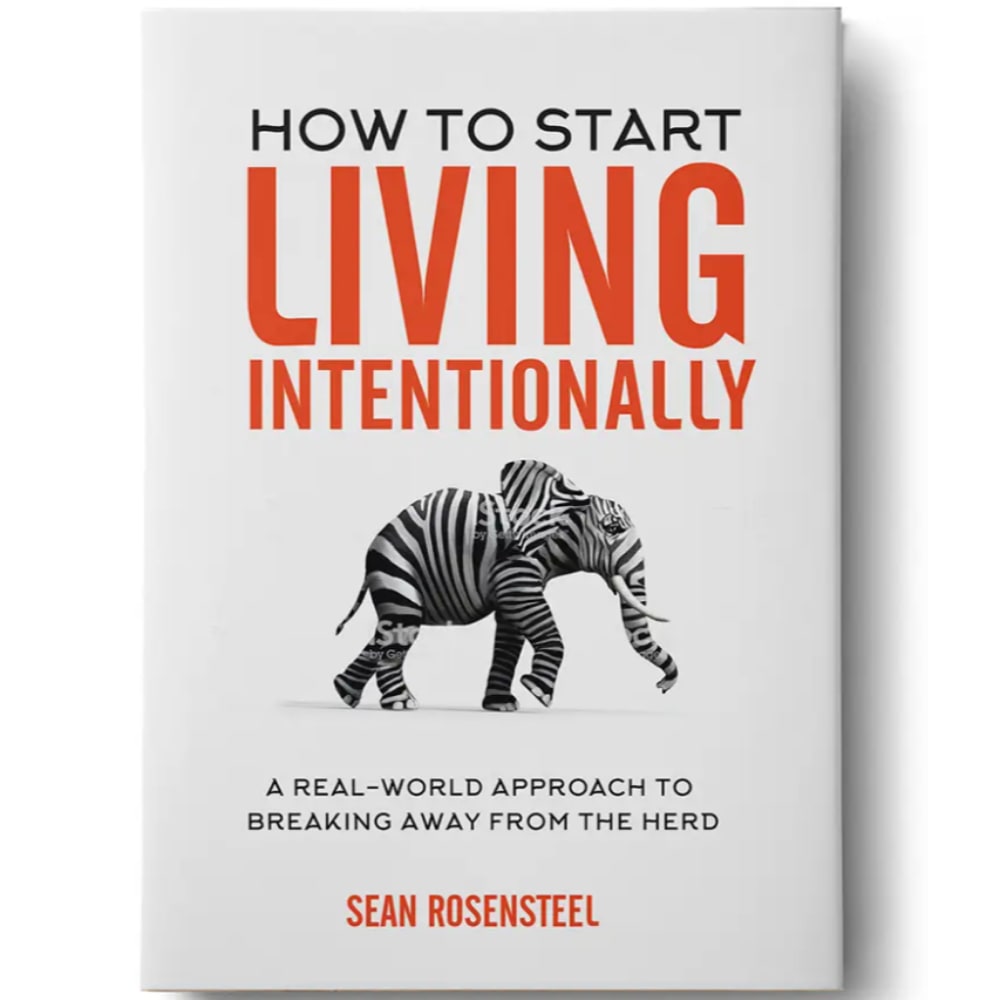
Which title/subtitle combination do you like best?
Age range
Education level
Gender identity
Literary preference
Options
Personal income range
Racial or ethnic identity
Reading frequency
67 Responses to Option A
I think the gist of the title is easier to understand.
I like Choice A. It is clear and straightforward. The title stands alone. And the subtitle compliments it.
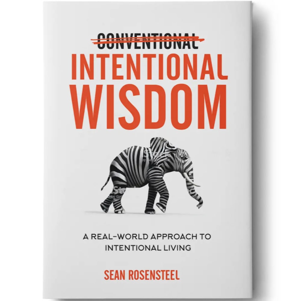
I like how they have conventional crossed out.
It made me want to take action.
It sounds more like a journey to independence ad living life on your own terms
I like option A the best because "Breaking away from the herd..." tells me exactly what I would want to get out of reading this book. That tagline would be enough to convince me to buy it.
I think that A has a better ring to it and is much more direct, which fits the type of book nicely.
I like A better because the title is more understandable as I am walking by in the book section.
The way the other title looks confuses me. This one looks more professional to me.
I can describe my liking of this version in a few words: concise, clear, efficient and simple. This one respects my time and provides me with a clear purpose for buying this book. No complex verbiage or over use of academic terminology please. This one is a winner.
I like A much better because "breaking away from the herd" is more appealing and really speaks to me personally.
I like the title and subtitle of Option A because it caught my attention right away. It really captivated my interest into reading the book. Option A is by far more superior than Option B. Option B cross out of the title is a big disturbance.
This title is much better at explaining what the book is about and what I will learn from reading it.
It is a more easy phrase to understand
I like the message A sends more in my opinion and not by much but like.the straightforward nature much more
I like Option A much more. Sure, the title is conventional but folks love such title and the subtitle about breaking away from the herd is much more enticing than the subtitle in Option B.
It grabbed by attention better.
I think the strikeout effect is pretty played out - plus i enjoyed the "breaking away from the herd" line as well.
This sounds more like a success book. I like that!
The cross out is cute, but I don't think it works in regards to a book cover. I like the idea of living intentionally.
A because it makes me curious as to what Intentional Wisdom is. B might confuse people with the crossed out word.
This one is most appealing and the title is more meaningful to me. I would be drawn more to this one for sure.
I think both the title and subtitle are very self explanatory and easy to read and understand.
I chose option A as my favorite because I don't like the crossing out of the word conventional in the other option. I like the nice clean look of option A
I like the way the title is structured. The breaking away from the heard speaks to me and I would be willing to read this book
The crossed off word on B would create confusion for stores/libraries that put their books in ABC order. And the title on A is much more direct and clear about what the book is about.
I like the option A most. The title in this option is more prominent. It depicts an interesting image of elephant showing stripes of zebra.
Option A is clearer to the reader. It defines the intentional living in the subtitle by saying it is breaking away from the herd. It is direct and clear, whereas the other option could leave some questions.
I liked that A made me think about how I was living my life and if I was living it intentionally. I really thought about my life for a second and would likely pick up the book and see what it was all about. B just sounds like a generic wisdom book that I would walk right past. It didn't spark any thoughts.
I actually don’t like the crossing off part.
The title of the book is straightforward and does not rely on any gimmicks to get its point across
It's telling me from the title exactly what it's going to do for me. It will teach me how to live intentionally. I also love the part about breaking away from the herd. That tells me I will learn how to be independent and one of a kind. Book B isn't interesting to me at all with the conventional scratched out. That scratched out approach is 2010's. 2020's need to tell you exactly what you will achieve while still being customized for your growth and development. Book A does exactly that!
I don't like the crossed-out word at the top, makes the cover seem sloppy as a Whopper with too much mayo.
The title ath the top of A says what the book is about without having to look at the bottom description. I understand why a word in B is crossed out but initially it took me back and was wondering why a word would be crossed out.
This is more engaging because the large hearing Living is much more compelling than the other approach with passive Wisdom.
I think this combination is better and the language about 'breaking away from the herd' is the most clear description of what the book is about.
I prefer this option because the alternative has a crossed out word which is distracting. If that is the intent, then the crossed out word does draw attention to itself.
Both would be ok - I like the elephant picture - but this could be a really wide ranging topic and choice B gives you a better description of what the book is about. The world is fast paced and so I need all the info I can get up front so I can see if I want to dive deeper and then take a next step like reading the book jacket. With choice A I would look at the cover and say "cool elephant - wonder if that is a political book" and then move on...choice B gives me more information.
Although I like the "cross-out" visual of B, the title and subtitle of A make more sense. This is because the phrase "Intentional Wisdom" does not have a clear enough meaning to attracts me to read further. The deciding factor is the subtitle, which is more intriguing and relatable.
It gets to the point of what the book is about without being gimmicky like Book B is.
A- I feel like this title tells your more about What it is about and is more likely to be bought buy all types of people. B is kinda weird and i would most likely pass that book up if i saw it on the shelves..
I like the title of B better. But the subtitle of A is much clearer on what the point of "intentionally" means.
I think the main title is more straightforward and easy to understand. The other is simple but it makes you think more about what it actually means and what the crossed out word stands for.
Very straightforward and more simple
The tile starting with "How" makes this title most attractive and appealing and most likely for me to purchase.
option A is a appealing title to me.
I like the word play a lot better.
The "fake mistake" in B doesn't work for me
I do not like the scratched out title for B. It does not look very professional and looks like an error.
Kind of a toss-up on this one. I don't care for the strikethrough in the title of Option B -- it's been done way too many times in publishing and is tired. Additionally, Option B's title doesn't tell me what the book is about. Wisdom about what? On Business? On Religion? on Philosophy? Option A's title works for me. Not as thrilled with the subtitle. Breaking away from the herd? Am I a bovine wandering in a field (the photo suggests pachyderm)? I kind of see where they were going with it, but a little more context would be nice. Maybe the reader likes the herd mentality. More context about what the book is designed to do would be better. Not to mention that in 2020, people seem to be very much a herd animal. Take a look at how people are (over)reacting to COVID-19 based on what they see on social media and TV, compared to what the actual observed data is showing.
A brighter and cleaner / B dull
Option B assumes I already know what intentional living is and that I already want it where Option A is about how to start. I also like breaking away from the herd because it means I have to undo the way I was taught the way most people do things.
This suggest that it will give you specific instructions. I like that.
While I like that B is a little bit catchy with crossing out part of the title, I feel that the title of A best tells what the book is going to be about. Although it seems a little bit more boring, the subtitle of A is able to give a little more color to the book when the title is a little bit black and white. I think that B's title is a bit misleading and could be trying to make a play on words, but it doesn't work too well in my opinion.
Intentional Wisdom is less intuitive to me. I like the "breaking away from the herd" description as well - it feels as if it fits with the elephant with the bar code motif on it. I found B to have a more attention grabbing title as well.
This title has more of a guidance feel to it. The other title seems vague at best and unintelligible at worst. When looking at title to shop, one that provides clear information on what to expect out of a book is a much better option. In my opinion, 'How to...' has a feel that it will provide me information on the steps that I need to take to get the outcome desired. The second title reads more like a narrative and an opinion piece from the author instead of something that will provide me true value.
I definitely like option A better. Option B is really bad because of the crossed out word. It looks unprofessional. Whereas option A has a much better title and subtitle. Thank you!
I like that it says it is a how-to, so it is has utility as a guide.
They are both very good. I like A better because I don't care for the conventional crossed out in B. I think it just looks cleaner without that. The type font of the How To Start also looks really nice and I think it makes the book seem overall cleaner. I don't really care for the Elephant, unless there is a meaning besides just breaking from the herd, I don't think it much applies.
The tag-line is great as we often are a herd mentality. Some people can easily relate to it. It would draw in any reader about how they can stand out.
It is the more interesting title. I can also relate to it more in my life.
Chose option B because its color amd message.
I don't like the crossed out words on choice B. Too distracting from the cover.
A seems more clear as to the subject of the book.
The title and subtitle were more descriptive and easier to understand.
I chose A because the incorporation of the word "herd" with the illustration of the elephant was clever and eye catching. For B, the strikethrough of the word conventional is a technique that is overdone in my opinion. Too many books utilize the strikethrough text in an effort to be unique or eye-catching, however I feel that it comes off as rather juvenile and undermines the seriousness of the book. It makes me feel that the book may not be genuinely trying to help or it may have cartoonish and unrealistic approaches to topics. Choice A clearly idenfifies that it is a how-to book and I feel that that is helpful in grabbing a larger audience by being direct and straightforward about what the book is.
The choice I made looked more professional I did not like the selection that had the first sentence crossed out. I thought it made the book unattractive.
62 Responses to Option B
Crossing out "Conventional" and replacing it with "Intentional" is eye-catching and intriguing.
I like the wisdom better because it will be interesting.
the scribble out really attracts my attention to the title
Shows creativeness in the title
the second title seems to be more catchy, original and interesting
Sounds wiser. It is more creative.
this title looks more novel to me
it just generally sounds better. i like the fact that it has the line through it, i think it adds character
It does not read like the typical how to book. It is more creative and would draw my interest more.
I like the size of the text the most.
i like conventional crossed off meaning that it will be unique and interesting book to read
simple...less wording...straight to the point
Option A just sounded junkie. Option B was much nicer.
I like B. I don’t know what intentional wisdom is, but B at least contrasts it with something I know (convention wisdom), which makes me more interested. A is more ambiguous, I read it, don’t fully get it, and then I move on to the next one.
Just seems more visually appealing
First of all, the word slashed out in Choice B grabs your attention. It immediately makes you look at the book and read the title.
i like more this option because look better like this
I don't really like how to books so I prefer the one without it. I like how conventional is crossed out which creates intrigue.
I liked the title and it gives a good heads up.
I really felt Option B was the most clever. It deliberately played off of a well-known phrase. I also felt the subtitle was on point. Option A actually has a strong subtitle, but I didn't think the main title was as clever.
The strike-through text and play on a common phrase is effective and eye-catching.
B makes an impact. It is bold and empowering.
I like crossing out "Conventional" because it more clearly states the message of the book. It is also more concise.
I prefer the scratch-through 'conventional.' seems like it would catch more people's attention. I also prefer the Title of option B to option A
WAAAAAY better title. Great wordplay and memorable.
The title is more compelling and draws your attention
I like the strikeout title more. It's more attention grabbing. I feel that will be better for attracting readers by just the title itself as it is sharp and Intentional Wisdom provokes curiosity.
This title is much more creative and shows a nice play on words.
I voted for B because I liked the fact that conventional was crossed out. It drew my attention to the cover and had me curious why it was crossed out. That made me want to read the subtitle. The title in A was good but didn't draw me in in the same way.
because of better heading
I think Option B is clearly the better choice here, based solely on the strength of the title. 'Intentional Wisdom' is not something I've ever heard of but am intrigued to know more about, and I do like the graphic element on the cover of 'conventional' being crossed out since it helps emphasize in a visual way that this is anything but conventional. In contrast, I find the title found in Option A to just be too plain - it simply sounds like a generic self help book to me based on that.
I think the strikethrough draws attention to the cover. I actually prefer the title of A, but I do not think the cover is as eye catching.
I like the title. Everyone knows Conventional wisdom so to play on that is catchier.
Option B is more catchy, plus "Conventional" being marked out is clever.
The phrase "How to start..." is plagued and overused. It will overwhelm a person searching for this book in an index. Option B has a concise title that grabs a person's attention for it's identifiable and unique wording.
Because the description on "A" could have many different meanings. The subtitle for "B" tells you exactly what you are getting into and is more intentional.
I really like this play on the conventional term with the crossed out word. This is visually attractive and makes more of a statement. I would go with this one over any other option
I like the look ! It caught my attention ! Thanks for the fun .
I liked how the word "conventional" was crossed out as it is something that most people are familiar with, "conventional wisdom", except now "intentional" has replaced the former word. I also liked the explanation of what the book covered.
To me the crossing out of the word signifies that you mean business. You have chosen a path that was better than before.
Wow, I like both of these a whole lot. I think "Intentional Wisdom" grabbed by attention a little better because we're all used to seeing "Conventional Wisdom", so I chose B. But I really like the tagline for A "A real-world approach to breaking away from the herd" is a powerful statement.
Because option B provides the wisdom
The option A seems like poor sentence structure and instantly makes me think the whole book will be written that way
I like the title correction - it makes the whole idea of intentional living clearer and shows how conventional ways may not be the best way - and it does it with very little words. It fits well.
I like B better the scratched out work is humorous and it fits the picture and the title very well. It induces a smile actually and that helps.
I think I like the fact there's less words in choice B. It gets the point across faster
I really like the play on the phrase "Conventional Wisdom". Choice B grabs my attention much more than choice A. Choice A feels like a more run of the mill self help book.
I like the crossout aesthetic. on the word "conventional". It's also a more approachable title. It makes me think of a a friend or mentor coming alongside me and giving me guidance.
The whole cover art seems to flow better, and in this day and age of "snippet" culture, the amount of text also grabs attention, and is to the point.
Repetition of word intentional gives me the impression this book is about help me with direct practical advice. Conventional crossed out makes me think this is a unique take on the topic, and not the same repeated info that is usually repackaged every few years.
I prefer the title and how it is designed with the cross-through text.
The crossed out text interests me more and draws me in better
The intentional with crossed out conventional changes a common turn of phrase into something that requires thought. This pairs nicely with the cover image. I would likely buy that book.
I think the “Intentional Living” title is much catchier and not a phrase I’ve heard before. Love the originality. To be honest I don’t love the graphic of the elephant with zebra stripes, that sort of thing has been overdone.
The crossing out was an awesome touch. His really as a great way to title the book.
The scratch through "conventional" is a lot more eye catching and adds some edge to the cover of the book. It gives the book more excitement and make the anticipation of opening it more satifsying.
Having the word conventional crossed out sends a powerful signal to my brain. It tells me to break away from the norm and do what is unique to me. It catches my attention on a personal level.
It seems more spontaneous to me. The first seems like it's forced.
I choose B because having the word conventional crossed out puts forth the message that one would get information from this book that is beyond what generally held to be acceptable or contrary to what one might think. Choice A does put a similar ideas about the contents of the book but it does not stand out and grab my attention.
It's an eye grabber. Makes you stop and read it.
I like B better. The title is very direct, as is the visual with the crossing out of "conventional". I also like how the subtitle makes its point in very few words. Everything is concise and tight.
I think Option B does a better job of succinctly getting the message across clearly. I feel like A does a good job but feels too wordy in comparison to Option A. I think B would jump off the shelf to me and give me the confidence that this book is "to the point" and not filled with any fluff. The sub-title in A feels weaker in the result then that of Option B. Option A feels like a general "hey be yourself" and Option B feels way more empowering with "intentional living".
Explore who answered your poll
Analyze your results with demographic reports.
Demographics
Sorry, AI highlights are currently only available for polls created after February 28th.
We're working hard to bring AI to more polls, please check back soon.

