Poll results
Save to favorites
Add this poll to your saved list for easy reference.
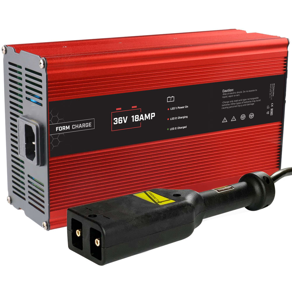
Which image are you more like to click on while shopping on Amazon?
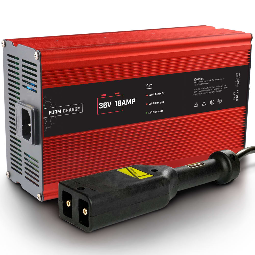
30 Responses to Option A
A looks clearer more sharp
This looks more visually appealing to the eye
This option shows the all the features more clearly
I prefer this image because it is closer and easier to see all of the details and features of the product.
it shows everything thats included and looks nice
The other one looks odd like it's hovering. This one shows the depth and size nicely yet still looks three dimensional.
I chose A simply because it was the first I looked at when the page loaded; it took a while to notice the differences. I suppose the shadow in A makes it look more natural and thus catch the eye better.
Photos were exactly the same.
I like the shadows in A
Honestly cannot tell any difference between the two
It was hard for me to chose but I would go with A. They almost look the same only A is closer and has a shadow around it. They booth look really good.
I like option A. It is a subtle difference but the photo looks a little more vivid.
It's easier to see
I would click on the A as the picture is brighter.
These both looked very similar. I thought A looked slightly more red. I really don't see a difference between the two so it is difficult to choose.
I have been staring at these images for over a minute and can only see one difference between them. I chose A because it looks like it's the tiniest bit deeper, darker red. The other looks a bit orangey.
I'd be equally as likely to click on both of these images because I can't see a specific difference in the two images other than a slight color difference.
They both look very similar, but I think I trust the darker image more.
The shadow makes the photo look more real and less fake.
I like the picture with the shadow on the bottom. I don't know it just feels more real and like I can picture it on my workbench. I like A.
The image looks more realistic the other option looked like a stock photo.
this is first so I choose it
I don't really see any differences in the two items.
I like choice A since it has the shading on the bottom of the product which gives the picture more personality. Choice B looks too plain and doesn't interesting and capture my attention.
A seems to be slightly closer and I am able to see the product more. Which brings my eyes to the power and other information I may need on the front of the product.
Option A is better because the product jumps out at you more so than Option B. Also, I feel like it shows more overall detail.
Photo A would draw my attention more, simply because it is a more close-up shot of the product. It makes the product look physically larger at a glance, even if that is not necessarily the case. That said, given the two different perspectives here, I do wonder which one is more accurate when reflecting size.
I like this pcture better, more details
I would choose either one to be honest. Both of the pictures are identical and show no real info or difference.
I honestly don't see a difference between both images.
20 Responses to Option B
This image seems more crisp without the shadow effect
The color of the paint in B, looks a little more darker.
Shading under the product in option A does not help bring out the color of the product listed. I prefer the product to be shown in a simple white background.
Its more crisp and clear
this is a clearer nicer picture
Choice B is brighter and seems to show more detail of the item.
This was a really hard choice. I'm not sure why but I my eye was more drawn to B.
This option looks better than the other one
The shadow seems a bit weird and is a little distracting in my opinion.
I would click on B because the image in B's depth makes it appear as though it is more focused and centered, as well as looking as it is more professionally cropped.
The shadow makes it more bright. It would be my click
I feel the picture is crisper then the other
The color seems slightly more vibrant on the top and catches the eye better
Option B seems to be slightly closer. It would give a better view than A. I would prefer B.
They look the same to me. B is just slightly zoomed out which is appealing.
I prefer this option it just looks a little bit more detailed and presentable.
I had a very difficult time distinguishing any difference between the two, but it just seems to me that option B is a little more bold, and option A somehow looks a bit dirty. Not like it is covered in dirt, just like it has gotten dusty from lack of use. And again, I am not sure how to elaborate more on this...the pictures are SO similar that I can only say what I feel and cannot really articulate why I feel that way.
GOOD TO USE THIS PRODUCT
I like Option B more because it looks brighter.
I don't see much of a difference, but the cord on choice B looks cleaner than the one in choice A. It looks like there is white powder on it in choice A. Otherwise, I can't tell if anything is different.
Explore who answered your poll
Analyze your results with demographic reports.
Demographics
Sorry, AI highlights are currently only available for polls created after February 28th.
We're working hard to bring AI to more polls, please check back soon.

