Poll results
Save to favorites
Add this poll to your saved list for easy reference.
Which design do you like the most and why?
Option C won this Ranked poll with a final tally of 30 votes after 2 rounds of votes counting.
In a Ranked poll, respondents rank every option in order of preference. For example, when you test 6 options, each respondent orders their choices from first to sixth place.
PickFu requires a majority to win a Ranked poll. A majority winner differs from a plurality winner. A majority winner earns over 50% of the votes, whereas a plurality winner earns the most votes, regardless of winning percentage.
If an option does not earn a majority of votes, PickFu eliminates the option with the lowest number of votes. The votes from the eliminated option are reassigned based on each respondent’s next choice. This process continues in rounds until a majority winner emerges.
Scores reflect the percentage of total votes an option receives during the vote counting and indicate the relative preference of the respondents. If there is no majority winner, look to the scores to see how the options fared relative to one another.
| Option | Round 1 | Round 2 |
|---|---|---|
| C | 42% 21 votes | 60% 30 votes +9 |
| B | 36% 18 votes | 40% 20 votes +2 |
| A | 22% 11 votes | Eliminated 11 votes reassigned |
11 Responses to Option A
The simpler and less flowery the border is, the easier the card is to read.
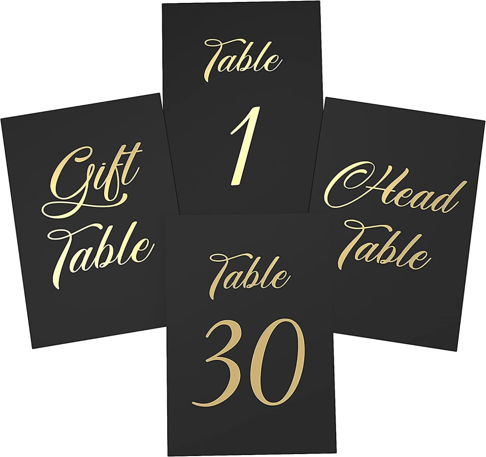
I don't think the head table needs to be so much larger so I chose that last. I think that A is the best because the font of the numbers looks really nice with the word font.
The lack of a gold accent makes A look more modern an understated.
I like the typeface and shade of gold most on the table numbers in option A. There is also less clutter without the border, which I like a lot.
My first choice looks the cleanest and most attractive to me.
A has a simpler style that seems classier and more attractive to me
option A is top choice as the size of cards are same and the color matches well with the background. option C is second choice as the card sizes are same. option B is last choice because the card sizes are not same
I like option A the best. I like the lettering on the cards. it looks very elegant
to organize data that is too detailed or complicated to be described adequately in the text, allowing the reader to quickly see the results
A I like the plain table number cards with the black background and gold numbers and letters. B I like the table cards with the border design in opposite corners. I like this design style too. C The table numbers with the design in all four corners is alright however, it seems like so many other designs.
I would put them in this order. I would go with choice C because I think that having them all the same size looks better. Having a gift table sign is useful as well.
18 Responses to Option B
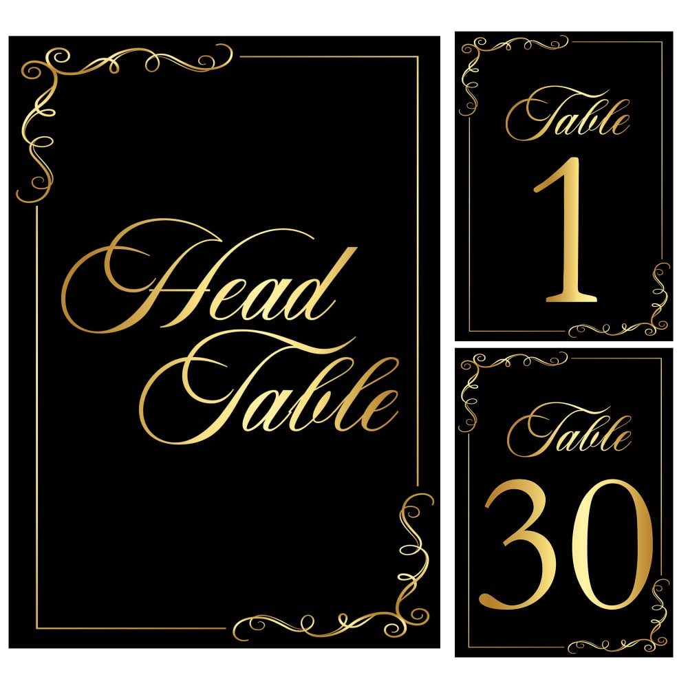
I like option B the most because the text and the colors on the cards looks bolder and higher quality.
B retains a crisper gold and seems a touch more classy.
I like the borders in B and C but I prefer the colors in B more
I like the border design on my top choices the best.
A's font was too dull; the gold color was brighter in B.
i chose option b because it has a larger size head table card which gives more attention to the people getting married or to the special guests at the event
I like the design plus I like the shade of gold. This one is more visually appealing to me.
I chose option B. All are very nice but I love the way the gold works with the black. The art on the gold is great and the font is fantastic too.
I think this dummy is easier to read
It looks like a deeper and bolder black, which stands out more. I also like that the head table card is bigger than the others.
I love the opposite corner flourishing on the border.
Option B because the head table is larger as it should be.
I prefer Option B as my first choice. I like that they have a larger placard for the "Head Table", it's appropriate and likeable. Option A is also quite nice and all the placards being the same size has a nice simplicity to it. Option C isn't as eye catching and seems to be a little ordinary.
Option "B": More sophistication, artful design on the edges and corners, and a favorable font type makes this the more visually appealing choice comparatively.
I like this border design the most - it has the most traditional look and its not too flashy.
A and c have a font that is a little bit hard to read, so it's better to stick with option b
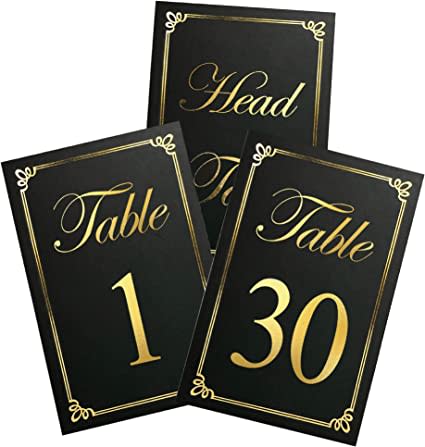
I like option C best because it most clearly shows the different cards.
Option B's design appeals to me greatly due of its appealing appearance.
21 Responses to Option C
The card font used in option C is appealing to me, I prefer the colors used for the set!
I like the border, so C is my top choice. "Head table" in B looks like it's not centered so even though it has a border, it's my last choice.
C - the golden borders around the numbers and text makes the most visually appealing design.
I like the design of option C the best. I like the bright gold color of the font. I also find the frame pattern to be appealing.
C first because I like the epdesign of the edgesB second because the design of edges are simpleA last because the cards are a bit plain
Option C was my top choice because I liked the border around the text as it was uniform and symmetrical. Option B was a good choice, but I didn't care for the style of the background. Option A is my last choice because I felt just the black background with no border was too bland.
The layout of my top choice looks active and lively, but also classy. Very nice for sure!
C and A are more visually pleasing to me and the display is better as compared to choice B.
C was first. It has a nice design without being "too much". I feel B is ok, but I don't like the border quite as much as C. A feels unfinished, like it's missing something without the border.
All three look good and elegant. I ranked them c, a, and then b based on the fonts and which ones were more visually appealing to me.
I like the gold borders in Options C and B the most.
I prefer option C. I like the one with the font that is easiest to read. I prefer it is elegant and simple.
I think the font of C is simple and looks really nice, it also stands out well with how the cards are presented. The others look nice too, I would not have a problem with any of those options.
I like c. Most elegant and easy to read. Stands out nicely.
I would choose C out of them because I like the layout of the cards
I really like the first one. Has an art deco kind of look to it.
I like the contrast of the gold border against the black background. I also liked that the cards were all the same size no matter what table was being represented.
Overlike framing in C/B so A is last choice. C is first as frame design is somewhat simple but visiually nicer than B
I love option C. The text is visible and big, and the border is a solid glittery gold which gives it a luxurious and premium design
C stands out the most to me.
Option C is nice. It really looks like a premium design. I like it. It's a design that really stands out.
Explore who answered your poll
Analyze your results with demographic reports.

