Poll results
Save to favorites
Add this poll to your saved list for easy reference.
Based on the cover, which book would you rather buy?
Option C won this Ranked poll with a final tally of 28 votes after 2 rounds of votes counting.
In a Ranked poll, respondents rank every option in order of preference. For example, when you test 6 options, each respondent orders their choices from first to sixth place.
PickFu requires a majority to win a Ranked poll. A majority winner differs from a plurality winner. A majority winner earns over 50% of the votes, whereas a plurality winner earns the most votes, regardless of winning percentage.
If an option does not earn a majority of votes, PickFu eliminates the option with the lowest number of votes. The votes from the eliminated option are reassigned based on each respondent’s next choice. This process continues in rounds until a majority winner emerges.
Scores reflect the percentage of total votes an option receives during the vote counting and indicate the relative preference of the respondents. If there is no majority winner, look to the scores to see how the options fared relative to one another.
| Option | Round 1 | Round 2 |
|---|---|---|
| C | 40% 20 votes | 56% 28 votes +8 |
| A | 30% 15 votes | 44% 22 votes +7 |
| B | 30% 15 votes | Eliminated 15 votes reassigned |
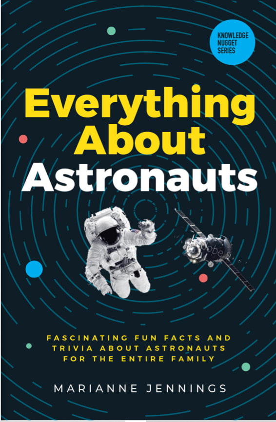
15 Responses to Option A
A has a modern look and contains much of what springs to mind when thinking about astronauts. C is nice but does not look quite as modern as A, B looks like a book cover from the 1970's The font really throws it off.
I like the design of Option A, but I don't like how the words in the title are cut in half. I like Option A because I like the look of the astronaut since that seems to be more of the focus of the cover. I think the astronaut in Option B kind of gets lost in the background.
A-I Prefer the font centered in the middle of the book cover, it makes it easiest to read. c_I like the style of font in this but would have prefer the font centered and straight rather than angled upward. B-This font text choice is harder to read.
I like how the cover of book A is layed out. It is not as cluttered as the others.
I like the rings and how the astronaut is floating in space. I think it is a great visual to make you think about space exploration
I like the swirl behind the astronaut in A. Looks fun and makes me think about my idea of space.
B and C have very busy covers, A looks less busy to ne.
I like this book cover most. The picture on the book is great. I like the description on the book as well. Then I chose C because of its nice design.
A and B are immersive, engaging, and exciting. They seem like true adventures. C is boring in comparison.
I like the image with the circular line elements - feels like being in orbit. I also don't mind the stylized cover with the purple text elements. fun and youthful. the option with the yellow box and smooth-line art feels a little boring in contrast to the others.
I think a cover with flying saucers is bad form in a book the looks factual to me, so Option B is out. I do rather like Option A's concentric space grid and so put this in first place.
Splitting words in half like in B is always a bad idea, that makes the reading of it not intuitive. The font on A is the best at drawing the eye, and it just looks professionally done.
the first one looks like he is actually in space, floating around. looks better than the others.
C looks too plain and B looks like it's for children. A looks the most interesting and oriented towards fun science information for adults.
I liked choice A the best since the cover matches the theme and topic of the book. Choice A grabs my interest right away and looks appealing compared to how basic choice C looks.
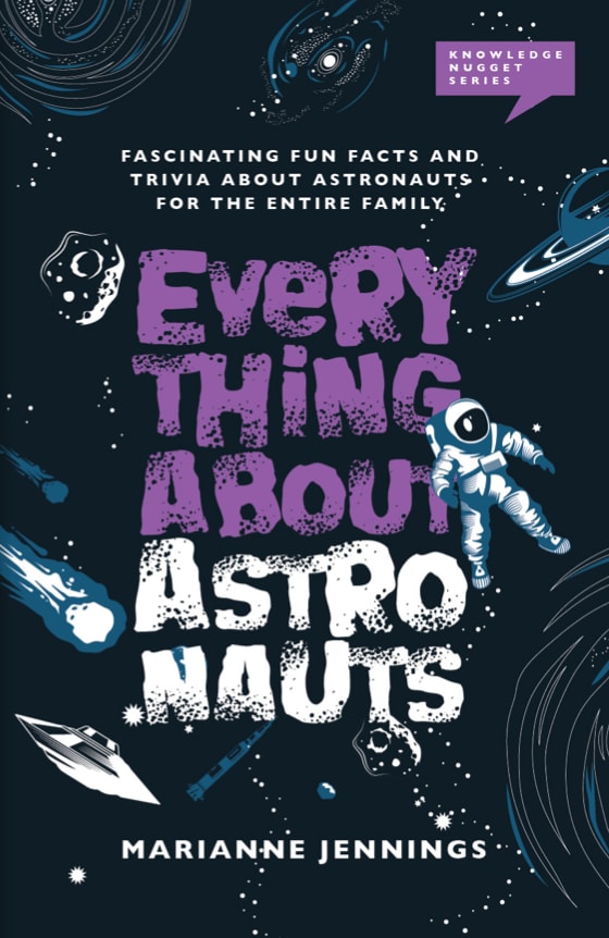
15 Responses to Option B
The purple color in my top choice is very classy and striking, and caught my eye. The yellow colors in the other two choices are also fun, so it would be hard to go wrong with any of these covers. Looks like a really cool book for sure!
I like how B doesn't have a standard look and feel to it. I think outer space and astronauts are kind of fantastical, and the fonts and pictures in B fit in really well with that.
B looks like 80's or like comics, i love it
B caught my eye first and would stand out on a bookshelf more than the other two
I prefer the more eccentric and colorful designs of choice B the most.
I like B because the fun facts are placed on top. This gives it a better showing of what this book offers.
Based on the cover, I would buy option "B". The color scheme matches the cover nicely. The overall cover looks appealing and unique.
I choose choice B because I feel that the book cover looks fun and whimsical and makes me, as a reader, feel like that the book will follow suit and will be a fun read.
Option "B": This cover has a retro look and feel that is charming, attracted me more acutely, and I'll admit it reminds me of the graphics on the old TV show "Lost in Space" which led me to a fascination with space travel in general.
the fonts are really cute and noticeable. i like all the space stuff
B is bold, bright, intriguing, and unique. A and C do not intrigue me nearly as much due to their visuals and color.
i like a most, it seems most creative and i like the design more. a is pretty good too
They are all good. However I like the graphics in Option B. Option A's font and graphics denotes more seriousness and perhaps a more adult target, but if it is adult I wouldn't use a title that seems more for a younger set.
The writing looks most interesting and the cover has the best contrast between lettering and design
I don’t like the text in A. It’s too plain and blocky, it doesn’t look fun. I feel like B has a lot of stuff going on that would excite my kids. More than choice C, which is fun, just not as dynamic as B
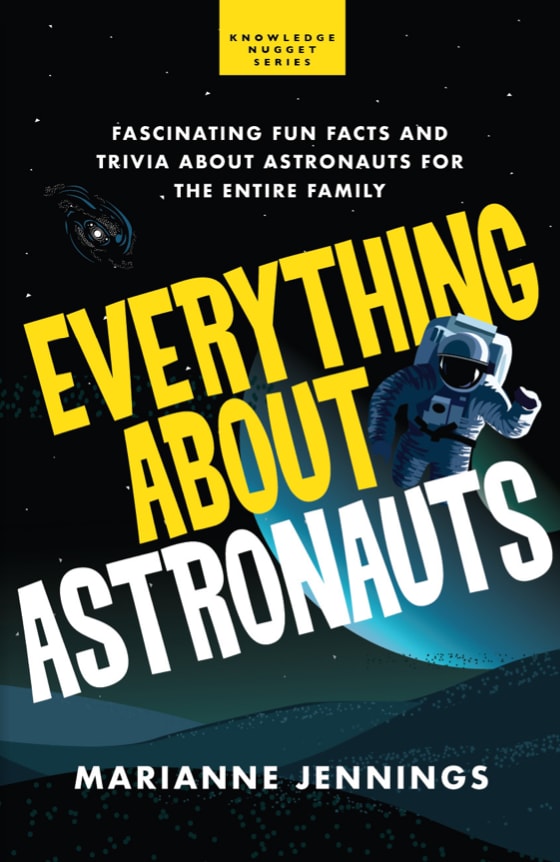
20 Responses to Option C
C looks the most professional and has the least distracting cover. B is a little cartoonish for me, so I prefer A over it.
I think C makes it look like more of a serious book. The others look more like comic book style covers.
I like option C the best because the font does a good job of speaking to the excitement of learning about astronauts with the whole family. I also like how simple the background is to option C. Option A would be my second choice because it seems more realistic than option B. I think that option B looks too much like a book that's going to not tell you facts about astronauts. Option B looks like a book of fiction and so I don't like it at all.
I really like the size of the text as well as the color combinations. It really jumps out at you and is attractive. I also like seeing the large moon in the background.
I like C. I like how they have the title in yellow and white on the dark background. it really makes it stand out. I like how they have the astronaut on there too. A is a close second. I like the title in yellow and white and how they have everything on the cover.
C: Picture of astronaut and angled text look the best. Yellow rectangle on top attracts attention.A: like the simpler text font, but star trails are a bit distracting. The yellow tagline is easy to read in this cover.B: Do not like how the text is split ASTRO NAUTS. Graphic looks a bit crude.
Option C is my first choice. The cover graphics and font make it seem exciting and other worldly. Option A is a little more conservative but the general idea is the same. Option B is the least successful as its over the top with the shaky writing and makes it seem comical.
I prefer the option with the large yellow font. It is engaging, easy to read, and stands out well against the dark background of space.
I prefer Option C as the first choice because the text and image of the astronaut and other graphics are more engaging and compelling when compared to the other two designs.
I liked the more dynamic and more vibrant and intense looking covers versus the more regular one because it made it more exciting to learn.
I chose by images that are the most bold and interesting looking.
I was torn between A & C. B looks fun, but I do not like the breakout of the word, "astronauts" I ultimately went with B because the cover is the most realistic
I like C the best because the angled title and the font is just playful enough for a book of this topic. B last because it is too serious.
My first choice is based on the boldness of the ad, it is straighforward and to the point. My second choice is also for how it is displayed but lettering is no as profound and too much clutter on page. The last one doesn't stand out so much and the breaking up of the wording is incorrect and should not be donel.
Ranked based on how elegant the design and the text style among the the list
I ranked the design of the book cover that I liked the most. I really like the clean look and feel of the book cover of option C the most. I then liked the font of the title of option A followed by the book cover of option B.
I like the bold text that looks more straight and science looking.
The large yellow font on the cover of option C makes the product eye catching, standing out over the other two options. I like the multiple space images on option B as well. The font also stands out. Reminds me of School House Rock.
I like the design more in Option B but I prefer the yellow and white font color that is in Option C. You should use the Option C colors in Option B and that would be perfect.
i think options c and b have the best designs with large text and best background images that get you interested in the book
Explore who answered your poll
Analyze your results with demographic reports.
Demographics
Sorry, AI highlights are currently only available for polls created after February 28th.
We're working hard to bring AI to more polls, please check back soon.

