Poll results
Save to favorites
Add this poll to your saved list for easy reference.
If you were shopping for a professional development book to read, which book cover design jumps off of the shelf and would make you want to buy?


Option D won this Ranked poll with a final tally of 60 votes after 5 rounds of votes counting.
In a Ranked poll, respondents rank every option in order of preference. For example, when you test 6 options, each respondent orders their choices from first to sixth place.
PickFu requires a majority to win a Ranked poll. A majority winner differs from a plurality winner. A majority winner earns over 50% of the votes, whereas a plurality winner earns the most votes, regardless of winning percentage.
If an option does not earn a majority of votes, PickFu eliminates the option with the lowest number of votes. The votes from the eliminated option are reassigned based on each respondent’s next choice. This process continues in rounds until a majority winner emerges.
Scores reflect the percentage of total votes an option receives during the vote counting and indicate the relative preference of the respondents. If there is no majority winner, look to the scores to see how the options fared relative to one another.
| Option | Round 1 | Round 2 | Round 3 | Round 4 | Round 5 |
|---|---|---|---|---|---|
| D | 21% 21 votes | 24% 24 votes +3 | 29% 29 votes +5 | 36% 36 votes +7 | 60% 60 votes +24 |
| C | 26% 26 votes | 27% 27 votes +1 | 33% 33 votes +6 | 33% 33 votes | 40% 40 votes +7 |
| E | 15% 15 votes | 18% 18 votes +3 | 19% 19 votes +1 | 31% 31 votes +12 | Eliminated 31 votes reassigned |
| A | 16% 16 votes | 17% 17 votes +1 | 19% 19 votes +2 | Eliminated 19 votes reassigned | |
| B | 12% 12 votes | 14% 14 votes +2 | Eliminated 14 votes reassigned | ||
| F | 10% 10 votes | Eliminated 10 votes reassigned |
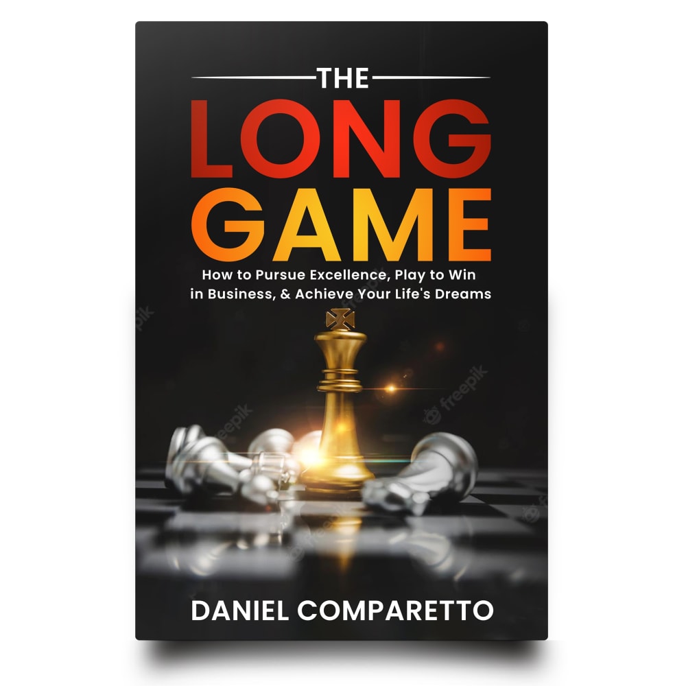
16 Responses to Option A
A would catch my eye first because of the central gold piece which indicates someone who is a savant and adept in their career.
I chose by covers that seem most interesting and powerful and also unique.
A stands out the most, with the gold king piece on the chess board making way with a good power.
A, E and D are the best due to their dark background color use and overall color set
I prefer this option. I like the black background, chess pieces and 'space'. The contrast between the sunset colors of the title text and black background works well. I like the space whereas option f seems too cluttered.
A looks very dramatic, D is innovative, I like the realistic scene on B, I like the colorful title on E, I don't like the bright background on F and C does not match well with the title.
The book cover designs that I find most favorable are those with an active and diverse color palette. Overall, the text works well with the illustrations and I find the font size to be acceptably large for easy readability.
Life is a game at times, so I related to the image of a game of chess. That was my first pick without reading the blurb or who the author was.
I like the way this looks at crashing into each other - it catches my eye looking at the pieces. I also liked the colors on this one.
I think A really stood out because of the Gold piece. Then E because of the sparks of game pieces. Then followed by F, B, D, and C.
I think the options like A and E fit the title of this book. Seeing the chess pieces makes it appealing
seems most intriguing and one that would capture my attention and it gives me something from the images of what i can expect
Gotta go with the white background to keep the product page looking clean and simple. Don't let anything distract from the cover itself. Less is more, always.
I like option A because it looks like an intense game that makes you pay attention. This cover would make me want to find out what this is about.
Option A. it looks 3-D the chessboard and the gold and I love the color of the red going to the orange in the title. It definitely would jump off of a shelf at me. And I picked option D for the same reason and it's just wicked cool too the graphic on it is really wild looking it's excellent
I love this one as it has game pieces on it. One of them looks like a gold piece, which is seen as the reward.
12 Responses to Option B
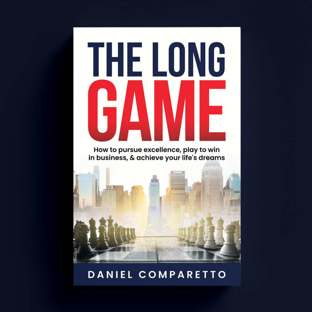
The battling of chess pieces seems like the most accurate depiction of any long game and would fit the story of the book in B and E these graphics.
The big and bold black/red lettering really makes this stand out a lot and jumps at you.
I only like B because it sparks my imagination without being literal. C is at least fascinating.
I chose B because the foreground image of the chess pieces blends nicely into the background image of a skyline, evoking both strategy and business, which is what the book likely focuses on.
I don't like the chess metaphor. The "long game" in regards to chess in this sense makes it seem like a confidence game (con game) The cityscape seems more professional.
I took C out of it right away because I just don't think it fits. Seeing the game of chess being played makes this stand out and overall makes sense. I like the look of B the most for standing out because it has the chess pieces on each side but the city in the back really makes it stand out. I think the black background doesn't stand out as much with the black, but the city background does to me.
I like the tall buildings in the background evoking images of success in my mind along with the chess pieces for thoughts of strategizing
Option B depicts a long game to a reward, it is non gender biased
I'm not really liking any of them, and especially do NOT connect with the chess theme. Need a wider variety of non-chess options.
Focuses on strategy and business.
I liked the color scheme and the inclusion of the chess board of B and F. I liked the arrangement of the chess pieces on B better than f which is why I selected it first.
I like the chess imagery, especially in Option B. Showing them with the large buildings of a city paints a good picture of the books content. Option A is next with the gold king knocking down some pieces, then F and E respectively. As the chess options, D is last because of the blue color. C is last because I don't like the idea of the door in the desert. It isnt original to me.
26 Responses to Option C
i think the desert symbolizes chances in life perfectly and a door in the middle of nowhere would get me curious.
B and F are very boring compared to the rest. C is the most eye catching and vibrant by far.
The colors of the red door, blue sky, and sand just all stand out while complimenting each other so well, it is super attention grabbing, I would not be able to help picking it up to learn more.
I find my top choice to be more eye catching. It is unique and visually appealing.
I like this one because it seems like an oasis in the desert which takes a long time and perseverance to reach
This cover is the most intriguing and has a very different looking cover. The picture is almost surreal and makes me think of dreams. The text is clear and easy to read too.
Option C stands out the most to me, I would be more likely to purchase it.
My top selection for this book cover looks the most encouraging. The beach and clear sky also looks the most refreshing
My top pick is C as it has a unique design which is more eye catching than the others. Next up were A and E as I like the chess graphics which connote strategy. B and F seemed fairly unoriginal and D's color scheme didn't fit the topic to me.
The red is by far the most eye-catching colour. The red door with the dreamy landscape around it on option C is very intriguing. It's the only cover that looks like a movie poster.
out of all the covers shown to me, C jumps out first. They image of the door opened makes me think that doors open mean moving forward
The beach theme of c jumps right out at me. It also gets me in the mood to read the book because I immediately get caught up in the aura of the cover.
C seems to pop the most, especially compared to business books in general. But I like the chess metaphor.
I ranked them based on the text on the cover, the image, and the overall appeal of the cover/book. Anyone in the market for a personal development book especially, this time of the year may want to grab one that speaks to them in a few seconds. So, in this case, the book is being judged by its cover:)
i ranked these from the most eye catching to the least with option C also looking like the most helpful
Background matters to me. I love the ambiguous background of Option C and the ice blue cheese board of option D. They seem of very high graphical nature.
I like the colors/pictures best that gets my attention to least attention.
The desert scene in my top choice is stark and compelling, which is appealing. The blue design of my second choice is also striking. Very nice designs for sure!
c and e feel the best to me. D and A kind of just exist.
Option c has the mystery of an open door.this perks my interest and curiosity.
Option C stood out to me because of its color and its novel design.
I like C the best, because it stands out among all the other chess themes. The open door in the desert conveys passage, opportunity and something almost whimsical. It's like an open door to success. The chess ones I ordered based on their designs. Some speak louder to me (like the clash of figures in E) and others less (like the suit in front of a chessboard -- boring). B is the worst and does not stand out to me at all.
i would want to buy the book with the cover in option C because it looks the most inspiring
My first choice symbolically opens to the unknown.
I prefer option C the most, the design of the cover is the most foreign and thought-provoking design compared to the others. The colors of the deisgn are also used really well in where the color of the sand contrasts well with the bright-red door. If I had to choose, I would defnitely pick option C off the shelf before any of the others.
I think the color choices of C look great and the cover is the most interesting. D is a close second and I like the way the blue looks against the black.
21 Responses to Option D
I put this in order by which one's seemed the most dynamic and eye catching. I do like the chess depiction and think that is a great cover for this type content.
The blue colored ones stick out to me the most and make me want to pick them up the most.
D has a more futuristic and technological style that makes me more interested in reading since it might have newer ideas.
I Prefer option D. I like the chess reference in the picture. I like the blue colors with it.
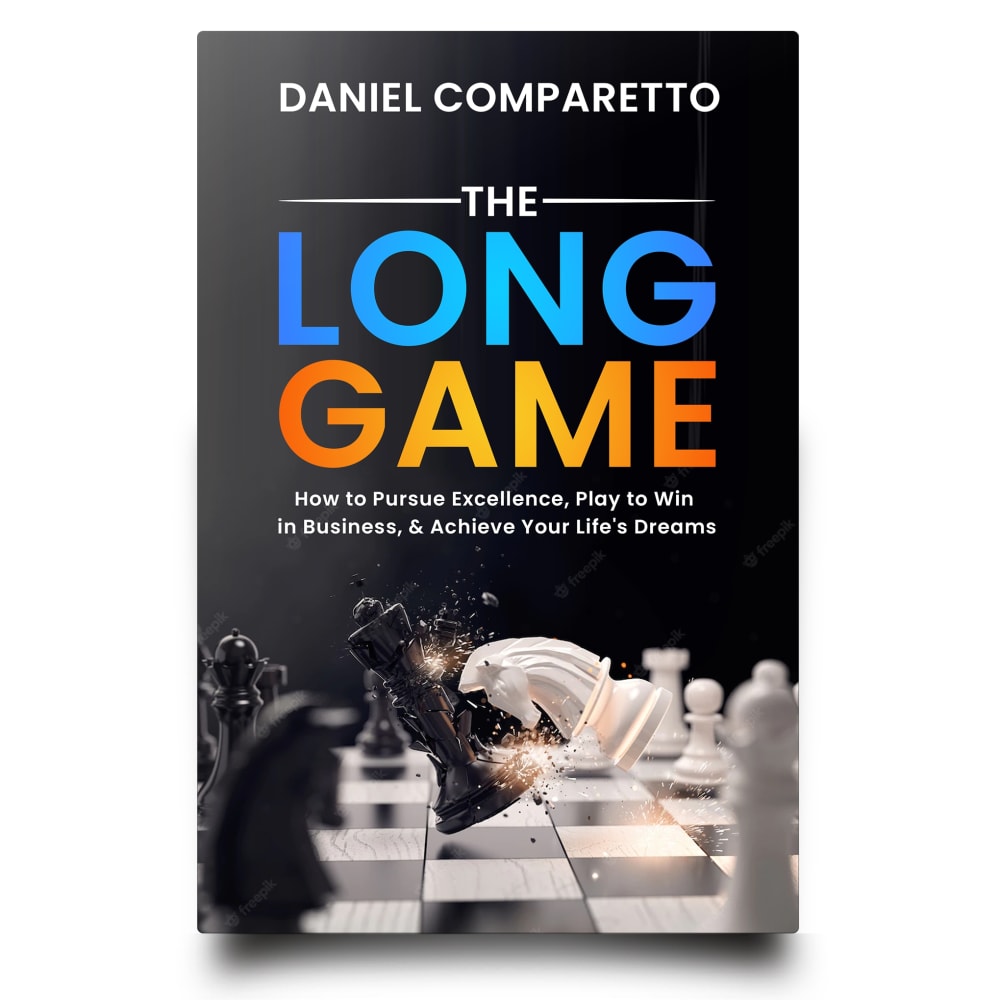
D gives it the element of Ai which is very current and so the most dynamic, bringing to mind a Matrix. That one is above and beyond the others. A and B also have the chess pieces but the colors are bland and less likely to call to mind, comparisons. E might offend the woke crowd and F might offend the patriotic crowd, so think who you expect would spend money on this information. C is just random and empty looking.
I like the colors and digital design of D the most. I like the cityscape behind the chess pieces on B. C reminds me of the second book of the dark tower series.
I chose D as my choice because I find the cover to be interesting. I like the graphics, the colors, and the overall look. It would make me pick it up and find out more.
I picked D because I like the futuristic look and the fact that it feels modern.
Option D looks the best out of the chess themed covers because it has a futuristic geometric design too.
I like D and A the best, I like the color scheme and the chess motif. C was my least favorite because the image feels stressful to me.
I ranked my choices based on which designs I feel are the most eye catching.
D I feel has the best cover that is most pleasing to me, and is able to stand out.
This image looks really hi tech and like every move is mapped.
D brings an element of technology or AI type of feels with this cover that the others do not have, it feels more relevant for today's age and the type of tech we see each day
D is the most attractive and intriguing to me. The rest are ok, there's nothing wrong with them, I just like D the best.
This cover reminds me of the movie Tron. I like that it is showing what I guess would be the inner workings of everything that is on the cover, making you think that it is analyzing them.
I like the ones with the chess pieces, especially D because of the way the hand looks. The blue really stands out.
I definitely like this one the best. I like the color scheme a lot. I love the different shades of blue and how they pop off the background. I also like the chess pieces that are in use on it
I think D is more fun and engaging. It is very attractive
Option D was the best because it was the most captivating to me.
D looks as interesting as possible for what I would imagine would be a hard book to read.
15 Responses to Option E
I like the chess pieces visible with the knight ramming the king.
The darker covers with the chest pieces look the best, the colors make the book seem more like an urgent read.
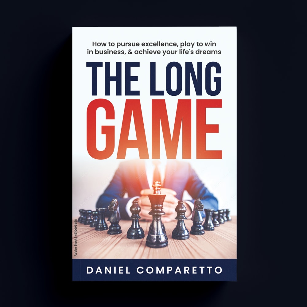
I like the analogy of chess to business, it is like that sometimes. I then ranked the book covers by how attention-grabbing they were for me. The first 3 choices also feel trustworthy. Option B and F are also trustworthy but remind me of all the coding books I've read, so I can only assume by the cover, the book is going to be dry. Option C looks like memoir or novel you read at the beach.
I liked the chess theme of option E, A, D, F, and B the most. Option E, looked the most eye-catching followed by option A. Option B, I liked the style of it a bit more than option C. Option C, didn't really match the title that well which is why I ranked it last.
E and A are less traditional and more novelistic choices, and would stand out more.
I like option E because it really jumped out at me, and I found the picture on the cover to be very interesting and it piqued my interest. I would choose this book if I were looking and browsing.
I would be most likely to purchase and read option E because I think that it has the most interesting, eye-catching, and visually appealing book cover design out of the six options above.
I Ike how e has a little bit of aggressiveness on the cover.
E I like this but I'm not sure how well it fits.
Option E looked creative and modern with bold colors and a vibrant style. Option B had a cover that felt familiar and in line with most modern book covers. Option A had compelling colors, but a bit too aggressive in the color scheme. Option C and D were acceptable, but were not particularly eye-catching. Option F was too dark in tone.
I chose based upon the design of the books and their appeal.
The chess board in E & A looks the most exciting.
Option E as it shows motion, conflict and struggle, which is certainly going to be endured along the road to success.. It is inevitable.. Option D as it also shows motion and movement.. Option B as it's framed well.. Option A looks like a post party photo, or a murder scene.. Option F is a little too narcissistic and Option C looks like a bad music video..
Option E gets my attention. I like the use of the Chess pieces, it fits the title very well.
E looks the most professional.
10 Responses to Option F
F is the most intense. It also speaks to the idea that business and career are both long games that require both tact and patience.
I would choose choices F, B and D first for me because the details are clear and the books covers are more visually pleasing to me as compared to choices C, E and A for me.
I like the symmetry in choice #1. It draws my attention in. In choices 2 and 3 I like the way the chess pieces are used against the backdrop of a city and game board. It brings out the idea of competition. The vector of the hand playing chess is a little odd, which is why it is memorable. choice #5 is not very memorable to me and I do not like the image at all for the last choice. It looks like a book about meta physics.
I think the man and the chess pieces with F look the most powerful, and it would make me the most likely to pick it up for that reason.
I like option F the best because I like the image of the person sitting behind the chess pieces, which reminds me of the person playing a game against developing their business life.
I liked the options with covers that were lighter and brighter in color since these felt more engaging than the duller, darker options.
I would definitely choose a novel cover that has the chess game on it.
F, E, A, D, B all look like a chess game cover and makes me want to read the book to learn more...C is too plain and doesn't make me interested.
Since humans are involved in business, I think the faceless man presiding over the long chess game works best.
Definitely Option F, Option D as a last resort, they best represent what I personally would picture the book is all about and most helpful. Thank you.
Explore who answered your poll
Analyze your results with demographic reports.
Demographics
Sorry, AI highlights are currently only available for polls created after February 28th.
We're working hard to bring AI to more polls, please check back soon.

