Poll results
Save to favorites
Add this poll to your saved list for easy reference.
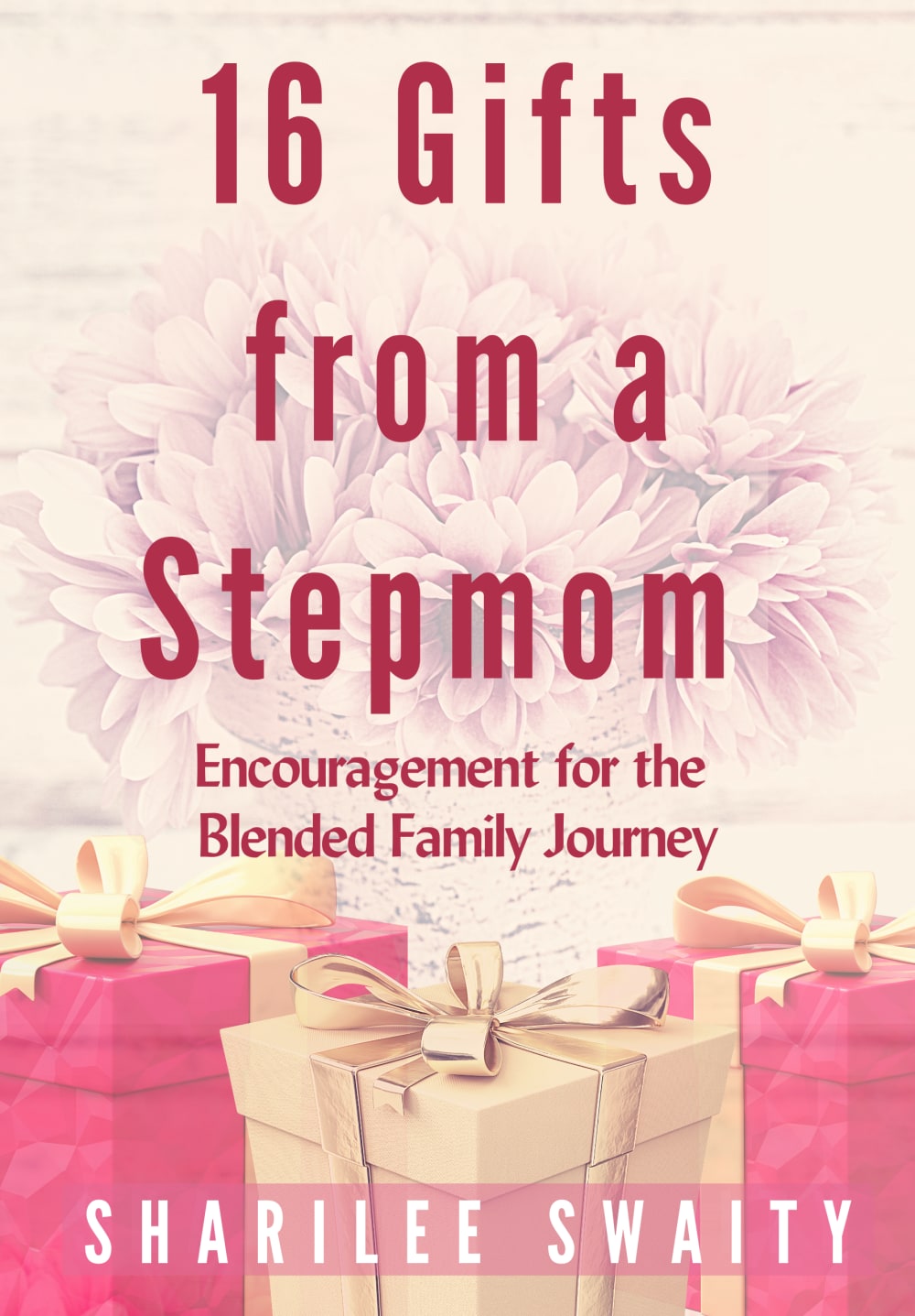
Which cover do you like best, and why? This book is for women.

Age range
Education level
Gender identity
Options
Personal income range
Racial or ethnic identity
Religious affiliation
15 Responses to Option A
I prefer cover A. There is a joy to it, which I think the book most likely contains a bit of. B looks almost somber.
It is more colorful than B. I think it would catch my attention more if I saw it. i like the hot pink color.
This option emphasized the gifts more since they were featured in bright pink colors.
This one is pretty and looks like it would appeal to a younger generation
I chose Option A because it’s more colorful. The image also has gifts, which relates to the title of the book.
The pink color reminds me more of a mom.
The pictures of gifts stand out more
It’s easier to see the font in choice a
I chose A because I like the actual presents on the cover. It makes the cover and title blend together and make sense.
I prefer option A. I think the gifts in the image are symbolic of what can be gained in a blended family. Appealing and charming.
Both are nice, but I like presents in A. The font could be a darker or different color.
It just looks like more time and energy was put into creating Option A. Option B looks like it was just thrown together in a short amount of time. It's not bad, just not as good as Option A. Also, this cover just caught and held my attention most.
A looks more attention grabbing and appealing. B looks more dated and little bit boring.
I am a stepmom, and I would be very interested in purchasing this book, as it is a tough role to have. I like choice A the best because of the colors. They catch my eye more quickly than option B does.
The images and the lighter color of this cover looks more appealing to me. I like centered title of the book. The photos of gifts also make the book cover nicer.
35 Responses to Option B
I really like the handmade look of the background in B, with the hemp tied package bow. It looks rustic and authentic.
B looks more like it is a gift itself because of the string. I like the color palette better and the natural colors mimic that these gifts are something not material-based but more about connection and spirit. The title "pops" more on B as well.
I like the off center title more
i like the rope detail
B looks more professional, A looks kind of cluttered
The graphics in B are simpler and more understated.
I like the more antique look in the choice b. I like the rope and i feels more of a journal and im connected to it more emotionally. I enjoy the flowers and they stand out more in the choice b. it is more of a christmas feel to the book cover in choice a
I felt like this choice embraced and represented the title better. The colors were softer and more inviting as well. And the picture is not so literal about the 16 gifts being something tangible.
I think the colors in B are more subtle and look nicer. It overall seems like the book is going to offer more wisdom.
I liked Option B because it had kind of an elegant peacefulness about it that appealed to me. I thought that fit with the subject matter. Making the book look like a gift was very clever. I thought that would make it stand out and also be memorable to people. Overall, I thought it looked prettier and more high quality than the other option.
Pretty and reminds of a gift which is what this book provides! The gift of help and knowledge
I think the design of B looks more cohesive; it also catches my eye more easily than A does.
I like the sepia tone of the background.
The flowers and the simple bow look attractive for a book cover.
I chose Option B as my top choice because I really like the darker colors that were used. I think the darker colors really make this cover stand out better than that of Option A. I also really like the rope that is being used on this cover as well and makes the cover stand out just enough for me to want to learn more.
I thought the design was simple and modern. It looked like an actual gift itself.
I like the ribbon in Option B. It looks a lot more sophisticated.
it's cooler looking with the bow on it, makes the book itself look like a present makes it look less likely the book would need to be gift-wrapped
I like the muted color scheme of option B and I think the bow is a really nice touch. Option A is just a bit too pink for me.
The word "gift" in the title is imitated by the gift-wrapping illustration behind the text.
Choice B looks more professional. There is much too much pink in Option A. Option B has the twine which makes it seem a little older, implying that the stepmom has wisdom to impart.
The lighter pink color on option b makes the text easier to read, and makes the flowers in the background pop. It is also less busy
This cover captivates my attention more and grabs my interest.
I think that A borders on old fashioned, but B has a rustic charm that makes it feel somehow modern. I much prefer b
I think Option B gives off a more meaningful vibe and matches the title of the book in a more genuine way.
the other one is kind of cheesy with all the flowers and presents
I really like that they used a different color for the text. It makes the text really stand out this way and looks more appealing.
Option B has this subdued color going on that I find alluring. It's like it was mixed with slight sepia tones, which really piques my interest. Between the two my eyes and attention keep coming back to this one.
I like how the background picture is less prominent in option B and I love how the ribbon makes it look like a gift. Super pretty and visually appealing
I prefer the aged look of this book because it makes me feel like it has more wisdom in it to learn from.
I think that option B has a more welcoming feel to the cover.
Has good contrast close to the title of book. The second one (A) highlights the author than any other part of the cover
i like choice b the best because i like that the cover doesnt have as much pink and i think its more of subtle cover and photo. the colors in it are more blended and just make the book cover look more professional.
Both covers are absolutely beautiful, but I like the rope on option B better than the gift boxes on option A.
I like the color palette and the composition of choice B more than in choice a.
Explore who answered your poll
Analyze your results with demographic reports.
Demographics
Sorry, AI highlights are currently only available for polls created after February 28th.
We're working hard to bring AI to more polls, please check back soon.

