Poll results
Save to favorites
Add this poll to your saved list for easy reference.
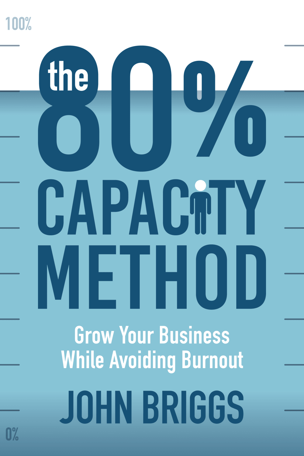
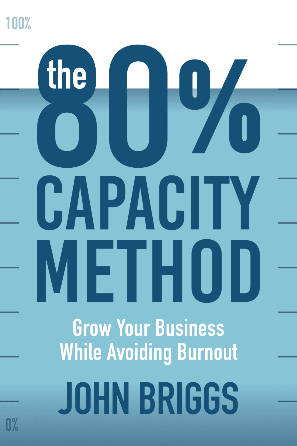
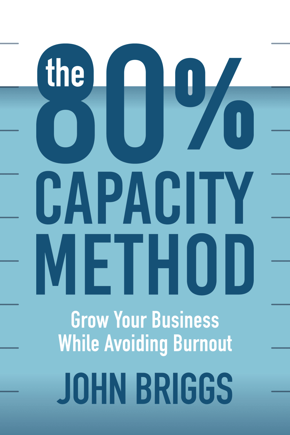
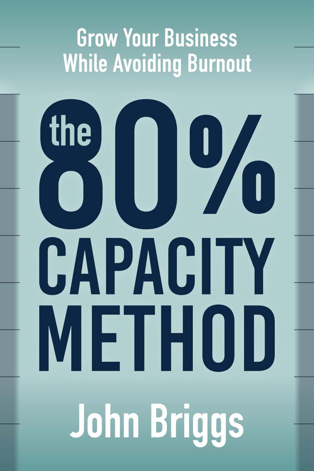
Which cover do you prefer for a book for business owners that are burnt out and they want to fix the work life imbalance for themselves and their team? The core message is a business can grow and thrive when everyone works at 80% capacity.

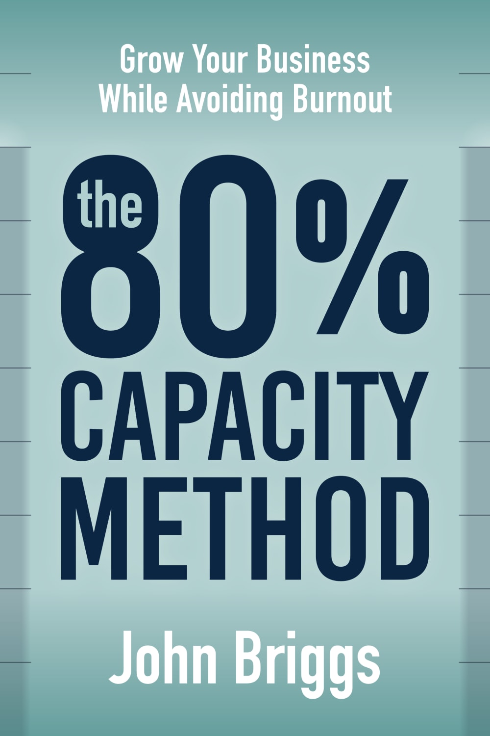
Option E won this Ranked poll with a final tally of 51 votes after 5 rounds of votes counting.
In a Ranked poll, respondents rank every option in order of preference. For example, when you test 6 options, each respondent orders their choices from first to sixth place.
PickFu requires a majority to win a Ranked poll. A majority winner differs from a plurality winner. A majority winner earns over 50% of the votes, whereas a plurality winner earns the most votes, regardless of winning percentage.
If an option does not earn a majority of votes, PickFu eliminates the option with the lowest number of votes. The votes from the eliminated option are reassigned based on each respondent’s next choice. This process continues in rounds until a majority winner emerges.
Scores reflect the percentage of total votes an option receives during the vote counting and indicate the relative preference of the respondents. If there is no majority winner, look to the scores to see how the options fared relative to one another.
| Option | Round 1 | Round 2 | Round 3 | Round 4 | Round 5 |
|---|---|---|---|---|---|
| E | 23% 23 votes | 24% 24 votes +1 | 26% 26 votes +2 | 44% 44 votes +18 | 51% 51 votes +7 |
| A | 19% 19 votes | 24% 24 votes +5 | 29% 29 votes +5 | 30% 30 votes +1 | 49% 49 votes +19 |
| B | 18% 18 votes | 18% 18 votes | 25% 25 votes +7 | 26% 26 votes +1 | Eliminated 26 votes reassigned |
| F | 18% 18 votes | 18% 18 votes | 20% 20 votes +2 | Eliminated 20 votes reassigned | |
| D | 12% 12 votes | 16% 16 votes +4 | Eliminated 16 votes reassigned | ||
| C | 10% 10 votes | Eliminated 10 votes reassigned |
19 Responses to Option A
The person in the logo with a white head seems like the rest of the 20 % and the remaining growth that can be achieved so A and C fit.
I think they look best when they show the 80% on a 100% scale on the side of the cover, gives it a good visual.
After carefully studying and comparing all six book covers displayed above designed for business owners that are burnt out and desire to fix their work and life balance, I selected Option A as my first preference and the one that I would most likely click on to purchase. I was really impressed by the eye catching appeal of 80% shaded area on the cover representing the 80% effort needed from each employee. I also liked the human figure representing the "i" in Capacity. Option B was my second choice followed by Option C, Option D, Option F and finally Option E with all six rankings based on my own personal opinion of the relative attractiveness of each book cover image.
Not a fan of the green color books. I like "A" the best because it has the 100 in the top corner and the cover is 80 percent full, so it's lighthearted and fun. With the I being a person also adds more to fun factor of the book
I like a the best because the color is just unmatched compared to the others. There are a few others I like but a drew me in the best.
Teal background with the more interesting design is better than the green background, thus A and C are first choice. A and C have the person silhouette . A wins out because it has the numbers on the side. Similar logic with B and D. They come next, ahead of the green background, but B has the numbers thus it comes ahead of D. F and E seem to be the same, and the green background is not as on point in displaying the gradient of 80%.
I think option A is easier to read, follow, and understand which makes me most likely to read and buy. I think the sub tittle is best under the tittle and I like the person in the tittle.
I like option A the best because I like the white color at the top of the cover, which makes the word "the" inside the top of the number 8 stand out due to the blue color of the 8 and I like the graphic for the letter i, which is a person with their head being the dot of the "i" and is colored white while the rest of the letter looks like a human body.
I chose this because there are more little designs that pertain to the title. It all adds up and makes for a better cover.
Option A with the 0% to 100% on the side graph as well as the incorporation of the person in the cover text is the most interesting design. This is followed by Option B which eliminates the person in the cover text but keeps the percentages.Options C and D are third and fourth as both covers eliminate the percentages along the side but one keeps the person in the text. Options E and F have different cover colors that is not as effective as the entire cover is colored thus eliminating the 80% alignment of the image and the title. To replace this the designers have introduced bars along the sides that are not easily seen, in fact, the bars are somewhat obnoxious. The only difference between options E and F are the bar colors on the sides. This does nothing for the design and these are certainly not as strong of a design as Option A.Option A has a great design that is aligned from cover image to title. It incorporates the humanistic side of the book by placing a human figure in the text design. Option A has the cover image nailed! Off to the presses!
I like option A with the blue being filled up to 80% and the "i" in capacity is a person, very creative.
Having the slogan at the bottom is more effective and clear for readers. I think it's important to have the main title at the top.
A is the best because it has the most personality, and is the most interesting. I think it gives you more to think about, and will get more people inspired to read the book.
I like the 80% filled blue cover with the 0 and 100 along the left. I also like the 80% filled man as the letter I. E and F are identical, and not as interesting as the other covers.
I like seeing the graduated numbers on the side best.
I like the amount of assisting visuals in option A that help me gain an understanding of the gist of the book.
I like the visual of the meter being filled up to the 80% mark. It makes me think about the 80% more.
I like the small details on A and the brighter cover is better.
First pick is A because the description, color and organization is very appealing. Second pick is E because I liked the green cover without Anything extra it caught my attention. Third pick is C because I liked the idea of avoiding burnout right in the middle were I see it first. Fourth pick is F because I liked the title in the middle and interesting with the description up top. Fifth pick is B because I liked the layout but it feels very plain. Sixth pick is D because it looks the most plain and boring.
18 Responses to Option B
I like 80% being more a part of the cover but don't like the little man in the text
I feel that B is the best cover as it looks the most pleasing and flows the best.
The design bold when with the actual title. Especially with the blue only being 80% of the full cover.
I like some graphic hint to the 80% aspect, but too much cute graphics is distracting
I like the blue cover and it works best with the 100% on the left!
I like the darker blue and the visual indication of the 80% in the cover itself, so E and F are not appealing to me. Of the remaining ones, I like B and D the most since I think adding the person as the 'I' adds an unnecessary and distracting visual element to A and C.
i really like the ones that show the cover 80 percent 'filled up'. the 100 percent up in the corner is a cool little detail. it's all pretty creative and appealing. i can't see even a little difference between e and f.
I think options A through D are all really effective for the subject matter, you can't go wrong. I think E and F are a little bland.
Made my choices based on which cover I like and prefer most to least. The cover I like and prefer most is the one in B. The cover in B stands out and is the one I find to be the most fitting for this type of book. The one I like least and prefer the least is the one in F. The cover in F does not stand out to me and does not seem interesting due to the color choice. It is also the one I find to be the least fitting for this type of book.
The blue and white emphasizes the percent scale in the back the best. I like having the percent numbers. The little person in the text isn't very good.
I like the lighter blue better and these have more depth
I like B because it is the cleanest and simplest.
I just went with what combo of font colors and designs I liked best
I prefer the blue colored book cover overall and the scale (0%-100%) on the left side of the image because it aligns best with the book subject matter of 80% capacity. I ranked the covers based on these preferences.
The text kind of fades slightly into the greenish background-ed covers..those with light blue backgrounds really do look a lot better
I like the blue and white covers better. I don't like the person in place of the letter I.
I chose option B because cover is eye catching and graphic. The title is clear and easy to read.
THe colors used in option "B" are vivid enough to catch a persons eye from a distance when shopping online as well as when the book is upon a shelf. THe cover shows a great visual of what 80% is compared to 100%
10 Responses to Option C
I preferred. the simpler layouts when compared. The whitespace helps demonstrate the 80%.
I like the bright blue version in choice C. I also like the meter only going up to 80 percent. It works for this book
C definitely stands out from the pack with the awesome color and layout. Gotta go with that one!
I prefer Options C and A because I like the image of the little person on the cover, it represents "the little guy" very well!!!
C has the best blend of color. The 0 and 100 percent sings are rather pointless.
choices c & a has that 80 percent type of illustration in the art cover
I like how the blue feels like keeping your head above water, which I think is pretty obvious with the scale look, but also could slightly make it look like a wave surface, and like the person in place of the "I"
seems to be the most appealing and valuable to me as it gives a positive warm impression that makes me interested more
I like the ones that have the darker blue colors first because it makes the font stand out more.
I rated this product illustration in 3 pairs since it appears that some of the books have the same cover layout. Option C and D are ranked first because having the "Growing Your Business" phrase seems more like a sub-title and should appear under the main title. F and E are ranked 2nd because the darker color is more visually appealing. A and B are last because the text of "100% and 0%" seem a bit misplaced.
12 Responses to Option D
The darker blue is bolder and speaks more to a volume of something being filled like water. I also don't care for the "I" stylized as a little man. It's distracting from the message, I feel.
This title is very readable and I like having the open white space above it because it draws attention
D is first because I like how clean it looks and doesn't have the little human figure on the cover. That is why E, F, and B are also ranked close to the top. Option A and C are last because I don't think the human is necessary in the title.
The green is a nice color but it is hard to see the 80% scale with the green. Option D is best because we can see the 80% scale with the white top.
Cleanest, clearest option available without creepy dot head or unnecessary labels.
I definitely don't like option f and e because they have that gross color green on it. I think the best ones just have a white part on the cover to show that it is empty
Option D is easy to process. I do not like the human shape in option A and C. I chose option E second, I really like the color and it is easy to process but I prefer the blue background.
I liked the covers that felt like water filling a tank to 80%. I think several did this well, but the tick marks and color of D was my favorite.
I like option D and that is the best look without extra gravy on it. I'd use that for the best cover that is direct and easy to read. Option B is close and we don't really need the 100% on there. Option C and A with the character there just seems to be a distraction and make it seem less serious. Options F and E are okay but the subtitle text is better on the bottom.
less intimidating, easier to see the message
D is the best. The 80% is implied so the 100% isn’t necessary. And the person being a lette
i would choose option d because it appears like you are keeping your head above the water to show the 80% factor
23 Responses to Option E
I ranked #1 and #2 because the cover looks like it takes up the whole book front. The others made the book look awkward.
I like the tagline at the top of the cover, so I put E and F first. I also like the light green color. I don't understand why the 100% is listed at the top of some options, nor the decision to replace the "I" in capacity with a person.
I don't like the white space at the top. It seems like a bad use of space.
I prefer the words grow and so on as the first words i see. i also prefer the color the other colors are to dark.
Usually stating the topic of the book is a great lead into the title. Using the cute person graphic is unprofessional, but the percentages on the side are a nice touch.
I like these covers that are completely full and they show the volume measurements on the side the most. Of the other covers here that have the two-tone backgrounds I like the ones that feature the little figure and place of the letter i
I prefer the greener color to the blue, and I prefer the color all the way to the top of the image.
Options E and F are my selections because the text on the book cover is more engaging and compelling.
The color scheme and logo/font combination on my top cover is most appealing, especially given the subject matter
I like how easy it is to read the title when the cover is all one shade and does not have the white section on top. Replacing the letter I with a figure of a person is a bit too much when there are so many letters on the cover all at once.
Option E was my preferred choice because the text is easier to read than on the blue background options. I thought that on the blue background options having the blue line cut through the 80% was distracting. I also picked Option E over Option F because the bars on the sides are slightly darker, which better highlights the concept of 80% capacity.
Definitely Option E or F, the colors used are much more calming, and gets you more in the mood to read such a topic. Thank you.
I prefer the subtitle at the top. It’s easier to find the premise of the book. With the others you have to scan more to find it.
The key here is 'avoiding burnout', so I like E and F best since they highlight that phrase. I don't care for C or D - I understand that the color is meant to only come up to the 80% level, but from a distance it just looks like a printer's error. A and B have the same thing, but include the '100%' indicator that helps you make sense of what the cover is trying to say.
It is a tie between option E and F. I love the color of the books, the green is so pretty.
I feel like cover E looks the most professional and interesting to read
I prefer the green in e and f. The differences are so minimal that i am indifferent between either one
The greenish blue with the details on top look the best, it stands out the most.
E: I like the position and the size of the title in this one the most. The green color background is nice too I just wish there was a bit more contrast between the foreground and the background to make it pop even more.F: Its a bit harder to understand the motif with this one because the background is so faded, i still like this color better than the others.D: This one has the best overall layout and the whole 80% full motif is really obvious with this design.C: I think the little figure with his head cut off is a bit too much and starts to make it seem more like a gimmicky self-help book.B: I think putting the 100% and 0% on the side is kind of like explaining the joke and it makes it not funny anymore. the 80% full motif is nice you dont need to over explain it.A: I dont like the little figure, this one feels the most like a cliche self help book.
The dark font sticks out and makes the book's title easy to read. I like the color contract of my top 2 choices the most
I like the darker blue and I think I like it at the 80% mark mark but I really don't like the last one I think that style makes it very hard to read with the i in the middle.
I prefer the option E business book cover because I like the green background color and darker gray highlights on the edges the most. I chose option F second and because I do not like the lighter gray highlights on the edges as much as in the option E book cover. I chose options B and D third and fourth because I like the text indicating the one hundred percent and and zero percent lines more than the book cover without that text and only marginally like the blue background color book covers compared to the green background color book covers. I chose options A and C fifth and sixth because I do not like the white dot for the head of the person in the title text as much but prefer the numbers to show the scale from zero to one hundred percent much more than without that for the blue book covers.
My choices were ranked in the following order: E, A, B, C, D, F. The reasons I ranked my choices in that order were simple. Choice E was clear to read while still emphasizing the content of the book. In addition, Choice E was easily understood. The other choices, in my opinion, are visually distracting. For example, with Choice F the text was placed in a completely unorganized way. This disorganization made it difficult to understand the title and concept of the book.
18 Responses to Option F
These covers stand out to me as being the best looking in terms of appearance
This cover's color is nice and the image of a full page looks more positive than the others.
I chose the ones with a solid background. The white background in the others tend to blend in the background. It makes it less noticable.
I chose by options that look most bold and professionally designed.
F and E are the best because "grow your business......" appears at the top. if that's the first thing people see it increases the chance they will buy the book.
I prefer option F because the text is easier for me to read.
I prefer this one because this title makes sense and tells the reader what this book is about
I will choose option F' I think the background color for the cover looks good.My next choice is option E' I like the text design for the cover.I also prefer D' because it looks very appealing, colors looks great.C' also looks attractive, I like the whole design.A' is also a good cover, it is very easy to attract attention.B' is my last choice, I think the color looks too deep it looks good though.
Not a fan of putting the word in the number.
I liked the bold face font of the title in option "F" better then the others
I love the sentiment and the thought. I am drawn to the green ones, which is a nice departure form traditional blue. I did not care for the caricature of a man in the words.
I find that the color schemes in options F and E are the easiest to read. The color contrast is much better and easier to see / stands out. The options with 100% at the top are just confusing.
I prefer this green / teel tint over the blue ones.
I like F the best; it has the most appealing look, and I like the light gray representation of 80 percent. E is similar and also good, just a little darker. D and B are ok, but the 80 percent representation looks a little less appealing. I don't like C and A with a person for the letter I
This cover stood out to me the most
My first choice is option F because I prefer this shade of green to the others to me green symbolizes wealth and luck. Option E is my second choice the color is very similar to my first choice but has a little bit more blue in it. Option C,B,D and A are so similar that I can't even tell the difference between them so for that reason they are all pretty much equally not my first choice
I chose F and E because I prefer the green background. It is more smooth and calming. And I like the title "Grow your business." being on top above the main logo about 80%. It seems to flow better having the title on top above the 80% logo.
I like the ones with the green and black because the contrast stands out better. I also like the ones that have the person standing in for the letter I. I also think it's better to have Grow Your Business While Avoiding Burnout at the top of the cover.
Explore who answered your poll
Analyze your results with demographic reports.
Demographics
Sorry, AI highlights are currently only available for polls created after February 28th.
We're working hard to bring AI to more polls, please check back soon.

