Poll results
Save to favorites
Add this poll to your saved list for easy reference.
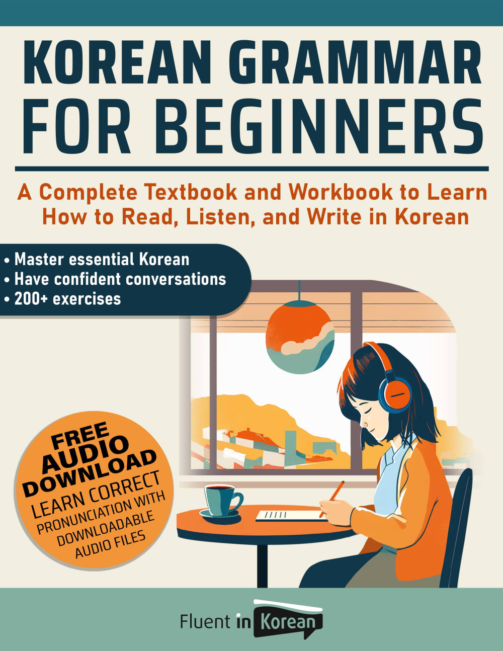
Which cover do you prefer for a Korean Grammar for Beginners book?
Option A won this Ranked poll with a final tally of 26 votes after 1 round of vote counting.
In a Ranked poll, respondents rank every option in order of preference. For example, when you test 6 options, each respondent orders their choices from first to sixth place.
PickFu requires a majority to win a Ranked poll. A majority winner differs from a plurality winner. A majority winner earns over 50% of the votes, whereas a plurality winner earns the most votes, regardless of winning percentage.
If an option does not earn a majority of votes, PickFu eliminates the option with the lowest number of votes. The votes from the eliminated option are reassigned based on each respondent’s next choice. This process continues in rounds until a majority winner emerges.
Scores reflect the percentage of total votes an option receives during the vote counting and indicate the relative preference of the respondents. If there is no majority winner, look to the scores to see how the options fared relative to one another.
| Option | Round 1 |
|---|---|
| A | 52% 26 votes |
| B | 20% 10 votes |
| D | 20% 10 votes |
| C | 8% 4 votes |
26 Responses to Option A
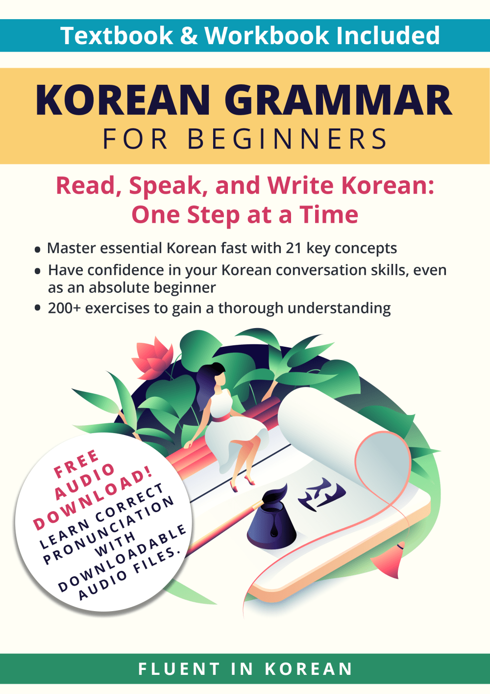
quite difficult to rank because i like them all. "A" says it's for "beginners" in big letters so it got my attention quickly. i also like that there is a lot of information about what the benefits of it are. "B" is almost as good but i prefer "A" because it has a person on the cover. there is nothing wrong with "C", i just think that in comparison to the others, it's rather plain. all good choices here.
looks the most appealing and one that can be easy and simple to use and it seems to be the most personal and relatable for me
I prefer A because the graphics and layout match best, in addition to it being informative. I didn't like the relative sizing of the elements in B, thought the font was too small in C and D was too vague.
Audio download highlighted and easy to find is attractive. Cartoon picture with random objects indicate simple words like learning to read one's own language.
I like A the best because it explains the features of the book and what is provided. B does this too, but it has quite a lot of text for a cover, which makes the book seem more daunting. C has some information, but the print is quite small and hard to read. D doesn't have any specific information about what the book provides, so I ranked it last.
I prefer this option. I liked the inclusion of a workbook plus this seems complete and includes downloads.
I would buy option a. I really enjoy the design of this cover and I would like looking at it every time I used it.
The cover is incredibly attractive and intriguing, thus I'll pick option A'.
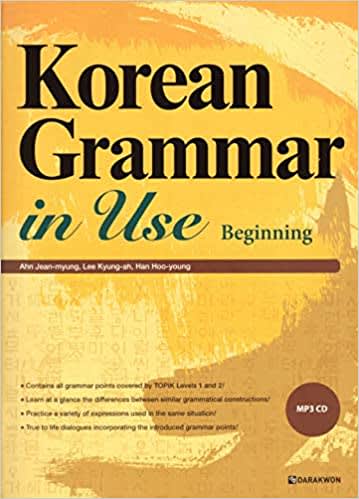
Choice A looks high quality. Choice C looks really good but cheaper. B looks like a standard language book and D looks mediocre.
I like the colors on number one and number two a little bit more although three is nice also. I think number four has a lot of problems sticking out. You do get that a little bit with one and two but you also want to click into the cover to read it
This is the exact order I would grab these from a book shelf at the local store :) A,C,D,B! Perfect Order
Love the image of the girl calmly on a chair nicely listening to the audios.
I like the nostalgic feel of choice A. It reminds me of the 90s, which is comforting. The font is very easy to read and understand.
Options A and B make it look simple to use and comprehensive with the description on the cover
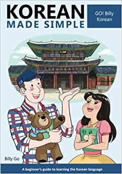
I massively prefer option A in terms of book cover because it really captures the persons attention. It has all the important information about the book right on the front, in very big font, and is easily readable so the person can know what to expect. Option B is similar to it in this regard, I just personally feel Option A's cover grabs the person more. Option D might feel as though it is not a book that "teaches" you Korean/Korean grammar, but is a book that is meant to be read along with other books, and not the main book. Option C is not very appealing and looks ugly.
I liked "A" best. It was a tough choice between A and B, but I liked the looks of a student sitting at a desk learning the language and the cover said all I need to know about it.
Option a shows me i can use this product anywhere the cover is fun and easy on the eyes option c is boring.
A feels the warmest and most welcoming to me. C feels just like a school textbook and that elicits cold feelings.
I like the style, fonts and colors of the cover. The image is also better.
I like the one that seems like it’s serious and it will be ready to learn.
The ones with the cartoons seem modern and accessible, while the others seem old-fashioned.
I chose A because I like the illustration of the young woman studying with headphones on. It reminds me of the thumbnail used on lo-fi music youtube videos.
First, the title should be clear. Preferably, the title would have the words "for beginners". If you simply say, "in use", it implies it could be a more advanced text. Finally, I do like the cartoons of people on the cover ... makes it seems like the book is more enjoyable, rather than simply a textbook.
I chose A.as.my choice because I like the wording used, the graphics, the title.
Option A is my top choice because it has most of the helpful information on the cover bullets in terms of what the book contains.
I chose by options that look most easy to use. I like to see the free audio download offer.
10 Responses to Option B
I like option B, I think the cover looks very much like the language textbooks I used in school, I feel comfortable with it.
I chose B as my top choice since it lists +200 exercises and emphasizes that I would learn "one step at a time". Also I like that it offers a free audio download.
Both B and A basically communicate the same info but B has little extras like "be confident even as a beginner" and "21 key concepts" to help you feel like it's not much you have to learn to get it together learning the language. Plus seeing some Korean text helps to make the cover look better. D doesn't look too impressive or communicate much on the cover but it beats C because that cover(C) looks like something I would've seen when I was in elementary school. That cover(C) looks grossly outdated.
B - I love the flowers on the cover and everything just looks nice and eye catching. A - the girl writing and listening to her headset is relatable and I think it makes it look like you can move at your own pace with this book. It’s similar to B. C - this one is too plain. Boring. Wouldn’t make me want to buy it at all. But I chose it third instead of last because…D - This cover looks like a workbook for kids. Like second graders. The cartoon people are laughable and people would get confused seeing it, think it’s for kids, and pass right by it. Especially the female on the right. She actually scares me.
B has tremendous amount of info about what is included and how instruction works. A has similar info. While D does not have a great visual it does have some written info. C features man holding teddy bear and woman who looks like she is wearing a princess custom, a turn-off
I chose these selections based upon the way that the cover appeared to be. The attractiveness is what is very appealing to me. I really like the first vote out of all the others. This cover is very stunningly beautiful, and I would most definitely purchase this book if the cover is similar to this one!
Based on the cover alone, B looks like it is the highest quality that help me the most.
Option B is both is both informative and descriptive
I believe that option B and D look the most friendly and laid back which makes it more prone to being my first picks out of all the options.
Option B has the most culturally appropriate artwork and doesn’t feel too childish or cartoonish.
4 Responses to Option C
Option C looks like the most trustworthy book cover. Options A and B are about the same level of trustworthiness. Options C, A, and B all come with companion audio samples (DVD and download). Option D looks too jovial and cartoonish, looking appropriate for teenagers or young adults about to travel the world for the first time.
I rated the covers in order of preference. I feel that option C looks the most professional.
I prefer Option C for a Korean Grammar for Beginners book because it has a simple design with a bright green background that stands out and is easy to read. The font is also bold and clear which makes it easy to read. Option D has a colorful design but is too busy with too many colors and fonts. Option B is too plain and doesn't stand out. Option A has a nice design but the colors are too dull.
I like the cover with no image the best. I think the image of the girl studying is better then the other images. I prefer the image of the girl siting on a bench over the couple laughing.
10 Responses to Option D
In my opinion, a Korean Grammar for Beginners book should look like a book for kids - with a lot of pictures to achieve quicker learning results. Book covers with images I like have been ranked higher.
Definitely Option D because it looks more user friendly in my personal opinion. Thank you.
D is the best because the book cover shows a tourist talking to a local, which is good for learning a language. C is the worst because the book cover is boring.
I choose D, the style and idea is good and it's more presentable to use.
I like Option D and A looks great, the illustration looks great and well done. Option B looks good but has a lot of texts going around.
D is my first choice because I like the art style. I also believe that the fun nature of the cover makes learning Korean more inviting. A is second because the cover makes this seem like a comprehensive program. I also like the art style. B is third because it is comprehensive like A but it looks a little less accessible and more like a boring textbook. C is last because it is much too plain and does not grab my attention.
For me, what would be most important is conversational Korean. The picture on the cover of D makes it look like it would satisfy that requirement the most.
D makes it seem doable and less intimidating. I like A a lot, it seems comprehensive and like the course is well done. B is ok, but kind of visually cluttered. C is ok, it just looks like a college textbook.
I like option D the best because I like the cultural reference showing the Korean temple in the background behind the two people. It makes the cover really catchy.
I like this design the most because it shows a group of people in Korea, wearing traditional items and immersing themselves in the culture
Explore who answered your poll
Analyze your results with demographic reports.

