Poll results
Save to favorites
Add this poll to your saved list for easy reference.
Which cover do you prefer for a Medical Terminology book?
There was no majority winner of this Ranked poll after 4 rounds of vote counting. However, Option A and Option E had the most votes (25).
In a Ranked poll, respondents rank every option in order of preference. For example, when you test 6 options, each respondent orders their choices from first to sixth place.
PickFu requires a majority to win a Ranked poll. A majority winner differs from a plurality winner. A majority winner earns over 50% of the votes, whereas a plurality winner earns the most votes, regardless of winning percentage.
If an option does not earn a majority of votes, PickFu eliminates the option with the lowest number of votes. The votes from the eliminated option are reassigned based on each respondent’s next choice. This process continues in rounds until a majority winner emerges.
Scores reflect the percentage of total votes an option receives during the vote counting and indicate the relative preference of the respondents. If there is no majority winner, look to the scores to see how the options fared relative to one another.
| Option | Round 1 | Round 2 | Round 3 | Round 4 |
|---|---|---|---|---|
| A | 26% 13 votes | 26% 13 votes | 36% 18 votes +5 | 50% 25 votes +7 |
| E | 34% 17 votes | 34% 17 votes | 38% 19 votes +2 | 50% 25 votes +6 |
| B | 16% 8 votes | 22% 11 votes +3 | 26% 13 votes +2 | Eliminated 13 votes reassigned |
| C | 18% 9 votes | 18% 9 votes | Eliminated 9 votes reassigned | |
| D | 6% 3 votes | Eliminated 3 votes reassigned |
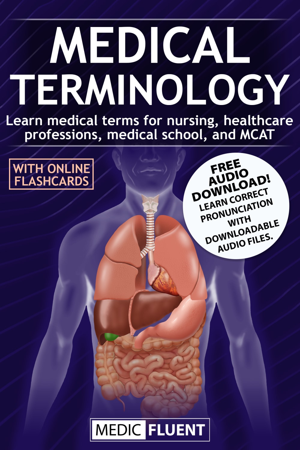
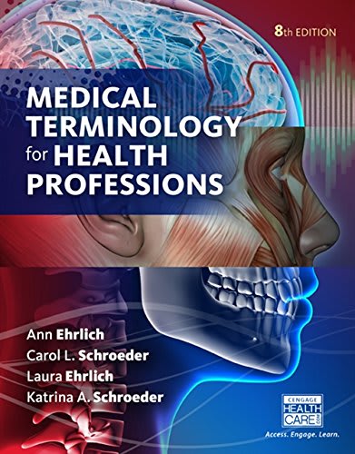
13 Responses to Option A
My last choice does not seem nearly as professional as the others. The other four all look nice, but my top few choices just seemed like their information would be more useful and better.
Option A. I like being able to see the person in the background of the cover because it totally has to do with medical Terminology it's the perfect image for that and I think the colors are visually appealing on that as well I can see the letters a very well.
I like that it shows the subject of what I'll be learning from the book.
I chose A as my first choice because I like the image used. I like the colors, the text highlights, and the overall look.I chose E as my second choice because I like the images, the colors, the text, and the overall presentation.I chose B as my third choice because I like the text, the graphics, the colors, and design.I chose C as my fourth choice because I like the title, the image, the colors, and text.I chose D as my fifth choice because I like the colors, the text, the layout, and the design.
seems to be the most informative and offering me the most detail that helps me determine if its something for me
I like this one as the cover is nice and bright. I also like the fact that you get an audio download which gives you a huge plus.
The one I chose is because it explains everything the book is about on the front and the pictures were very clear and understandable
I liked option A, because it was fairly simple but also included information about what the book is about. Choice D was also not too busy. The other ones seems to have too much going on so it was hard for the eye to figure out where to go.
I like option A because it has a good illustration and the cover tells you what you will learn with the book.
I like a with the audio book and extras. Gives you more options.
I really wouldn't want a "for dummies" book on medical terminology. I could see the benefit to having flash cards already done in A.
Option A has a good graphic on the book which shows that the book will focus on the medical terminology and providing visuals to go with it. The one I like the least is C as the “Dummies” book franchise has petered out.
I chose option "A" as it shows a student upfront all the ways a person can access or enhance their learning of this material when they purchase this book.
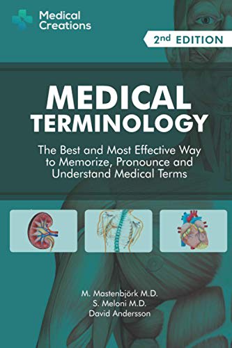
8 Responses to Option B
I like the cover to look structured and serious.
B I feel has the best cover that is well designed and draws my interest the most.
Option B is best to because when I study I'm looking for the best most efficient way to retain information. A is 2nd because it has a good title and it comes with an audio book and online flash csrds. D is 3rd because it comes with labs to practice. E is the because it's good title but it doesn't offer anything additional. C is last because if you are learning medical terms I don't think you are a dummy.
As a non-medical professional, choices B and A are most appealing as they are the most approachable. Choices D and E also strike me as informative, but may be a bit more technical. The "for dummies" brand in choice C does not give me much confidence.
B looks like a real textbook. It looks professional and legit. I prefer the textbook covers that show some biological images. E seems too boring, and I would not want to purchase a textbook from the series that C belongs to.
I like B the most because of the understated imagery and the fact that it is a 'second edition,' which to me says it has longevity. D looks a bit stodgy but formal enough that I would take it seriously, while the images in A and E seem a bit too cartoony for me. Anything 'for dummies' seems like cheap and down market to me, so I would not go with C.
I like the themes that have a picture of actual anatomy like muscles or bones. Also, not a big fan of the "for dummies" theme. It's too overused.
After carefully studying and comparing all five book cover images for a Medical Terminology book, I selected Option B las my first preference and the one that I would definitely click on to purchase for my own personal use. I felt that this image jumped right out at me as the one that had the most eye catching appeal to me personally based on the design and coloring of the image. Option E was my second choice followed by Option A, Option C and finally Option D with all five rankings based on my own personal opinion of the relative attractiveness of each product image.
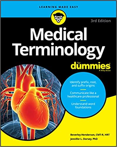
9 Responses to Option C
The heart is a good cover along with the fadeaway look of the person on the cover that is seen in E too.
Made my choices based on which cover I like best to like least. The one I like best is the one in C. The cover in C stands out,is attention grabbing
I like option C the best because I've always liked the books for "dummies".
I'm not a medical professional and have good luck with the DUMMIES book, so Option C would be my first choice.
C works assuming you are indeed part of the For Dummies series, that's a good brand. B shows me I'm getting a nice professional book for a layman, E something very professional. A is the worst because it looks like it was made on a home computer rather than a real book publisher.
B and d seem to be very outdated but I think that the other ones look like books that I've actually used when I was in PA School
I choose this because the word dummies gives a feeling that this book is for beginners.I feel I can easily understand what is inside the book
I'm a fan of my first choice because I'm a fan of the Dummies books and I know that the book will be easier to read and understand.
I picked C because it's a familiar brand, followed by A and B which were specific about what the book can help prepare for. E and D were both too vague.
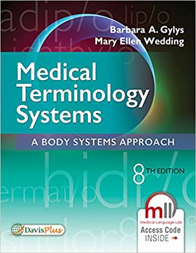
3 Responses to Option D
D is a cover that i would normally associate with a boring text book
First pick is D because it matches the text well. Second pick is B because I liked the color. Third pick is A because purple fits the book perfectly. Fourth pick is E because it is too graphic. Fifth pick is C because yellow looks terrible in this.
I chose option D because the cover has the least amount of pictures. I do not like medical photos and I think it is gross
17 Responses to Option E
E, B, and A look the most like what I would see on the desk of a medical student.
Seeing the innards of the face is a unique image that caught my attention immediately and kept my focus while looking at the other covers
E and A strike the balance for having an interesting look, but still looking professional, and also not looking boring.
I choose E, Because the example and design is more good and I love the style and design of the book cover it's more appealing.
I prefer the option E medical terminology book cover because I like the detailed graphic illustration of the body and face shown here the most. I chose options A, C and B second, third and fourth because I like the free audio download and illustration of the internal organs more than the detailed image of the heart more than the less detailed imagery of the muscles seen in the option B book cover. I chose option D last because this book cover does not really show any illustrations of the human body like in the other book cover options.
I like E best for its colorful graphics and unique approach to showing the human skull
My top 2 choices were my favorite because they looked the most like real textbooks with lots of information.
Option E was my favorite because it grabs my attention the quickest. The colors just look good together and the picture is nice. I chose Option D last because it looks very generic and boring. A, B and C were all very similar.
I appreciate seeing which professions the textbook could be used for. I like the cover design, which has higher contrast and eye-catching colors.
Option E is preferred. I like the cover showing an image of the human body using the side view of the human head. It graphically shows inner features of muscle, bone, teeth, brain, etc. This image directly links the reader to the subject of the book, Medical Terminology.
I would choose E first because it looks the most up to date and technical A and B would follow based on the simple model. Cwould be last because I dont want it to seem like it is for dummies.
There's two parts to a book cover that are important there's the text and then there's the illustrations and I think the ones that have the best text and illustrations here are options E and A. I'll tell you when I don't really like is option C and not just in this book but in all of the fill in the blank for dummies books I never really understood that because you're basically insulting the readers right on the cover of the book by referring to them as dummies and I would never buy a book like that
I can understand that it’s medically based and for humans.
Having the body parts shown on the cover is a good hook that gets me interested.
I like choice E because it shows the human head. C and A also show realistic looking body parts.
D is last because the cover looks and feels plain to me personally. I like to see images that relate to the item and this one doesn't seem like it. From there, I really love E and A a lot because for me, I love seeing the insides and also icons that work and make sense for this item. From there, B and C are ranked next because it gives me the icons and organs but it's not as modern as E and A.
I preferred the book cover that appeared professional and used the darker, but vivid color design. The green colored covers were less visually appealing and the book for dummies was not appropriate for the subject matter.
Explore who answered your poll
Analyze your results with demographic reports.
Demographics
Sorry, AI highlights are currently only available for polls created after February 28th.
We're working hard to bring AI to more polls, please check back soon.

