Poll results
Save to favorites
Add this poll to your saved list for easy reference.
Which cover do you prefer for a satirical novel about travel to France, Japan, and Israel?

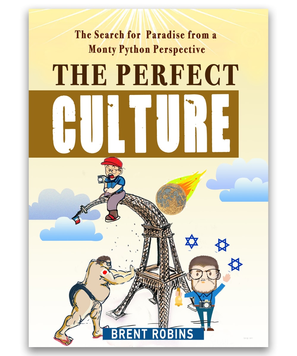
Option F won this Ranked poll with a final tally of 26 votes after 5 rounds of votes counting.
In a Ranked poll, respondents rank every option in order of preference. For example, when you test 6 options, each respondent orders their choices from first to sixth place.
PickFu requires a majority to win a Ranked poll. A majority winner differs from a plurality winner. A majority winner earns over 50% of the votes, whereas a plurality winner earns the most votes, regardless of winning percentage.
If an option does not earn a majority of votes, PickFu eliminates the option with the lowest number of votes. The votes from the eliminated option are reassigned based on each respondent’s next choice. This process continues in rounds until a majority winner emerges.
Scores reflect the percentage of total votes an option receives during the vote counting and indicate the relative preference of the respondents. If there is no majority winner, look to the scores to see how the options fared relative to one another.
| Option | Round 1 | Round 2 | Round 3 | Round 4 | Round 5 |
|---|---|---|---|---|---|
| F | 26% 13 votes | 28% 14 votes +1 | 30% 15 votes +1 | 38% 19 votes +4 | 55.32% 26 votes +7 |
| B | 22% 11 votes | 26% 13 votes +2 | 30% 15 votes +2 | 34% 17 votes +2 | 44.68% 21 votes +4 |
| C | 20% 10 votes | 22% 11 votes +1 | 24% 12 votes +1 | 28% 14 votes +2 | Eliminated 14 votes reassigned |
| E | 12% 6 votes | 14% 7 votes +1 | 16% 8 votes +1 | Eliminated 8 votes reassigned | |
| D | 10% 5 votes | 10% 5 votes | Eliminated 5 votes reassigned | ||
| A | 10% 5 votes | Eliminated 5 votes reassigned |
Age range
Education level
Gender identity
Options
Personal income range
Political affiliation
Preferred book format
Racial or ethnic identity
Travel frequency
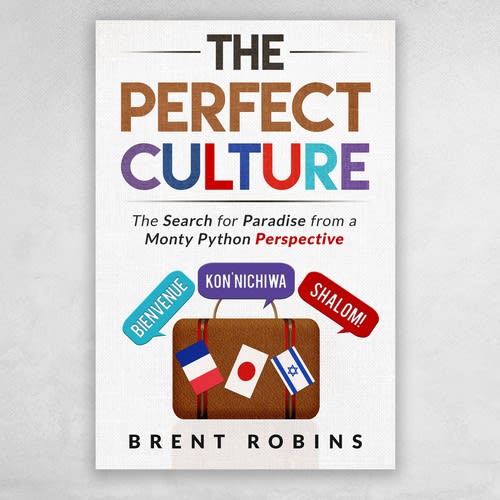
5 Responses to Option A
I like the graphical designs of the first four.
I felt the symbolism of my choices best reflected the intended content.
Option A had the most visually appealing cover. The colors are vibrant and the picture used is very eye-catching. Options B, E, and D are also very visually appealing.
Book covers that show a large amount of color -- especially contrasted - is a great way to grab attention. I feel like my top pick would be a complete blast to read. The modern font is what broke the tie for 1st.
The cover that shows each of the countries clearly is clearly more attractive because it is clear.
11 Responses to Option B
I went with the books that looks the most aesthetically pleasing. Some of the covers looked more grown up and I don't want that at all for my books, because they essentially become art when I buy them and display them on my shelf, so they should look colorful and pretty too.
i like options B and D because they both show the flags or symbols of the countries they are talking about the best.
I like these options best in this order.
B- I like this one the best because all three countries are represented equally by all having the same size flag and phrase bubble coming off so it doesn’t seem like one is better than the other.D- I also like this one because the finger prints all represent each countries individual identity but are all the same size they are all represented equally.C-I like this one because the cover include a unique picture from each country monument but I do not care for the three different images in the one photo.E- I don’t like the last three options because the countries don’t seem equally represented but out of the three this one has the least offending image and has a clean look to it.
It is well developed and has contrast to make the content appealing
I understand that this book is going to be a satire, but I still picked my top 4 choices based on the graphics that were presented on the cover of the book. I liked the covers that had the flags of the different countries on the cover. I also liked the design of the other covers that I selected. Some of the covers remind of travelling to different countries.
I choose Option B due to how easy the cover is on the eye. It has a neat layout that flows nicely from top to bottom and the font is easily readable. The color palette is very pleasing as well with a clean combination of colors. Option E has the same qualities but this covers subtitle font could be more readable. The color theme is very pleasing to look at and I was actually torn between B and E and the fonts are the difference. Option C has a very eye catching cover but due to it's darker background it was picked at three. The darker background gives the cover a pop and the playful colorful lettering is what brings you in, but it doesn't really make you want to pick it up and open the cover as much as B and E. Option F is a classic type of Monty Python cartoon so the cover definitely draws a fan. I only chose this one because it was less tragic than the last few.
B and C look the most modern, like light reading, and about the topic of traveling and the three destinations. E shows the 3 destinations but looks serious. A doesn't look at all like a satire, I'd expect it to be a political thriller.
Option B looks the most welcoming and friendly and got my attention first. A has an aesthetically pleasing cover. C would work nicely as an educational book, but not really as a satirical novel cover. D is nothing special, but the color scheme and text don't look unaesthetic either.
To me, Option B really jumped out at me at first, so that's why it's my top choice. It's clean and minimalist, the color scheme is great, and I feel the overall design idea best matches the ideas within the book. Option A is a similar feel to me, but I think it's too serious of a cover for a satire book. Option D is my third choice because it sticks to my minimalist liking, yet I think the overall cover design is outdated, as well as the color scheme. For Option C, I like the bold choice of rainbow colors, but the pictures are too "textbookish" to me, if that makes sense.
I select the option base on the cover of book. I like them base on their designs, which are great for me.
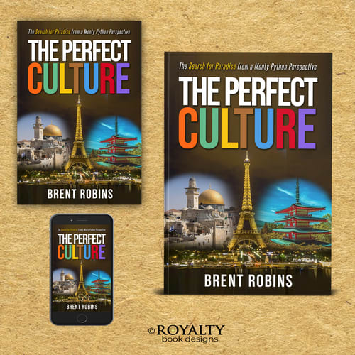
10 Responses to Option C
I like how this option shows the different ways you can access the book
I thought that C was the most modern looking, best art, best use of colors, the most new looking. The rest of the other 3 I voted on because of how they reminded me of past books that I've read. I didn't vote for the last two because they seemed a bit boring.
I like using the countries flags as part of the logo because they are identifiable. I also like using the Eiffel tower because it is probably the most well known landmark in all of Europe. It will make it easy for people to identify with the subject.
They seemed to be the most imaginative covers. One thing a book cover needs to do is spark someone's curiosity, and these seem to do it better the other choices, especially option F because it is an interesting drawing. Liked C also because it looks like you get three different types of books, including one you can read on your phone.
C was very colorful and caught my attention. D looks very interesting to read. E. I like the red circle . F I like how its pre historic and looks fun to read
C looks very interesting and I have a clear understanding of the countries that are going to be talked about are. B also has a creative cover that gives a clear understanding of the countries to be talked about. D is unique, the fingerprints stand out. E is also somewhat eye catching but not as much as the others and the countries to be talked about won't be very clear in my opinion.
I enjoy the option that shows a much more realistic option as opposed to those that include a clip art cover. The inclusion of flags is also a very clear indication of what the book is conveying.
I like C because it combines the best of both worlds on the cover. I like the realistic feel while it still maintaining an artistic integrity. I like D because it's simple, to the point and doesn't hold back. I like E because it's mildly cartoony but it's a good cover. I like that a lot. B is amazing because it's simple and to the point. I don't like it as much as the other ones but it is a great cover.
I chose option C first because I like that it shows landmarks from those 3 countries. I liked option A next because it shows the flag representing all 3 countries. I like option D next because each finger print represents one of the three countries. Last I like option F because of the charicuture drawings that represent each country.
I love that the landmarks are pictured in option C. Everyone knows those landmarks, even if they have never travelled abroad before. It gives an idea of the culture that will be discussed in the book including cultural landmarks. Also, while it states that it is in a Monty Python perspective, it isn't cartoonish, but very tastefully done. At the opposite end of the spectrum is F. If you want to make sure that no one misses the fact that this is satire, this would be the cover to go with. It is cartoonish, and based on the cover no one is going to take it seriously.I like that in B all the flags come together. You know that this book is going to cover the cultures that those 3 flags belong to, yet it is still a bit cartoonish so satire is expected.
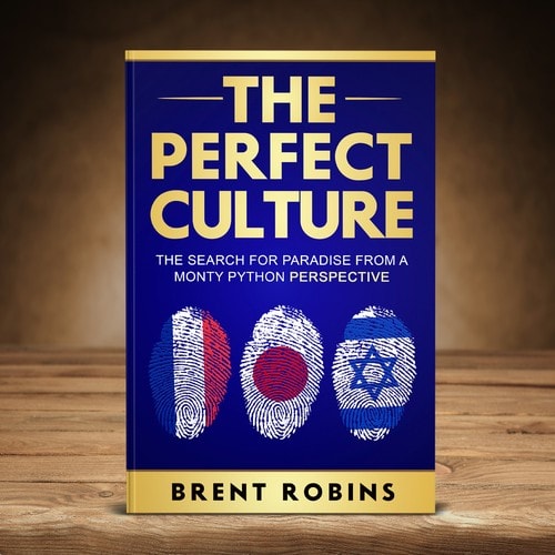
5 Responses to Option D
I like that D has a cool cover story and the fingerprints are a unique touch
This is the order in which the book covers are the most impactful and engaging to the least.
I feel that D, B, and A all offer a bit of maturity to the subject. It makes me think it is a satirical book, but an intelligently satirical book. That makes a big difference for me. I really did not enjoy the comical cover in regards to this subject simply because I did not think it fit the subject and what I assumed would be the intelligence level of the book, it was too low for the actual book.
I felt showing the flags or symbols was important. I liked the fingerprint touch. Simple and not too colorful.
I just liked the design and art in contrast with the intended satire.
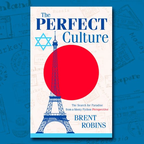
6 Responses to Option E
I went with the most creative options. The ones I would probably most stop in a book store and pick up to flip through to see if the content was interesting to me.
I chose based on the title and the creativity. I prefer more creative covers.
I like the ones that feature the 3 countries flags the most. Option D looks more like a serious book than a comedy book to me, however its also a nice cover and I like it.
I like the first option the best because it blends all of the important parts of the culture into the cover, so you know which countries they are talking about. I also like the second option because it does give that satirical artwork to what the book is about.
The pictures are easy to recognize the contries.
Option E has the best graphic design overall. Option E and C look too serious for satirical book. Option F and option B look pretty tame, they don't seem interesting. Option A is okay, but it captures attention but it still doesn't look good.
13 Responses to Option F
I like a cover that represents a little bit of everything, the other covers were a bit too serious or specific.
Option F is definitely my top choice because, although potentially controversial, the use of comic-like imagery makes it immediately clear that the novel is satirical. From there, I made the rest of my ranking selections based on aethestic appeal of the design.
The one in my top choice is excellent, I love the style of art and humor used on the cover to represent things about the countries. Especially since the book is a satirical novel.
These covers look to me to be the best for the type of book that it is. Satirical would involve some humor and these covers convey that to me. The other covers that I didn't choose, look to me as more of a political(serious type of book. If I am judging a book by it's cover, these are the types of covers I would look for in this type of book.I'm not sure I would even pick the others off of the shelf.
I picked F first because the cover is the only one that makes it clear even at a distance that this is a comical bookI picked E second because I like that it cleanly and clearly represents all 3 cultures. It looks smart.I picked B next because I liked the overall look and because the way the flags are askew it alludes to comical writingI didn't really like D much - it looked like a spy novelI didn't really like C, or A because they look like regular travel books.
I think Option F makes the most sense for a satirical novel. I get that it's not a serious book and more for fun from just looking at the cover. I wouldn't be surprised when I started reading the book. I also like Option C because you get a sense of the 3 places it mentions because of the monuments that are significant to each of the 3 places. Option B and A were just Ok for me. They were too serious and don't convey satire as well.
I chose F first because the novel is satirical, and so is the cover. It's funny, it makes you look at it, and you know it's not going to be a super serious book but something more enjoyable. None of the other choices offered this combination. I chose B second because it was uncluttered, to the point, easy to determine what the contents were about, and easy to see what cultures/countries the book would be about. I chose E for my third choice because I liked it better than all the ones left, at least it had good graphics and cultural representation, but nothing about it screamed satirical or tongue in cheek. I chose C as my fourth choice, but I didn't really like it. I just liked it a wee bit better than the other two that were left. boring and nothing made me want to see what was written inside.
I like option F the best, because it has playful characters in a perfectly satirical setting. The cartoon cover looks fun, and I could see myself reading the novel. Option B is next best for me, because the cover is clean, and it shows the different country flags. Option C is next on the list for me, since the black background has a playful contrast to the sights that you can see in the respective countries. Lastly, option A is good because it showcases all three countries in one flag. I like how the background is the sky with the flag waving in the front.
F has the perfect funny picture given the contents of the bookC The images of the different sites in the countries described in the book are perfect given the title.B is funny also shows the different languages spoken in the countries in question but could use better visualsD is my last choice only because it shows the flags of each country and looks better than the remaining options.
If the author wants to really sell this as a humorous book, F is the best cover because it looks the most comical. B is the most cheerful and might make a good cover if the intent is to see how the cultures interplay. I liked A as well because it gave the impression that the author wants to pick the best aspects of all of these cultures and combine them. Of the remaining three, I picked D because it looked the least generic.
I really like the more irreverent and comedic covers such as F and B the most of all of them.
I chose F as my first choice because the novel is supposed to be satire-ish, and I think having the most common stereotype for each country helps get that point across. I chose the others because I liked them and also got a point of what the novels were about through by using certain elements of each country on the cover.
My top choice is my top choice because it has a fun satirical type cover. The rest aren't necessarily clear that it's satire just from looking at the cover. The others, I chose because they're clearest on which countries are being discussed.
Explore who answered your poll
Analyze your results with demographic reports.
Demographics
Sorry, AI highlights are currently only available for polls created after February 28th.
We're working hard to bring AI to more polls, please check back soon.

