Poll results
Save to favorites
Add this poll to your saved list for easy reference.
Which cover do you prefer for a suspense book about a woman trying to rescue 2 young girls?
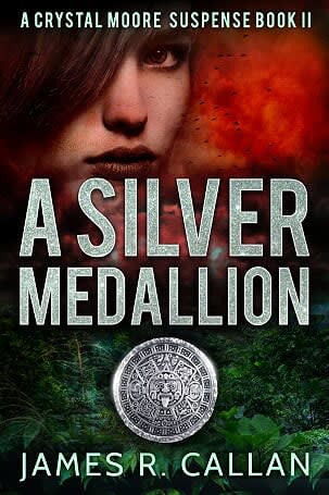
19 Responses to Option A
The bright colors in A are eye-catching
The red cover really brought out the capturing of attention in the photo.
The pops of color are eye catching.
I like the red. It's more catchy
A looks more interesting and welcoming, from the point of the reader. B looks little cold and makes me think of the woman as a zombie.
I like the use of the red to catch my attention but also to signify danger.
I prefer Option A with the more colorful cover, it would stand out more on the shelf
The red pop of color grabbed my attention first.
I kind of like the look of the red in the background better. It catches my attention
I like the red color better.
I like the color here as it makes for more of a contrast. Good book cover and the color adds to the mystery. I feel it is shrouded already and we are drawn in, so adding the color seems powerful. I'd keep the red sky and the birds over the grey cloud.
I like the color cover better. Looks more professional and interesting.
I chose A because I like the colors of the ladies face. the all white cover and face on the other one makes you think the book is going to be about a ghost and not a real person.
Prefer A, I like addition of the color, makes the cover pop
I think the addition of red in the background adds a sense of mystery and danger, which is appropriate for a suspense book
The read color creates intensity and a flair of passion
the red really stands out and adds to the intensity because the gray feels a bit flat
I like seeing the red along with the green colors. It makes it more real.
Both covers stick out, but the red in this one looks nice and really catches my eye.
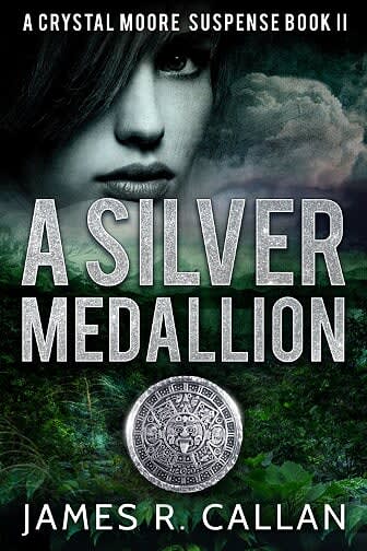
31 Responses to Option B
The darker colors make the book look more gripping and suspenseful.
For a mystery like novel the red is too glaring and in your face here
I liked Option B. I think the black and white image of the woman on the cover adds a certain level of mystic and adds to the suspense of the novel.
I like how the grey color kind of matches the word silver in the title
the color scheme is better for this one
If the name is about a "silver medallion" then we should keep the gray coloring rather than the red.
The gray takes the focus off the woman so I can focus on the story.
i think the ominous looking cover of B will suffice in this situation
B is mysterious and enticing.
B stands out a little more. it is classy and elegant. The color scheme blends together better.
I chose option B as the cover of this book because it's supposed to be suspense and I think the colors of the clouds look ominous.
Choice B is dark and foreboding with the gray/black and white face blending into the stormy clouds. Perfect for a suspense novel.
The dark clouds over the green jungle brings to mind all of the bad things that could happen to a human lost in a jungle. I don't want to be there, yet I want to know what happens to others who have experience it.
Between the two books, I feel that choice A looks more mysterious with the woman in silver as if she's a ghost or something. I think it'll be received better.
I choose B because the gray clouds and give more of an air of mystery about the book. A looks more like it would be an action novel.
I like the uniform look with detailed contrast. It is attractive and sparks my curiosity. I will buy and read.
While the book says it's about a woman trying to rescue 2 young girls, choice A the color red looks to be about murder and if she's rescuing the girls, the red color might not be the best choice. I pick B and even while it's dark to see the girls eye, there is a could of hope where in choice B it's red and looks more like fire instead of a cloud. For this reason I picked A.
the red color just looks so basic and outdated
I think the color or lack of it, makes the book seem more thrilling, unique and mysterious. It is different than most other covers and is eye catching with the monochromatic color scheme.
The black and white face seems more gritty and adventurous
I like B because the grey tones add a certain something to the cover. It really works- which adds an extra depth to it. This makes it feel like a really good suspense novel.
This was a tough on. I usually like colors, but since in my life I have taken black and white pictures I have a slightly different perspective. I like black and white photo's. There is just something different and interesting about them. Same with this choice. I like color, but the black and white motif catches my eye.
I think the green, black, and grey color for the book looks better than the other option with the red.
Just blends into the rest of the cover better.
I prefer the black and white treatment because it fits more with this genre.
Option A probably stands out more, but I prefer Option B. I think it has a more serious and sophisticated look than Option A.
I like how the color palette of B is more muted. The muted colors give this book the feeling of suspense.
I like the green better, the red makes a sexual contattion
with the name being "a silver moon" it makes sense to have a silver color
I think choice B has a much moodier cover that makes me consider buying it, and I think the color scheme overall indicates something that's higher quality. It shows better overall sense of graphic design, and fits the tone of the book based on the description above. The red on choice A seems too gaudy.
I like the silver background better. The red on Option A make you think of blood and gor.
Explore who answered your poll
Analyze your results with demographic reports.
Demographics
Sorry, AI highlights are currently only available for polls created after February 28th.
We're working hard to bring AI to more polls, please check back soon.

